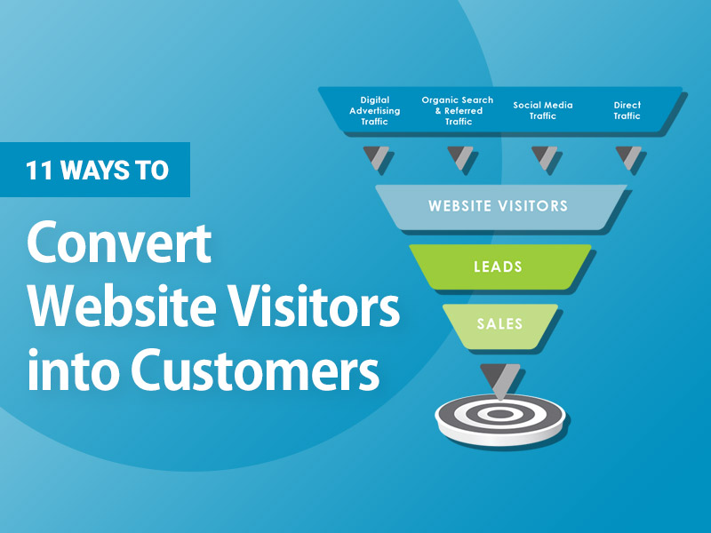
Building a successful website that converts users into new loyal customers is one of the main elements of our PWA development company online success.
You should know that the job of a web agency is exactly that: to create a professional website that will attract potential customers to sell your products and services online.
Today, if you want to make your company more visible, whether it’s an online store, a blog, or a simple landing page, know that it’s very important to have a home page that follows the rules of web design, content, and SEO.
Usually, if you check Google Analytics statistics on the traffic of any site, the home page is the page that gets more traffic than all the others.
This page also offers more opportunities for better search engine positioning for the most frequently used keywords, since most users connect to the home page and therefore better develop it in an optimal way, even following the most common SEO rules.
Here’s how to create a business website that generates conversions right from the home page.
To create a website, we want to explain to you the steps that will help you evaluate or design your home page well.
- Buyer Persona Mapping
- Create a value proposition
- Create a connection with your users
- Determine the most desired action
- Create a call to action
- Write user-centric content
- Add elements of trust
- Test length
- Check download speed
What are the basics of creating a website that converts?
Let’s start with the main aspects that should never be missing from any website:
1. Logo
Users expect to see your logo in the top left corner. Clicking on the logo will take you to the home page from any internal page. This is one of the basic principles of user experience, user experience when browsing your website.
There is no need to hire an expensive logo designer for your website.
If you really don’t want to give up graphics at all, you can find great logos on Fiverr for 10-20 euros, otherwise text logos are just as good and, most importantly, practically free.
You can create an amazing logo using text. Choose an enticing font and background color you like, and voila, you’re done!
2. Navigation menu
People are accustomed to 2 types of menus: horizontal and vertical. Do not look for alternative solutions when creating a site … do not take risks!
3. Footer
People expect to find contact information in the footer. Make sure they are.
4. Customer persona mapping
What are buyer personas? Buyer personas are essentially a specific group of potential customers that you want to reach with your marketing campaign.
Optimizing your website for buyers is focused on users with their needs and desires.
Let’s face it, what users worry about is getting their queries resolved quickly, which is why customer image is so important to your web marketing strategy.
Why use?
It’s about understanding who you’re marketing to, their circumstances, their thoughts, their requirements, and their fears.
You will be better able to offer your goods or services if you know your target market and their demands.
So, while creating a website, consider your clients’ demands!
Formulate a benefit
Your value proposition is the key to your home page. This message should have a header, subheader, and potentially some bullets.
- What is this website?
- How can I help?
- Is this valuable to me?
- Do you sell more than competitors?
The attention span and tolerance of consumers are decreasing due to the constant barrage of messages.
If your site doesn’t respond quickly, people will go.
No one will strive to comprehend your actions or read your whole website. If you don’t save them to your home page, they are gone.
So, to design a website that converts, consumers should always get a good value proposition.
5. Connect with your users
Today, if you attempt to sell your goods or services to everyone, you will lose (unless you have a lot of money to spend). We are here to warn you that your internet marketing approach will never work!
Choose your niche and generate material particularly for them!
The ability to build your own community may establish you as a leader in your area and improve sales!
6. Identify the intended action
In other words, providing people with too many options might lead to their choosing nothing.
Choice slows the customer. If you assume customers will spend time figuring out where to click to advance, you’re mistaken.
7. Don’t make your consumers think
Focusing visitors on one activity makes the site more straightforward and, most importantly, it works!
But first, while creating a website, you must know what activity they would like and for how long! Inquire about purchases or registrations too early. Before asking for a commitment, offer them to learn more about your business or see a demo (registration, purchase, etc.).
Don’t push a sale after just a few phrases of reading. No one says you can’t have a buy/subscribe button on your website, but try to hide it, so the content stands out.
Consider the questions your visitors have when they arrive at your site and if the material addresses them. Help them go through your website’s lifespan.
8. Action urged
A call to action is an invitation to the user to take the desired action. You’ve often read these examples of calls to action in a persuasive letter, but that’s not all. Call to action wording really matters a lot when you want to build a website because it directs your buyers to a page where you can sell products or services.
We recommend making value-driven calls to action and stating what happens when they click.


