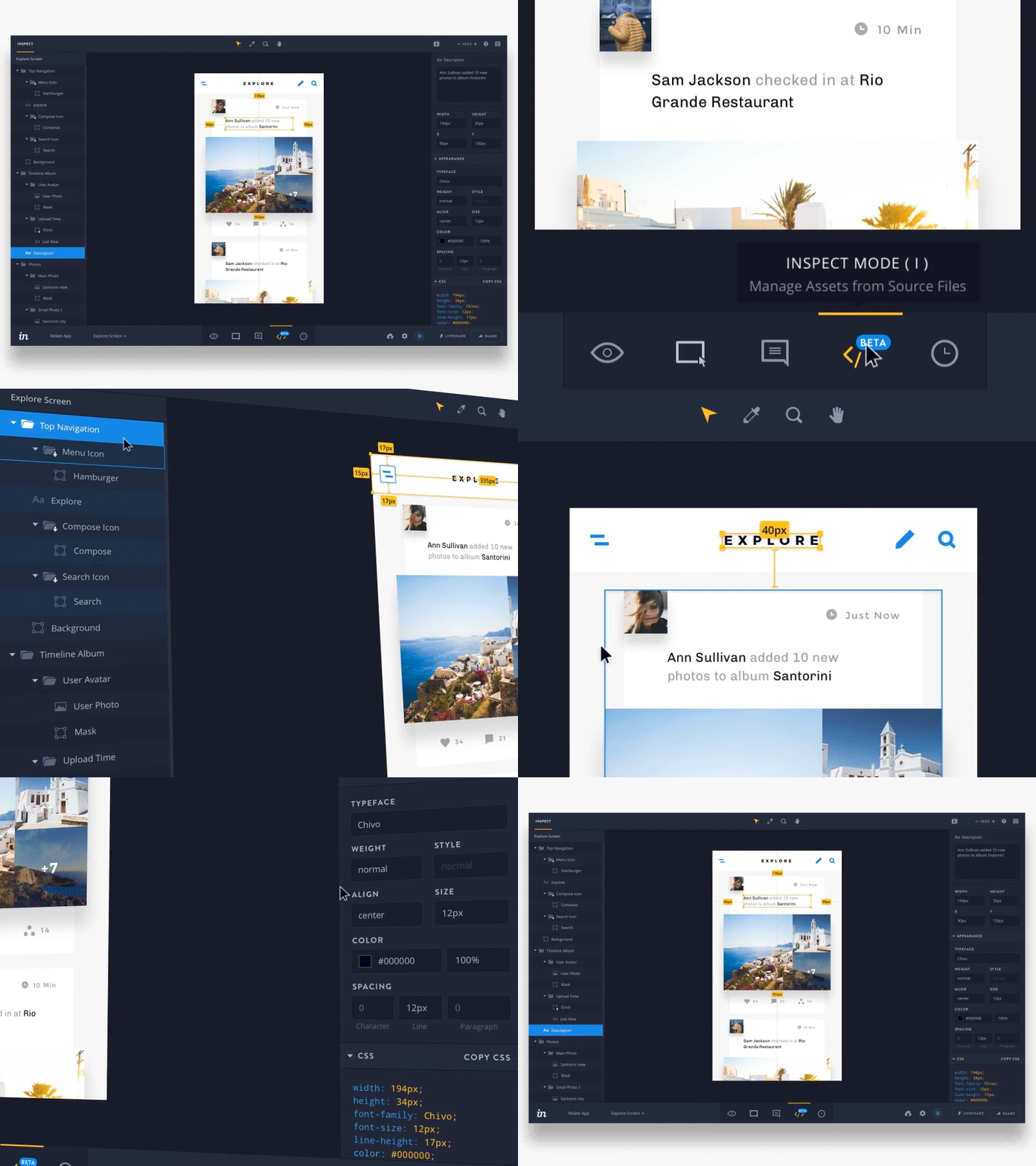
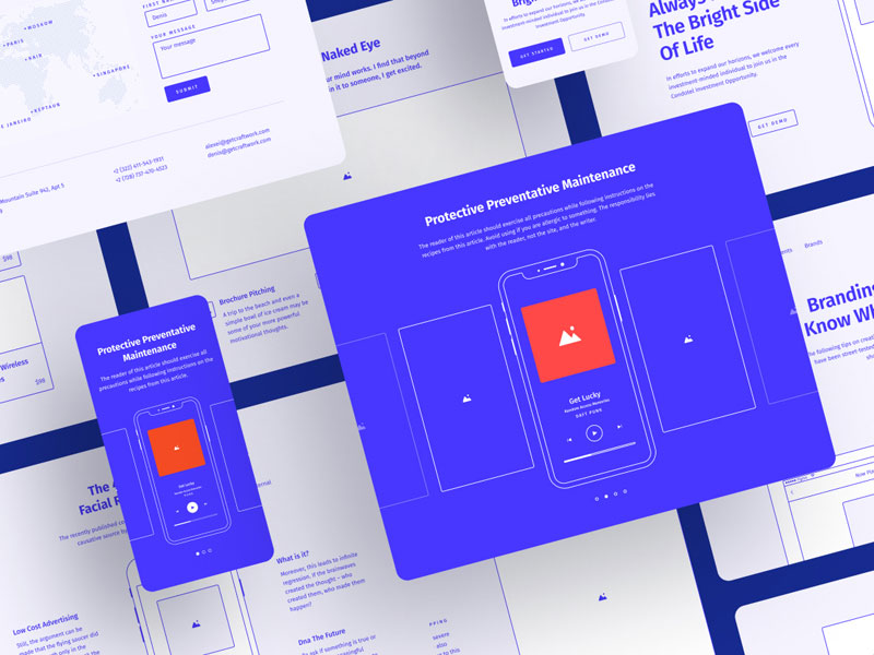
Noted also as IxD, Interaction design is a noted field of design. It is an area to design the present behavior of the human computer systems. All the interaction designers have created functions and content of products, noted to be useful, user-friendly, easy to use, of commercial interest and even technically feasible. All these services are currently meant to improve user experience. However, there are some basic principles of interaction design, which can work well to boost the power of basic UX design. Whether it is noted for the traditional graphical user interface or associated with any of the smart electronic devices, you will definitely find these points to be rather useful.
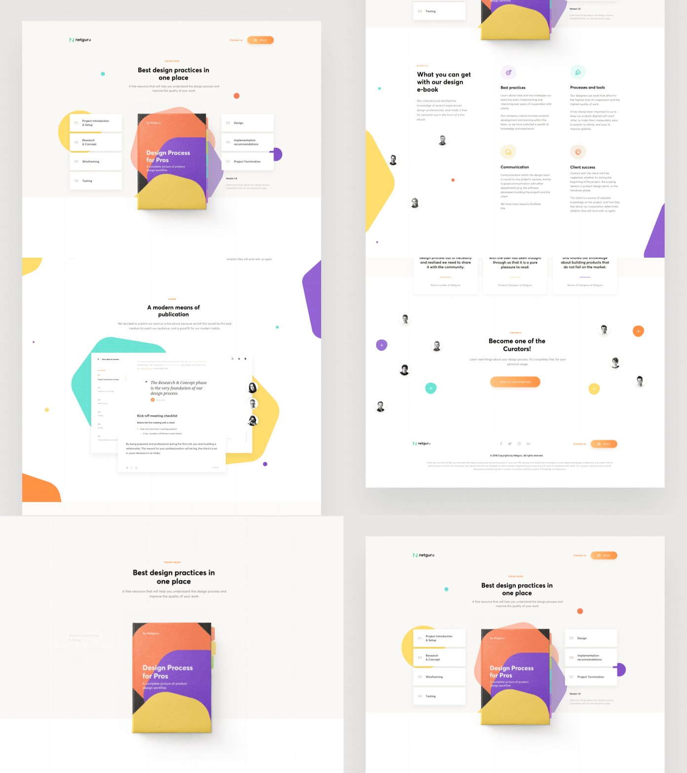 Image Source : Dribbble
1. Following the best mental model of the user:
Most users are currently operating interface, based on the present instinct. Whenever they get the chance to encounter a button, they will actually think that the button will trigger for matching the requirements and needs. But, in case the button gets triggered in any other operation apart from the user’s expectation that can easily be stated as a bad design. You better to be aware of the mental models guidelines for boosting your design.
- It should provide good conceptual model. That will allow users to predict the action consequences and will be communicated through system’s image.
- Things will turn out to be visible. The relations between required actions, user’s intention and results will be consistent, sensible and meaningful, that is non-arbitrary.
- There will be proficient use of mappings, visible affordances and constraints. It is going to remind people of what they can do and how to work on that.
In short, it is mandatory for the designers to be completely aware of the mental model of users first, before coming to a decision.
You May Like : 20 Excellent UI/UX Interection Examples
2. Matching with user’s needs:
The basic principle of interaction design is mainly to match user’s needs. To determine that requirements you have to deal with basic works of product manager. Furthermore, there are multiple tools and ways used for identifying user’s needs. You can try observing the behavior of the user, analyze data, and build user scenarios and much more. If you are trying to create great experiences, it is not about doing as per user’s expectations, but to create design that will match their needs when they need it.
3. Focusing on the consistency:
Consistency happens to be the fundamental principle in the current product design procedure. It is primarily required within familiar or same scenes and functions. It is used for its consistent performance, feeling in product or category and operation. The main aim of consistency is reduce learning costs from a user’s side and also lessening cognitive costs. It can lower the chances of misusing the product design.
You May Like : How are Web Designs These Days Using Social Media for Promotion?
4. Less is always more nowadays:
While going through some of the latest principles in design research NYC, it can well be stated that less is more nowadays. This idea was primarily proposed by Ludwig Mies van der Rohe and termed to be the design philosophy. This rule promotes simplicity and completely opposite to decoration. This principle is known to have a long history and can lead to so many different interpretations in multiple industries.
It is a true fact that ‘less” does not mean “simple” at any cost. But, the designers are working hard to reduce the operational and cognitive costs of the users. It is primarily the “less” essence in the internet world.
Some examples might help in making the point rather clear. It was in the year 1979 when a well-known music company realized that customers are more into playing than recording more. So, they end up removing traditional recording function and removed external speakers. This way Walkman was invented. Later, in 2007, Apple streamlined phone’s keyboards and cut the traditional keyboard. Then they launched iPhone. These examples might help you get a glimpse of story.
You May Like : 26+ Remarkable and Unique Web Design Layouts and Template Ideas by Netflayo
5. Always using simple language in place of technical terms:
Users cannot be termed as a developer or designer. Most of them are not even aware of the design concept and development procedure. Therefore, it is important to address the text and language of product and make those easy to understand and closer to general user’s knowledge. However, it is mandatory to know that users are busy people. So, it is important to optimize functions for the said middle-class users.
6. Designing for functions and not always aesthetics:
Good looking interface is going to please the users. It can further reflect the upgrade iterations of the product. But, it is to be noted that functionary of the product based design is way more important than aesthetics. The designers cannot lose basic operations to achieve any unnecessary beauty. In most of the cases, they have to obey the generic operation principles.
Whenever it is about art, many people will try to put art and design together. But, the reality is different. The design is completely different from that of art. Art provides sense of feeling. On the other hand, you have designed products, which are helping people to solve needs and problems.
7. Allow some of the user making mistakes:
Whenever user operates interface, mistakes they made should be allowed. This might not be the user’s fault but a problem in the design. Whenever the user ends up making a mistake, it should provide effective information to guide the person to proper operation path. It is the work of trusted designers to create a situation for avoiding error, or check and even confirm options before actual action prompts to users.
8. For the feedbacks:
The major process of the information transmission is a free-flowing and translucent communication between machines and people. The procedure of information send out will form effective interaction and with mutual understanding. Therefore, timely feedback and explanation form the major part of the entire service.
Clearing the interaction procedure:
For conveying user’s needs in prototyping design, the Interaction designers have to clear our interaction procedure and IA when creating the wireframe. Whether it is a high fidelity or low fidelity prototype, interaction design is the major key to the entire design of the product. Make sure to follow the basic principles to improve design efficiency.
