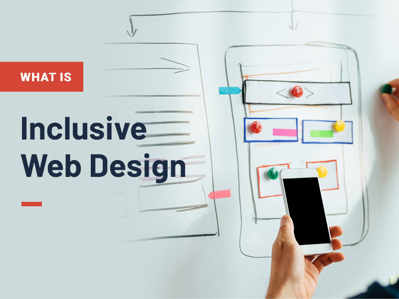
There is a common misconception that inclusive web design is the equivalent term for accessible design. Although they share the same common goal, they are not the same thing.
The difference between accessible design and inclusive design
Accessible design provides the foundation for a website. It is centred around meeting the needs of everyone online, including those with disabilities. This entails building digital platforms that give equal access to users, no matter what device or software they use.
Inclusive design is more focused on crafting content for a broad range of users. Being mindful of the users ability, environment, situation and the context they may need.
Simply put, accessibility assesses whether someone can use and interact with a platform. Inclusive design looks into the user’s experience and whether they want to visit and stay on that platform. Together, they seamlessly go hand-in-hand in creating the best possible experience for your online audience.

The importance of inclusive design
Web design used to be just around creating eye-catching and colourful sites that stand out from the crowd. Nowadays, there’s a lot more to take into consideration. Whilst designing in an inclusive way doesn’t mean that your sites still can’t be aesthetically pleasing, it just takes a little more time to think about the user experience. Ensuring that your striking platforms can be accessed, interacted with, and enjoyed by your whole audience. This will remove barriers that may have been preventing users from previously being able to engage with your content, information, and services.
Creating an inclusive user experience that encompasses all disabilities including:
- auditory
- cognitive
- neurological
- physical
- speech
- visual
It also benefits people without disabilities, such as:
- auditory
- cognitive
- neurological
- physical
- speech
- visual
7 Principles of inclusive design
By considering the key principles of inclusive design, you can ensure that your website or application remains accessible and usable for all users. This not only improves user experience but also helps promote digital equity and inclusivity.
Provide context for your users
It’s important to give context for your users, especially for visually impaired people. This can enhance the user experience and aid with navigation.
This can be on-site elements such as:
- Making hyperlinks descriptive. Avoid writing ‘click’ here, instead tell the users where they will be directed to.
- Add alternative text to imagery. Some users can’t see a web page image, so they rely on you to describe this to them. Ensuring they aren’t missing out on key information and have an equal experience as someone who has vision.
- Avoid using infographics unless the same information is available in a text or audio format.
Implement accessible media
It’s great to use different formats across sites for users to interact with. Giving alternative ways to aid in processing information. However, there are some considerations to make when implementing media:
- Ensure captions are on all video files for Deaf users or those who are hard of hearing.
- Add additional downloadable transcript files to help blind users understand your video content.
- Make sure controls are available on media players.
- Avoid using flashing content where possible. It’s crucial not to use videos that have more than three flashes within a period of 1 second, as this can trigger seizures for people with photosensitive epilepsy.
Create and calm and safe space for users
To give your site visitors a pleasant, stress-free, experience consider:
- Removing page timeouts. Timeouts can induce panic for users. Some users may need to take longer to fill in items such as online forms.
- Get rid of page pop-ups. These can be a real nuisance for many, but can actually prevent some users from accessing a page altogether.
- Have no auto-playing features. This is not only distracting, but it can also be harmful for some people when online and can induce panic.
Ensure you make keyboard accessibility a priority
Keyboard accessibility is paramount for a website. People with motor control problems may struggle to use a mouse, so it’s the only way they can access a site.
Once accessible, make sure:
- Users can tab through site elements in a logical order.
- The keyboard can access all media controls, select buttons, use drop-down menus, and fill in forms.
- There are clear visible focus states on what area the user has tabbed to.
Use inclusive colours
It’s imperative when using colour on a page to ensure that there is a strong contrast between text and the background. Poor contrasts, may not be legible, which can impact all users – in particular, low vision users would be affected above all.
Web Content Accessibility Guidelines (WCAG) requires at least a 4.5:1 contrast ratio, or a 3:1 contrast ratio for large text.
Accessible layouts and user-friendly content
It’s important to keep your designs simple. This should be the case whether in graphic design, web design, content creation and user experience (UX).
Cluttered and unstructured layouts make it harder for your user to understand. Keeping clear and consistent layouts throughout your web pages, will make navigating your platform a breeze.
It goes without saying that your content is an integral part of your website. So, ensuring it is both legible and readable is crucial for your users:
- Use short sentences, bulleted lists, and avoid large blocks of content to make your content easier to digest.
- Write in simple understandable language.
- Use structured heading levels.
- Use an active voice rather than a passive voice.
- Avoid figures of speech, idioms, and complicated metaphors.
- Try stating complex or technical terms in a user-friendly way.
- Always write the full version of acronyms and abbreviations.
- Use proper punctuation and grammar.
- Check your readability scores on a platform such as Readable.
Test your inclusive web design
This is the most important aspect of inclusive design – test your work. Gain feedback that what you are designing is inclusive and accessible. If you are making common mistakes, then it will probably be across your entire platform, graphic designs, branding, and in documentation.
Take a free website accessibility health check today at https://www.horlix.com and gain the vital feedback you need to ensure your website design is inclusive.
