What is breadcrumbs navigation, and when to use breadcrumbs? How does breadcrumb navigation influence usability and SEO? Questions like these may overwhelm you when it comes to improving your online presence.
As a website owner, your primary mission is to make your site as comfortable and functional as possible to provide visitors with a positive user experience. Otherwise, you will lose potential customers since the present-day clientele prefer accessibility and usability. No one wants to wait for your page to load, and no one wants to get lost on your website.
Imagine you are going to do the weekly grocery shopping. You visit a huge online supermarket offering tons of products from different departments. And you are stuck on your list’s first position because you have no idea how to find milk or switch to the entire product catalog. It can make you feel frustrated, especially if you do not have much time for shopping.
This is how your customer feels when your website lacks proper breadcrumb navigation. Confusion, frustration, and annoyance are just a few of the emotions to expect from a prospect in this case. Therefore, if your site does not have convenient navigation yet, it is time to think about adding breadcrumbs.
What is Breadcrumb Navigation?
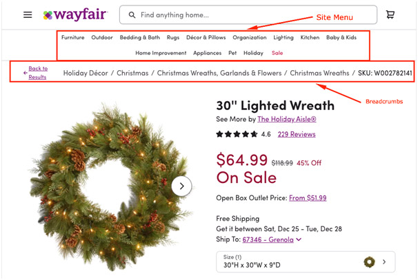
Breadcrumb navigation refers to wayfinding and represents a breadcrumb trail helping website users become familiar with their location and understand the site hierarchy. Breadcrumb navigation consists of breadcrumbs — special navigational links situated below the main website navigation (site menu).
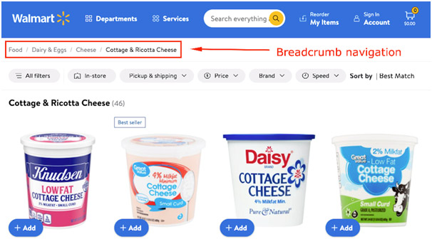
There is a misconception that breadcrumbs are necessary only for large websites with a sophisticated structure and extensive hierarchy, for example, eCommerce websites. Yet, breadcrumb navigation is suitable for any website that is at least three levels deep.
Essential Types of Breadcrumbs
Fundamentally, there are three major types of breadcrumbs: hierarchy or location-based, attribute-based, and history-based or path breadcrumbs. Drop-down breadcrumb navigation also belongs to breadcrumbs but represents a specific type, which is perfect for big websites. Keep in mind that each breadcrumb type has a particular trail of elements.
hierarchy or location-based breadcrumbs
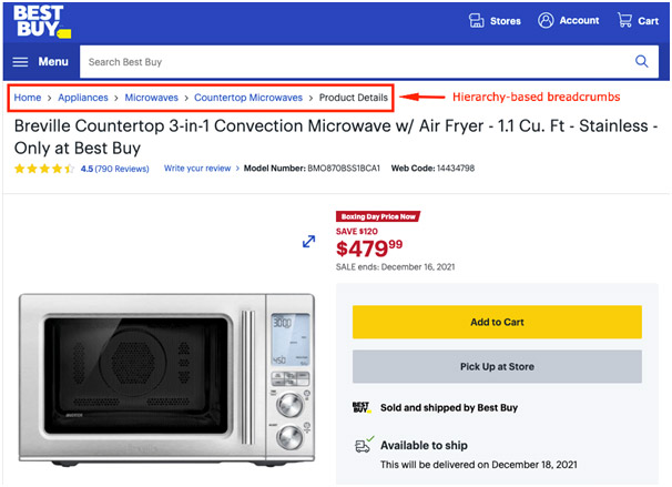
Thus, the location-based or hierarchy breadcrumbs show users the entire route they pass on the website, allowing them to seamlessly navigate several site hierarchy levels. Such convenience makes this breadcrumb type the most popular option for simplifying website navigation.
Attribute-based breadcrumbs
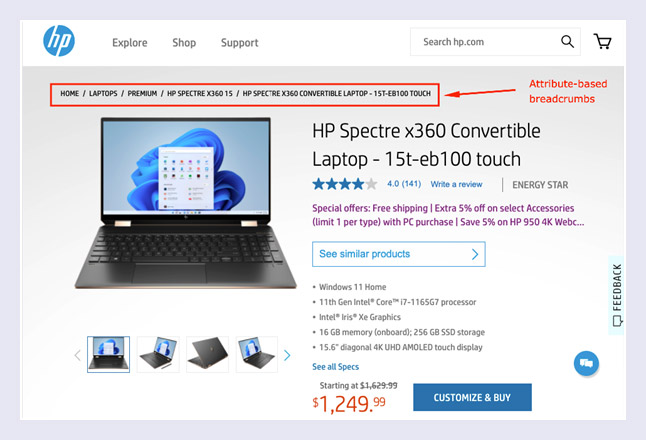
The attribute-based breadcrumbs are also known as dynamic breadcrumbs as they showcase the trail of attributes users select and can vary depending on the click path. This type of breadcrumb navigation allows potential customers to get to know more products they may be interested in, so it is an intelligent way to provide clients with enhanced choice options.
History-based breadcrumbs
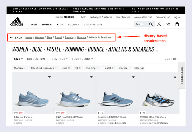
History-based breadcrumbs represent the set of steps the user came through to land on the current page. They provide the full path of visited website pages and can functionally be replaced with the browser’s Back button.
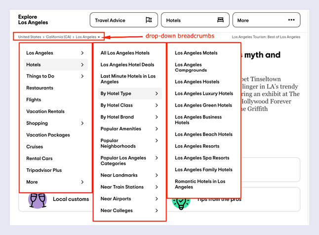
There is one more option for breadcrumb navigation — breadcrumbs with the drop-down menu. This progressively-enhanced solution is suitable for huge websites with complex elements and tons of information. Drop-down breadcrumb navigation is compatible with location-based and attribute-based breadcrumbs.
Why Do You Need Breadcrumb Navigation?
Whether it is location-based, dynamic, drop-down, or history-based breadcrumb navigation, adding breadcrumbs to your website can bring you excellent benefits. Thus, check out the advantages of using breadcrumbs and learn how a well-organized breadcrumb trail can help you improve your website.
Refined Site Usability
Firstly, coherent breadcrumb navigation dramatically improves the process of surfing your website. Site visitors can move freely between your website pages without any hassles, and the entire user experience is improved. Next, breadcrumbs help visualize the current and nearest location, so users do not need to spend extra time navigating your website.
This feature is super helpful when dealing with giant marketplaces like Amazon, as users may feel disappointed when faced with a wide variety of product categories, subcategories, product pages, etc. Using a well-thought-out breadcrumb trail also makes your content look organized and allows visitors to quickly find the desired information or switch to the necessary site section.
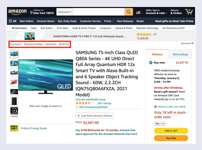
Additionally, different types of breadcrumbs will enable you to properly utilize the screen space. Well-designed breadcrumbs come as plain navigation elements that usually represent a smooth horizontal line offering users an opportunity to glance over the site. Such a narrow line looks neat and helps designers to prevent page overloading.
Enhanced SEO Performance
A well-crafted breadcrumb navigation path also provides broad opportunities for improving the performance of your website in organic search results. For instance, breadcrumbs allow you to fine-tune the internal linking by adjusting link juice across the website pages. It is highly beneficial for SEO as it helps search engines better grasp the structure of your website content.
Moreover, detailed breadcrumb markup is a superb way to enrich your search snippets on Google. Google snippets or search snippets are content extracts represented in search engine results pages or SERPs. They contain a brief description of website pages (metadata), helping users understand the relevancy of a particular website page to their query. And since Google prefers showing breadcrumbs directly in the search results, it is best to compose an accurate breadcrumb trail that will positively affect your snippet.
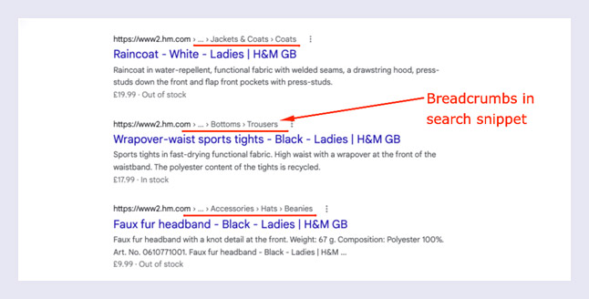
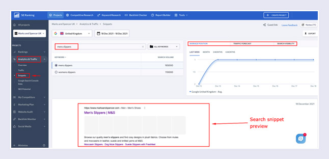
If you want to examine the look of your search snippets, you can manually check the pages with the help of Google. There are also automatic tools that can help you check Google snippets for different keywords and monitor snippet performance for a specific period. For example, take a look at the SEO monitoring tool by SE Ranking.
This tool has a feature that allows you to comprehensively track search snippets by keywords and investigate the search appearance of your website pages in a convenient tab. Create a new project and monitor snippets for the desired keywords by reaching the Analytics & Traffic section and navigating to the Snippets tab.
Appropriate breadcrumb navigation also helps to reduce the bounce rate. In case visitors come to a particular landing page of your site, they can land on other pages through proper breadcrumbs.
Furthermore, an accurate breadcrumb trail also allows first-time users to stay on your website longer. They might be interested in different categories and subcategories of your site, which is why breadcrumbs are great for lowering the site’s overall bouncing. You can check both bounce rate and the average session duration in Google Analytics or SE Ranking (navigate to Analytics & Traffic and then go to Traffic).
9 Handy Tips for Using Breadcrumbs
Utilizing breadcrumb navigation has become commonplace due to its remarkable impact on website usability and visibility in search results. Nevertheless, to achieve the best results, you need to employ the breadcrumb markup correctly. There are some practical ways of using breadcrumbs, which you can examine below.
#1 Make Sure Your Website Really Needs Breadcrumbs
Certainly, big eCommerce websites are not the only place to employ breadcrumb navigation. Nevertheless, there are cases when breadcrumbs look awkward and do not fulfill their primary function. For example, breadcrumb markup is improper if you have a single-level site or a website with a flat hierarchy.
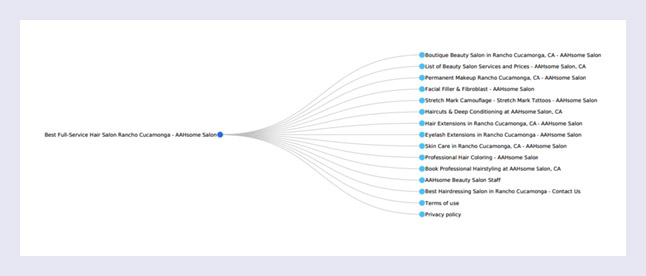
Therefore, you need to ensure that adding a breadcrumb trail makes sense for your website. To check if your website needs breadcrumbs, use some website crawlers like Screaming Frog that will show all the levels of your site architecture. Alternatively, you can visualize your website structure manually.
#2 Do Not Replace Your Main Site Navigation with Breadcrumbs
The convenience and relevance of your primary website navigation menu are the key to an enhanced user experience, and breadcrumbs represent a thorough augmentation that makes the process of site exploration even better and more comfortable for visitors. Consider using breadcrumb navigation as an excellent way to support your main site menu.
#3 Prioritize the Link to Your Homepage
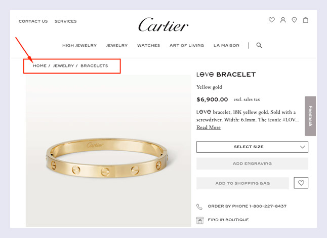
When creating perfect breadcrumb navigation for your website, consider starting the breadcrumb trail with a link to the homepage. By adding the link to your homepage at the beginning of the breadcrumb markup, you provide a robust anchor that emphasizes the users’ journey and clarifies the entire route.
#4 Ensure Your Breadcrumb Trail is Consistent
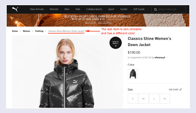
Breadcrumb navigation works well if it boasts consistency. That is why it is crucial to make sure your breadcrumbs provide enough information about the user path on your website. Link all the elements of your breadcrumb markup except the last item in the trail to avoid empty links that do not make any sense. Additionally, to add contrast and highlight the current page of the path, make the last item bold or emphasize it with a different color.
#5 Highlight Breadcrumbs with Separators
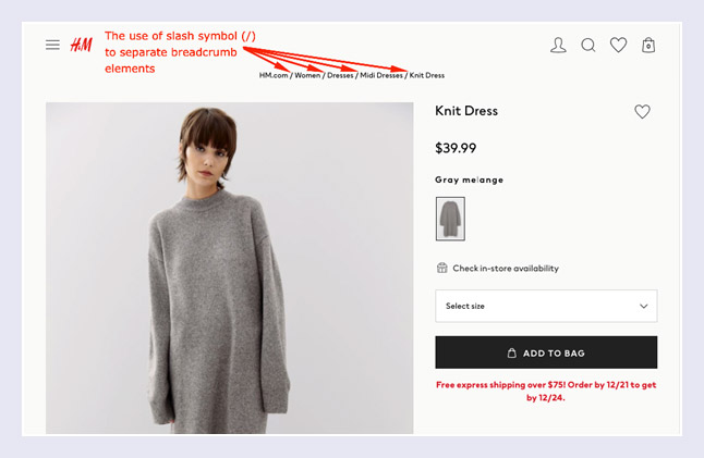
You definitely do not want the breadcrumb trail on your website to look messy. Therefore, do your best to separate the elements of breadcrumb navigation and provide the markup with a clean and neat appearance. Feel free to utilize a symbol like a slash, arrow, quotation mark, or ask your designers to highlight the breadcrumbs with a unique layout style imitating the lines or tabs in a suitable color.
#6 Opt for the Correct Breadcrumbs Placement
Your website layout should be well-structured and organized to provide a high level of user experience. Each website page needs to have a coherent markup of headings to ensure proper crawling and the correct location of other page elements.
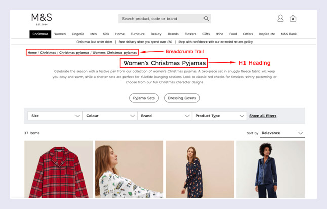
For instance, the area above the H1 heading is the best place for situating your breadcrumb trail because it is in sight of the visitors, providing a better sense of orientation. The Marks and Spencer website is a great example of proper breadcrumbs placement.
#7 Make Sure Your Breadcrumbs Show Current Users’ Location
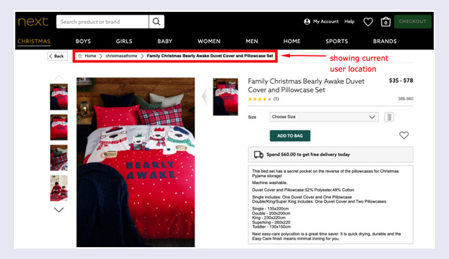
Before implementing breadcrumbs on your website, make sure you understand the primary purpose of such an essential navigational element. Breadcrumb markup should not showcase the session history as the browser’s back button fully copes with this task.
In essence, breadcrumbs are designed to help visitors sort out the entire website hierarchy, so it is essential to let your breadcrumb navigation fulfill this principal function. Your breadcrumbs should clarify the path on your website to the users and not vice versa.
#8 Do Not Use IA Categories in Breadcrumb Navigation
A specific breadcrumb trail should include valid pages that correspond to the desired user path on the website to provide refined site navigation. Thus, each breadcrumb element (except the last item in the trail) has to navigate users to the associated page. Breadcrumb markup aims for seamless navigation between the pages.
If some pages of your site do not have related pages to land on, consider avoiding them in your breadcrumb navigation. For example, take a look at the Victoria’s Secret website. The main site menu contains an Accessories category that has a Handbags subcategory.

This subcategory does not have a separate page. So the breadcrumb trail does not include Handbags but contains a similar Bags & Accessories element that has an associated page on the website.

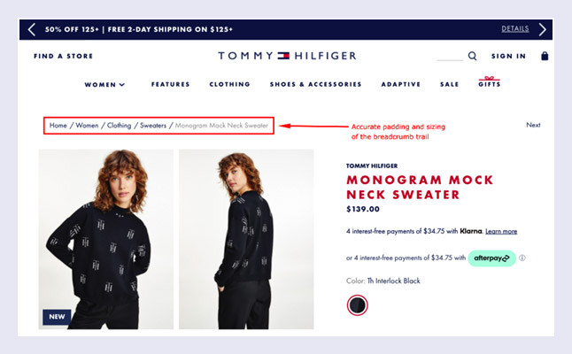
#9 Decide on the Best Breadcrumb Padding and Size
Although your breadcrumb navigation should be noticeable, it should not represent the most prominent element on your entire website page. Therefore, think over the padding and sizing of your breadcrumbs to make them a fine addition to the page styling.
Breadcrumb markup is all about users’ convenience, so try to keep it calm and uniform, avoiding bright accents and big, extraordinary fonts. For example, notice the Tommy Hilfiger website with a neat breadcrumb trail that perfectly suits the entire web page layout and does not distract users from the page content.
Summary
Breadcrumb navigation makes it faster and much more comfortable to move around a website. Implementing breadcrumbs can significantly improve site usability and enhance your SEO performance. We hope this guide will help you flawlessly add breadcrumb markup to your website.
