Looking for ways to build a faster business website? Let’s proceed with the actual tips, without wasting time on an introduction.
Faster Business Website Building – 5 Tips to Help You Streamline Conversion
How to make your digital presence effective? How to make your users decide on a purchase quickly and automate the sales process through your website? Here is what you can do step by step.
1. Use an Online Builder to Create a Fast Website
If you are just thinking about creating a business website, then you need a modern online builder. These tools allow you to quickly create a website without the need for an IT specialist or huge investment. The following platforms allow you to instantly get started with your website development. Their templates are already focused on conversion boost, and most of the necessary features come for free.
Wix
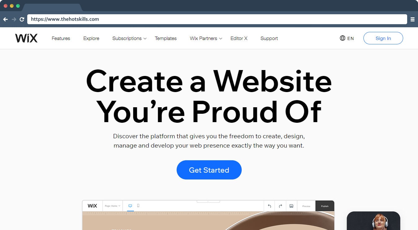
This is one of the most popular builders that allow you to create a website without knowledge of programming. This is also an ideal option for those who need a website for faster business but do not have the desire and time to understand the technical aspects of web design.
Pros
- Lots of ready-made templates.
- The ability to add animations.
- The presence of an app store with useful tools.
Cons
- It may take some hints to design the template and make changes.
- An overloaded website may work slowly – not the best option for a faster business, so you should be smart about creating website sections and conversion elements.
Read more: Wix vs WordPress – Which is Best CMS For Web Development
Weebly
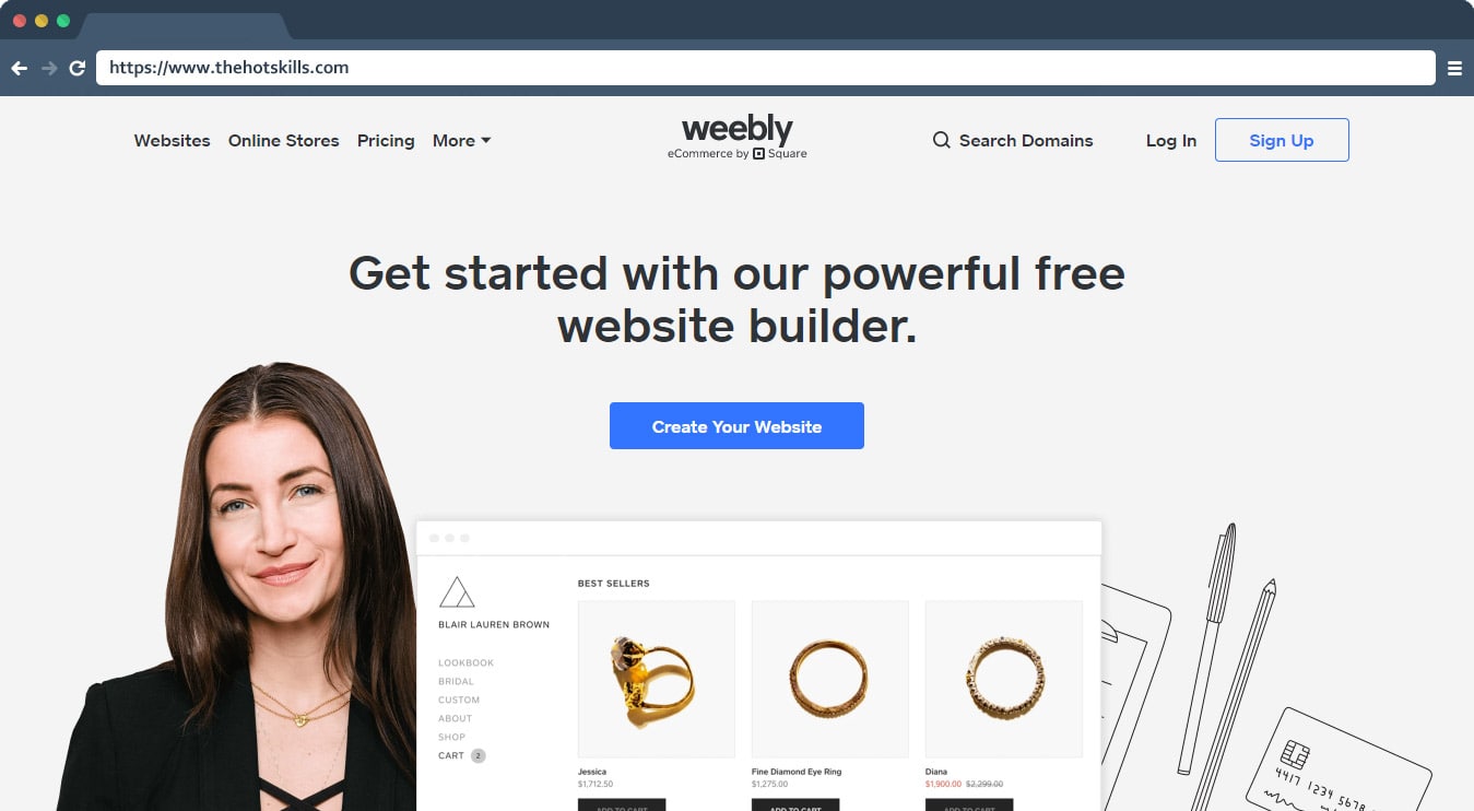
This is a great option for those who are looking for a simple and affordable tool to create their website. The advantage of this builder is the free plan with pretty good features.
Pros
- Ease of use, suitable for complete beginners.
- Good assortment of themes.
- The ability to switch from free to other plans if you need to expand the functionality.
Cons
- Limited blogging options.
- The site will receive the platform-specific domain.
Read more: Top 12 Free Website Design Tools
WordPress
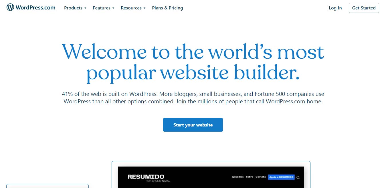
This tool is familiar to many who know at least something about web design. A distinctive feature of this builder is that the assortment of plugins allows you to add everything you need without technical skills. Also, this builder offers excellent eCommerce opportunities.
Pros
- There is a free plan to build a website.
- Convenient e-commerce functionality.
- Ease of use.
- The presence of plugins with tons of free products.
Cons
- It may take time and skill to set up the site.
- There is no way to test eCommerce for free.
Read more: WordPress vs Squarespace – A Brief Overview
2. Give Preference to Simple Design
Regardless of whether you already have a website or are just planning to create one, you need to keep simplicity in mind. The simpler the website design is, the easier it is to manage your customers. Placing a lot of content, using the wrong font, adding complex animation elements, and too vivid color schemes can cause users to leave your website.
Minimalism and UX design are what you should be striving for. But simplicity doesn’t; mean your website can’t be impressive and conversion-boosting. Take a look at Apple’s, Asos, or Pattern website design. Simplicity can be appealing, and with the right design approach, you can guide your customers to the target actions.
3. Don’t Pass by Mobile Website Optimization
In order not to lose your orders and potential consumers, you should take care of optimizing the mobile version of the site. Today, most purchases are made through smartphones, and if you do not have an optimized mobile version, then you lose the chance to sell.
Keep in mind that when it comes to the mobile experience, it should be even more seamless compared to the desktop ones since such interactions often happen right on the go. To make sure your users will be able to finalize the target action, pay attention to the following points:
- Make sure the checkout function works well in the mobile version.
- The mobile version must have a minimum number of stages to place an order.
- You are better to have the auto-fill function when placing an order.
- The customer should be able to pay for the order without leaving the mobile version.
- Make sure that while scrolling through the pages, the user does not accidentally click on the call action button. But vice versa, they should click on it intentionally so think twice before integrating them into your mobile design.
4. Develop a Chatbot for Instant Communication with a Consumer
According to research, by 2022, it is expected that 80% of requests will be processed without human intervention. Therefore, the introduction of a chatbot on your site is a good investment not only in the future but also an opportunity to reduce labor costs for customer support managers.
Chatbots are programs that automate communication with a customer. For example, when placing an order, the chatbot will act according to the script. Why does your site need a chatbot? Users always strive to get an immediate answer to their questions, and at the same time, they can expect this even at night but not when your team’s working day begins.
The chatbot allows you to provide quick answers to common questions your consumers ask. According to SalesForce research, 69% of users prefer to communicate with bots as they can get a quick response.
A chatbot is all about speed, simplicity, and usability. Therefore, the introduction of this tool is a must-do for all business website owners who want not to lose sales and keep up with trends. Until all small and faster brands start actively introducing chatbots, you have the opportunity to stand out among the competitors and win over those consumers who don’t like to wait. Today, few people like to wait in such a rapidly changing environment.
5. Ensure Easy Ordering Process
The problem with low conversion rate often lies is often the result of the stumbling blocks users face when placing an order. It would seem, what can be simpler than choosing a good, adding it to the cart, specifying your shipment details, and making a payment?
When this process is seamless, this is one more reason to consider your business fast. Use the following checklist to make sure your customers have no problems with finalizing their deals.
- 1. The buy button should be placed in the same place on every product page. This button should also be available in the product listing so that users don’t need to open a specific product page to add it to the cart.
- 2. Avoid hidden costs. Taxes and additional shipping costs that your potential client does not know about right away feel quite frustrating at the moment of finalizing the order. If you have no free shipping, then the consumer still should know the shipment cost in advance.
- 3. Help your consumer to place an order. Just add auto-complete and the ability to save the password for the account. It is also worth taking care that the user can save the delivery address so that they don’t re-enter everything when making the next order.
The Bottom Line
These tips are better-to-follow for those who want to create a business website that will drive profit, in addition to just making a digital presence impression. Users want convenience and ease of interaction, and site owners want sales. Match these two desires to get a working formula that will lead you to success.
