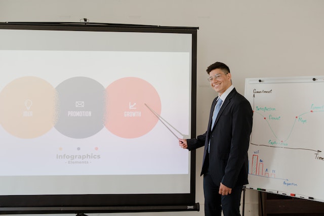
PowerPoint is a popular presentation software tool used in a variety of settings. From business meetings to academic presentations, PowerPoint is present. Yes, the content of your presentation is important. However, your PowerPoint slides’ design can impact your message’s effectiveness.
PowerPoint data show that visual aids make presentations 43% more convincing than those without. But, creating a powerful PowerPoint presentation can be difficult if you are unfamiliar with creating them. This article will review the dos and don’ts of designing visually appealing PowerPoint slides.
This article will provide PowerPoint tricks and designs to help you make presentations.

The Importance Of Visual Aids For Presentations
Have you ever wondered why you need visual aids for PowerPoint presentations? A creative PowerPoint design requires the use of visual aids. Images, graphs, charts, and diagrams can be used to support the points you make and add interest to your presentation. According to research from Acuity Training, Powerpoint is the most common software used for presentations. Thanks to its software tools, it is now simpler to make presentations with a professional appearance. You can create visually appealing and captivating presentations to draw in your audience.
The Dos Of Creating The Best Presentation Slides
While using visual aids for PowerPoint slide design, it’s essential to adhere to certain best practices to deliver an interesting and engaging presentation. Here are some guidelines for creating PowerPoint slides that look appealing.
Identify Your Audience
When creating a PowerPoint presentation, the target audience for your slides should be your priority. This refers to customizing your presentation slide’s design to fit your audience’s standard. For instance, a business PowerPoint presentation will likely differ from a presentation on the same subject for the general public. Similarly, a presentation created as a standalone tool could be different from one created as a support for a speech.
Utilize Professional Presentation Templates
You can make a presentation that is well-organized and appealing to the eyes by using a professional PowerPoint template. PowerPoint templates can also save you time and work by giving you a pre-designed layout that you can modify to meet your needs. So if you are new to the world of presentation, PowerPoint Presentation templates is a great way to start designing appealing PowerPoint slide design. You can use the free and premium PowerPoint templates available on numerous websites.
Use Data Visualization In Presentations
Data visualization is an effective method for presenting detailed information clearly and concisely. To present your data in a visually appealing way, you should make use of custom PowerPoint charts and graphs. Since most people learn better visually, data visualization can help ensure your audience gets your message’s point.
Explore Powerpoint Animation Strategies
You can increase the retention and interest in your points by including animations in your PowerPoint presentation. However, remember to adopt them correctly and sparingly. Use animations to draw attention to essential information, but use them sparingly, as they can be annoying, mostly when with high speed.
Use Original Presentation Techniques
When designing an interactive PowerPoint presentation creativity is essential for making an impact when designing an interactive PowerPoint presentation. Consider unconventional approaches and develop original concepts to help your presentation stand out. Even when you have the best presentation templates, you must bring your uniqueness. This is most important if your presentation is for a pitch. Your competitor may use the same template as you. Various fonts, colors, and graphics to make an aesthetically beautiful presentation. The same applies for your delivery of the presentation, which should stand out from other people’s. To help give you ideas, or perhaps help to reduce nerves or enhance delivery, corporate presentation training courses can be very helpful for developing your presentation skills.
Use Transitions
Slide transitions can increase the impact of your presentation. They can, however, be highly distracting. Using the same transition or a version of it is a good case practice to keep transitions to a minimum.
Transitions might be helpful when you wish to divide content across numerous slides while maintaining a sense of continuity. Instead of making individual slides, think of it as making movie sequences. Also, you can add sound effects to some of your transitions to give it a more professional touch.
The Don’ts Of Creating The Best Presentation Slides
While there are several dos when creating visually appealing PowerPoint slides, there are also don’ts that you should remember to prevent making a presentation unclear or distracting.
Avoid Using Much Text
Presenters make one of the biggest mistakes when creating presentation slides is including too much text. Including too much text in your PowerPoint presentations can be tedious and overpowering for your audience, and it can be challenging for them to stay engaged with the presentation. So, use bullet points and brief sentences to make your points clear and concise.
Don’t Use Too Many Different Fonts or Colors
Adding too many colors to your PowerPoint presentations might confuse and distract your viewers. Keep your presentation’s color scheme to a few hues related to your subject, and use them regularly. Stick to a consistent color scheme and font throughout your presentation to ensure your slides are cohesive and easy to read.
Do Not Overcrowd Your Slides
Although including more information in your presentation slide design may be advantageous, organizing too much information onto one slide may make it challenging for viewers to follow or distinguish the key points. Consider the content density while you work on your slide designs. If a slide feels stuffed, you should divide it into two or more slides to convey the information more effectively.
Reduce Effects
You can apply different transitions and effects to presentation items using PowerPoint software. This can include slide features like movement as well as transitions and effects. Although these effects can often add interest to your presentation, too many can distract you from your message. Instead, use animations and transitions sparingly and purposefully. For example, use a subtle fade-in effect to introduce a new slide or a simple animation to highlight a specific point.
- Avoid Using Clip Art: Your presentation may appear outdated if you use clip art. Instead, enhance your message with high-quality photos or original designs.
- Use Only High-Quality Images: Visuals are an effective tool for engaging your audience and reinforcing your message, but they must be of excellent quality. Low-quality visuals distract from your content and make your presentation appear amateurish. Make an effort to locate high-quality images and graphics pertinent to your issue that will assist in reinforcing your argument. Enhance your presentation with high-quality photos that are relevant to your subject.
6 PowerPoint Tips And Tricks
What you omit from a PowerPoint slide presentation is as important as what you do include. Consider the following tips when you create your slides:
Considering Using The Slides
Your presentation is different from a replacement. It is intended to aid audience participation and provide the cues to organize the information you are delivering. Therefore, prepare your speeches. Speaking slowly but steadily during speeches is essential so everyone in the audience can understand you. Also, ensure to follow what you have organized in your Powerpoint slides.
Use The Graphs And Charts In Powerpoint
Visually appealing ways to communicate numerical data include PowerPoint charts and graphs. To illustrate your points, use a variety of charts and graphs. This includes pie charts, bar graphs, and line graphs.
Use effective slide design
Effective PowerPoint presentation design depends on excellent slide design. For each slide, give it a clear, concise title. To divide your content into sections, use headings and subheadings. To make your content more legible, use bullet points and brief words. Also, make sure that your slides are simple to read and comprehend.
Keep Animation To A Minimum
Using animation sparingly is crucial. An excessive amount of animation might be annoying and detract from your message. Use animation to draw attention to critical details or to switch between slides.
Time Your Animation
A key component of PowerPoint animation is timing. Ensure to time your animation at the appropriate point in your presentation and not detract from the main point.
Use White Space Effectively
White space, or negative space, is the area around your text and images. Adequate white space can help make your presentation more visually appealing and easily read. Use white space to separate elements on your slide, and avoid cluttering your slide with too many elements.
Conclusion
It is important to balance effective communication strategies with design principles to create visually engaging PowerPoint slides. By following the dos and don’ts listed in this article, you can develop a presentation that entertains and educates your audience.
Remember that a presentation’s main goal is to share a message or concept with your audience. Therefore, your PowerPoint design should enhance and reinforce that message. By adhering to these best practices, you can create visually appealing slides. These slides can effectively convey your message. At the same time, leave a lasting impression on your audience.


