PowerPoint presentations are used by a wide variety of people for different purposes. But not everyone can make a good presentation. Since most presentation slides are made at the last minute, people do not usually pay attention to the finer details. This results in a very mediocre presentation that fails to get the job done. But all of that can be changed if you just keep a few tips in mind. Here are 5 underrated and simple PowerPoint presentation tips that you can use the next time you have to create a slideshow.
Have a clear idea of the contents: Don’t congest your slides
The very first thing to keep in mind while creating your PowerPoint presentation is to keep it away from visual congestion. This means you need to stay away from packing your slides with lots of pieces of text that are extremely hard to read.
Besides that, you need to keep a few more points in mind while you work on your presentation. You can ensure this by first having a plan on the narrative that’ll be discussed, the reason why it’s mentioned, and the order in which you plan to organize the contents. Once you have this idea in place, you can dive into scripting the presentation content onto a Word or Google Docs document. Now, remember that you don’t need all the points from this document in its entirety. Identify the topics that are absolutely important and put the rest of the points in the Appendix section to refer to during the Q&A session at the end.
Now, use all the important points you collated in the presentation slides and arrange them such that it doesn’t look cluttered. An important thing to note here is that you need to know who your audience is. Depending on who they are, the text and the other elements need to be adjusted.
Remember, less is more. So, design your slides by avoiding distracting elements that could cause confusion to your audience on whether they should focus on you or on the slide to find relevant information.
Follow color theory
Colors tell a story. The right mix of colors you use on a slide can make a huge difference to your presentation. You can control the feelings and the impression of a person with the colors you use. You need to understand what emotions the color you use on the slide trigger in people. Learn more about the color wheel and the complementary colors that you can pair up on your slides.
Understand the difference between warm and cool tone colors, and the places where the split complementary colors can be used. Also, never use colors that wouldn’t interact with each other. For instance, a red dot on an orange background can look inconsiderable while the same red dot on a green background will give a bold and embellished outlook. Finally, limit the use of colors on your slides since a small number of colors work perfectly together.
So, choose your colors well. Right from the fonts to the elements of your presentation, apply the basic concepts of color theory well to impact your audience effectively.
Use simple and minimal designs
A PowerPoint presentation that uses a simple and minimal design always works. Like we said before, less is more. Be it the graphics, or the text, use it all in moderation. You can follow this by limiting the words you use on your slide. For instance, avoid using bullet points, instead express your points using fewer simple words. This is because you don’t want your audience to get busy reading while you explain your subject explaining them.
Another way to keep it simple is to use relevant graphics that are of high quality. This can make your presentations look visually appealing. Another aspect of such an attractive presentation is that it is more effective at conveying your message to the audience.
To make things a little easier, you can use high-quality, pre-made PowerPoint templates with fresh designs available on the internet. Instead of using the in-built age-old PowerPoint templates that both you and your audience are tired of looking at, you can download these stunning templates that will elevate your presentation to the next level.
Use slide transitions and sound effects
Slide transitions and sound effects are so important in a presentation that they can make or break the final output. It is a key aspect of a presentation; you can shift the focus of attention of your audience to whatever you want. If gone wrong, the use of certain transitions and sound effects can distract the audience. Imagine you used an extremely slow transition and then played the presentation on a much slower computer. The resulting presentation would be sluggish, which will be almost comical when viewed. Dramatic transitions and sound effects rarely enhance the message you’re trying to communicate. So, stick to the ones that are basic and use them on your PowerPoint presentations.
Also read: 20+ Beautiful Minimal Keynote Presentation Templates (Free & Premium)
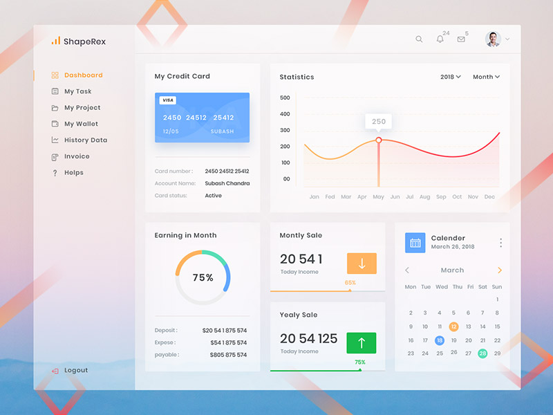
Use data visualization tools
Using data visualization tools can help you a lot in storytelling rather than just creating a bland presentation. You can get your audience’s attention by processing and presenting the data or figures in an engaging manner. Sometimes presenters calculatedly skip data and figures just because they don’t know how to present them. Use visuals, charts, bar graphs, pie charts, diagrams, etc. to represent data. You can represent data using column charts, icons, measuring scales, progress bars, unconventional pie charts, circular infographics, and various other methods.
Remember, whatever data visualization tools you use, pick the chart types that will communicate your idea effectively. If you find it difficult to identify a chart that bests communicates your data, simply plug the data into different types of charts. You will automatically find out the best chart from it because that will look attractive and displays information logically.
Conclusion
So, those were five important tips you need to keep in mind to create a killer PowerPoint presentation. Before anything, know your audience and understand what they already know and what they are unfamiliar with. If you have an idea about this, you will naturally know what needs to be placed on the slide and what needs to be communicated with them. After that, take the aspects that can subconsciously influence them such as the colors, fonts, style elements, and transitions you use on the slides. Finally, adopt a storytelling model with all your data and figures using the right data visualization tools.


