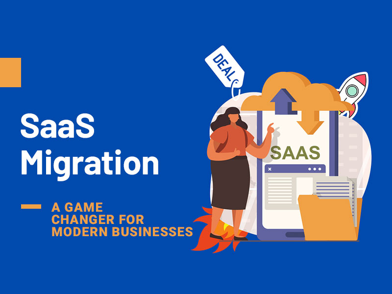
Offering a SaaS product is a popular business specialization today. Many web agencies and software businesses have shifted to the SaaS model of service delivery as it gives their clients a perfect combination of cost-efficiency and convenience. A regular SaaS product saves the time and cost of custom software development. Besides, it allows significant time savings and comfort of plug-and-play software use without security compromises. Who will resist such a perfect business deal?
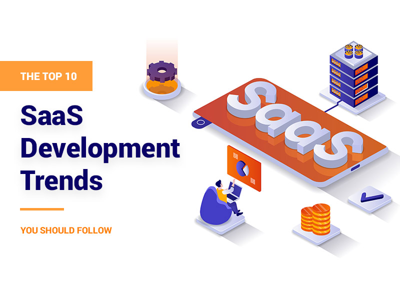
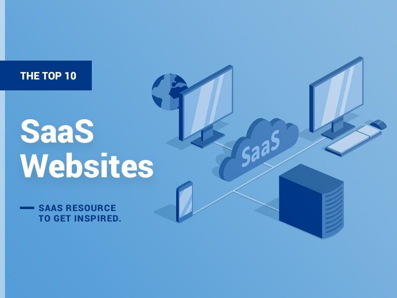
Given this unique set of benefits for businesses and clients, many businesses owners have stepped on the path of SaaS product creation. But without understanding of the popular SaaS design trends, your product risks getting lost among a ton of competitor offers. Thus, it’s vital to be on the constant lookout for SaaS trends to offer the maximum value and visual appeal to demanding clients. Here we provide an overview of top 10 SaaS websites that users across the globe admire.
Mailchimp
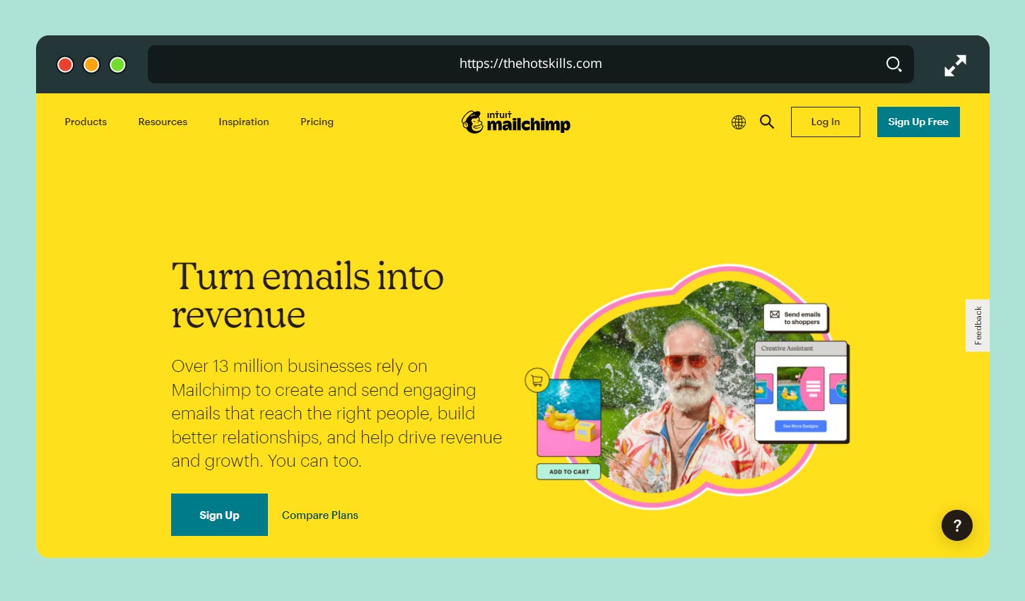
Mailchimp is a SaaS product meant to streamline and automate your e-mail marketing efforts. Simplicity and richness of functions is what people look for in this niche. So, the homepage of Mailchimp delivers a clear message to users that it can do it all. The website layout is sleek and intuitive, while the key USP-related messages are impactful and persuasive.
A new product developer’s key takeaways should be:
- A user-friendly, simple main page delivering its key business message in clear terms.
- A visible slogan is presented in a readable font, giving the visitors a strong CTA.
- Simple and intuitive navigation menu that every newcomer can find.
- No fancy animation or functionality.
- Absence of sophisticated graphics, which focuses the visitor on the key message and purpose of the service.
Evernote
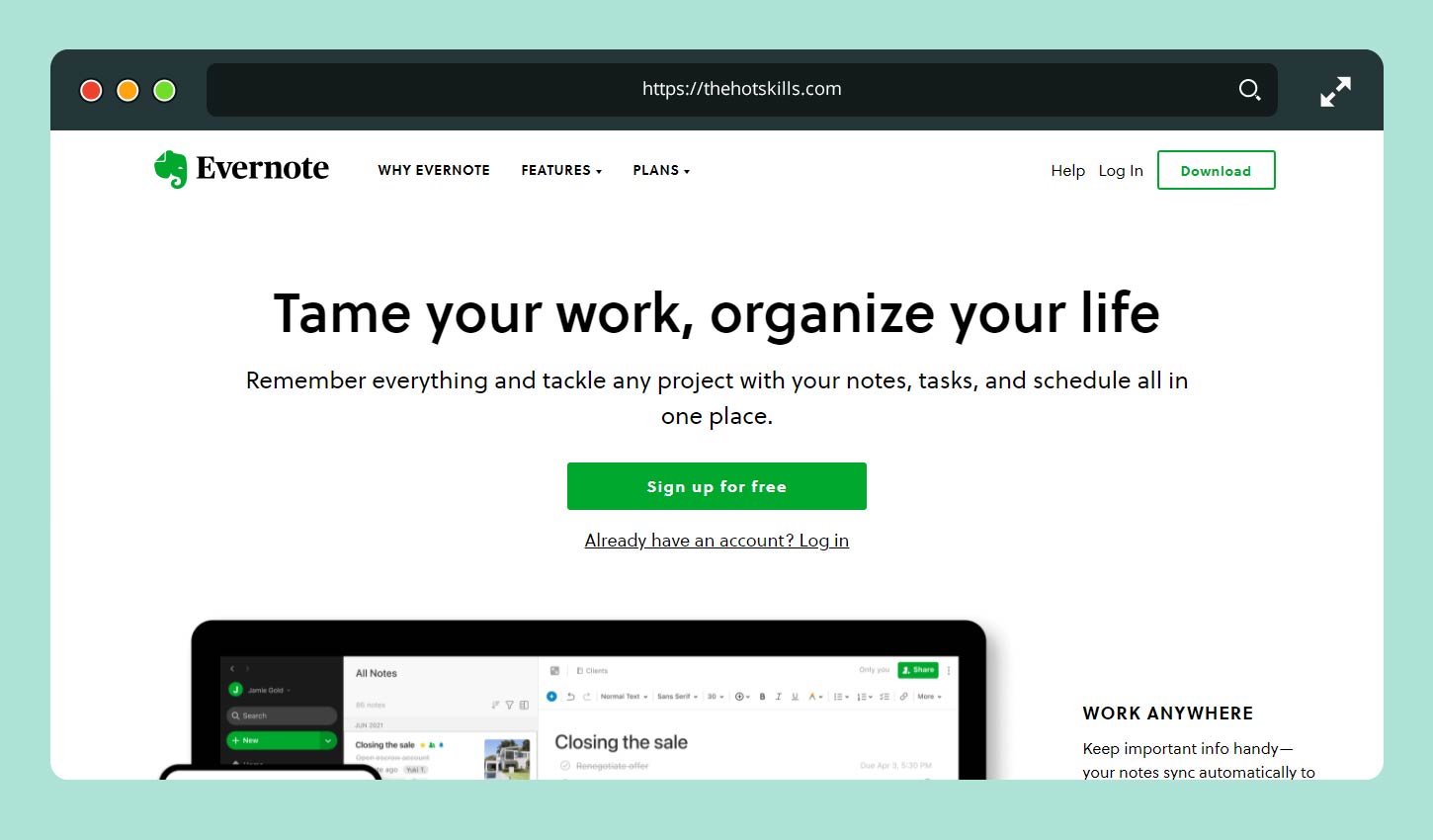
Evernote is unrivaled when it comes to its self-presentation. You will hardly ever find a better address to the visitor and a clarification of the pain points this service is ready to solve. Simple, direct messages are placed above the fold to guarantee that every visitor captures the product’s key purpose and value for them. The call to action is impactful, urging people to sign-up for a free trial and explore the rich diversity of included functions.
Dropbox
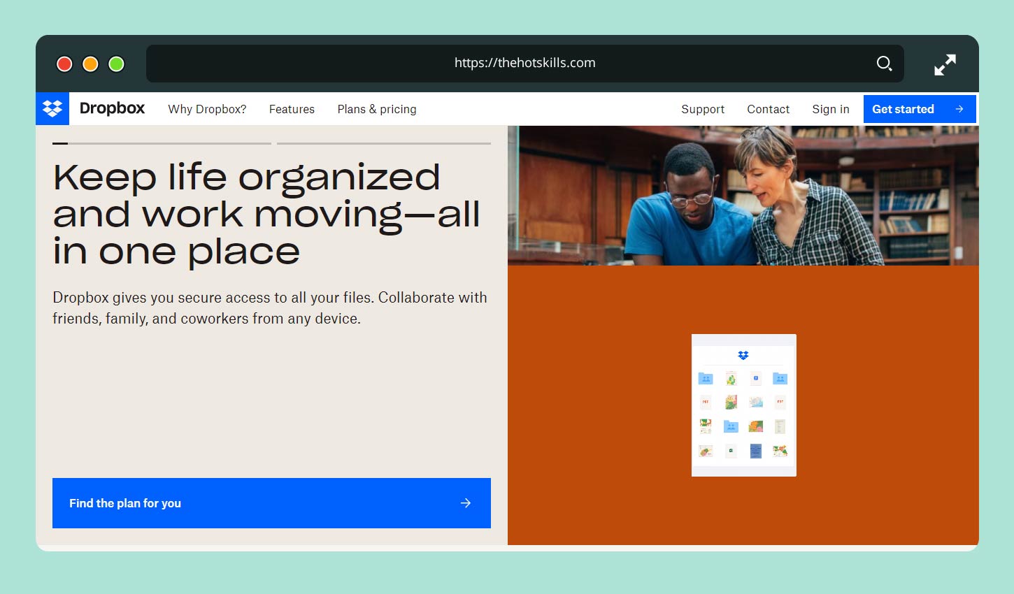
Dropbox can also be distinguished for its clear and simple company statement and connection to the user. Besides, it offers a very quick sign-up form that every visitor can complete in less than a minute. While Dropbox is a world’s leading cloud storage provider, it may afford using no impactful slogans and CTAs, just giving people a sign-up form. But you as a product owner need to work a bit more on a similar SaaS offering. Give your users a bit more rationale for sticking to your service. Indicate the pain points you can resolve and stress the benefits of your product compared to analogs.
Kissmetrics
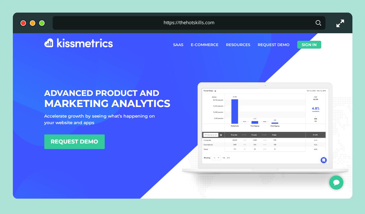
Kissmetrics also did a great job in presenting itself in a favorable light for the first-time website visitors. Here you will see vital statistics of its activity that impresses and makes you want the same business outcomes. The layout is simple and reader-friendly, with a great white-and-blue color palette. Overall, the website is simple and easy to scroll down, so that every visitor finds relevant information and gets as much data about the provider as possible. The homepage is conveniently equipped with a direct sign-up CTA that minimizes the churn rate.
Slack
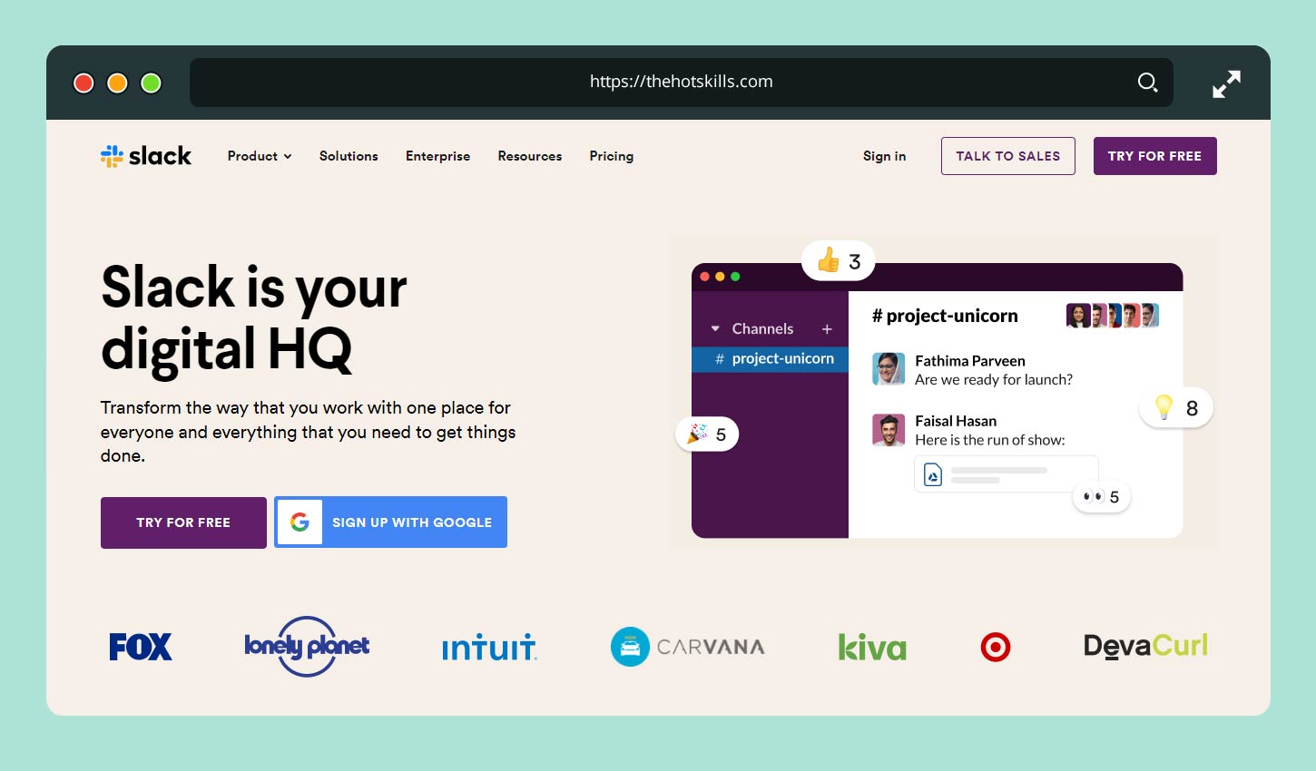
Slack wins in the SaaS design discussion in many aspects. First, it’s the website that is simple to read and use, coming with direct CTAs and persuasive messages for users. Second, it’s a great app that any business, small and large, will benefit from. The introductory video provided on the homepage is a simple and informative tour around the app’s features, which convinces many more users to join the team of satisfied Slack clients.
Uber
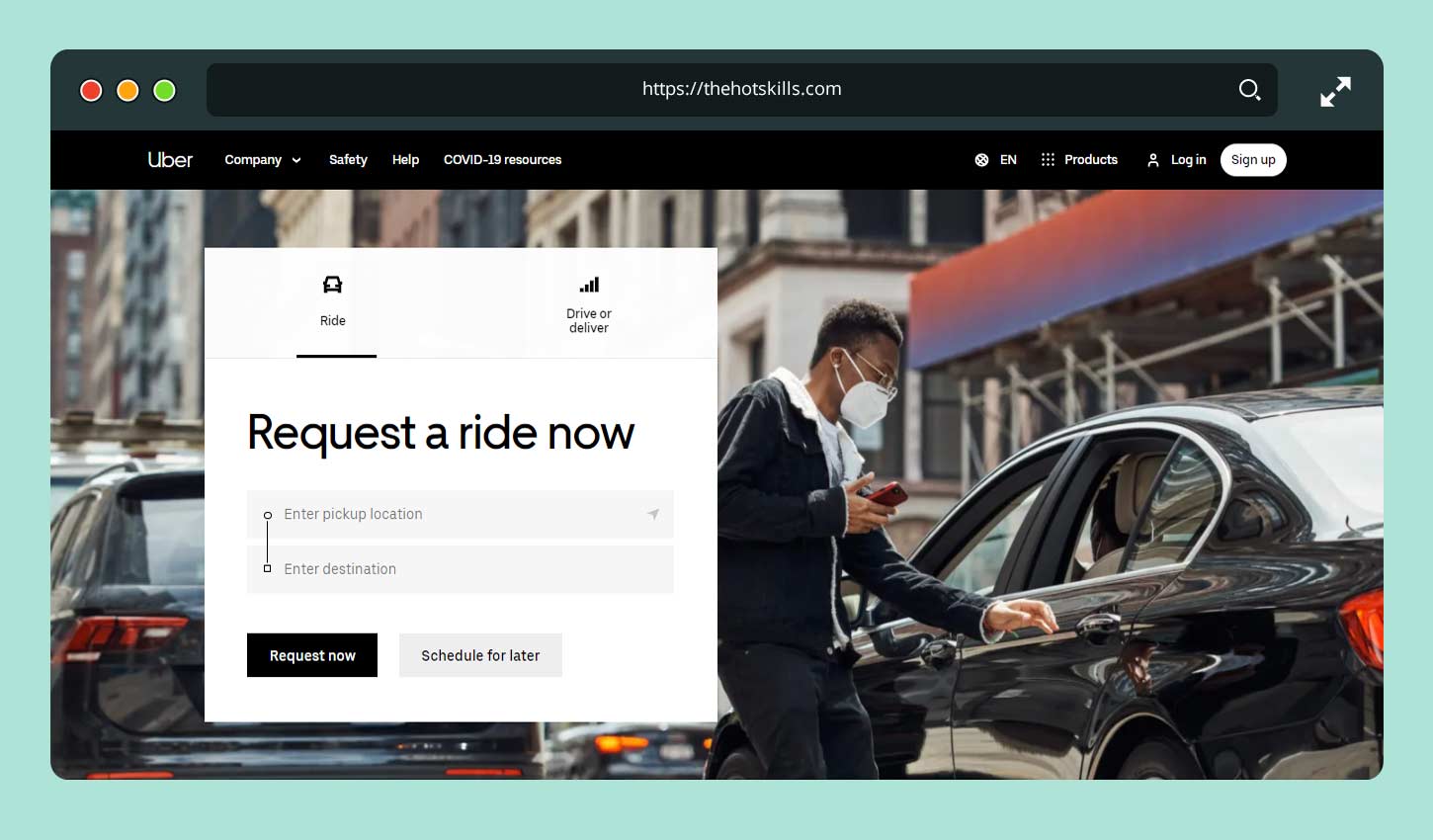
Uber has been a standard of SaaS design for many years to date. First, it transformed the very transportation industry by offering a completely new business model. Second, its self-presentation deserves a separate mention to explain the golden rules of impactful design. Uber passes a clear and attractive message across by giving every driver an ability to earn without joining a company or going through the red tape. So, its empowering CTA is a strong rationale for joining and using Uber services, both as a driver and as a client.
Orbiter
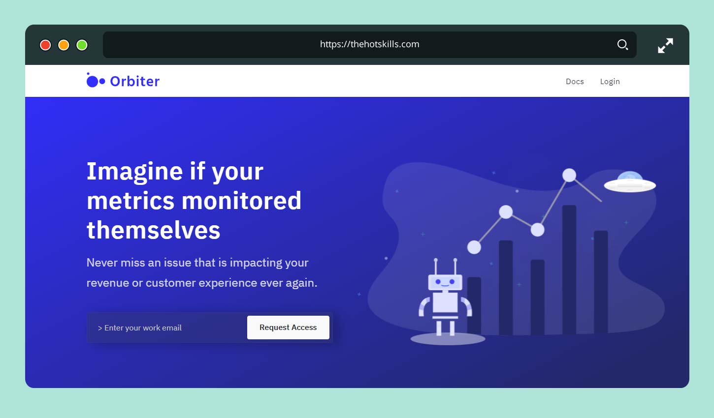
Another great sample of a SaaS website is Orbiter – a service for autonomous data monitoring across industries. It has a simple layout and presents the visitors only to its key business mission and a description of how it can help clients take their business data under control. The homepage is limited to critical product features and business benefits, giving interested users the key stats. A relatively short main page ends with a sign-up form requiring only an email address, making the sign-up process instant and convenient.
Catch
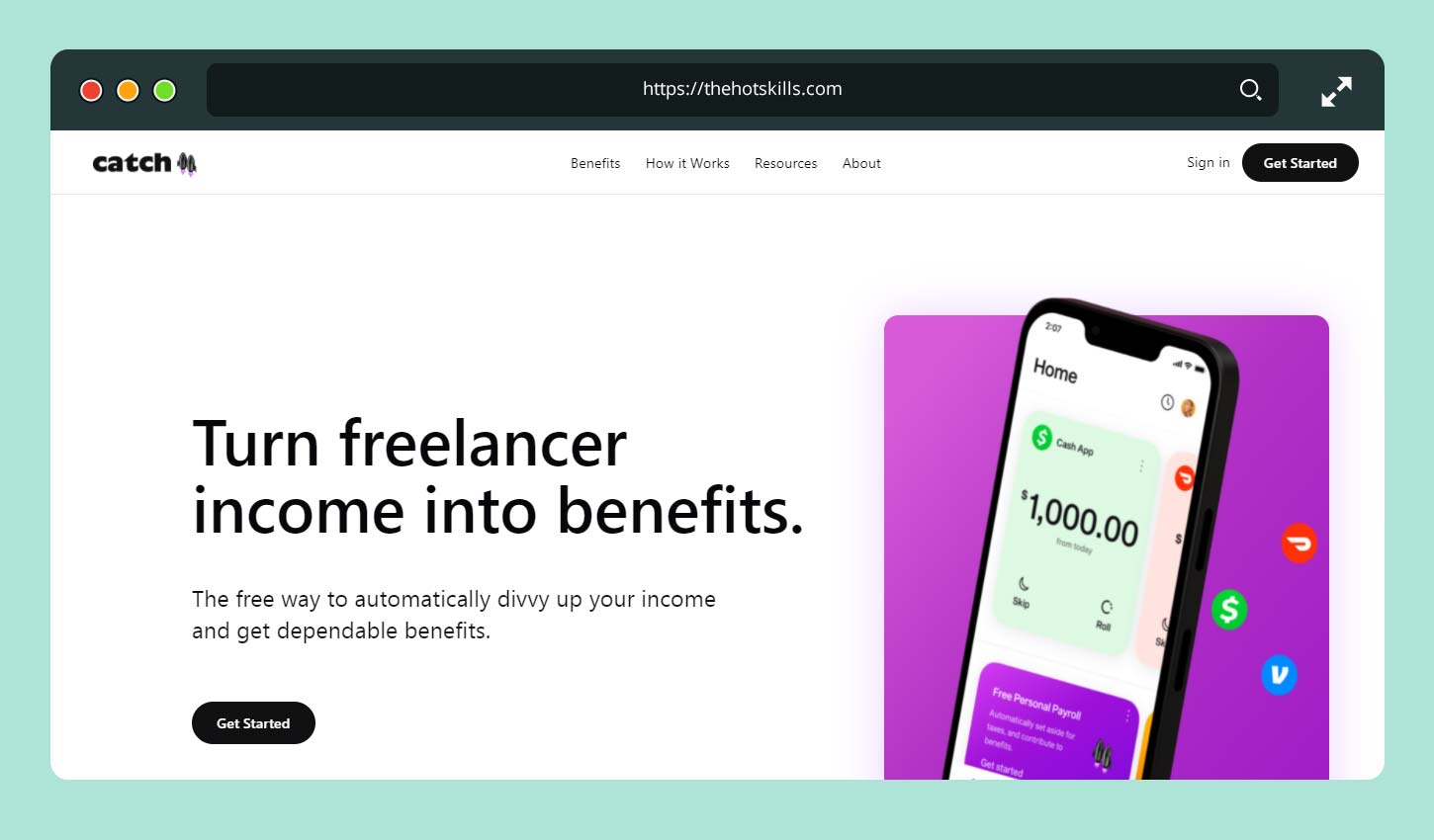
Catch is a user-friendly finance management app. It’s a SaaS product with an appealing, neutrally colored design that contributes to a competent look and advanced readability. The content of the homepage is also an example of impactful SaaS approach. It speaks directly to the user by telling what the project is meant for and what it can do for them.
Grow
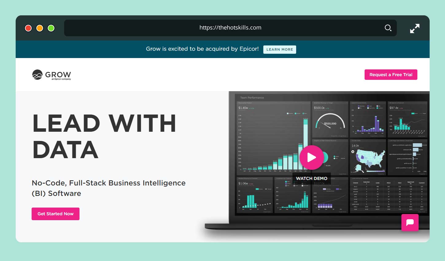
Grow is a B2B SaaS product with a unique appeal. You’re sure to like a presentation of the app’s core functionality in a clear snapshot on the top of the homepage. It shows what stats you will get from Grow, thus giving you simple, manageable solutions for business analytics.
Sprout Social
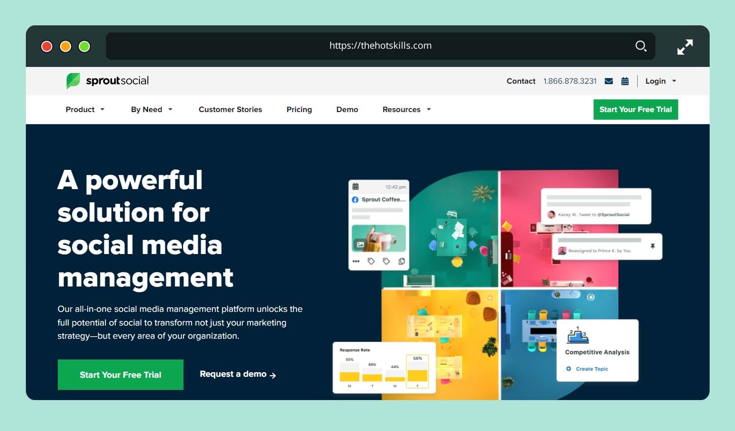
Sprout Social promises to make your SMM simpler. And by looking at the company’s website, you can feel that the promise is believable. The team worked hard to create a persuasive resource with strong CTAs and many details about the service. So, you’ll definitely feel that this example is worth following.
Trends Really Matter
You might first be tempted to create something totally new. But be careful – users tend to choose something they understand and can follow. Thus, incremental changes are better than something shockingly innovative. Follow the trend, which is your friend, at least in winning the initial audience and setting your product up in the competitive market. After that, you’re free to experiment with designs and features.
Image Source: Neil Patel