By its nature, good UI UX design should go unnoticed when it’s doing its job correctly. However, some UI UX design tips are so good that they’re worth applauding. For many of us, 2020 was the year that our computers and smart devices functioned as the window to the outside world. With more people relying on online services, the average UI UX design agency has never been busier. At the same time, the field has never been so crowded. This means that it’s critical to incorporate the latest trends into our UI UX design portfolio to ensure that our work remains fresh, vibrant, and engaging to help it stand out like a space unicorn. Let’s look at some UI UX design trends that are on the cutting edge and see how these will prove influential in the coming year.
1. Minimalism
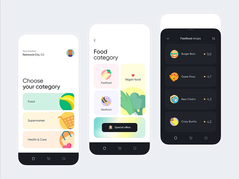
Image by Anton Anoshko
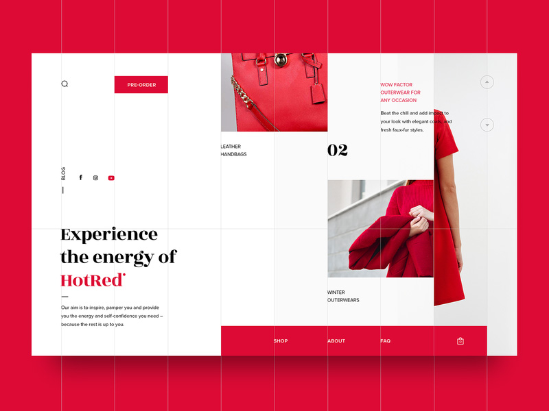
The old adage that “less is more” is a frequently repeated mantra in UI UX design training, but that doesn’t mean it rings any less true. Online users are bombarded with adverts, graphics, and other forms of content on an hourly basis. Pretty soon, most of them have become numb to the sight of all these assets and consciously and subconsciously ignore them. That’s why minimalism retains such power in UI UX design best practices. Clean lines, a reduced color palette, and simplified graphical elements help to highlight on-page content and offer a better visual value proposition for audiences. Needlessly complicated and overstuffed UIs only serve to frustrate customers and create obstacles between them and your content. Follow a UI UX design course that’s simple and elegant to stand out from the crowd and show your class.
2. Simplified UX
Continue to promote minimalism throughout your UX as well, with a limited number of fields and page elements to promote function over form. Streamlined login and registration is going to be one of the big UI UX design trends. It makes your calls to action more convincing and demands less from users. Major websites are all looking into ways to make signing in easier to encourage customers to share their details and make it less fatiguing to engage with their brand. Implement this into your UI UX design tools, and you’ll find that your visitors are more likely to engage in behaviors that are valuable to your site.
3. Photography
Illustrations and graphic design have been dominant elements in UI UX design for years, but there’s a feeling that some fatigue is setting in amongst both users and designers with regard to this. Today, people are becoming more drawn to photography that engages them with images taken from real life. These images can speak to users and their life experiences in a way that illustrations often can’t, so look at incorporating more of these into your work to make your UI UX design more engaging.
4. Escapism
With so many of us forced to stay at home over the last year, escapism has taken on new power. UX designers are starting to incorporate more exotic and scenic locales into their work to help capture users’ attention and speak to their wanderlust and frustrated desire to get away from it all. Many of us found that we couldn’t take holidays or travel like we wanted to, so the scenic aesthetic offers a visual escape from the daily grind and forced isolation. UI UX designers are expressing this with deep, organic color palettes and layered copy to create a sense of depth in their pages. Make your work feel like somewhere people would want to live, and its impact will prove enticing.
5. Brand Values
We tend to think of UI UX design as a one-way conversation between the user and a site. However, the average user has new questions about prospective brands that are courting their interest. Fundamentally, an increasing number want assurances that a brand falls into line with their own ethical standards before they decide to follow through on a CTA. UX elements can help provide the answers to these questions. Some examples might include labels that outline how materials for a product are sourced and used sustainably. Or it might be an overlay to explain the moderation policies in a comment section. Using the UX to create an opportunity for a transparent dialogue on brand values helps win trust and serves to assure users that your company is on the side of the angels.
6. 90s Retro Aesthetic
New trends are rarely ever completely novel, and style tends to come back in cycles. Nowadays, the retro appeal of the 90s and early 00s is visible everywhere, from fashion to music and art. The 90s aesthetic gives designers a real opportunity to be playful and tap into the retro styles of the MTV era before the internet became such a polished marketplace. Glitch transitions, screen tearing, VHS overlays, primitive animations, and pixelated typography can give your UI UX design a DIY chic that’s bold, playful, and eye-catching. You can see this aesthetic deployed by bleeding cool streetwear brands and artist websites to terrific effect. For a style that feels both experimental yet oddly comforting, give this aesthetic a spin.
7. Bold Sophisticated Typography
Everywhere you look in UI UX design, it seems like bigger is better when it comes to fonts. There’s no doubt bolder typography is more attention-grabbing, especially when it contributes to a user’s first impressions of your page on a microsite or landing page. However, big typography by itself isn’t guaranteed to get results. It has to be properly integrated with the rest of your page elements and your overall design aesthetic if you don’t want it to feel clunky.
8. 3D Illustrations
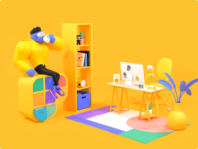
Image by Romain Briaux
While 3D illustrations have no shortage of naysayers in UI UX design books, it seems that their appeal is a long way from dwindling just yet. With modern UI UX design software, it’s never been so easy for UI UX creators to come up with gorgeous 3D illustrations that continue to exert a strong visual appeal on audiences. 3D animations are also as popular as ever, so it may be some time before the trend for 3D shows any sign of diminishing.
9. Glassmorphism
One of the red-hot new design trends is glassmorphism – an effect that creates a background blur on your pages so that certain elements appear as if you were seeing them through a glass surface. The UI UX design software for this effect has been around since Windows Vista, but it seems like its popularity has only just caught on. Glassmorphism lets designers play with depth and focus on their pages to surprising effect, and the technique can be a subtle yet striking way of drawing the user’s attention to a particular element.
10. Augmented Reality
Design commentators always seem to be predicting that we’re on the cusp of the augmented reality (AR) revolution. This prophecy has been made year after year, and yet, it still doesn’t seem like the technology has really gone mainstream (unless you count puppy dog selfie filters on social media). However, there are strong signs that it could be the year the AR really makes its presence felt on the cultural and commercial landscape. If you’re wondering how to become a UI UX designer, AR might be a future-proof technique to begin with.
Today, AR is being integrated everywhere you look. You can use AR to enhance a trip through a museum with extra information about the exhibits. Or, if you’re thinking about buying a coffee table, you can use AR to see how it would look in your lounge. Wondering if that hat would look good on you? Use AR to create a virtual dressing room. In the field of education, UI UX design tutorials could be poised to play a huge role in supplementing conventional teaching in the classroom.
As UX UI design professionals, our job is to work out how to make these interfaces snappy and intuitive. That means paying attention to unobtrusive UI functions adapted for camera overlay, like dynamic labels, 3D pathing, and subtle buttons. As smartphones continue to overtake computers as the most widely used digital devices, AR interfaces are going to be the next big challenge for UI UX designers, so adopt early and learn to leverage the technology’s potential in dynamic and creative ways.
Final Thoughts
Ultimately, each new year brings the opportunity on how to learn UI UX design innovations to invigorate our work moving forward. We get to familiarize ourselves with a whole new box of tools while figuring out ways to freshen up established aesthetics. As more people live life through their smart devices, it’s up to these designers to empower users with a UI UX design process that pays equal attention to form and function with innovation and beauty. Are there any UI UX design trends that you’re excited about for this year? Tell us about them in the comments section below.
