Graphic design is a broad subject and covers a variety of jobs under the “Design” umbrella. Colour choice, however, remains a common concern for all the design needs. Choosing colours for a UI design is like putting little details to your home décor or embellishing your favourite wall with enticing details that catch the attention of people walking around.
In like fashion, you can compare the background colour of your website by painting the front wall of your home. You must keep some factors in your mind while going with a specific colour for your home. Similarly, there are several things you need to consider when you choose a background colour for the website.
Choosing the right colour can be really challenging sometimes. The colour needs to be soothing enough to spend time in front of that wall or website. It should not overwhelm your eyes with the excessively sharp or bold tones. You would want to make your website comfortable and worth watching for the users who come to visit your website.
Meanwhile, you would be challenged not to choose a colour that may turn out to be so boring that people don’t enjoy spending time on your website. Choosing the colour for your website background can be challenging, but you can definitely make it at ease by considering some important points.
Make your website worth watching and comfortable for people browsing your website. Choose something between too sterile or too sharp so that you can avoid your audience from getting annoyed with an overly sharp base. You also would not want your audience to get bored with an aloof website background that makes some important content to be overlooked.
How to choose the right background colour?
The choice of colour for different for a drawing-room versus a child room can be significantly different. Similarly, the colour choice for a trendy apparel store versus a fine-dine restaurant would be different, right?
This is mainly because of the two basic reasons; first, you are targeting a different audience, and next, you want to satisfy the visual needs of the users/visitors.
Let’s understand with an easy example. In a trendy clothing outlet, you want your customers to entice a particular rack. Moreover, it can help shoppers to differentiate instantly among several trends representing through pop colours.
In comparison, a fine-dine restaurant would be better suited to a soothing and relaxing colour. You want the surroundings to be relaxing enough to eat and talk to the loved ones sitting around.
Similarly, the choice of your website’s background colour must focus on what your visitors want to emphasize upon.
Putting it simply, choose the colour for your website background completely depending on the purpose of your website. The following types of website can help you choose the right colour for your website.
- Content Intensive Information Websites & eCommerce Websites
- Corporate / Business Websites
- Stylish & Creative Websites that are Graphic Intensive
eCommerce & Content Intensive Information Websites
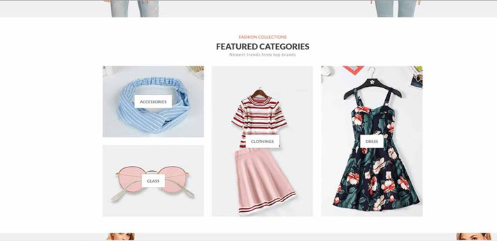
E-commerce and information websites usually choose a white-coloured or neutral background for their websites. This is probably because these websites require promoting an idea or product. Thus, the product needs to be vivid in front of a solid and quiet background.
Such websites focus on the content more than the design of the website. So, the light background makes the content more visible and highlighted. Moreover, the plain background keeps the visitors’ focus on content and products more than the design. Consequently, the best colour choice for e-commerce and information-intensive websites is white, neutral, or light-coloured background with accent colours in front.

Corporate / Business Websites
The colour choice for corporate websites can be varied depending on the purpose of the business. A business typically focuses either on promoting the brand or its services. According to the purpose of the business, the colour choice may vary.
Promoting a Brand
While promoting a brand, you would want your visitors to get a strong brand image of your business. Using dominant shades or your brand colour can attract your visitors’ attention to your brand.
You can do this to tie the background colour with the business logo or identity. Take the example of Coca-Cola, McDonalds and KFC. Seeing their banner would instantly recall their brand identity or message.
Use a variation of your brand colour as your background so that you may reinforce your brand through your website and makes it more memorable to the viewers.
However, if you have a very bold brand colour, using it as your website’s background colour can be overwhelming for viewers. In such a case, consider choosing a less intense shade of your dominant colour. You can use the Adobe Use a variation of your brand colour as your background so that you may reinforce your brand through your website and makes it more memorable to the viewers. Color CC tool to get different shades of a colour.
Promoting a Service
Using a white or neutral background colour is a wise choice if you want the value of your service to be the focal point of your visitors.
Just as in the case of content-intensive websites, a business website should not contain such a background colour that takes the focus away from the message you want to communicate through the content. You can make your content more enticing by choosing a neutral or white background.
Stylish & Creative Websites
Websites that are meant to be used for design, fashion, beauty, restaurant, and other creative industries can go with the design that looks pretty. They have the license to play with the glam and the creativity on their website. The design is a representation of their creativity in their business. This is why you see design and development companies’ website with a touch of creativity in those websites.
Here, you can use colours to add a little drama to your site. For instance, for a beauty website, you can use rainbow colours for each tab of the menu bar.
With these website designs, you can do what you think looks interesting but make sure not to choose a background that makes your text or content hard to read.
If you feel you are in doubt, go with white or any neutral colour. This would not be a bold choice, but it guarantees your content to be shined on the website.
Do’s and Don’t’s for choosing your website colour
The colour choice for your website should rely on its purpose and rather not the designers’ personal choice and preferences.
Good website design is one that focuses its audience the most.
Your choice of colours and design must entice your focused audience. It helps in building a memorable connection subconsciously, and eventually help you stand apart from your competition.
The designer should not pick colour schemes just randomly. Instead, it must depend on sensible series of organized, objective, matching exercises. The exercise includes; match the brand with the colour that speaks for it; match the dominant colour with accent colours using the Adobe tool; match the background colour with the dominant & accent colours.
This way, you can create a sensible and profitable colour scheme for your website regardless of being unaware of deep design and colour knowledge. And as a final verdict, beware not to overpower your colour scheme your content.


