With the technologies booming at the speed of light, it has become mandatory to have responsive designs. Nobody has got time now to open up their desktops to see a particular website. Nowadays, people want to lay back and scroll through websites from their mobile phones. This mobile-driven approach invokes website development companies to revise their development methodologies and drive their focus on responsive designs.
Are you confused about what is a responsive design? Do not worry; we will get to it.
According to Statista, mobile devices accounted for nearly 57 percent of web page views worldwide in 2021.
After hearing this, who could deny the importance of having a mobile-friendly website that would work well on mobile and tablet? Companies are investing in mobile-friendly designs, mainly if their targeted audiences belong to the younger generation. Responsive web design not only provides an ease to your users but also improves your website rankings in the search engine. It also saves time on development and the designers do not have to come up with separate designs for each type of screen.
But – What is responsive web design?
Responsive web design means giving the most direct user experience across all devices, including phones, desktops, tablets, or more. As a result, the user does not have to rummage all around the website and becomes frustrated.
Explained in simpler terms, a responsive design is the ability of the invention to give the first-hand response according to the size of the screen. One of the examples would be if the screen size is more extensive, fonts and images will appear more prominent. On the other hand, if the screen size is small, the size of the images and fonts will appear according to the size of the screen, let it be an iPhone or tablet.
A responsive web design also adjusts the resolution concerning the size of the screen. Therefore, having a responsive design also takes the weight from the development side and does not require a new design for each screen size.
Under responsive website development, elements like pinching to zoom in/out, panning the screen, or scrolling are eliminated, so the user does not have to find their desired option desperately.
The more uncomplicated and smoother the customer experience is, the likelier they would browse your website, make purchases, or even come back!
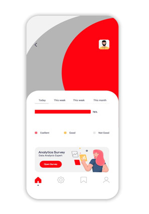
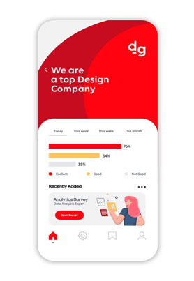
Let’s look at this example of a responsive website from a web design Dubai agency.
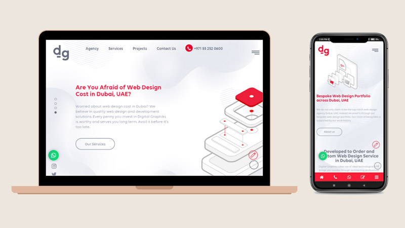
Where everything is perfectly aligned, and the content is clear. The website does not send out the message of content getting messed up, along with the fact that there is no unnecessary space left.
You will be doing your business a disservice if you do not opt for a website that would perform nicely and give a great user experience on mobile devices and tablets.
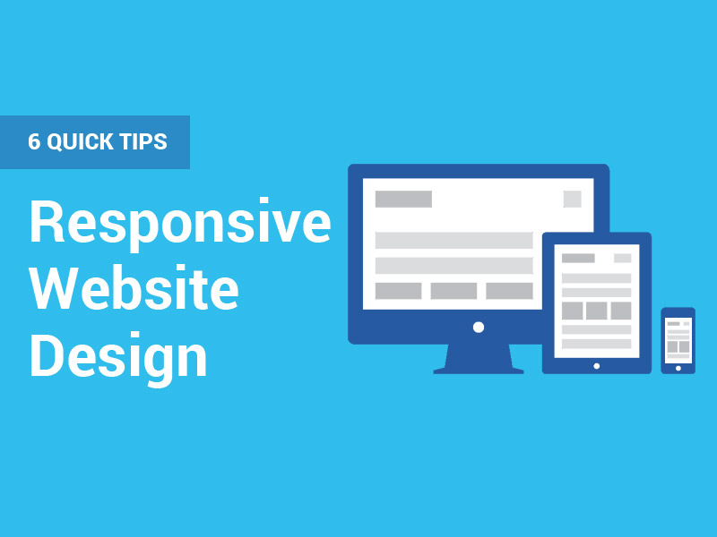
Were you worried about your web design not being responsive? Don’t freak out. Because here is a list of 6 quick and foolproof tips for responsive web design:
1. Having the perfect Hamburger menu
There are many fun names for a hamburger menu like Sandwich, Hotdog, Pancake, Tribar, etc. A hamburger menu incorporates the navigation bar into itself, and it shows three lines for the display. These three lines look like a hamburger, the lower bun, the patty, and the upper bun. This idea works great for the screen that does not offer much space to incorporate the menu in full mode.
The hamburger menu came under a lot of heat when it was first introduced. The main reason for this was people were unable to identify what these three lines were supposed to do. However, the scenario has completely changed now. Everyone knows now what those three signs mean.
Usually, users get distracted by the bulk of information present on the website, and they cannot comprehend where to go and where to find things they are looking for. In this way, the bounce rate becomes higher for the people accessing the website from their mobile. This hamburger approach allows for more space, and the more critical information could be placed here like important CTA’s and reviews about the business.
2. Do not leave important things while opting for Minimal Design
Going for minimalism in responsive web designs is a huge trend right now. But mistakes that are being made now are opting for too much minimalism. Here is one example of this:

You could see no calls to action, no portfolio, and the message is not received correctly. As a result, the visitor will not take prompt steps based on their decision.
One more problem with minimalism is that things become unclear, dispersed, and give an unfinished look. The item you were opting for, which has a clean palette, loses its cause and gives the feeling of sparseness. If you are going for a minimal design and it is stripping you off your creativity, then don’t Do It. It is going to drive away your visitors and will not create a robust identity amongst your audience.
Your website must show the true nature of your business; all the content and main elements of the website must be placed even when you are reaching for a minimal design. There should be enough call to action, reviews of your previous clients, and details of the project you have done in the past. If these things are not done right, the user might not be able to depict the website’s value.
3. Be Careful With The Font Size
The only duty of a responsive design is to give the same feel and view on desktop, tablet, and mobile. It is of no use if a design generates a great user experience on a desktop but fails to provide the same touch and feel on smaller screens. As we have seen before, most people access websites through their mobile phones.
While going for a mobile responsive design, the lead with font size should be taken with 16px and should not go less than 14px, and for the caption, you could reduce it a bit. Font sizes play a vital role in conveying the message you have intended to pass on to your audiences. Unfortunately, developers usually mistake not equalizing the font sizes on all sorts of the screen. So, the text that looks good on a mobile ends up looking weird on a desktop.
If the website visitor cannot read the message, they are supposed to bounce off, and the sales lead cannot be generated. That is why a strategic approach is required for defining fonts.
4. Unnecessary space should be filled With Important Information
The first hurdle while rooting for a responsive design is the lack of space. That is why every element must be placed appropriately. Users must move freely across the website, and every information must be available at their fingertips. Unfortunately, developers usually make the mistake of leaving out spaces that won’t result in a good user experience.
The left-out space should be filled with important information that directly relates to the user to enhance the user experience and ultimately portray the company’s message and value to the end-user.
Take a look at this design.
It could be placed with this version, where the spacing has been replaced by the information, including its past projects.
5. Transit to Fluid Grid
Building websites on the pixel is the outdated method; the new one is the fluid grid. This new way of building websites does not restrict the screen size to one specific screen. Instead, the measure will vary according to the screen size. This benefits when you have to design for several devices. The grid is divided into different heights and widths, but no website element adheres with height and width. Every component or button will be automatically adjusted according to the screen size.
One dilemma that developers face nowadays is that the desktop screen is getting more extensive and more advanced in resolution. But, on the other hand, mobile screens are getting smaller in size. So designers have to come up with something that goes well with both types of screens. Here, a fluid grid is the best option that works on percentages rather than pixels. And has more minor limitations.
We roll out on the Fluid layout journey by setting up a maximum size for the layout. Then, columns are defined for the grid, which sets the tone for a straightforward approach. Then, the components are designed by relating with proportionality. This way, the elements will respond accordingly.
6. Give Full Thought to Images

It wouldn’t be wrong if I say,
“Images are the one factor that could make or break your website.”
Usually, this problem arises that the size of the image doesn’t fit into multiple screens and while one image size looks good on one screen. It ends up looking horrendous on the other. That is why you need to give serious thought to it. In addition, there are some questions you would need to ask yourself before putting up an image.
- What should be the resolution?
- How will my image appear on different screens?
- What kinds of adjustments should I make to give the image uniformness for multiple devices?
- If this image looks good on desktop or larger screens, will it also look good on smaller ones?
Only after answering these questions, start placing and crafting your images. Also, some color combinations look good on smaller screens, but they appear lifeless when you look at them from the desktop.
Technologies for Responsive Web Designs
Gone are the days when designers had to develop two designs, one for the bigger screen and one for the smaller screens. Here I am listing down three widely used tools for coming up with the perfect responsive design.
Bootstrap
Mark Otto and Jacob Thornton came up with Bootstrap. It combines HTML, CSS, and JavaScript to come up with the perfect UI/UX designs. As a result, bootstrap has made its reputation as one of the most widely popular tools for making responsive designs.
Grids
The best thing about grid set is that it works well with exclusively created Content Management Systems, along with other famous CMS like Joomla, WordPress Drupal, etc. It allows the developers to develop grids that are responsive and intuitive and provide the best grid layout systems.
Read also: Isometric Grid – A simple guide to make it.
Gumby 2
Gumby 2 offers a massive collection of grids, website forms, controls, dropdown menus, toggles, and others. This framework has been developed on SASS and offers more flexibility than the previous versions. It allows for the cool functions of the Javascript to work in the background.
Adobe Edge Reflow
Adobe Edge Reflow was first introduced in 2013. It allows for the creation of responsive web pages and prototypes. A critical feature of Adobe Edge Reflow is that it will enable one-click connectivity with Adobe Photoshop. Thus, it will transform the static design into a well-acknowledged responsive design in the most hurdle-free manner.
The Final Verdict
Responsive designs have now become the need of the century. There is also a lot of testing required when it comes to responsive designs. We have to check across multiple platforms and on different screens to ensure uniformness among all screens.
Responsive web designs also account for a convincing web experience. When a visitor first visits your website, the design should be compelling enough for the user to come back. Suppose you have designed a responsive website, but it takes forever to load, or the images are not perfectly aligned. In that case, it will immediately send out the message that the company is non-professional.