There are more than 3.4 million mobile apps in the Google Play Store today. The App Store has fewer of them – about two million. New apps appear on these platforms every day, and there are more and more of them. Mobile app developers do their best to make their work stand out in this huge media stream and try to create products that are both beautiful and enjoyable to use. You should pay special attention to design in useful applications, such as voice aloud reader apps and the like. Check this article to learn more about such applications.
Today, to make a popular app, you need to adhere to a few rules of mobile design. Let’s consider the 10 commandments of mobile app design.
Also read: Top 10 Mobile App Development Trends to Watch Out
#1. Keep it simple
Mobile app designers too often get carried away and overcomplicate the product. Since they are tasked with taking the app to the top of the rankings, developers try to add all sorts of features to it, believing that it will be better that way. This approach is especially common in teamwork. No one wants to take on the role of moderator and be seen as the executioner of a successful idea that would put them ahead of the competition.
So the team begins to complicate the product, constantly adding new functionality to it. As a result, the mobile application turns out to be overly complicated and incomprehensible to the user. The interface of such products is not focused on the main thing, while today people want to interact with simple and logical navigational elements.
Any complication, even one extra step to achieve the goal, is the wrong approach to design. Users prefer minimalism. So the designer needs to temper his enthusiasm and create a well-designed interface with nothing superfluous. The app should do exactly what the user needs it to do and nothing more.
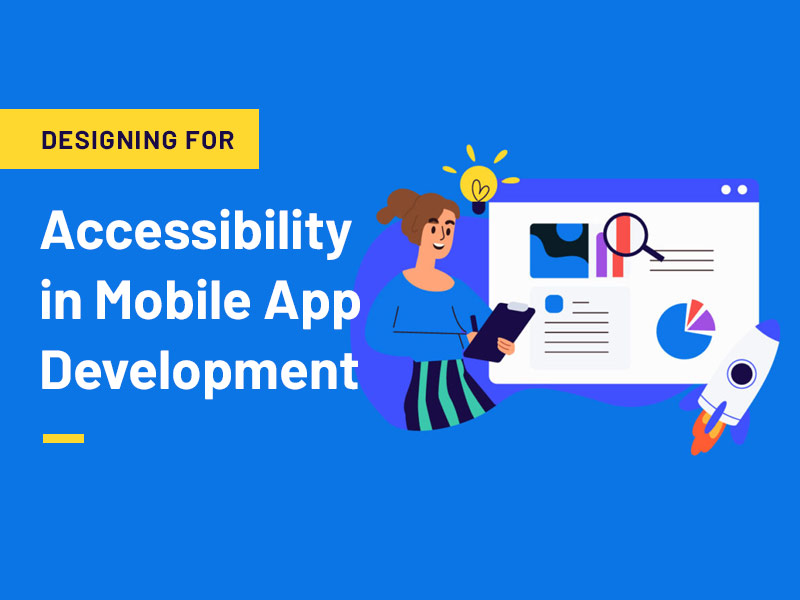
#2. Make the design accessible
Accessible design means that there are no negative emotions when interacting with the app. This is a very important point that should not be forgotten for a minute. If the product is inaccessible to some categories of users, it is better to start from scratch. For example, you need to make sure that the app is accessible to people with disabilities, as well as hearing and vision impairments. There are tens of millions of hearing-impaired users today – not taking care of their needs would be a catastrophic mistake. The same goes for people with visual impairments.
Accessible design is always good design. The advanced design techniques offered by Apple and Google are simple and straightforward and allow the designer to create perfectly working user interface controls. Focus-based navigation avoids audio-based feedback design. Today, it’s not enough to test an app only on the target audience, you need to make sure it’s accessible to all categories of users.
#3. Don’t reinvent the wheel
The design of a mobile app should have logic that the average user can understand. People who run an application on their smartphone expect things to work in a certain way they are already familiar with. The way certain elements, such as menus, appear should be predictable. If the user expects that an object can be moved by simply dragging it to another part of the display, don’t overcomplicate things. It’s better to do it the way the user needs it to be done.
There is no need to introduce something new if the old works well. Many developers forget about this, and in an effort to distinguish their product, overcomplicate it. The designer must speak the language that users understand and be extremely careful with innovative ideas to interact with the interface.
#4. Remember who you’re designing for
If the designer is creating a photo editing app, he should use techniques that photographers will understand. If it’s a kid’s app, like memorizing new words, then other interaction patterns should be a priority. You always need to keep the target audience in mind. Different groups of people react differently to different types of interfaces. So you have to do your best to meet their expectations.
You should always keep a portrait of the ideal user in mind. Who’s that? A student? A doctor? A small business? Or maybe an athlete or a musician? When designing an interface, you should try to make sure that the entire structure of the application corresponds to a key phrase. For example: “an app for travel enthusiasts” Or “an app for sound mixing“. This approach allows you to better focus on the core functionality.
#5. Use the right fonts
All designers make mistakes when working with typography. It is very important to choose the right fonts, simply because the wrong choice is very noticeable. Of course, you can hardly find a designer today who uses Comic Sans or Papirus, but there are still a lot of apps with disgusting typography. In mobile design, fonts should be given the utmost attention. And the most important thing is that the font should be not only beautiful but also readable. For mobile apps, sans serif fonts are better. But this is not an axiom. You need to choose a font so that it fits the idea of the app and fits well into the design.
#6. Stay Consistent
When designing apps, you need to stick to the main idea on all screens. You don’t want to use a pull-out navigation bar if other pages have menus on top. It is better to use bright colors for the screen saver and to tone down the palette on other pages. If a button works a certain way, it should work that way everywhere, on any screen.
Consistency is more than just aesthetics and style coherence. Design elements should guide the user’s actions and not mislead them. You can’t abruptly change the rules of interaction. When designing a mobile app, you need to keep an eye on what competitors are doing. If any set of features in the app is a standard, it’s better to stick to the scheme which is familiar to the user. The app should perfectly match the environment in which it will be used.
#7. Don’t forget about mobility
Many developers get so involved in the design that they forget about the needs of the users. For example, the fact that people will operate the application with their fingers, and in many cases only with their thumb. And what’s particularly frustrating is that some designers don’t think about how people will use their product on the go. If a design has too many buttons and other controls, it becomes uncomfortable, especially while moving.
The user interface needs to be clean and concise. To achieve this, you need to work properly with empty space. This approach allows you to highlight the main elements of the design and make them convenient for mobile users.
#8. Remember to be logical
No matter how beautiful the design is, if the app doesn’t work naturally, it will never win the hearts of users. Before you dive in, you need to answer a few questions. What is the goal of the app to achieve? How will the user search for the features he wants? How many pages will be in the app? How many clicks will it take to get to the goal?
People often act predictably and this should be used.
#9. Create realistic prototypes
Designing a prototype can be a long and arduous process. Almost every designer has had occasions when a client rejects an interesting design. To avoid rejection, it’s best not to show clients raw sketches. There is a huge difference between a sketch and a realistic prototype. Clients are experts and they can’t appreciate the beauty of an idea unless they see how it really works. An interactive, realistic prototype will make it so that the client accepts the work without objection.
#10. Don’t forget about testing
Any designer or developer knows that only testing ensures the creation of a positive user experience. Any, even the smallest mistake can lead to users uninstalling the app as soon as they install it on their smartphone. If the design is unclear or the font is hard to read, the app is unlikely to become popular. The designer has to be on the lookout for bugs and flaws all the time. There is always something that can be corrected or improved. And achieving a perfectly working design is possible only through constant testing.
Stages of the design of a mobile app
In order for the program to fully meet expectations, it should be convenient, visually pleasing, and easy to use. Designing a mobile app consists of several stages:
Analysis and UX design
Before moving on to the prototype, the designer conducts an analysis of the target audience, competitors, and tasks which the program should solve. For example, if the target audience is women, the buttons can be made smaller, if men – bigger. Since users mostly click on them with their thumbs, men should feel comfortable working with the service.
At the development stage, the UX designer thinks through the entire user’s path: from the first screens to the target actions. Therefore, when designing the interface, it is important to take into account several details:
- 1. Placement of controls at the bottom. The upper left corner is practically not used in this case.
- 2. Vertical and horizontal scrolling. The application should scroll both from bottom to top and from left to right.
- 3. There is no need to duplicate the logo on all screens. It is enough that it will be on the main icon and the loading screen.
- 4. Large fonts. It is not desirable to make the font very small. So, the approximate sizes for titles – 18-24 px, for hints – 12-14 px, for the main text – 14-16 px.
- 5. Native colors. They should tell the user which elements are allowed to click on, and which are not. The color can also differentiate between elements with different meanings.
- 6. Hints. It is always a good idea if the user will make several attempts to click on a non-clickable element, as well as if non-standard controls are planned.
Designing the UI of a mobile app and adaptive versions
After designing the interface, you can proceed to the visual part. At this stage, there is a sort of “cleansing” and bringing all the elements into a single style. Therefore, when creating the design of mobile applications, it is advisable to adhere to simple rules:
- Use no more than 6 types of the same font (different color, size, thickness) and no more than 5 colors. To put accents and not to spoil the interface, it will be enough.
- Consider the transitions from one screen to another: displacement, disappearance, preloader (loading indicator), etc.
- Take into account the color scheme. For example, the design elements of a mobile application for iOS have a richer palette than those for Android. Therefore, in the second case, it is better to refuse “dirty” combinations.
The final step is the development of adaptive versions. If the service is created only for iOS, in this case we are luckier, because it will be necessary to draw a few versions (2-3). If the program is being developed for Android, you will have to choose 4-5 versions of the most popular resolutions in a particular segment of the CA.
Testing
Another important stage is the testing of the usability of the finished interface. It imposes certain requirements on the design of the mobile application. So, the prototype, in this case, is evaluated in terms of:
- 1. Effectiveness. Whether the user reaches his goals.
- 2. Performance. How much time the user spends to achieve their goals.
- 3. Satisfaction. Whether the user is satisfied with the service quality.
The easiest way to perform testing is to create clickable prototypes in Figma. You can also record the process of using the program, followed by feedback. In addition, there are more advanced services that broadcast the interaction of the user with the application in real-time.
The requirements for the design of a mobile app are quite different from the features of the visual part of websites. In this case, it is necessary to take into account the small screen and more specific goals of the user who enters the program to perform a certain action. The most important thing in app design is minimalism, convenience, and a worked-out user path.