Love it or hate it!
Here we have flat web design websites to inspire creative minds. Past years, our digital designer community is just focusing on showing their skills and creating their portfolio with glittery illustrations, graphics & animations aimed to attract their viewers.
Then came flat UI designs, without any effect that makes objects appear 3D or make them stand out like drop shadows, textures, bevels, gradients and so on. Minimalism is the main highlight of this design concept and because of it, flat design trend is become popular and get in use for web design blogs or sites in a short period of time.
With the plenty of flat design websites templates over the web with the same boring or minor changed designs, it’s nowadays easy to be unique among the crowd just having new and creative flat web design ideas. This is why web designers Melbourne way are so successful, or web designers in any location, as they help those with web pages to develop their website in new and exciting ways.
That’s we have collected a collection of websites for best flat web design for inspiration.
What is Flat Web Design?
Flat design for websites became famous in 2015 and continues to work well with internet users today. Flat design has very streamlined elements, focusing on modern, minimalist, and efficient design.
Flat design is opposite to what is called Skeuomorphic design. We construct everything in our design in flat design using flat shapes, monochromatic shapes, no gradient, no shadow, no graphics, etc. In flat design, we orimarily focuses on color and typography.
Flat design may not be the hottest trend in web design, but it sure is the most durable. Every web design trend from the last couple of years has followed some of the flat design principles.
Here’s an example of the Chrome logo to quickly understand what is flat design.
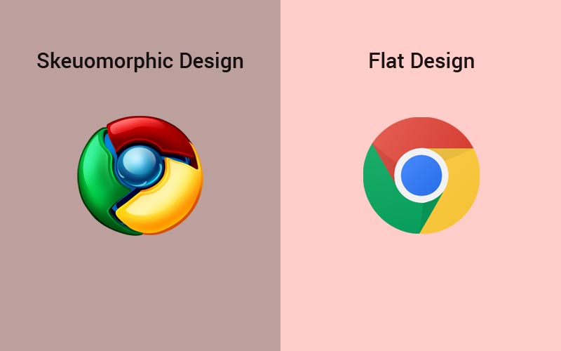
But making things completely flat is not a flat design concept. It’s a specific language for web design and development. If you look again at the Chrome logo, you’ll notice a big difference in file size. It’s simply because, in a flat design, there is a lot less information.
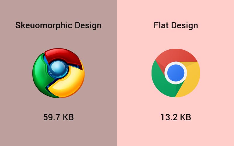
Flat websites load faster than any other website designs. That is why the connection between flat design and website performance (a.k.a. speed) and the underlying reason why this design language is so important.
The benefits of using flat design in your website is simplicity in design, improve load time and, the fact you can’t precisely mess the structure up.
The Role of Flat Web Design
Imagine: You are browsing a website and see a great combination of bright colours and exotic typography. The very first thing that comes in your mind is to make minimalism as an integral part of your design idea. Today this is possible with the help of flat web design.
Reputed IT bloggers have praised this ingenious web design and certain times have included it in the list of popular design trends. This includes reputed web design agency in Toronto like Chameleon Digital Media.
The amazing part? Flat web design has a very simplistic style. It can be available in a variety of forms.
So, when it comes to defining the words “flat web design” it is important to focus on what it isn’t.
Let us now divert our attention to the things mentioned below.
This ingenious web design is not 3D. It consists of three critical elements:
- Flat forms
- Non-existence of details that aid in creating beautiful designs
- Absence of details that create astuteness and size, including highlights, textures, and shadows.
It does not skeuomorphic properties. The great news is that flat design originated to fight skeuomorphism.
It is nothing but a beautiful style that is employed to resemble real-life objects or processes.
Skeuomorphism is an art that makes use of generous effects like reflections, realistic textures, embossing, beveling, and drop shadows, etc.
The History of Flat Web Design and The Way its Popularity Spiked
Flat design started to get due attention between the years 2012 and 2013. It was during these formative years when this amazingly new web design started getting visibility, thanks to the perfect timing of Windows 8 and iOS 7 release.
You can see lots of different things in the flat design that have been inspired from well-known brands. Like Window’s modular layout with pragmatic blocks of colour and Apple’s use of spotless shapes and clear icons.
The origin story of flat web design commences somewhere in between the indigenous trend and the skeuomorphic embodiments that were sacrificed.
A great thing is that flat web design has been around for years and is still performing great. This makes it more than simply a passing fad.
Flat Website Design Examples for your Inspiration
For making your first impression good and avoid viewers from leaving your website for the first few seconds, you need to make sure that you present a compelling experience for users on your site. And to implement this tactic, you have to focus on latest and creative design.
But as a designer, it will happen many times when you are new to website design or get out of the ideas and there you will need some web design inspiration sites such as for speedy and fast loading site, there you should go for responsive web design inspiration.
Also for making a flat design website, the role of flat web design in making your website an instant hit.
Now, without getting your more time on reading. Here we have a handpicked collection of best flat website design inspiration. Enjoy!!!
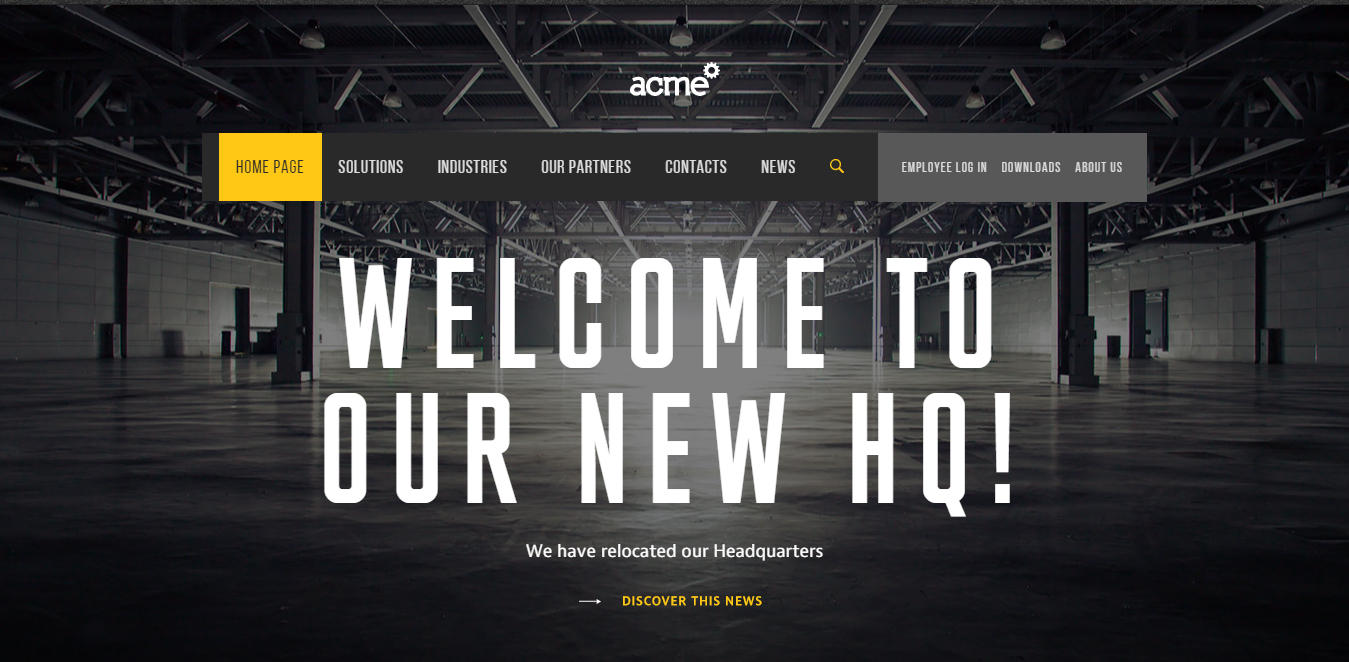
Acme World
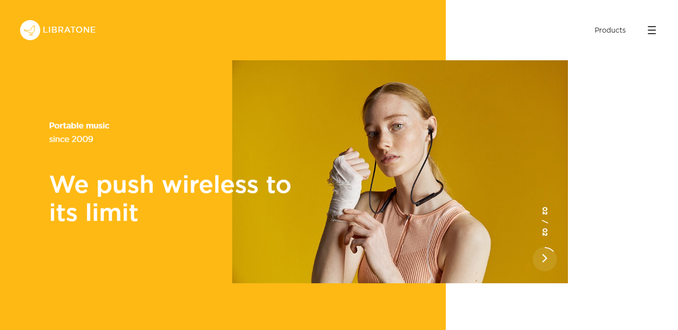
Libratone
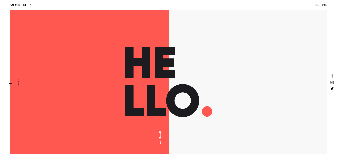
Wokine
Fantasy
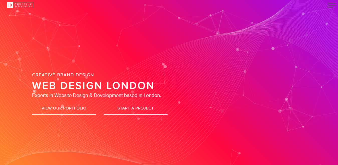
Creative Brand Design
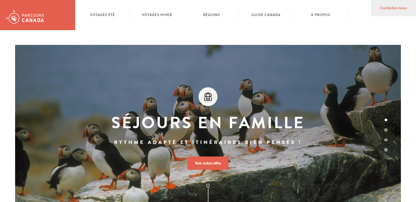
Parcours Canada
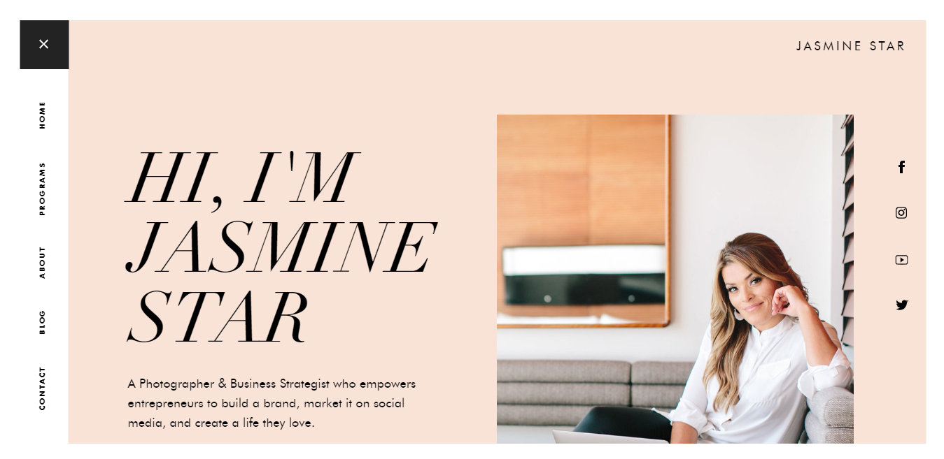
Jasmine Star
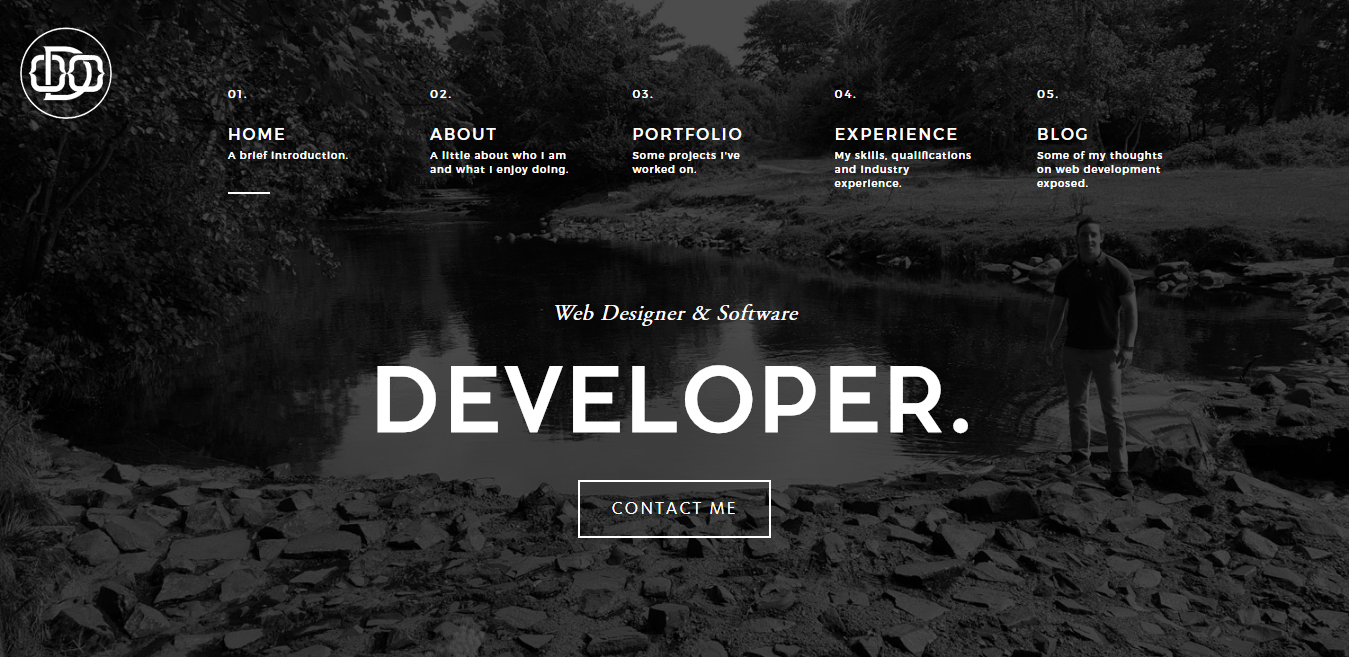
Owen O’Donnell
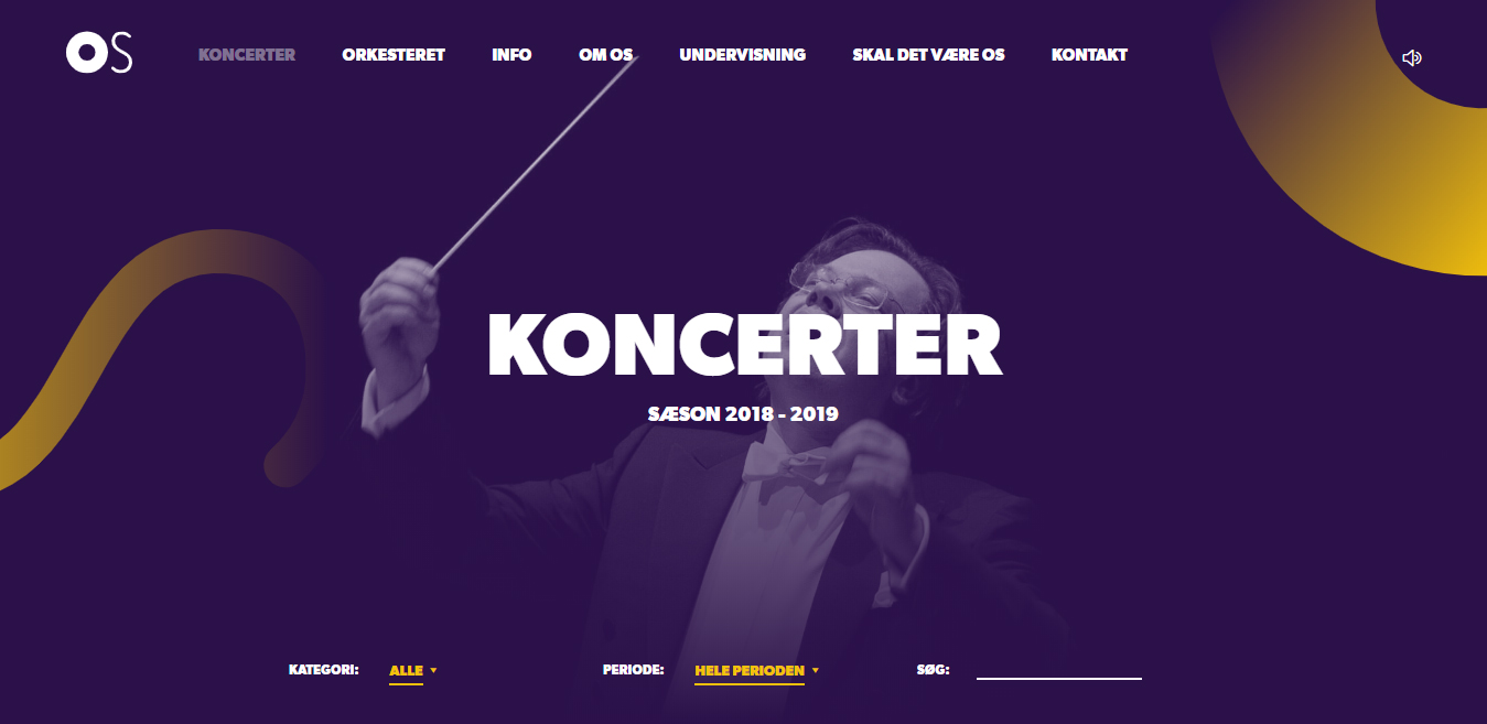
Koncerter – Odense Symfoniorkester
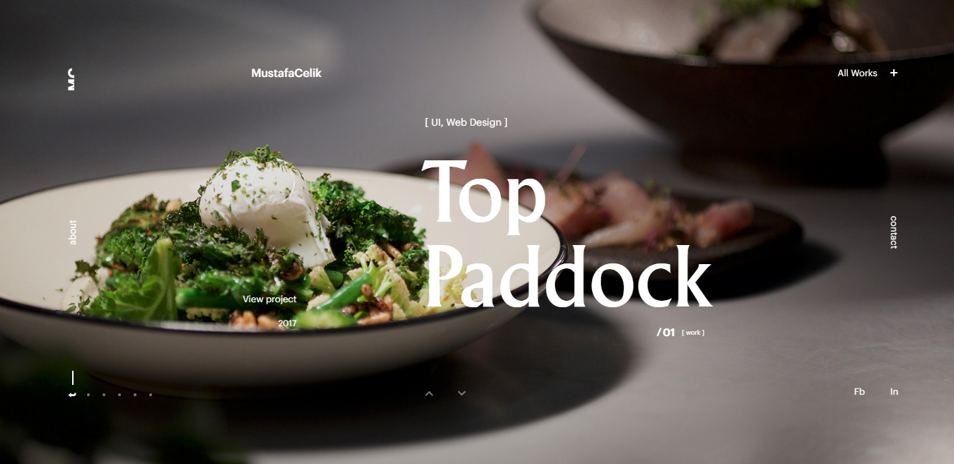
Mustafa Celik
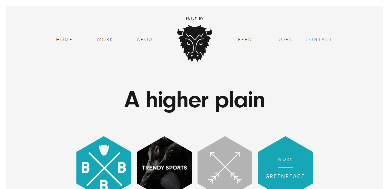
Built By Buffalo
Minimal Monkey
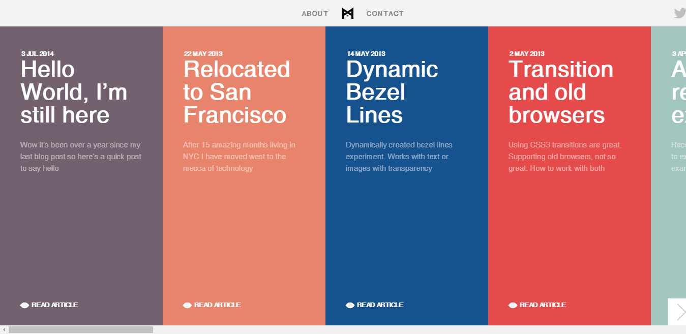
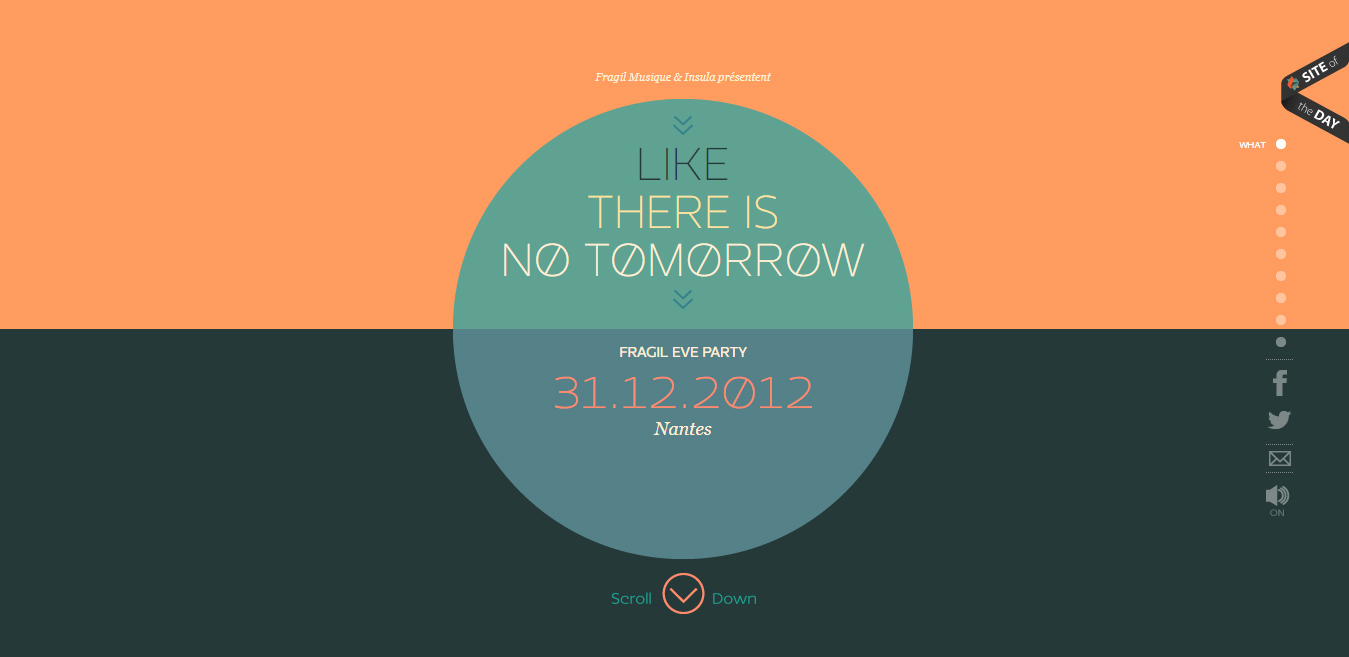
Like There is No Tomorrow
Talent Garden

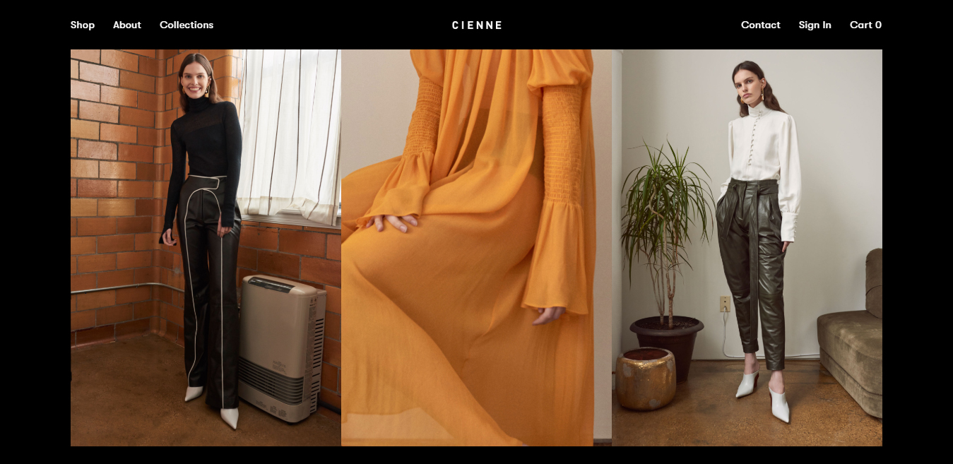
Cienne
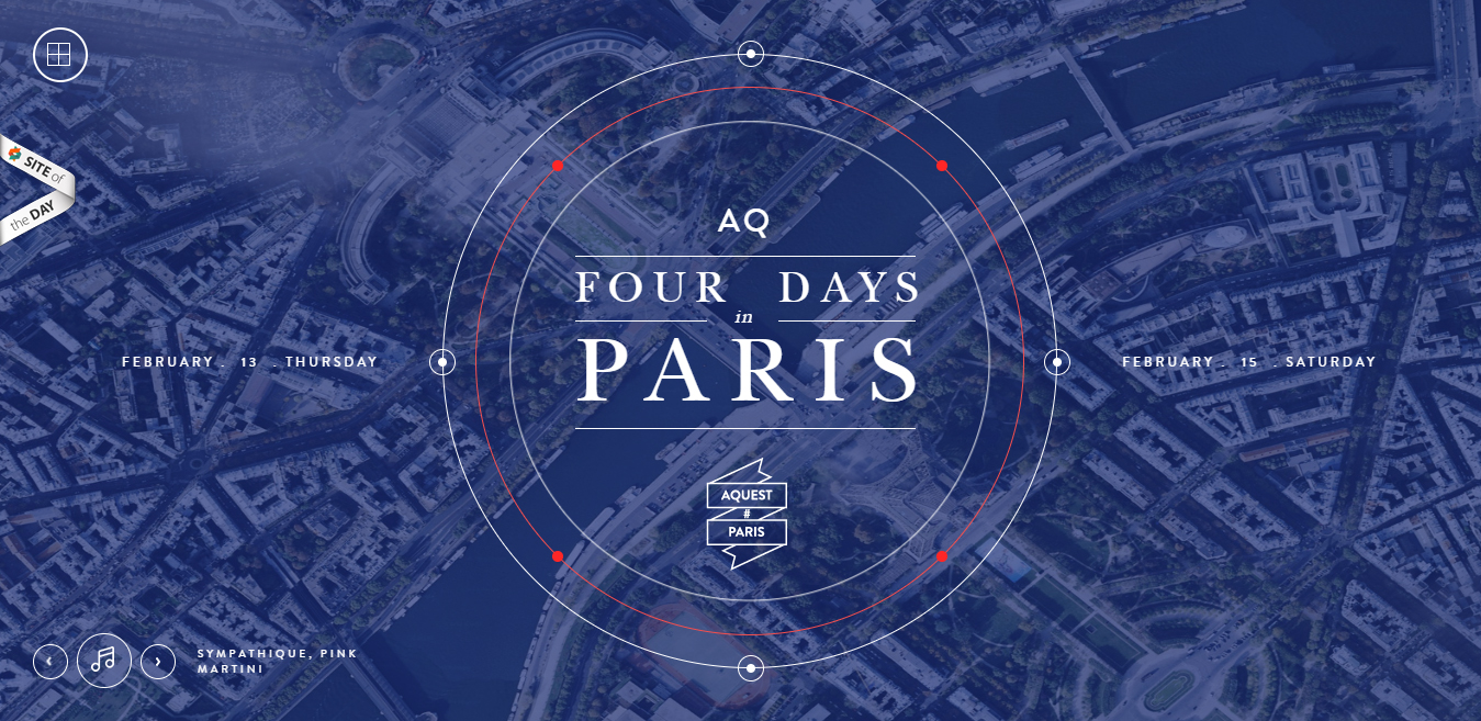
Four Days in Paris
Google Santa Tracker
![]()
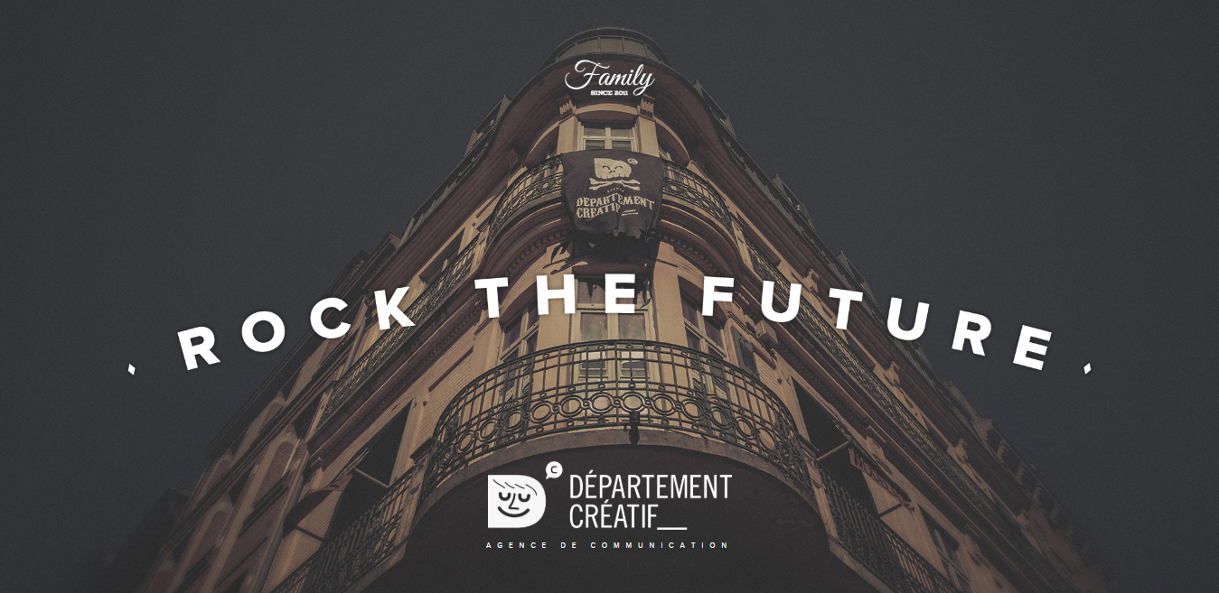
Departement Creatif
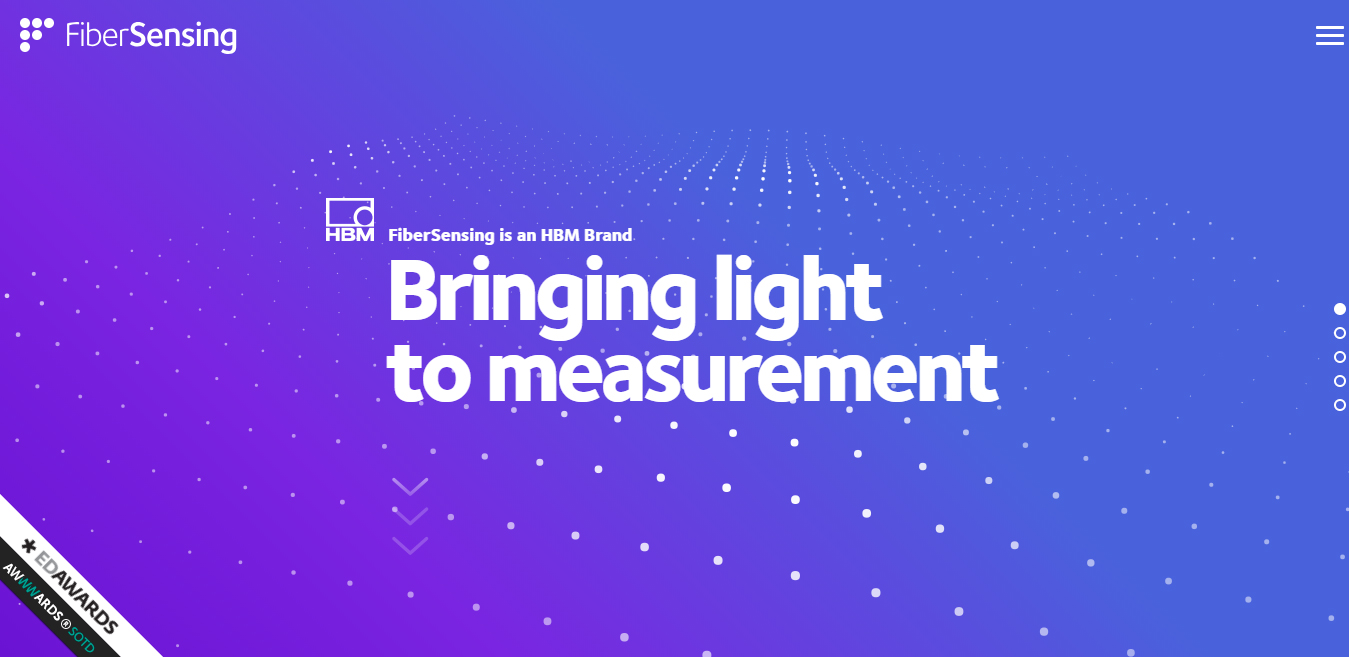
Fiber Sensing
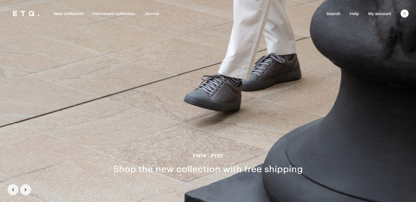
ETQ Amsterdam
At last, we hope you really enjoyed and also get inspired by our set of best flat website designs for inspiration.
Pros and Cons of Flat Website Design
Let us now divert our attention to the pros and cons of flat web design.
Pros
Affinity with responsive design
Microsoft and Apple were the pioneers when it comes to adopting a flat web design. Once they adopted this novice design it was only a matter of time for others to follow them.
Today, it has become one of the most popular web designs for web and mobile design. Reason? It is easier to apply the principles of flat web design to other design categories.
Flat web design principles can be applied to other design categories.
Although its grid-based layouts and simplistic design are most recommended for web and mobile design.
There is a rationale for this: It is easier to rearrange or resize the flat web design ultimately leading to easy display on varied screen sizes and devices.
Its framework can easily be moulded as per requirement
The best part about flat web design is the fact that it is very simple to navigate and effortless to scan. The grids, cards, modules or blocks design going for a flat look have a uniform geometric shape.
The amazing part is, grids do have a flexible framework which can easily be shaped into different configurations.
This gives enough freedom to the designers in creating an arrangement that synchronizes pretty well with the content instead of compressing content in a predetermined layout.
Spotless, easy-to-read typography
It is a unanimous perception amongst designers that flat web design provides more options for typesetting. The best part? They end up with larger, more modernized typography.
Thanks to the non-presence of shadows and other effects the text become very easy to read.
Designers love the Sans-serif typefaces which are not only good match for style, but also ensure that be highly effective in representing the big statements like a headline.
Cons
Adjusting to the second best use of the design
Certain designers try to compromise on the design part of the website in order to give a clean look to the flat web design.
This results in negative consequences on the use of the design. It is particularly happening in the case of web and mobile design.
There are times when a designer needs to decide what to keep as clickable or not (the reason being, everything is flat on the same visual plane).
Certain times important features are concealed from the views, or certain visual cues are missing for the users which are all compromises for making the design look as simplistic as possible.
Lack of original thought process
Every businessman wants to create a website or project to highlight its exclusive qualities.
But, when it comes to flat web design there is a dearth of ideas since every design looks quite similar.
Since the designers are working on the same flat style they have limited scope of choices to implement their projects.
Following the trend as a crowd without thinking about the usefulness factor
Flat web design is one of the trending topics on the top design trend list. It is one of the popular choices amongst designs as it uses breakthrough technology to come up with interesting pieces of work.
The problem is, certain designers, follow the principles of flat web design simply to follow the crowd without thinking about the usefulness factor. This can result in the creation of art which is totally purposeless.
Conclusion
Designers have already started experimenting with flat design.
They are now adjusting to the style accordingly.
Today it is time for designers to visualize simplicity and introduce subtle changes like texture and shadow for making your designs look aesthetic and functional for users.
At present, these minor tweaks have given an altogether new meaning to the flat design approach.
Now, this new style is regarded as “Flat 2.0” or “almost-flat” design. A drastic change…
It is about the time when you need to take the help of an ingenious web design company in Toronto or web design agency in Toronto like Chameleon Digital Media and make your flat web design dreams come true!
