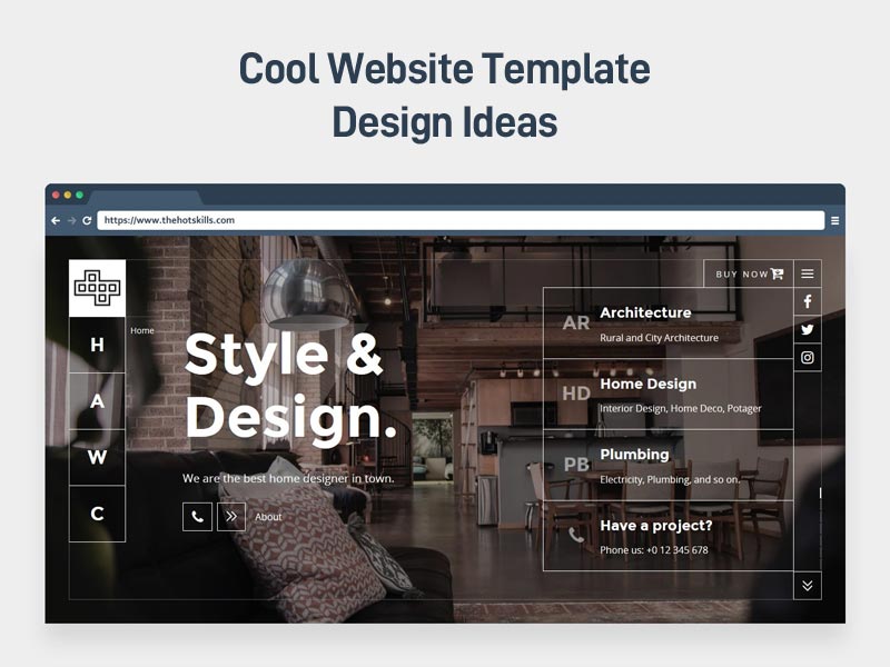
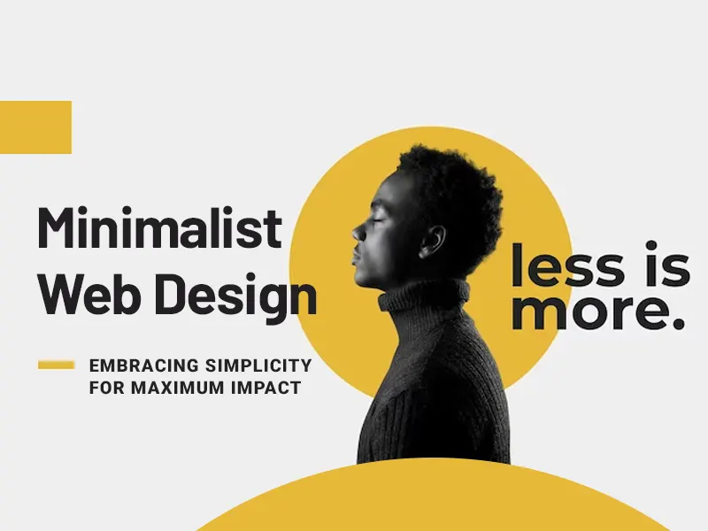
As web design is becoming more and more important to user satisfaction, designers need to create increasingly useful and visually appealing websites. Carefully and wisely applied principles of minimalism can help create attractive and effective websites with fewer elements, simplifying, and improving user interactions.
Create Websites with A.I Online Builders
With Weblium — AI website builder you can easily create a beautiful website that attracts clients. Custom integrations, ready-to-use lead generation forms, friendly support, your own domain, and much more under the hood.
What is minimalistic website design?
In various spheres of visual arts throughout history, minimalism demanded that only a significant part of the object be left to focus the recipient’s attention on it, as well as improve the overall aesthetics of the design. Today minimalism has been revived as a powerful technique in modern web design.
It has become popular as a response to the trend of increasing complexity in web design (the complexity of the image affects the user’s perception of the site: the more elements a design has, the less readable and intuitive it will be for the visitor). Minimalism applied correctly can help us focus on those elements of our project that will simplify user interactions.
Research suggests that minimalist pages have a lower bounce rate. Minimalism has also brought additional benefits to websites due to faster loading and better compatibility with screen sizes. Perhaps one of the best-known examples of minimalism in web design is the Google search engine.
Google from the very beginning (since offering the beta version in the nineties) has prioritized the simplicity of its interfaces. The homepage has been designed entirely around the central search function. Its simplicity can lead to the belief that minimalism is uncomplicated, but there is much more to this superficial observation. The minimalist web design strategy is to simplify interfaces by removing elements and content that the user doesn’t need to interact with our site.
To create a truly minimalist interface, the designer must rigorously rank the elements, showing only those that are most important and removing everything (e.g. decorative elements), which will distract users from what is important. Each subject in the project should have a purpose; it should not be turned on unless the message must be clear. At the same time, you need to make sure that we do not hinder the user from visiting the site by removing or hiding the content he needs.
Negative space
Negative (or white) space is the most important feature of minimalism and provides the project with great power. Negative space is simply a space between visual elements. The space between objects is to emphasize the value of these objects.
Visual features of minimalism
In a minimalist design, every detail matters. Minimalist interfaces often use flat textures, icons, and other graphic elements (flat design). Flat interfaces do not use the game of lights, shadows, gradients, or other textures that would make the interface elements look shiny or three-dimensional.
Photos and illustrations
Paintings are the most characteristic form of composition in a minimalist design. But photography or illustration must comply with the principles of minimalism. An inappropriate image (for example, a busy photo full of distracting elements) would negate the advantages of the surrounding minimalist interface and spoil the integrity of the layout.
Limited color scheme
Color is of great importance and potential in web design because it can establish both informational and emotional connections between the product and the user. Color can increase the visual attractiveness or draw attention, causing the project will not need any additional elements or graphics for this. Designers striving for minimalism tend to “squeeze” the maximum from just a few selected colors and it is not uncommon to use only one color. With less visual information, the color palette will be more noticeable and will increase the user’s impact.
Typography
In addition to color, typography is the basic visual element in minimalist design. Bold typography focuses on words and content while helping to create a much more intriguing image.
Center point
The minimalist philosophy focuses on the idea of design around content: content is the “king” and the visual layout “greets” the king. The goal is to make the message more transparent, not only by getting rid of distraction but also by focusing on what is important. Since minimalism consists of removing unnecessary elements, a strong focusing area is important. What is visible on the site and does not require any action will encourage users to visit the site. To make sure people do this, we need to provide them with content that interests them. Therefore, place high-level content with a large negative space at the top of the screen, and then gradually increase the “density” of the content.
Simplified navigation link
Although simplicity and minimalism are not the same, minimalism should be simple. One thing that simplifies user experience is the ability to interact easily without distractions. The biggest factor contributing to this kind of simplicity is intuitive navigation. But navigation in the minimalist interface is a serious challenge: when trying to remove all unnecessary elements and improve the content, designers often hide part or all of the navigation. In the minimalist style of designing websites and mobile interfaces, a menu icon that develops to a full list of elements remains a popular solution. This often results in lower detection of navigation elements. Keep in mind that easy navigation is always one of the main goals of web design.
Minimalism and landing page
While the minimalist design philosophy for content-based design applies to every website, minimalist aesthetics may not always be appropriate. Minimalism fits well with the portfolio of landing pages and pages (landing pages), which have fairly simple goals and relatively little content. At the same time, the effective use of minimalism on a more complex website can be much more difficult. Lack of elements can be harmful to a site rich in content (low information density forces users to scroll through the content). A better solution might be to create a minimalist landing page that leads to more specific pages.
Summary
In summary, minimalist websites simplify interfaces by removing unnecessary elements. What makes such sites inspirational is the combination of usability and great aesthetics, and easy to navigate, a beautiful website is a powerful communication tool.


