Every click, purchase, and interaction generates a digital trail of information. Marketers, managers, and business owners can find invaluable insights in this data. Excel, Google Analytics, ERP, CRM, and API create massive amounts of data that are difficult to understand.
Making raw data into aesthetically appealing charts, graphs, and dashboards is the art and science of data visualization. Data visualization helps understand complicated data by emphasizing trends, patterns, and anomalies. All this could otherwise go undetected.
The Power of Data Visualization
Imagine sifting through thousands of rows and columns of numerical data. To put it mildly, it’s a difficult endeavor. Data visualization transforms this overwhelming information into a story that anyone can understand. At the same time, you can simplify your tasks as much as possible with the help of Power BI consultants; this will help reduce operating time.
But it’s not just about pretty pictures. Decision-makers may immediately understand the meaning of data thanks to data visualization.
Data visualization is really about conveying stories visually. Instead of drowning in a sea of numbers, data is transformed into visual narratives that make complex concepts accessible.
ERP Systems: Visualizing Operational Data
ERP systems handle the operational lifeblood of businesses, from inventory management to financial reporting. But these systems often produce complex data that’s a puzzle without the right visualization.
Imagine viewing your supply chain as an interactive flowchart, instantly spotting bottlenecks and inefficiencies. Or visualizing your financial data in real-time dashboards that highlight areas requiring immediate attention. This is the power of data visualization for ERP systems.
Google Analytics: Visualizing Website Data
The holy grail of online analytics tools, Google Analytics, has a wealth of information about site visitors, traffic sources, and conversion rates. Yet, without data visualization, it’s like having a vault of gold bars with no key. Don’t forget that business intelligence in insurance or in other industries is very important.
Google Analytics data may be converted into clear, useful insights with the correct data visualization tools. Traffic sources can be plotted on a world map, user behavior can be tracked through interactive timelines and conversion funnels can be visualized to pinpoint drop-offs.
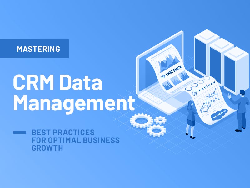
CRM Systems: Visualizing Customer Insights
CRM systems hold the keys to understanding your customers better. However, data within CRMs can be scattered and unwieldy.
Data visualization can turn this chaos into clarity. Visualizations can illustrate sales pipelines, segment customers based on behavior, and map out the customer journey from the first touchpoint to conversion. This enhances decision-making and deepens interactions with customers.
Excel: Beyond Spreadsheets with Data Visualization
Excel, the trusty companion of countless analysts, is powerful but has its limitations in visualizing large datasets.
Fortunately, data visualization add-ins and tools are here to enhance Excel’s capabilities. You can create dynamic data dashboards that update in real-time, interactive charts that drill down into details, and heatmaps that reveal data patterns at a glance. Excel has become a data visualization powerhouse.
APIs: Visualizing Real-Time Data Streams
Real-time data flow between apps and systems depends on APIs. However, without visualization, the data flow remains hidden.
Visualizing API data in real-time dashboards can provide an instant pulse on your business. You can track website traffic, monitor app performance, or analyze social media engagement as it happens. Interactive charts and graphs breathe life into otherwise static data streams.
Choosing the Right Data Visualization Tools
The difficulty is in choosing the appropriate data visualization tools from the vast selection that is accessible. Your choice should align with the specific analytics system you use and the complexity of your data.
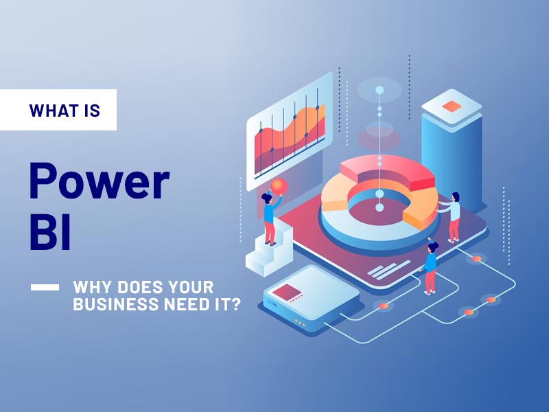
Popular tools like Tableau, Power BI, D3.js, and Google Data Studio offer diverse capabilities. Factors such as data volume, user expertise, and budget should guide your selection.
Conclusion
In the data-driven landscape of today, the ability to unlock insights from analytics systems like Google Analytics, ERP, CRM, API, Excel, and more is paramount. Data visualization serves as a link between unprocessed data and useful insights.