If you’re new to graphic design, you’re probably looking for some high-impact graphic design tips to help you quickly develop your skills and gain a better understanding of the field. Also polish your skills according to latest graphic design trends. Within such a broad field it can be a bit overwhelming to find a place to start, luckily there are many tools available to help find inspiration and hone your skills. There are even AI-powered text to image programs that can help you visualize your burgeoning ideas, if you think this might be a helpful starting point you may want to try out dall-e 2 and see what your vision could be.
You may have had a misunderstanding of what a graphic designer does for years. Perhaps you weren’t aware that it’s a broad area that encompasses everything from your morning coffee cup to the smartphone app you use to monitor your sleeping habits and nearly everything in between.
Designers build brands, experiences, commercials, magazines, physical spaces, digital spaces, animations, and many other things. The design has a significant effect on our lives and has the power to improve the environment.
There has never been a better time to learn graphic design, whether online or in person.
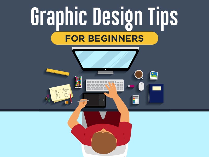
11 Most Effective Graphic Design Tips for the Beginners
1. History of Research and Design
The significance of understanding design history is often overlooked. The importance of history is often underestimated. I remember being dissatisfied with my history classes in high school.
On the other hand, it aids in understanding why graphic design is used in the way it is. For example, I’m sure you didn’t know that the first designs date back to 38,000 BCE. The first cave paintings, according to historians, were made to depict tales. Our attraction to visual contact is only increasing today.
According to studies, 65 percent of people are visual learners, which means that when a concept is visualized in front of them, they understand and comprehend it better. This need for visual communication goes back to the dawn of time, demonstrating how important it is to understand design history to learn design usage and significance today.
Read also: Image diff online
2. Keep it as Simple as Possible
Keep it easy is the most critical design tip for non-designers and novice designers, or you can try here for graphic artist hiring. Nothing is more frustrating than an overbearing, difficult-to-understand design.
Make use of your inner minimalist to keep things plain. Keep the text and fonts to a minimum, the colors under control, and the visuals balanced. The key to good design is to avoid cramming your plan with as many graphics and elements as possible. It’s striking a balance between visual appeal and simply and efficiently communicating the message.
3. Maintain the Power of Typography
For non-designers, the art of font selection has a poor rep in the design community. It’s easy to get overwhelmed by the variety of fonts available on the internet. Not only that, but you must understand how to combine fonts in a template to make it look seamless and appealing. Luckily a text effect maker is a handy tool for beginners wanting to experiment with typography, generating a great artistic flair to any text.
Using tried and true pairings is a perfect way to avoid the stress of trying out a million different variations. Professional designers enjoy modern and beautiful fonts as well, but if you ask them, they will tell you that they only use a few classic fonts.
If you want to make your pairings with different fonts, a straightforward rule to follow is to use one novelty font for headings and a standard classic font for the rest of the text. Graphic artist hiring enables a fantastic resource for saving time while matching fonts, including a list of tried-and-true variations for various occasions.
You can also use only one font family and pair the different weights together. For instance, a Montserrat bold for the title, a Montserrat regular for text blocks, and italics for subheadings.
4. Contrasting Fonts in a Pair
What fonts go well together and which don’t? One of the most popular places where people who are new to graphic design get stuck is font pairing. Choosing fonts with high contrast is a good rule of thumb. This will help the fonts complement each other while also adding interest to your design. E.g., the title could be written in Sifonn, and the supporting text could be written in Arvo.
The contrast between the two typefaces has been increased by making the title much more significant and using a bright color to complement the background ocean image.
5. Social Networking Models Help you Save Time
To find the templates, you need graphic artist hiring, which also helps search for a social channel, a category, or a subject. However, templates aren’t limited to social media.
Presentations, infographics, surveys, invites, CVs, and more are all available as models.
6. White Space is not Anything to be Scared of
The term “white” or “negative” space refers to the space between your design elements, while the white space will help the design achieve a specific look or feel. It can have a clean, minimal, contemporary, even fashion-forward feel to it. Even if clean and minimal isn’t the message you’re trying to send, the impact of creating some room shouldn’t be overlooked.
It can be tempting to fill in any gaps in your design; however, when used strategically, space can be one of your greatest assets and aid in creating a focal point. Space in design isn’t just the absence of content; it’s also a design option that can help achieve essential design concepts like contrast and hierarchy.
7. Keep the Hierarchy in Mind
When you’re working on a project, ask yourself, “What is the most important aspect of my design?” To put it another way, what does anyone look at first?
The importance of hierarchy in graphic design cannot be overstated. It is your duty as a designer to direct a viewer through the design, so you must prioritize elements based on their value.
Fortunately, hierarchy and contrast go hand in hand, and you can quickly achieve that priority by scale, color, type size, and font choices, as well as the use of space.
8. Icons can Make a Big Difference
Symbolism is a well-known phenomenon. From early cave wall signs to today’s ability to hold an entire conversation using emojis, humans have been living with symbols for thousands of years. A small graphic representation of something is called a symbol, and it can be used to depict objects, locations, individuals, emotions, and acts. Icons may also express meaning faster and in less time than actual words.
They can help to overcome language barriers, draw attention to a specific part of a design, and take up much less space when conveying the same message as written instructions. If your style is on the easy side, icons can be a great way to spice things up without adding too much. When using icons, make sure they all fit together and have the same look and feel.
9. Don’t be Afraid to take Risks
Contrast is unquestionably one of the most powerful design concepts to remember. Size and scale, relative lightness or darkness, color, and the use of space can all be used to accomplish this. Ensure that the dimensions of the items on the page contrast and the colors are in contrasting tones or shades.
You can experiment with the size of the form on the website, and it’s also a good idea to think about contrast when pairing typefaces. In this place, some designers adopt a “go big or go home” mindset, pairing fonts that are vastly different from one another.
10. Consistency Reigns Supreme
Now that you’ve completed all of this work and considered all of these essential design concepts, make sure you stick to the rules you’ve developed and that your design is consistent. Set sizing and spacing rules for type elements like headings, subtitles, and body copy, and use Adobe’s paragraph and character stylings to apply these rules wherever those text elements appear quickly.
Ascertain that all of your images have the same look and feel. Find photos with similar color tones or saturation levels and parallels in how detailed/busy or abstracted/simple they are. Keep the color palettes and application consistent, and repeat elements where possible.
11. Obtain feedback
The best way to learn is by feedback. Listen to what your customers had to say about your concept and develop your skills based on the aspects they said weren’t as successful as the others. Even if it’s difficult to hear at times, poor feedback is much more helpful than positive feedback.
Conclusion
It’s never easy to be a novice in any industry. You will, however, be able to achieve greatness soon with the assistance of graphic artist hiring. Only remember to remain motivated, develop your skills, and continue to design. Your contributions will be rewarded as a result of your efforts.