Healthcare is undergoing a revolution like never experienced before. Telemedicine, IoT, big data, cloud technologies, mHealth applications, healthcare software development and other innovations are opening new medicine frontiers. For example, smartphones are being used to track infections, with artificial intelligence playing a vital role in searching for signs of pneumonia in people’s lungs. Websites have become the medium through which patients can get all the needed information, book an appointment with a doctor or even have one online.
No doubt, we live in a digital world, and a digital healthcare environment is necessary, especially with the increase in online users and innovative use of data. That’s why every clinic or healthcare practitioner should have their own website now that has professional healthcare web design. But medical websites might slightly differ from other websites in their design and functionality. There are a lot of things you should take into account when creating a healthcare website to make sure it’s patient-oriented. And in this article, we’re going to share the most efficient healthcare website design trends and inspirations to keep an eye on.
How Can a Healthcare Website Design Improve Patients’ Experience and Medical Practice?
By having a good website design, the patients can get the required information on time regardless of where they are, leading to a medically informed public. They can also access certain services without visiting the healthcare facility, saving both the hospital facility and the patient time and money. Using explanatory videos and frequently asked questions, the customers can also get the answers to their burning questions and make informed decisions.
Long story short, the medical website can save money and resources for the hospital providing all needed information to patients and reducing concierge work for hospitals while bringing more patients to the clinic. While for patients the website also can save their time and improve the patients’ experience. Obviously, designing your own clinic website is a worthed investment for every healthcare practice. So below we are sharing 15 healthcare website design inspirations and ideas you can consider for your website.
Clean Design and Structure
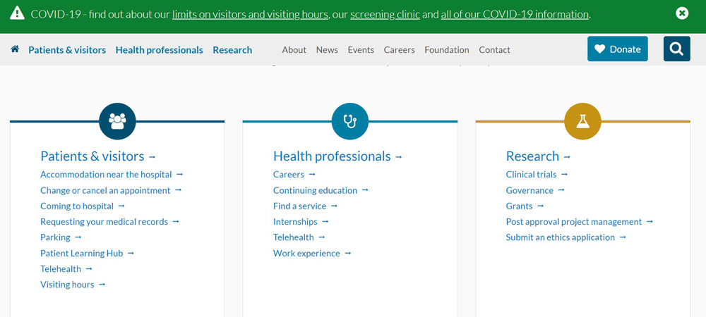
A good healthcare website should have a straightforward design and structure. This makes it easier for the patients to scan through, looking for the information or services they want. In addition, this makes the site more accessible to all with ease. Therefore, use a simple color scheme and bold yet basic typography when designing the healthcare website design. A design like the one used by the Royal Melbourne hospital is clear yet simple. You can get all the info easily. The website’s structure seamlessly flows, with proper linking from one webpage to the next.
Robust Website Search With Filters, Categories
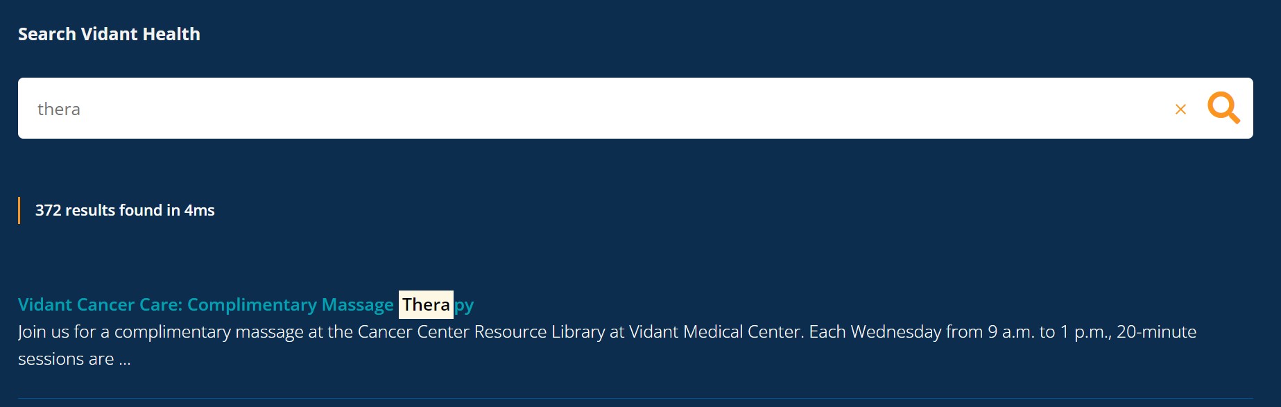
Not all the content can be displayed on a website’s landing page. And for this reason, most websites feature a robust search component. However, the search component should have simple filters, properly categorized to ensure the queries can be retrieved within no time. This stems from how properly the database is organized and the website’s structure.
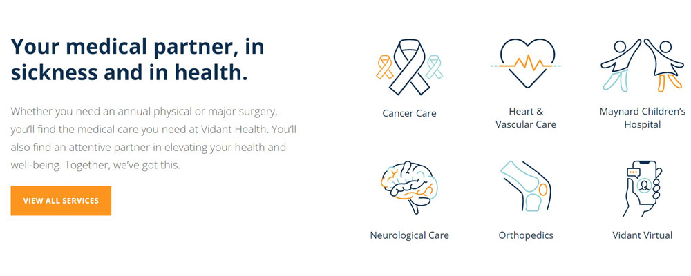
Categorize your data into various small but related groups to ensure the search results are hit within no time. An excellent example of a healthcare website featuring a robust search is Vidant Health. The website features a clear search box that even autocompletes searches, producing results in an instant. As a result, the patients don’t want to wait for their search query to load.
Website Accessibility
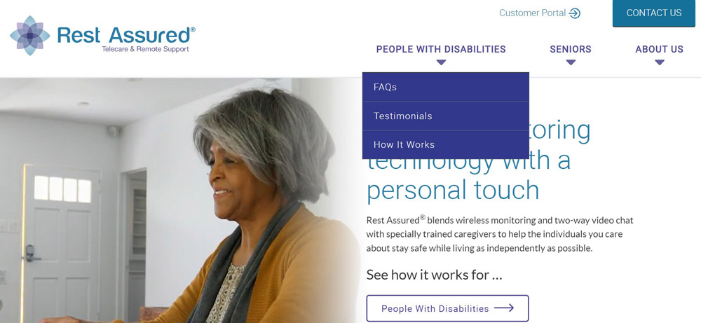
The website must be accessible to all, including people with disabilities. Otherwise, you could be opening yourself to lawsuits. Therefore, one critical accessibility compliance that your website must have is the ADA (Americans with Disability Act). In addition, ensure that the healthcare website follows the four guidelines of web accessibility outlined by WCAG; that the content must be operable, understandable, robust, and perceivable. One great example is Rest Assured’s website. It is open to all users, and that is a great choice. Featuring accessible design elements like large and high contrast fonts and keyboard navigation that is easy to use, this website is perfect for a design with accessibility in mind. It also has alt-text and all the images and features screen readers, including other text-to-speech functionalities.
Calm Color Scheme
A calm color depicts the mission. Although colors can be powerful marketing tools, they also play a vital role in communicating with patients. It keeps them interested in your page and is an essential part of the user experience. For example, Open and Affordable, a dental practice in Denver, uses bluebecause it conveys trust and calm. Therefore, have a calm color scheme on your healthcare website that contributes to the readability and clarity of your website. This allows the patients to find what they are searching for quickly.
Again, Vidant health wins in this case. Its use of a perfect combination of blue and white colors makes the website a sight to behold. The blue color depicts calmness, seriousness, reliability, and seriousness, making a patient sure of the provided services and feel an urge to continue browsing the website.
Easy Registration / Booking / Call / Purchase Functionality
Make life easy for your patients. Include an easy registration, booking, call, purchase functionality on the healthcare service website. This ensures that purchase or registers with the fewest number of steps, calls with just a click of a button, or even makes a purchase easily with integrated payment methods.
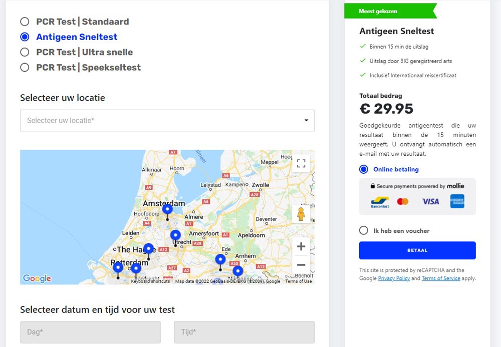
A good healthcare website design inspiration is the SpoedTestCorona website with a simple registration page, capturing only the necessary details in just a single step. It also includes any fees necessary all on one page. It also features an intuitive map where you can select a location.
Engaging Health Content
It has long been said that content is the backbone of any website and mores healthcare website. Therefore, ensure you include informative content that is helpful to your patients, clearly and in an understandable format. You don’t want your patients struggling to understand the content because they might abandon the site or make wrong decisions. Use clear fonts when writing the content and include a robust blog section on your health website.
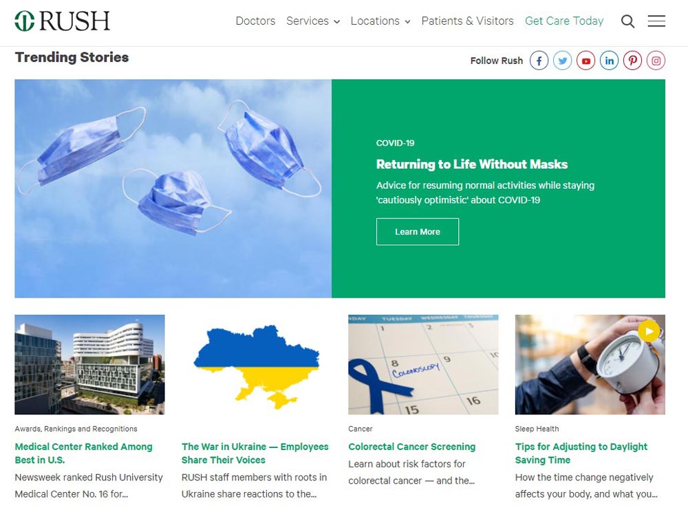
Rush University Medical Center from Chicago does an excellent job of providing its audience with engaging health-related content. With its easily navigable site, RUSH uses well-written content on various subjects ranging from organizational articles and news, health-oriented classes and events, and health conditions.
Patient Reviews and Testimonials
One of the critical design ideas to include in your healthcare website is patient reviews and testimonials. This helps the undecided audience or prospective medical patients decide whether to enlist for a health care organization’s services or look for the same elsewhere.
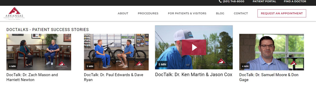
Testimonials and patient reviews are among the most sought-after information source on a healthcare website, meaning it is a powerful section of your healthcare organization’s website. Besides helping the patients decide, they also provide additional comfort while adding extra credibility to a healthcare provider. One of the organizations that have excelled in presenting patient reviews and testimonials is Arkansas Surgical Hospital.
Intuitive Navigation Structure
Any healthcare organization’s website should have an intuitive navigation and simple site taxonomy. Also referred to as the navigational structure, your website’s taxonomy refers to how you organize the whole website to make an intuitive sense whenever users navigate from page to page. Organize the entire website such that any user can find the necessary information they are searching for effectively and quickly without a need for assistance.
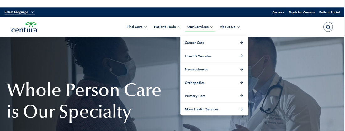
The operative rule in any healthcare web design is having an intuitive, logical, and persistent organization of information on the website to ensure that a user always knows where they are within your website. An example is Centura Health. They use a clean, straightforward, and easy navigational structure.
Mobile Friendliness of The Website
It is preposterous not to have a mobile-friendly website because most searches or browsing worldwide occur on mobile devices. Therefore, a mobile-friendly healthcare website is vital. To begin with, Google uses a mobile-first approach when ranking sites, meaning that it deprioritizes non-mobile-friendly sites. Unless a customer searches your branded name, you don’t exist in their searches, translating to no more Google traffic.
Next, over half of the internet traffic globally comes from smartphones today. That is a massive market to anger or abandon altogether. You want them to have a great digital experience. Lastly, a mobile responsive website makes your brand competitive.
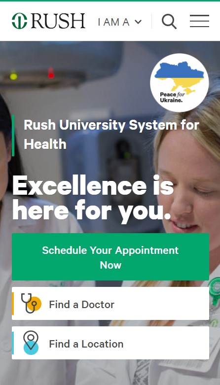
Again, a good healthcare website design inspiration in this category is the RUSH (Rush University Medical Center) website.
Voice User Interface
Voice search and UI are increasingly becoming a thing nowadays, with 40% of the millennials using voice assistants. It is an accessibility mechanism that helps the old and visually impaired access content on your site. In addition, a voice user interface is being used to improve a patient’s recovery experience at home using smart assistants on mobile devices or chatbots built into a web application. These chatbots can direct a user to the right medication.
An excellent example of a healthcare organization that uses a voice user interface (VUI) on its website is OhioHealth Urgent Care. Their VUI allows the patients or audience to ask Alexa regarding locations, waiting times, and more to reduce unnecessary phone calls and improve the patient experience. VUI can also help a healthcare organization is through patient support, prescription refills, and billing.
Visual Assets With Adding Human Elements
Web browsing is a visual medium, to begin with. You’re selling yourself short if your healthcare website doesn’t have vibrant animations, imagery, and video content. It takes a visitor 20% of a second to develop an opinion of a brand based on what appears on your website. Patient-centric websites leverage a patient’s tendency instead of catering to non-existent tendencies you might wish a patient had. To maximize the visual effect on your website:
- Include high-end videography and photography.
- Ensure your visuals have a balance and no one element pulls much focus or causes extreme asymmetry.
- Use a limited color pallet.
- Use graphics that go together; don’t use flat graphics close to small-aperture photography.
- Use a compartmentalized design that leverages the Rule of Thirds and grid layouts.
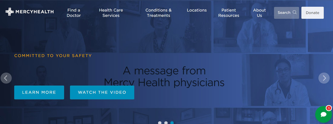
Mercy Health clinic is an example of the hospital website design that uses vibrant, high-quality photography and soothing green throughout.
Explanatory & Engaging Videos
The healthcare websites showcase various instances of storytelling. Provider interviews, treatment videos, and facility tours rank higher among the prospective patients. Ensure you tell your story using explanatory and engaging videos as Regional One Health clinic does. They use dramatic and engaging videos on their homepage as hero statements to immediately captivate the audience and promote a user’s feelings.
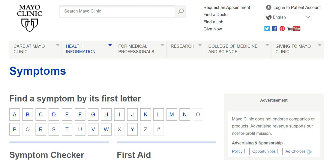
Symptom Checker, Calculator, Diagnostic Tools
Including such tools on your website is an excellent way of valuing your patients. With the effective delivery of patient information, Mayo Clinic is long recognized as one of the leading healthcare organizations. Their website displays an extensive menu where users can explore health information related to health conditions and diseases. You can reach health issues by finding information from an alphabetical listing from the website or using its comprehensive symptoms checker. Including things like calories and bills calculators and other diagnostic tools is a ripe healthcare web design tip that you should include on your website.
Captivating Questionnaires, Quiz, FAQ
You can make your healthcare website more engaging by including captivating quizzes, FAQs, and questionnaires. Instead of waiting for the customers to reach your website, serve them the information they need directly. For instance, based on how the patients answer the quiz, you can automatically reroute them to the relevant content. It is very easy to create quizzes or questionnaires with online tools like Jotform Quiz Maker or Qzzr. To engage the patients, you can create multiple-choice questions or free responses, including other forms of quizzes to engage your patients.
Patient’s Account Where It’s Relevant
Another design practice to include on your healthcare website is a patient’s account. This is a portal where patients can get their medical history, billing information, or even addresses. Such information is critical, primarily if the patient is referred to another hospital. Incorporating a patient’s account on your website also eliminates the hassles of recalling things like medication or when a patient is required to visit the doctor. Mayo Clinic is an excellent example of a health website design incorporating a patient’s account. However, ensure that patient information is appropriately secured according to HIPAA and GDPR.
Summary
The whole reason for having a healthcare website is to inform your patients and make service provision easy. Therefore, following the above healthcare website design trends is essential to make it patient-centric. Otherwise, your prospective patients will not be able to access the site since it will not be ranked, and if they do, they leave immediately.