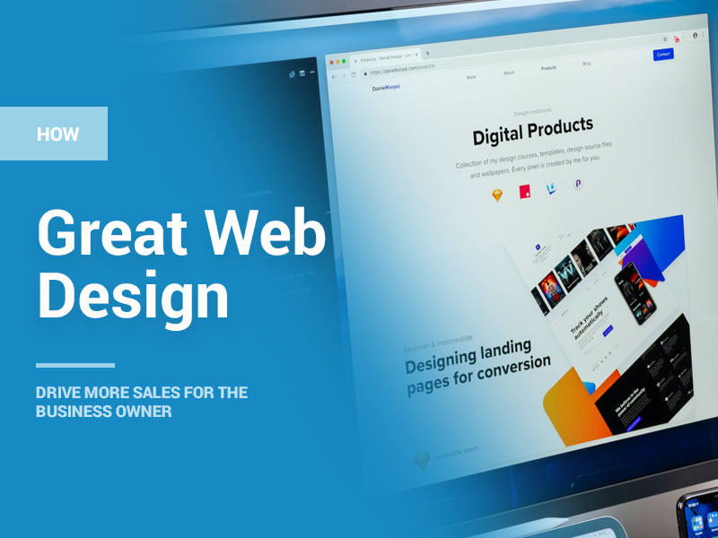
Web design is one of the most essential components of a website. It is always prioritized before a website is developed. However, most web designer teams tend to focus on getting the aesthetics right and tend to ignore web design essentials. These essentials are largely in correspondence with the implementation of web design principles.
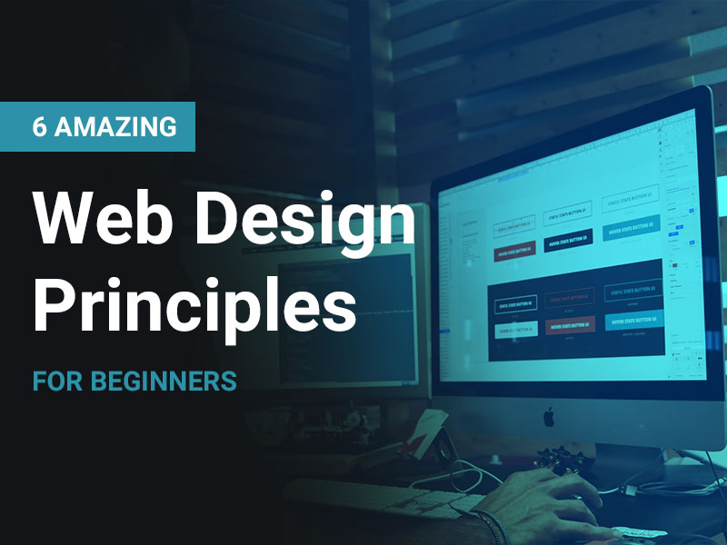
Website design principles are nothing but a standard set of guidelines. These guidelines help web designer teams implement quality website designs. After all, a highly converting website becomes successful only after it gets the basics right. Things like typography, colors, content, layouts, and branding can be taken care of once the core web design has been prepared. However, most of web designers in a web design company are unaware of what principles are covered as a part of the core designing process. With that said, here’s a list of all amazing web design principles that can help beginners craft ideal web design:
1. Whitespace:
Whitespace is one of the most essential aspects of web design. Most websites tend to make use of this concept uniquely, depending on the nature and business of their platform. It is normal for beginner designers to think of filling every nook and corner of a whitespace fill with whatever they can. This results in the formation of nothing but excessively cluttered designs.
Every website needs breathing space to propagate its content in a better way. Here are some points to be taken care of for practicing ideal white spacing:
- I. Do not call out Whitespace as a lost space. It emphasizes designers pursue minimalistic designs. After all, “A Good Design is as little design as Possible” -Dieter Rams.
- II. Whitespace helps prevent cramping. A web designer might be tempted to fill a canvas with as much content as possible, but it tends to ruin a design.
- III. Whitespace is also a design element. It should not be ignored as it plays a key role in guiding the content and flow of a website design.
2. Layout:
Understanding websites is all about how easily a user can grasp information. This grasping is determined based on two key factors: layout and navigation. A layout helps website design skim-friendly. Most of the people who browse the website on a daily tend to scan websites.
Here’s what a web design company like Bond Media can do to craft an ideal layout for functional visual hierarchy:
- I. Human eyes have a natural pattern of scanning things. Ensure that the website designs are made keeping these patterns in mind. For example, when a person reads a book; it is either read from top to bottom or from left to right. The same perspective holds at the time of browsing.
- II. Follow patterns for arranging information. For example, People ideally prefer Z & F shaped patterns while reading online.
- III. The information must be segmented properly. A website design can be greatly simplified by using this approach along with proper formatting’s like pointers and headers.
- IV. Try to offer essential information at the top of a webpage.
- V. Make use of grid layouts to design websites. Such layouts help a web designer to build a website design with the consistent distribution of assets across all web pages on a website. This is how layouts help deliver a seamless User Experience, irrespective of a device.
3. K.I.S.S:
This is regarded to be one of the most commonly advised principles. Irrespective of a niche, every form of design idealizes this principle because of its efficiency. KISS stands for “Keep It Simple Stupid”; propagating the message of keeping things as effortless as possible.
Since website design is a communicative field, designers need to keep themselves updated with different trends and practices. However, designers often end up cluttering designs following new trends. Here’s how a web design company can make their website design ideal:
- Build Simple designs. The core aim of a web design is to be visible.
- The mode of communication and the way a design is propagated should be effortless.
- KISS idealizes a rule of threes. This approach helps a web designer team craft a product by using three types of elements. For example: using 3 images, colors, and fonts for a certain design.
- Designs should always emphasize the content that is hosted on a website.
- Extra graphics always come in the way of information. Ensure that communication is done effectively with the help of lesser complications.
4. Relevance:
Information that is hosted on a website needs to be contextually relatable with any kind of media that is present on a website. “An Image is worth a thousand words”; this saying truly signifies the power of using relevant images in a web design. Humans tend to learn a concept easily whenever they come across relevant visual content.
Things to take keep a note of:
- Avoid making use of decorative media unless necessary. Such kinds of media may obstruct the key information provided by a website and clutter the website unnecessarily.
- Prevent usage of stock and commons media. Most people who browse the internet on a frequent are likely to recognize a media as a stock image or a stock video; leading them to believe that the website is not trustworthy.
- Always consult with a website design team and a marketing team to see if the information matches with videos and images hosted on a website. Such relativity will help the audience develop a sense of understanding the information while browsing a website.
5. Optimization:
People prefer to get things done quickly while working online. Slow loading can be one of the leading reasons people would exit the website. Making use of heavy graphics and animations can significantly slow down the processing of a website design for most devices. Almost 50% of the people on the internet expect a website to load within a small timeframe of 2 seconds.
Here’s what can be done for the ideal optimization of websites for faster loading:
- Make use of videos and images that are of lesser size. This ensures that they end up loading quickly even if a person’s browsing speed is less than ideal.
- Refrain to make use of a plain webpage while a website is loading. Such a web design will lead people to believe that the website is not loading at all due to a lack of progress.
- Idealize making use of SVG assets instead of resource-heavy raster assets.
- Make use of Google’s Page speed insights to recognize any kind of performance-related issues on a certain website.
6. Hierarchy:
A website design should always be smart enough such that its elements always craft a visual flow by themselves. Hierarchy forms the basis for every kind of communication in a design. A hierarchy acts as a guide for a web design team to implement a design from the user’s perspective. This perspective enables a web design company to showcase navigable and interactive elements properly.
Here’s what can be done to achieve an ideal Visual Hierarchy:
- Make use of attention grabbers and clues to dominate a design for the user.
- Define the hierarchy of a page before anything else. This will ensure that people have an idea of what to look at first, then second, and so on.
- Place the content and controls in such a way that they boost the effectiveness of a website design. Rely on the ideals of spots and focus on best outcomes.
- Always have a design reviewed in a grayscale tone. Such a review will give an idea about contrast-related details and obtain the true sense hierarchy in the application.
Conclusion:
That concludes all amazing web design principles a beginner web designer must know. Remember that, a good web designer always thinks about the users at the time of designing a product. Hence, pleasure should be the sole reason behind designing an experience. Once a design has been prepared, it needs to be tested with users to get reviews, insights and improvise the website design for better outcomes.