Do you know why landing pages are so important? To answer this question, you need to think about them as the gold mine of your website. You create a landing page as a stand-alone to push specific campaigns or marketing strategies.
Landing pages aim to convert audiences into buying customers. The trick lies in personalizing messages and sharing content that motivates the right action. These include offers and incentives that will attract, engage and sway customers to take the right action.
Lead nurturing or marketing landing pages can give a 5.31% conversion rate. An upwards of 30 landing pages achieves seven times more leads. Including video content drives up the conversions by 86%.
With proper testing and targeting, the marketing team can boost conversions by over 300%. It is essential to avoid multiple offers because it can result in a 266% reduction in conversions. Interestingly, only 50% of digital marketers will optimize landing pages for mobile devices.
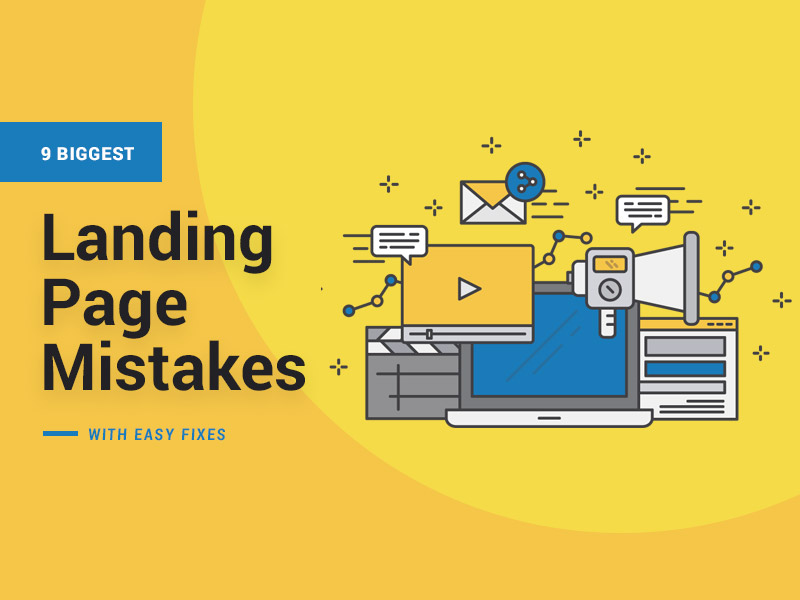
9 Biggest Landing Page Mistakes with Easy Fixes
Without a doubt, this is one of the biggest landing page mistakes. We look at others, and what steps you can take to fix them in our article.
1. Going It Alone Without Expert Advice
A cursory online search will expose you to tons of free web builders. It may be tempting to take advantage of such for several reasons. They are free, easy to use, and the website will be up within minutes.
The developers have also ensured that lack of coding knowledge should not be a problem when using the tools. You also get templates for landing pages.
We don’t argue about the veracity of the statement. But, for a brand, we would recommend that you seek the services of professional web builders. This is especially true for a business trying to establish itself in the market.
Business continuity depends on your ability to convert audiences into customers. But, according to Hypelife brands, a successful startup marketing agency, a lot goes into achieving conversions.
The focus should not only be on intent strategies, campaigns, or lead generation. Neither does it depend solely on social media marketing, campaigns, or fantastic web designs.
In combination, all these factors help. But, you also need a clear brand strategy and vision. You need to convince the customers that you are the best option.
Let the experts guide you on how to set up optimized landing pages. The ROI will be worth every dollar you spend on them.
2. Not Strongly Communicating Your Message
On a landing page, you have very little space to communicate everything you want to say. Online users do not have too much patience for a lot of content. If you expect them to read tons of text, change your thinking.
They will leave without ever getting to the core of the message you want to communicate. The best way to go about it is to draw their attention to the benefits or results they will get. Whatever supporting text you include should be brief and support the titles.
But that is not all. Let’s go back to the titles and headlines for a minute. When the audience clicks on the headline, they need a seamless flow to the correct information. Let’s say the headline is for baby diapers.
When the online visitor clicks on it, the redirect goes to baby prams. That lack of continuity can be annoying. You could lose a potential customer with such a simple-to-fix mistake.
Also, ensure that there are no broken links on the site. You know how irritating it can be to need information and get a 404 error. The probability of losing such a potential customer is very high.
Take advantage of broken link checkers available online to ensure this never happens on your site.
3. Avoid Information Overload on the Landing Page
As we said above, multiple offers on a landing page can work against you if you want to capture the online user’s attention and redirect it to a specific point.
Always aim to achieve a 1:1 attention ratio. That means one campaign, one call to action (CTA), and no other distractions.
If you have five campaigns running on one landing page, that means 5 CTAs. You could end up overwhelming the online visitor.
You will also not be able to guide them to take the action you desire if they are confused. The more the confusion, the more they are likely to leave without taking any action.
Be strategic about the kind of information you have on the landing page. Shouting about product attributes or features is not the way to go about it. Rather, talk about the benefits the customer can get from using the product. Position the brand as a solution provider and not a company that is only interested in selling.
Also, include plenty of social proof on the landing page. Testimonials are free third-party endorsements of your brand.
Potential customers want to know what others have to say about you. That is why many will read online reviews and check out such social proof before buying.
4. Use of Generic Landing Pages
Another big mistake is to have one landing page for all the different campaigns. Remember, you create a landing page for a specific marketing or advertising campaign.
From our point above, to ensure a 1:1 attention ratio, you should only have one campaign per landing page. Yet, some marketers will have one generic landing page for all their campaigns.
The direct result ties into our point above. You bombard the online visitor with too many messages.
If you must create 30 landing pages specific to 30 different campaigns, then so be it. Don’t forget, an upwards of 30 landing pages can significantly boost conversions.
5. Asking For Too Much Information
One of the most critical components of a landing page is the contact form. It provides a fantastic way to collect customer information in lead generation.
Now here is where some digital marketers make a big mistake. The contact form is so long or complicated that it ends up being bothersome. Some of the information does not even add value to the teams.
If we know one thing about online visitors, they like convenience. The less you require of them, the more they are likely to stay. Place yourself in their shoes when coming up with a contact form.
What kind of information would you be comfortable giving out? Aim for the least number of fields possible. Limit yourself to 3 to a maximum of 5 fields. If they sign up, you could always get more information the more you nurture your relationship.
6. Your CTA Needs Work
A CTA has one critical function. And that is to get the online visitor to take a specific action.
Please ensure the following with landing page CTA.
- We can’t say this enough. Have one CTA on each landing page. Remember our point about the attention ratio.
- Give the CTA visual prominence. The placement should draw the eyes of the online visit immediately they land on the page.
- Ensure the CTA communicates the right message. Don’t, for instance, have click here for more information, when what you intend to say is click here to download a copy. How many times do you click on a CTA and files start downloading? Many people will stop the action fearing it is unsafe. The brand loses out by not getting a chance to communicate with the customers.
- The font should be clear and the text easy to understand.
- Give more importance to the CTA than the surrounding text. A tiny CTA surrounded by bold, huge text is easy to miss.
- Provide contrast between the CTA and the page. A colored CTA on a white background will stand out quite prominently.
The perfect CTA should communicate the purpose of the page or products. It should also guide the online user on the next course of action.
7. Slow Loading Pages
Page speed plays a critical role in conversions. Research shows that you achieve the highest rates within the first 5 seconds. Any additional second after, results in a 4.42% drop.
70% of customers base their decision to buy from an online retailer depending on page speed. A mobile page that takes up to 10 seconds to load can expect a 123% bounce rate.
It is also important to note that slow-loading pages will impact your rankings on search engines like Google.
It is easy to see why you need to pay attention to loading times with such statistics. There are some steps you can take to deal with the issue.
- Choose the right web hosting provider. They should give you sufficient bandwidth to handle the amount of traffic that comes to your website. This is especially important when running campaigns because of peak traffic at such times.
- Optimize images by compressing or resizing them. Heavy images consume a lot of bandwidth which will slow down the loading.
- Optimize files for mobile by formatting them for such devices.
- Cache web pages and reduce redirects.
Keep testing the page speeds. There are tons of tools available online to help with the task. These include Google Pagespeed insights, Pingdom, WebPage tests and RabbitLoader.
8. Too Much Clutter on the Landing Page
Think of how you react every time you see a website page with too much information. The designer was too generous with text, images, and other design elements. The probability of staying on such a site is pretty low.
Do note, the user experience defines stay rates. If online visitors find it difficult to navigate the site, they will leave. We already said that the space available on the landing pages is very little.
That means all the design elements should create a visual appeal that is engaging and attractive. Operate with the less-is-more mantra when deciding what to put on the landing page.
Give prominence to important sections that you want the online visitors to notice. Highlighting such areas is a good example. It means that, even if someone is scrolling through the page, they will take note of that specific section.
9. Focusing On Selling, Not Converting
It is important to remember that the landing pages are not for selling. The aim is to start the conversion process. Think about your typical behavior when online. You see an interesting product or service. You click on the link with one aim.
You want to know more about the offering. At this point, you have not decided whether you are ready to buy or not. The information you receive will have a significant role in the decision-making process.
That is what your landing page is supposed to do. It should be the first point of interaction between your brand and the customer. The right messaging and strategies should move them further along the sales channel.
If they fill out the contact form, the level of interest is still pretty high. This is a warm lead that, with the right tactics, can become a hot lead.
Please do not make the mistake of pushing products hoping to get them to buy. Instead, let the sales development team take over to connect and nurture relationships first.
Finally, remember to keep up with performance monitoring. Metrics like page views, bounce rates, stay rates, and conversion rates will let you know whether your efforts are paying off.
Final Thoughts
A landing page is a powerful tool for connecting, generating, and converting leads. Yet, some mistakes can reduce the value you get. We have highlighted some of the most common and easy ways to fix them.
The best piece of advice we would give is to get expert advice when building your landing pages. You want to ensure that everything on the page provides a gentle nudge to the online visitor to take the right action. The page’s design should be simple, clutter-free, and easy to navigate.
The CTA should not be ambiguous, and the placement should be noticeable. Please stick to the 1:1 attention ratio for best results. It is also essential to maintain fast to page loading speeds.
Do keep up with page testing using the online tools available. The same should apply to the links on the landing pages.