eLearning is going to be the mainstay in education in the coming years. This was a trend that was visible even before the movement restrictions came into effect.
Educators and learners use eLearning tools, platforms, and content to complement their teaching and learning.
The on and off restrictions make it frustrating for learners and educators to design and define a consistent learning experience.
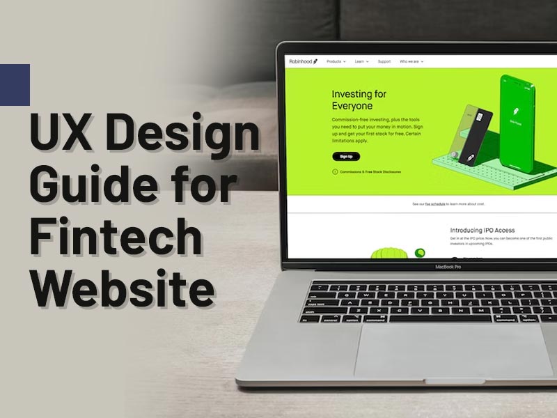
This is one place where the user experience of elearning app can play a definitive role and help you reach out to the maximum number of learners. The impact that you will leave would be formidable and lasting.
- Have you thought that design, presentation, navigation, and many other UI and UX elements can affect learning outcomes?
- Have you wondered why despite having the best subject matter experts, best-designed course, and best content, you are unable to engage learners and educators?
- Do you see that your competitors see an increasing number of new and repeat users, while you are steadily losing market share?
In this article, we try to answer some of these questions, where we establish a link between amazing UX design and learner acceptance.
We also share with you the best and most successful tips to make your eLearning platforms user-friendly.
eLearning is About Ease of Use
When a user – learner or educator – comes to your eLearning platform, you must make their experience pleasurable.
They should be able to easily use every aspect of the platform – from accessing content to uploading them, from getting custom alerts to searching relevant courses.
How can you make this experience more engaging, fun, and easy is up to your design, user interface, and user experience for elearning apps?
UI and UX are two different things, both dependent on each other, but entirely different. Even if you have the best UI engineers, it is not sufficient to deliver a stunning UX.
A UX involves much more than clever use of front-end elements, CSS, and JS. It needs a deep understanding of the user persona and psyche.
To keep things simple and be clear, we define User Interface (UI) and User Experience (UX) as follows:
User Interface ( UI )
The user interface is collectively the graphical layout of an app, website, or application. GUI elements like buttons, text fields, radio buttons, images, menus, sliders, and the text they read (like this one) make the foundation of UI design. These elements allow a user to interact with your application.
UI design also includes visual aspects such as the screen or window layout, screen transitions, animations, event handling, and micro-interaction. As nothing is by default, the UI engineer must design everything and provide an appropriate response for those interactions.
User Experience ( UX )
There is no doubt that UI affects how a user experiences the elearning website, app, or application. But a user’s experience is much more than GUI elements.
How the app, website, or application responds to users’ actions defines their experience, and UI elements are just a means to that end.
To understand the role of UX in design, you must ask the following questions:
- Is the placement of UI elements clear and clean or is it cluttered?
- Is the navigation smooth, logical, and easy to follow or is it confusing and difficult to recall?
- Are different sections on the website/app/application accessible from everywhere or does one need to follow a long chain of confusing commands?
- Do users feel that they are accomplishing something when they interact with your app/website/application, or do they leave with a sense of struggle?
Designing a definitive and perfect UX no doubt involves the clever placement of UI elements. But it also involves support from back-end engineers, front-end engineers, content creators, and user feedback.
What eLearning Demands?
You can have a great UX despite a simple UI, and worse UX despite the most fanciful design. But the target for a winning eLearning app development must be to assimilate and deliver the best UI with perfect UX.
The average use of your eLearning platform could be anyone from a pre-primary student to a research scholar, or a kindergarten teacher to a university professor. Though the latter category is proficient in how they teach and educate, they are not proficient users of eLearning platforms, especially not yours.
Therefore, it is your responsibility to deliver a perfect user experience for all elearning app users – learners, educators, content creators, content managers, and administrators.
Ease of use, simple & logical navigation, uncluttered arrangement, and clear CTAs are some of the best ways to offer just that.
Your UX designs must transcend the barriers and boundaries of devices, OS platforms, and network hiccups. If you are not targeting a particular group of users, then it should be simple to use for users from all age groups and speaking any language.
Why is a Fabulous User Experience Design required for eLearning platforms?
eLearning platforms, as we have seen earlier, are used by users with diverse skills sets, proficiency, devices, OS platforms, and educational backgrounds.
Therefore, they must cater to the least common denominator when it comes to targeting a user. It does not mean making all platforms tow the lines of a Disney channel, but it also does not mean making things complicated.
A great UX design would address the entire learning journey and user interactions completely and holistically.
You must ensure that the users not only benefit from your content but also enjoy the learning experience on your platform.
Designing a great UX requires a deep understanding of the user behavior, persona, expectations, and emotions while interacting with the product. It is necessary to present the content in the best possible manner and to engage the learners in activities.
But UX does not stop there. You must ensure that the user finds the content easily, can perform tasks required in activities, and can interact with the educator in as many ways as possible.
A great UX design allows users to use the eLearning app efficiently and smoothly.
The following are some of the great reasons why you must hire an expert UX designer to build a 360-degree experience for your eLearning platform users.
Accessibility & Readability
Responsive websites and apps that use images in multiple sizes and resolutions make it easy to comprehend them with the surrounding text.
If the content is not readable on all devices, even by people with disabilities, then your audience base would shrink.
Better Learning Outcomes
Educators endorse an eLearning platform that allows their learners to improve their learning outcomes. Better learning outcomes require regular assessments, evaluations, feedback, and omnichannel interaction between educators and learners.
Learner Personalization
A great platform would allow learners to personalize their learning experience on the platform. As each learner would bring her unique perspectives, you should allow them to personalize their interactions and perspectives.
By creating a unique persona for the learners, you can guide your content creators and educators to achieve more.
Streamline Course Creation
One of the biggest impediments is the lack of tools and functionalities to streamline course creation on the eLearning platforms.
You should allow the educators to create, curate, and present their content in a manner that they find is best suitable for their learners.
Easy course creation, linking of activities, quizzes, assignments, and evaluation schemes will do the trick.
Reduce Development Cost
If you follow UX best practices, you will not only offer a world-class product, but you will also offer it at a more competitive price.
To build a great UX, you need to plan and strategize. And with a well-laid plan in place, you can reduce the efforts of the design and elearning app development teams and control costs.
Website Performance Optimization
Incorporating UX design elements and best practices make your website load faster and show properly on all devices. This gets your website a big plus from all search engines.
Similarly, the inclusion of accessibility features gives a higher rank, no broken links mean better crawling, and optimized images mean quick response time. what is not to love about UX designing?
Increase Sales and ROI
With an effective UX design and strategy in place, you can make the learning experience of your users memorable.
With more educators and learners adopting your platform, you will spend less on marketing, convert more leads, and enhance revenues manifold. You will see that with reduced costs and improvement in sales, the ROI would go through the roof in the shortest possible time.
Gain Competitive Advantage
The platform-based business model works on the principle of “winner takes all”. If you have any doubt that look at the market share of Google in search engines, Facebook/Instagram in social media, and Amazon in eCommerce. With a great design, you gain an advantage that your competitors will find hard to surpass.
Bad UX Design = Bad Content
It does not matter that you have the content from the greatest educators and best creators. If users find your platform difficult to use or the content not navigable, eventually they will stop using it. The users generally equate a bad UX design with bad content.
On the other hand, even with less than great content, a good UX design is generally perceived as good content.
This does not mean that you should focus only on UI and UX design and let go of content quality. We favor great content with great UX designs to deliver a formidable learning experience.
9 Tips to Improve eLearning UX for Better Engagement
Now that you understand the importance of a great UX design, let us check some practical tips and strategies that can deliver just that.
We assure you that with the arrow in your arsenal, you can engage your users better and boost your eLearning business.
1. Design for Every Device Separately
A typical user of your eLearning app may spend more time on one type of device. But that does not stop and should not stop her from accessing your services from other devices.
Therefore, while planning the UX design strategy, the first and foremost requirement is to plan for every conceivable device. Be it smartphones, tablets, desktops, laptops, or smart TVs – your app or website should be available everywhere and deliver the same world-class experience.
2. Use F Shape Layouts
The research on tracking eye movement while a user is reading content on a webpage or even mobile phones, the most common pattern is in the shape of the letter F. it is typical of the users to first read horizontally.
Then, they move down a little further and read again horizontally. Finally, they scroll through the content on the left side vertically.
Though it is not the ideal way to consume content, a UX designer can take advantage and represent your content for maximum traction.
3. Clarity of Approach
A good UX designer keeps clarity and readability as their top priority and ensures that your content follows a clear direction.
Instead of overloading the users with too much information, focus on concisely presenting relevant and sufficient information.
4. Catchy Headings & Subheadings
Catchy headlines and titles entice a user to read more. Take the example of this piece. If instead of the current headline, had we used something like “Know More About UX Design,” you would not have read it.
Therefore, a catchy and relevant headline, heading, and sub-headings are as important as the content itself.
5. Respect and Engage Readers
You must always identify with the persona of your reader and respect it. By respecting, we mean that you should understand their unique requirements and try to solve them.
This is neither impossible nor too simple.
You must engage your readers and encourage them to respond to your compelling calls-to-action (CTAs). Always conclude the paragraph like a hero giving a clarion call!
6. Class and Course Categorization
If you can categorize and classify your courses clearly, it will make the task of educators and learners much simpler.
With a logical and clear class categorization in place, there is little room for anyone to confuse. They can access their curriculum, learning material, assignments, and support material with ease.
7. Visually Appealing
The use of minimalistic design, attractive images, blending color schemes, and contemporary themes make the appeal of the platform stand out.
We may argue that the appeal of the product does not matter but tell it to enthusiasts of Apple products who swear by its designs and aesthetics. Or tell it to the users of Microsoft’s Office applications which are the most used office automation applications because of their appeal.
8. Do Not Assume, But Gather Feedback
Assuming that you know your users in and out, is the worst mistake that you can make. By patronizing them you are disrespecting them and trivializing their individuality.
Therefore, instead, ask them by taking regular feedback to help improve your services.
The feedback should be anonymous, transparent, and should be implemented. If you implement a suggestion, then announce it and take the feedback once again.
If you cannot implement it, tell them about it. We cannot emphasize enough the importance of two-way communication with your readers.
9. Consistency
One of the most common aspects of the user experience of eLearning apps that fail is that they lose track of what and how as they expand.
When you forget about the “what” and the “how”, you lose out on consistent delivery of the experience. Even a small break from consistent delivery can put your users in a bind.
Even if you grow, beyond your wildest imaginations, consistency in design, navigation, content quality, interface design, and overall experience is something that will compel users to visit you again and again.
When it comes to eLearning, users tend to move to the familiar and consistent as it has always delivered what it promised.