Web design is constantly changing with the arrival and departure of various trends. Whether you are working on a portfolio website, online store or web application, your project should be easy, convenient and understandable for the end-user. After all, a beautiful design will get a lot of attention and people spend more time within their pages. Over the years, many businesses are trying to set up the appearance of the website in order to boom their sales.
With the availability of professional web designers, you will transform your site into beautiful, responsive, and interactive creations in regards to making a good first impression in customers’ as well as clients’ mind.
Useful Web Design and Development Tips
So, if you want to create a website that looks professional, you should always be aware of the latest trends in web design. Here we will explain the latest web design and development tips in detail:
Stick to Colour Palette and High-Quality Images
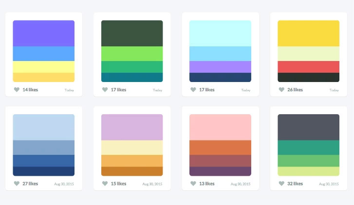
Stick to the color palette of two or three colors to keep everything under control. If you want to simplify the design as much as possible, use a monotonous color palette with several shades of the same color. A small number of colors does not cause mental fatigue and helps in creating a more harmonious appearance. The combination of perfect color attracts users easily while poor combination leads to distraction.
Moreover, add text-friendly and relevant images that look real and genuine. Picking a perfect palette and high-quality image can create a pleasing atmosphere and leave a good impact on visitors. Therefore, by selecting a complementary color palette and attractive images, you can enhance the user experience and also give a balanced-look to your website design.
Read More: 30 Free Sketch Gradient Color Palette Plugins for UI/UX Designers
Optimize Page Count
Does your design consist of many pages of information? Divide content into several sections, but do not force users to “click on” through many pages. If your website communicates efficiently with visitors, most probably they would spend more time on your pages. Get rid of pages that contain old, irrelevant information. In addition, by making relevant short headlines, paragraphs, cutting the waffle and using bullet points, it will help the users to scan your website easy. Therefore, keep content original, simple and easily palatable, which is easy to read and trust.
Use Standard Navigation

Navigation is always a great opportunity to communicate. Visitors usually begin their visit by browsing the headline. Everything is likely to look clear and visible, including your menus. An easily navigated site not only help the users to find the information but also helps the search engines. Follow the standard navigation pattern to make your site easier to use. A navigation bar at the top of the page, or slide-out navigation elements with 3-8 menu options, is considered best.
In addition, you can also follow the “three-click-rule” to help the visitors to get the required information within three clicks. Having logical and simple menus will no longer need sidebars with links to other pages. Stick on the primary menu will help the users to find the relevant information that they need.
Adopt Useful UI Elements
Putting too many elements on the page can distract the visitors. Therefore, icons, images and other user interface elements in the design should be used for a specific purpose. Do not tire users with excess elements. Plan and use them only where they accomplish a specific goal and make sense. Understanding the layout, consistency, typography, sizes, headings, sub-headings, and button styles will perceive the users to your site.
In addition, while finalizing the right fonts and colors for your texts, it is recommended that stick to them throughout the development. So, plan everything in advance because having a clean and fresh design of your website will make the website more appealing and also help navigate the users from one page to another seamlessly.
Take Care of Typography & Font Size
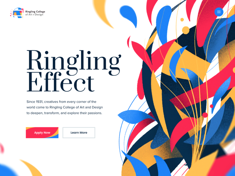
You should keep your typography visually appealing and readable for visitors. So, make proper combinations of typefaces for each and every design element like headlines, body texts, buttons, etc. The font families that are the most readable have standard shapes, line heights and are not embellished.
Solid font families come with several variations, so you do not have to look for additional fonts to highlight some specific parts of the text. Letters should be well distinguishable and readable and contrast with the background. You only need two fonts like one for the main text and the other for use in the design. Make your text clearly visible when the screens are getting bigger.
Read More: Discover the Modern Typography Trends in Web Designing
Also Read: Best Practices to use Typography in UI Designing
Use Appealing Call-To-Action
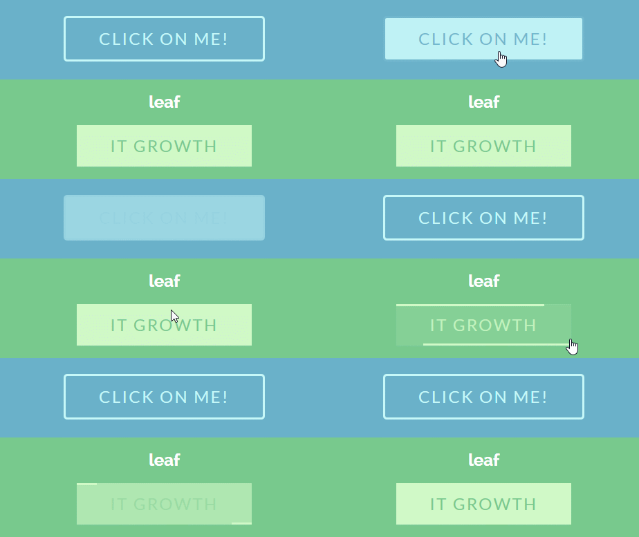
One of the new trends in web design is CTA (Call-to-Action) – a call to action. They increase the chance that the user will respond to the service offered by the site. Users click on attractive call-to-action buttons at least once and view the service offered. They create a unique experience of use in addition to the rest of the UX site.
Calls to action must be clear, large enough and occur in several locations so that users never get too far from this key click. Keep in mind that when creating Call-to-Action buttons you need to use calm colors that can attract the user. Correct CTA buttons will help to establish contact with readers. The most popular calls to action are “Sign Up”, “Request a Quote”, “Buy Now” and “Work With Us”.
Read More: Promising Interaction Design Principles For Boosting Current UX Designs
Mobile Compatibility
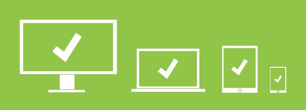
With the ever-growing usage of smartphones, tablets and mobile phones, having an effective and standard design of website is necessary so users can access it from anywhere to any device. The adaptability of the site is extremely important, as users increasingly began to view them from mobile devices.
Since users like this approach, working with adaptability has become one of the essential tasks of any site holder. With the availability of a number of web design companies, help their clients and customers to turn the desktop design into responsive and adaptive one for all screen sizes.
Page Load Time
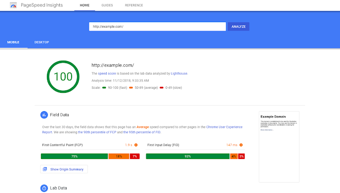
Visitors do not want to browse a site that takes a long time to load. Studies show that about 40% of all users will not continue to browse a site that loads for more than 2-3 seconds. Moreover, customers who are dissatisfied with their interaction experience will most likely not make purchases on the site.
You can increase the speed of the website by optimizing the images properly, combing code into a central CSS or JavaScript file as it reduces HTTP requests, and compressing HTML, JavaScript, and CSS for enhancing speed. Therefore, when developing a website, pay proper attention to page load times.
Read More: 3 Things that Make You Improve the Site Load Speed
Include Social Share Buttons
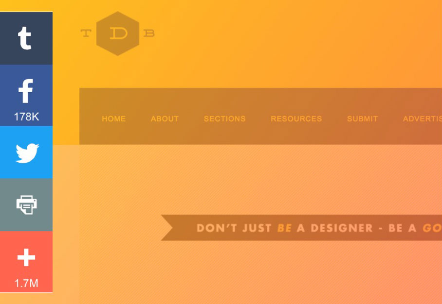 Source: AddThis
Buttons allow people to take action. Adding well-designed, attractive buttons to your website will increase the number of submissions, subscriptions, followers, and visitors. In addition, you can also share social buttons like Facebook, Instagram, Twitter, Pinterest, etc.
These interactive and appealing buttons will encourage the consumers to see more about your brand on these social channels. You can add these small buttons around the top or bottom of blog posts. Theses buttons also encourage social sharing from your buyer personas.
Prioritize Scrolling Over Clicks
Users like scrolling more than clicking. So, in order to present information into sliders and/or accordions, you need to put everything in one long page, including the stuff usually tucked away.
Therefore, if you want to spread the information about your product across many different pages, it is time to reconsider this technique. It will improve the appearance of your website, which looks more convenient to users.
Conclusion
With the advent of new web design tips, you can innovate the user interfaces more precisely. Get rid of all the extra items that stand in the way. Users love clear and easy to use design. So, accomplish your task when developing a website and bear in mind all these points that are mentioned above.
