Is your site shiny and looking just like you wanted it to be years before? But now it may not be serving its full purpose anymore? If so, it’s time to upgrade. Every website owner should regularly review their website design and look for opportunities to improve and redesign their website.
In this article, we’ll give you a detailed and comprehensive guide to redesigning your website. You can also get a detailed guide on how to write a web design RFP here.
- What is a website redesign?
- When should you redesign your website?
- The comprehensive website redesign checklist
- How often should you redesign your website?
- Some excellent website examples
What is a website redesign?
A website redesign is a detailed process that involves significantly changing the code, content, structure, and visual elements of your current site to better serve your visitors. When redesigning a website, a business owner would tend to reach the following goals: better UI design, enhanced online presence, greater user experience and higher conversion rate.
When should you redesign your website?
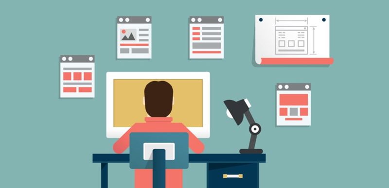
How can you tell if it’s time to redesign your website or not? Before investing valuable company resources into a redesign, you need to make sure you’re redesigning your site for the right reasons. Here are several factors to consider when deciding whether to redesign your website:
- When your business has changed. Your website acts as a speaker for your business and it is an important factor in attracting new clients and customers. As time pass by, your business embarks on a new strategy — developing a new unique value proposition, introducing a new product, deciding to target a new demographic, etc., but your website has not been updated to bring it in line with your new approach, and at the same time you are seeing a drop in traffic or a high bounce rate or lower conversions, then it may be the time for you to redesign your website.
- When it has an outdated and old-fashioned design. Best practices in web design are changing rapidly. The site that was intuitive to visitors five years ago doesn’t mean it is now. If your site has not been upgraded for years, you’re likely missing out on visitors or clients based on current trends in search engine optimization, user experience, and new technologies.
- When the site is not mobile optimized. There are too many people browsing the web on mobile devices, and if your site is hard to use on a small screen, visitors will click away and search engines will punish you in the rankings. So if your website isn’t mobile-friendly, a website redesign project is imperative.
- When your website is unsecure. Cyber security is one of the biggest concerns in modern times. If your site was set up years ago and hasn’t been updated since then, you are more vulnerable to website hacks and viruses, which means you need to upgrade it to enhance its security.
All in all, just consider the above factors to help you judge whether you need to redesign your website or not.
The comprehensive website redesign checklist
If your business needs to redesign your website after considering the above factors, then let’s get into the good stuff — our web redesign checklist.
Take an in-depth audit of your current website
Before you take these website redesign steps, you need to make it clear what goes wrong with your current website. You need to check the key performance indicators to see how your website is doing. When doing this, you need to take the following metrics into consideration: bounce rate for the home page and for main pages, total traffic to the site each month, top visited pages and conversion rates.
Create a temporary URL
Creating a temporary URL will prevent loss of business and damage to your carefully cultivated SEO. One of the easiest ways to do this is to copy your existing website and set it up in a temporary URL. Then, change and update your site from the temporary URL. Once you’re done with the redesign work, you can switch domain names and have your new site replace your old one.
Build a persona

Building a persona means that you need to pay attention to your visitors and design your site to meet their needs. It can help you get a basic sketch of the type of person you most want to reach. Personas allow you to map out the people you’re creating your site for, so it’s easier to get inside their heads and make sure your design approach is centered around their experience.
Look at your competitors and find inspiration
You need to check out the latest list of innovative marketing techniques, Google algorithm updates, current SEO best practices, and new keywords for your redesign inspiration. In addition, devote more energy to doing further research on your competitors’ websites. What are their outstanding features and what goes wrong with their website? Make a list of all the things about your competitors, try to do better design work than theirs and also avoid the mistake they have made.
Craft the content of your website
You do not have to start over from scratch while redesigning your website, because there are many pages you already have, but you need to look for ways to make them better. While doing the content mapping, you should try to find out the pages that are well optimized for search now and that lack a clear CTA. What’s more, you need to build content that can be repurposed into different formats and that can be updated to better drive visitors to take the actions you want. The most important part is to figure out the broken links or other issues contributing to high bounce rates.
Redesign your website
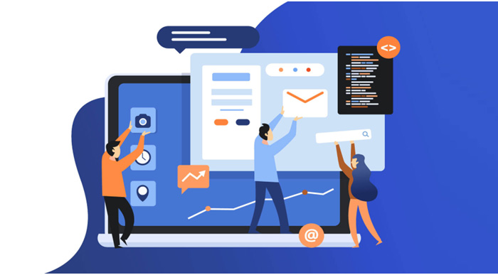
It’s time to begin your design phase after completing a content plan for your website. At this phase, a product or website designer need to create the wireframes or prototypes for the new website first by using some prototyping tools like Mockplus, Axure, Zeplin and etc. After that, you need to begin the UX/UI redesign process. This may include aesthetic changes, updating outdated content, refreshing keywords, checking and replacing links, replacing old images and more.
Develop and code your website
At this phase, you need to dedicate ample time for the site to be developed and coded out cleanly. The flat design mockups that were created will be transferred into HTML, CSS, and other languages to make the website functional. What’s more, you should be checking for cross-browser functionality to ensure a consistent experience for all users. This reassures you that your site will show up exactly as expected, no matter what browser your users use, they will have the same fully optimized experience.
Optimize your website for mobile devices
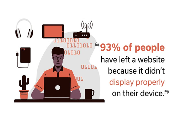
The website optimization for mobile devices can not be missed out, because people will 100 percent look for your website on their smartphones, thus making your website’s design mobile-friendly is a must these days. Keep in mind that a proper mobile web page will not have the same design as your desktop web page. It should be minimized and formatted for easy reading on handheld devices.
Test your website
After completing the above steps, you need to test your redesigned site now. You also need to make small changes to improve it a few months after launch. One way to do that is with A/B user testing. This form of testing uses two versions of your site to see which elements drive traffic and engagement. If any problems have been tested out, you need to have your developers or technical people ready to quickly fix those bugs and issues before launch.
Launch your new website
You’re almost there! After months of auditing, planning, design and development, you’re finally ready to launch your new site. You’ve paid a lot for it, and now it’s time to show it off on social media and in newsletters. Post it on the web, but pay close attention to your site analytics to see how it works. Track-specific metrics against your stated goals, see what works, and then continue to fine-tune your design based on that data.
How often should you redesign your website?
At this part, I need to make it clear that there’s no one-size-fits-all approach. But in general, business owners should redesign their website every two to three years. However, it depends on the trend in your business and your industry. With technology constantly changing, new web design techniques seem to be implemented every month, and you may have to redesign faster to keep your site looking fresh.
What’s more, if you don’t want your site to be redesigned again in a year or so, you can choose to work with an experienced web team that uses modern design trends and technology. An experienced web designer or design team will create a modern design that will look fresh and innovative for at least the next few years, which can help you save a lot of time and effort.
Some excellent website redesign examples
User testing
User Testing‘s core product dubbed a “Human Insight Platform“, is a usability testing tool that is claimed to provide on-demand insight into website behavior and user experience.
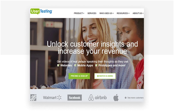
Before the web redesign, the homepage was dominated by a three-slide carousel promoting sign-ups for the main user testing service and CTAs pointing to additional services. Apart from the risks inherent to carousels, the second and third slides felt unclear and unlikely to generate the intended leads.
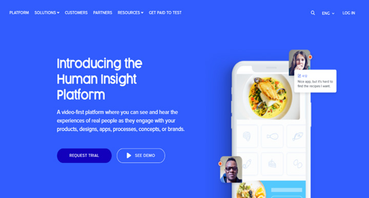
After the web redesign, its home page is a breath of fresh air with bright blue color. The number of words has dropped by 25 percent, making it much cleaner. After improved top navigation, the carousel was ditched in exchange for clever, professional and inspiring illustrations, with bold value propositions and striking CTAs, which can help to generate more leads.
Mockplus
Mockplus is a great web-based platform for your whole design team, all of your team members including product managers, UI/UX designers and developers can do their work and collaborate on this platform. It can provide you with a seamless workflow never seen before.
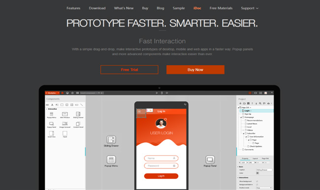
Before the web redesign, the look was a little outdated because of its background color. Speaking of the web layout, it has top menu navigation followed by a super-clear value proposition, followed by more detailed feature descriptions and two clear CTAs, making it a responsive page, but that doesn’t mean that it couldn’t be improved.
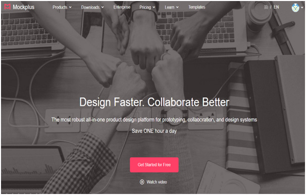
After the web redesign, it looks totally different, while remaining somehow familiar. As the business has changed, the designer also changed big font headline words. Under that, several words invite you to get a quick guide of Mockplus. The final CTA has a bright red color to get you started, which is less scary than diving in and buying the product right away.
Global GRAB
Global GRAB Technologies, Inc., is a leading provider of perimeter security products and services with its headquarters in Franklin, TN.
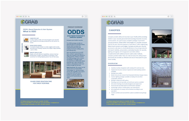
Before the web redesign, the homepage is text-heavy and outdated and lacked intentionality. The small images on this page don’t speak volumes about the company’s unique products and services. In short, the old site page does not accurately represent the worldwide authority on perimeter security.

After the web redesign, the brand colors weave throughout the website. And the page brings the value proposition front and center. It clearly tells who Global GRAB is and its services, it also features moving video on the home page, bold calls-to-action, icons to designate the different offerings, testimonials, blog articles, and more.
NeilPatel.com
Neil Patel is a New York Times Bestselling author. He was recognized as a top 100 entrepreneur under the age of 30 by President Obama and a top 100 entrepreneur under the age of 35 by the United Nations. Here is his website.
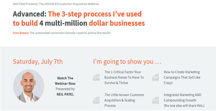
Before the web redesign, the homepage is focused on his webinar, which he was heavily promoting at that time. Since then, though, his focus has changed, so he redesigned the homepage to concentrate on collecting new leads.
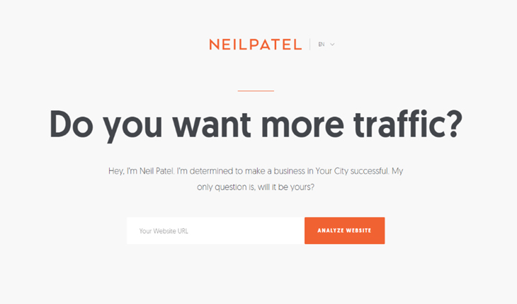
After the web redesign, it clearly shows who is he and how can he help to build your commercial success. The color scheme or his font choices has been changed, but for the most part, it has the same feel. And because the previous design was no longer compatible with his marketing strategy, so it had to change.
In conclusion
You need to bear in mind that when considering starting a redesign project, the first step is always to evaluate why you want to redesign your website. You need to have sound reasons behind your redesign decision and the above content about “when should you redesign your website?” can help you to make the right decision.
After that, you need to make sure you understand things like what current assets you have to work with, what areas of the site do you want to improve, and what goals will you track to see if your redesign was successful? You can follow the above comprehensive website redesign checklist and you can’t go wrong.
