Engaging website design is in hue nowadays. Stay updated with latest web design trends for a clean yet a sophisticated design that makes website shine throughout your business. Today’s modern website design has taken a big leap towards shifting their focus on creating an elegant, mesmerizing blend of amazing typography and eye-catchy images that will make visitors lure into exploring more into their hidden stuff.
In the dynamic world of web design, staying attuned to the latest trends is essential for businesses aiming to make their mark online. As we dive into 2023, it’s crucial to keep a keen eye on the top 10 web design trends that are poised to shape the digital landscape. These trends are more than just aesthetic preferences; they have the power to redefine user experiences and elevate your web presence. Whether you’re a seasoned designer or a business owner seeking to enhance your online footprint, these trends will be instrumental in keeping your web design services in New York at the forefront of innovation and user engagement.
Best Website: Ultimate Web Design!
Creating your dream website keeping in mind all these essential checkpoints in mind is necessary to get the most out of your newly designed website. The best part is that developing such amalgamation of diverse colors from your palette actually helps to attract some new potential customers and pitch a higher number of sales for your business.
This is the reason why people look for unique web design layout ideas that do their magic and make others fall for their exotic design.
Just as food is first relished by your Eyes, Your website design marks the First Impression to Your Website.
It thus becomes mandatory to follow the current website designs trends and the various elements that form an indispensable part of this entire process.
It’s time to unload the New Web Design Trends that will keep your online audience motivated and put life in your web design.
Top Web Design Trends to Follow
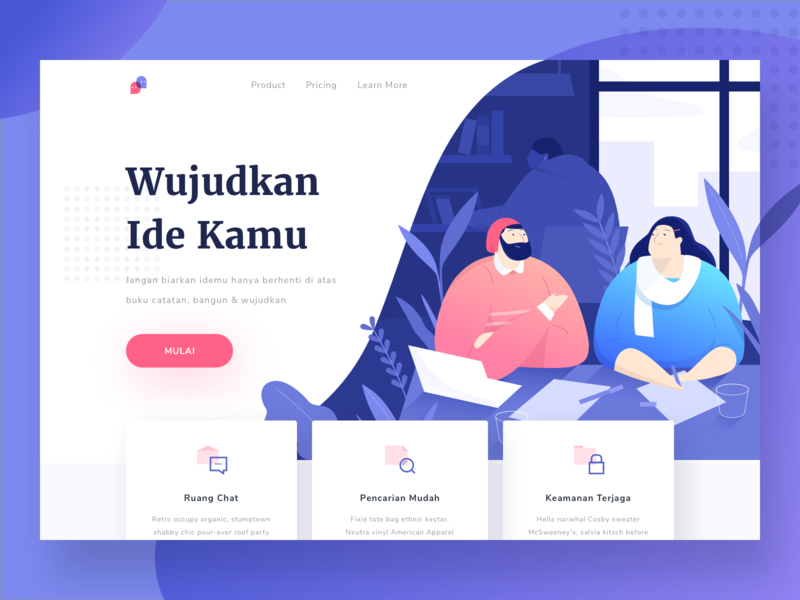
Design an Illustration Masterpiece
Everyone loves to see and intercept the message via illustrations than reading long texts. Why waste your efforts on thinking the best words for describing your website. Let the image do the magic!
You can check out Dribbble to watch some awesome illustration designs of some best websites that will just blow your mind. It is essential to always keep a clear view of all your ideas about your ideal website design. Or you may choose to get your illustrations from reliable illustration services.
 |
 |
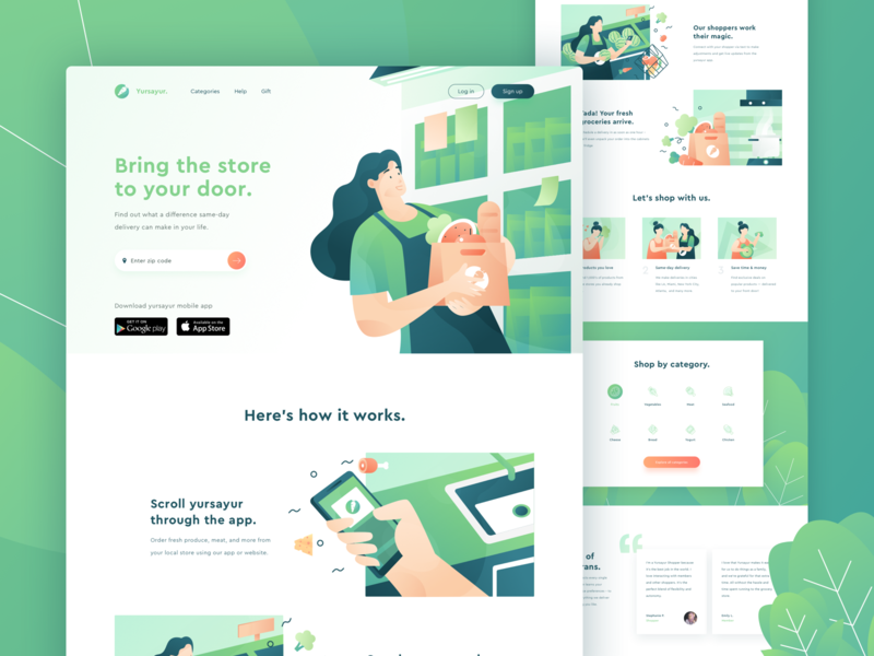
This creative landing page design by solechan for Paperpillar is just an apple to the eye. The illustrative perfectly depicts the communication and how to connect effectively.
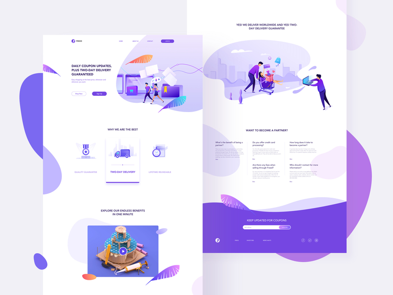
This exclusive design by Sigit Setyo Nugroho is a perfect example of illustrative art. The excellent blend of colors in this web design makes it the most jaw-dropping design to make your day.
The e-commerce design speaks louder than the words. Designed by Jenson Z. for Queble, this is very lovely and you would love to feel the effect from the eyes.
You may also pick your favorite web design layout idea that will help the designer in easy identification of what type of website you are looking for and the right illustrations to save the efforts.
Large and Variable Typography
Newest website designs are a perfect blend of LARGE and BOLD font styles that easily catch the eye and it goes on to depict the right message directly without any hassle.
 |
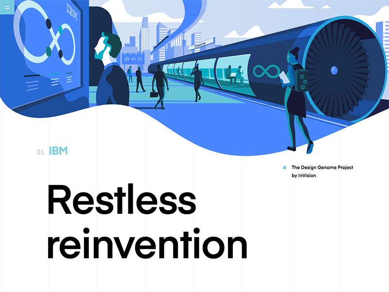 |
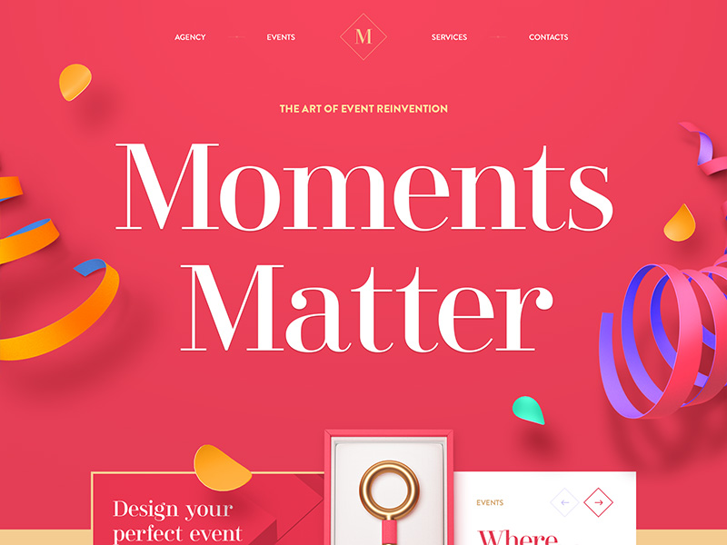
This typography in this website adds sugar to the already beautiful website design by Mike – Creative Mints. The font used creates a direct influence that pleases the audience.
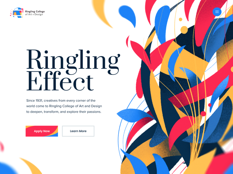
Don’t miss this easy-going typography found in the homepage design by Eddie Lobanovskiy for Unfold. It represents typo-simplicity along with some clean design.
Another report for the design genome project by Jack Daly for InVision.
There are numerous unique font styles – a little curvy or elongated and elaborate styles that give us that old nostalgia feeling! Kick it with the perfect combo of font styles alluring your eyes for more.
Be Choosy, Don’t Settle For One Style.
Use Bold text in Moderation and choose the right font style that suits the color theme of your full website, highlighting the core message with their subtle and simplified look.
Immersive 3D Art On-the-Go
Push your thoughts to cross the lengths and breadths of the 3D world. The future calls for more real things, immersive 3D designs open up its horizons by offering a gate to traverse between the physical as well as the digital world.
 |
 |
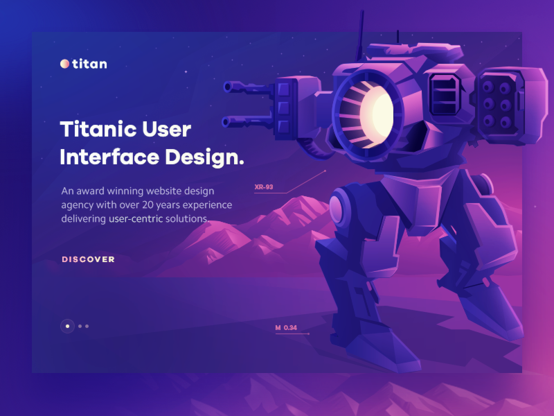
Deep dive into the Titan’s 3D world with this web design for Walid Beno for Artland. You will love the custom titan concept that treasures in realistic 3D design.
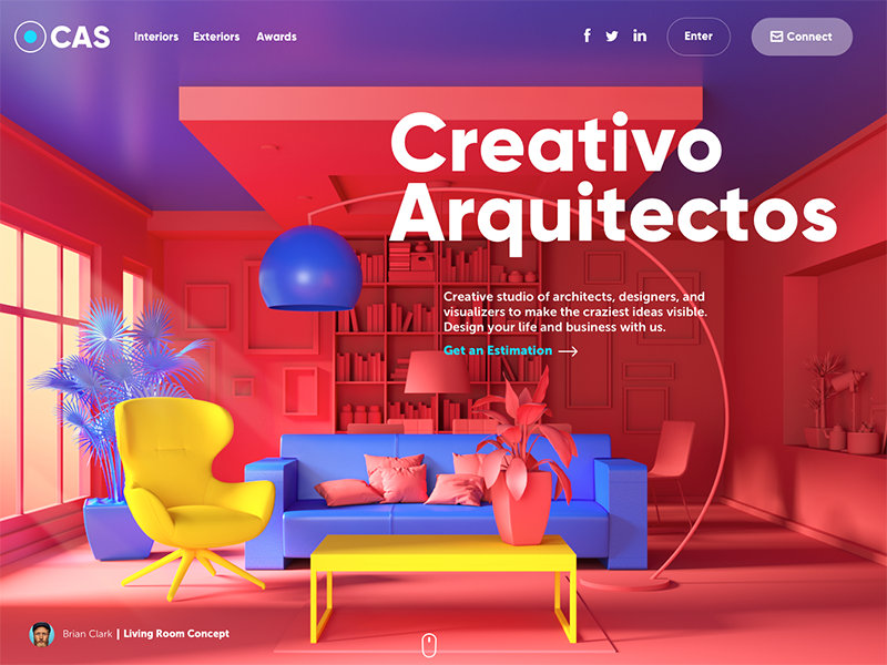
Architecture website by tubik is a free show of different dimensions converging together.
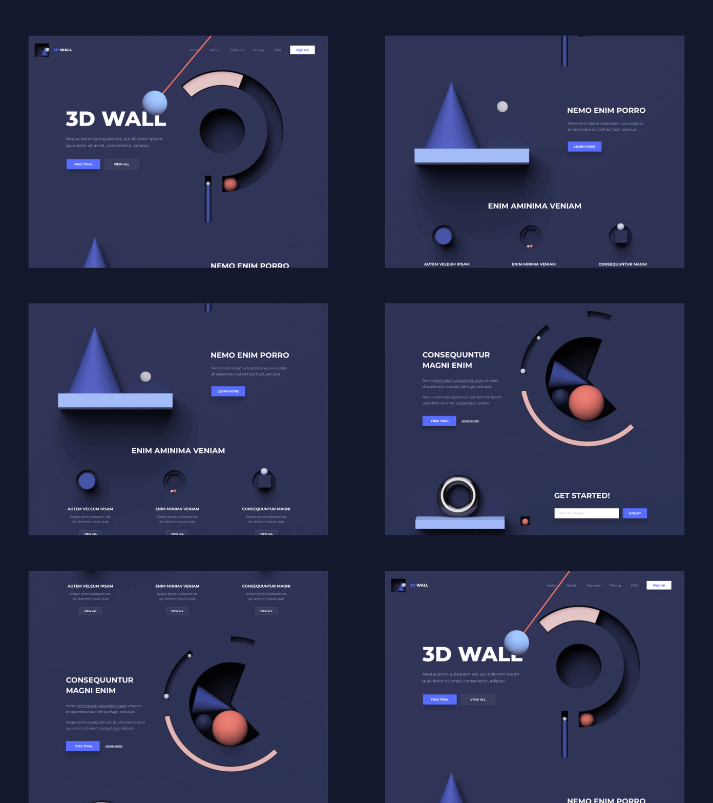
This exotic 3D landing page by Outcrowd is here to give your designs a new height that will surely astound the visitors.
The essential part is to know the basic elements of 3D designs that you are about to design. Be wise, build a prototype first. Use the right prototyping tools and get some designs ready so as to understand the client requirements closely.
3D uplifts the bars for engaging user experience by rendering an extra-support to digital elements that get growth in surreal approach. Many designs come packed with an expressive and beautifully laid out art.
When there is a rush of impressing the audience, 3D becomes the working key!
A First-hand to Intricate Interactions
Focus on creating a delightful experience for users and adding pervasive interactions is the on-the-go solution for it! Make your presentation high-end with a personal touch of grabbing the attention of users.
Flowing information with a pinch of animation brings out the perfect beauty of the website. But mind you, No need to go overboard here. Explore your creativity and build a thumb-friendly navigation arrangement that will count in as a simplified answer to all the people crying over bad experience calls.
Simple Micro-interactions on Hover, scroll, and others feature more sophisticated outputs.
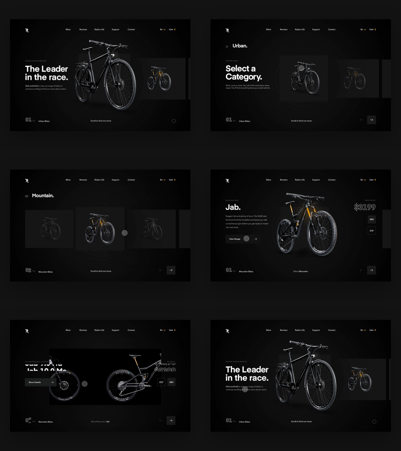
This prototype by Matthew Hall for MakeReign describes the use of micro-animations to make users understand the use of simple interactions.
Native shoes by Marianna Ustyanovska is a blend of several colors and creative user interactions.
Fluid UI + Interactions by Cuberto’s design are just spell-binding. Anyone would love to shop from such a creative website.
When you get your hands on modern web design trends, you will find a minimalistic design strategy pulled together with interactions that will steal user’s mind and create a considerable performance.
Eye-popping Isometric Graphics
A well-structured and systemized design form is what isometric graphics are all about. Infuse isomerism into the website’s design with large orthographic projections, rotating objects, perfect scaling.
Isometric designs bless the website with highlighted explanation and absolute creativity.
Like many polygon designs, these integrate a modern space to indulge in both value and organized design capabilities, use of several optimized isometric shapes boost the website’s impact manifolds.
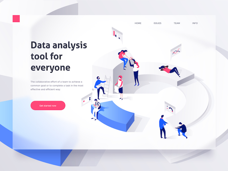
These two web designs by Dmitrii Kharchenko provides a close picture of exploring different styles and presenting them in a well-structured layout.
Bitcoin mining by Walid Beno for Artland are creating a cool isometric reflection that elaborates the concept more prominently.
The best technical isometric designs depict the message in a colorful way and emphasize on the wonderful side of maintaining an exciting web design.
Small Animation Touch-ups
Visual objects are said to hold a strong grasp on the web market. Where images create a static design, small animations comfort the website with its interactive content.
People tend to remember about 80% of what they see and do than other media forms. Quoting some highlights of what you are about to do provides a glimpse that delves into the corners of your mind.
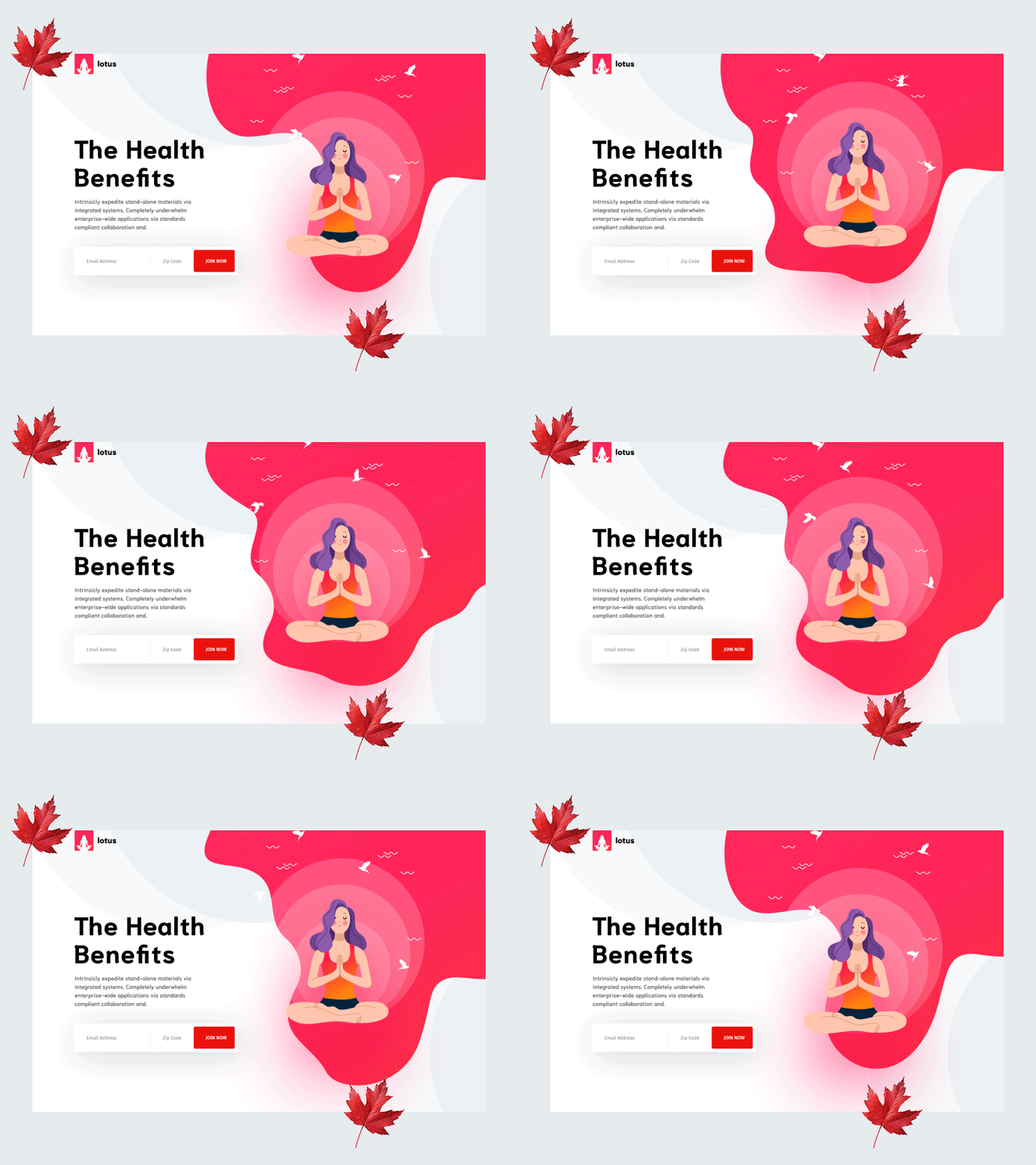
This simple yet effective animation design by herdetya for Plainthing Studio gives an appealing look to the website and spreads the message in the best way.
Yoga Hero animation by Eftakher Alam translates the yoga balances life in a perfect way with is bright colors and well-structured design.
The complete process exploration by Permadi Satria Dewanto for Plainthing Studio will let you travel their site virtually, straight from their animated video.
Use some of the ultimate animations with Adobe XD to enrich your website with some nice animations and flare up the world with easy to go designs. This helps in auto-creating a crisp video that fills the user’s eyes with best web design inspiration.
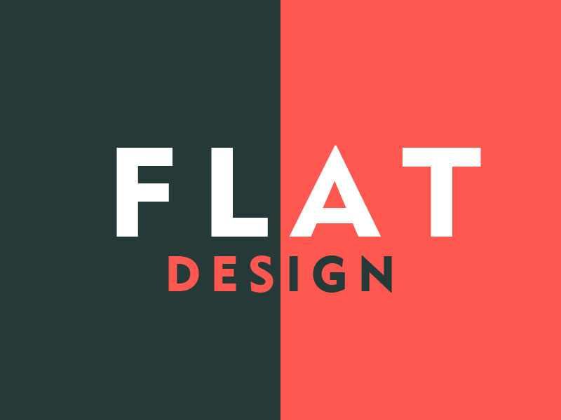
Flat Web Design Trends
The subtle way of incorporating art and mature web design is Super Clean, No Complex design. For getting a better insight, look at these simple flat web design inspirations and you will surely forget cluttered designs for life.
Simple colors, impressive typography and brilliant images together give out the best flat design for your upcoming website that will beat every other design.
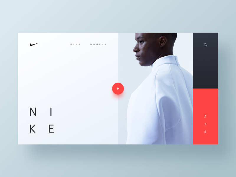
Bold minimalism by Nike’s brand produces a futuristic design with high white spaces and only a few words.
Overlapping flat designs by Sasha Turischev for Zajno Crew in Innovative Eye Pillow is driving fast with less complexity.
Simple yet gorgeous design by Gabe Becker for Ramotion makes you feel minimalism at its full.
Flat designs are not Boring! Rather it is evergreen, it never fades away!
Flat means reducing the waste and bringing what actually matters: Content. This design approach is dominating the world with its timeless trendy websites that never lose their valuable clients.
Adding More <video> Tags
Videos are the best way to engage users into your Work!
The key to Seamless web design is explaining more through less and often when other images fail, Videos bring the solution to the point! You can easily add any YouTube or other video content that perfectly matches your idea.
Not just Videos, GIFs will do the needful too!
GIFs are easy-to-go, compact and readily usable videos, full of enriching color and helpful in devising a crisp explanation for the right image to be used. You will see an instant hike in the number of visitors with this little addition to your web design.
Organic and Abstract type of Natural Shapes
There are a plethora of natural shapes that create a large influence than the other simpler objects. The website looks more engaging and subtle. A shape in a website design makes a user’s experience super original, impactful and bright.
Shapes add a distinctness to the website. One can easily differentiate between all the screen objects. Any floating shape such as a triangle or other polygon will show its real magic with the refined definition and a layered structure.
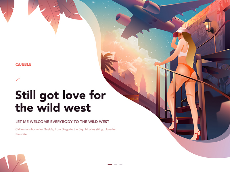
Visit the raw shaped world of Jenson Z. for Queble for its intensive design.
Panda Bank’s landing page has treasured the feelings of natural shapes catching the eyes of the users.
Your Travel Guide has got a lovely eye-grabbing user interface that has scattered shapes using them in the best way.
Designers know how to convert a simple-looking website into a closed-off polygon-based design. Surprised? Check out some best abstract shaped website at Behance, you will get a working idea of how shapes explain the design better.
Extensive Scrolling Effects
Fading elements while you scroll, expanded images and any other comprehensive scrolling effect eases the work for a user to become smart enough to understand its functioning.
Scroll down and you will see a beautiful and impressive web design style. There are two main things backing up this thing, improving website’s readability and imparting a unique feel to the website.
Open, look and look more down to feel the ultimate expression of your design!
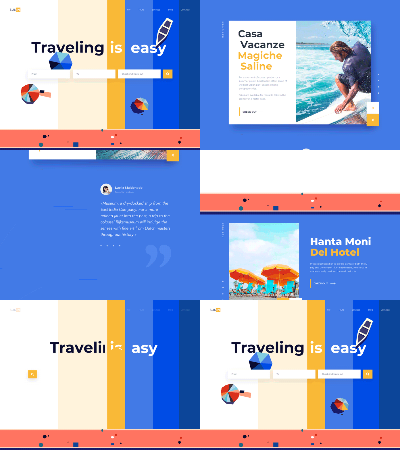
Check this travel and Garden designs by Outcrowd which reflects simplicity and elegance hand in hand. As you scroll, you see different objects popping up.
You will definitely love scrolling Steakhouse homepage by Patya Pindo for Sebo owing to its tantalizing design that uncovers a new element as you go down.
If you want to level-up the website’s design strength, it is necessary to bring out the amazing style and feature some great mesmerizing effects that will help in balancing the design’s art and excel in unique self-speaking user experiences.
Elegant Colors Right off your Palette
Remember, Right Color means Right Effect!
Touch people through the vibrance of different colors gradients in web design. From adding a personal touch to extreme color combinations in the form of overlays enhance the minimalistic approach.
Different textures and colors bring a realistic feel to your web design and people love to connect with a website through their Color scheme.
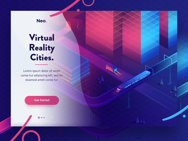
You must check this selection of colors and creativity of Walid Beno for his Virtual Cities design that is just superb!
Like little girls fall for Pink and little boys for Blue, make your website personalized by rejuvenating the audience with a fresh set of colors that make their experience on your website a memorable one and they learn your domain name for life.
Maximize the View with Full-Screen design
When you look at some beautifully designed websites that are actually focusing more on creating an impact from the view, Go for a Big Screen.
This web design trend is as appealing as it can be. You will create a cinematic experience for the user with a large image defining a Wild shot with minimal Words as the image speaks for itself! It truly justifies the Words: Less Is More!
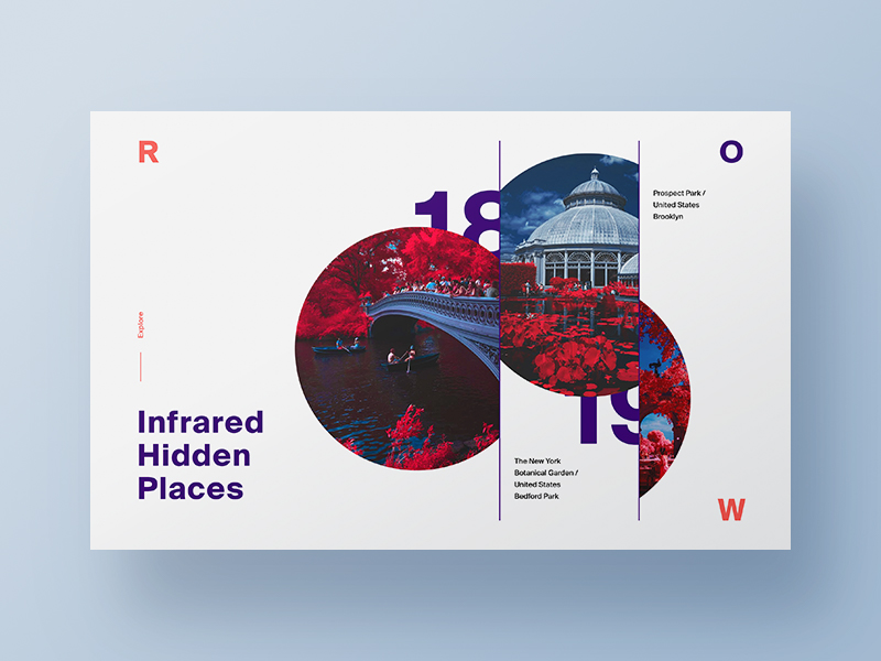
With endless possibilities to get the best full website design such as this Visual Exploration by Nick Taylor that truly assembles all the corners and provides the ultimate experience in no time.
This Jelly Agency design by Manoj Rajput for Mindinventory makes us reckon the beauty of simplified design approach that complements well for people loving a no clutter design methodology.
Also, this Façade design by John Hall for NICE 100 is a live example of how full-page web designs must be designed.
Such designs are a feast for people as they offer more responsiveness and more returns with least effort. You will see the navigation bars hidden completely or occupying a corner position.
Some Final Words
Every year we experience new trends stacking along the previous ones displaying the revolution of newest website technology. From simple line strokes to complex subtle designs store a place in the mind of the user if created well using the right approach and experience.
What are you waiting for? You know the new trends in web design now, go get some more web design inspiration from some famous websites such as dribbble and behance to know where the world is reaching.
Showcase your business in the form of a wild terrific website or an exciting simple design that dazzle up in the eyes of the users to get the rustic touch of modern web design trends. Numerous classic graphics that are put in along with the other elements to get the most out of your web design. See you guys!
