A banner ad is one of the most widely used and visually appealing methods to catch your target market’s attention and boost conversions. These graphical advertisements may be seen at the top or down the sides of many pages online.
Banner ads are incredible—they help drive potential customers along the sales funnel and may be helpful for various other goals, such as generating brand awareness, getting more people to sign up for your newsletter, and even generating more sales.
Globally, Banner Ad expenditure is expected to reach US$155.00bn in 2022, demonstrating the segment’s potential as a cost-effective tool for attracting new customers.
Businesses widely use banner advertising since it is inexpensive, quantifiable, and successfully boosts brand awareness. Knowing your audience, creating engaging images, and writing compelling text are all essential components of effective advertising campaigns. But your skill at developing banner ads is also crucial to their success. They ought to pique the interest of your intended readers and prompt them to take the desired action.
Read on to know what banner ads are and the nine tips for using banner ads to generate more leads.
Understanding Banner Ads
Advertisements in the shape of banners often run over the top, sides, or bottom of a mobile app, television show, or website. A primary goal of banner advertising is to redirect visitors from the hosting site to the advertiser’s site. Banner advertising is designed to increase brand awareness and drive traffic away from the host site and onto the advertiser’s site. Ads like this often employ eye-catching visuals and animations to attract readers and encourage them to click through to the advertiser’s site.
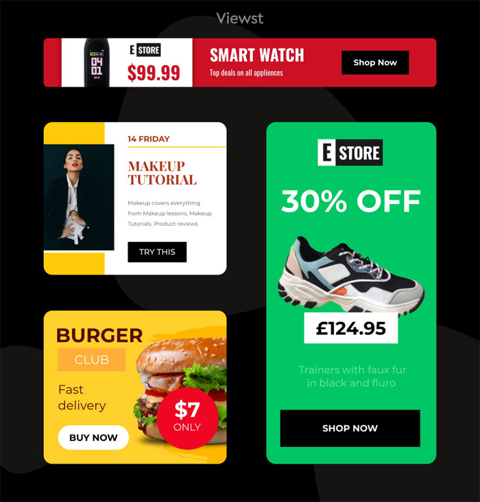
Banner advertising often takes one of two forms: horizontal ads that run across the top or bottom of the screen or vertical ads that appear in the sidebars on the left and right. Skyscrapers are tall, rectangular banner ads in the margins to the left and right of the host page. At the same time, leaderboards appear at the top and bottom of the host page.
Banner ad design tips to boost your conversions
Banner ad design optimization is crucial to the success of any marketing effort. Here are some tips to improve your banner ad designs and get more customers to buy.
1. Affiliate with a display network for your agency
Several display networks are available nowadays. Choose a reliable one — create a banner online with Creatopy to best suit the needs of your advertising campaign and easily customize your visuals, and automate your ad production while working synchronized with your team perfectly.
Use this simple tool to develop display advertising campaigns that will help you connect with your target audience when it matters most to them. Creatopy is a platform for making dynamic and static banner advertising for use on Google Adwords, Bing Display or Google Display Network.
Ad objectives, such as impression and click counts, should be discussed with the display network to ensure that the intended statistic is being monitored.
2. Choose a dynamic or static layout
Before you can begin designing your advertisement, you must complete a few preliminary tasks. Choosing between a static and a dynamic banner is the first step.
All the parts of a banner are still in a static banner. They’re a lot less of a hassle to make. However, dynamic banners incorporate movement to catch the viewer’s attention. The image may be a moving GIF or video, and the accompanying text and buttons could also be animated. These banners are more complicated to make and possibly more costly, but they may also be more effective. You should select this choice before you begin developing banner ads since doing it later on, is a tedious and time-consuming process.
3. Include your logo, USP and a call-to-action
There are three essentials for all display ads, regardless of the product being promoted. One of the essential parts of banner ads is the logo, which helps promote brand awareness. Ensure your audience recognizes your brand’s content to continue engaging with it. Advertisements may include logos in various ways, with the logo either taking center stage or appearing at the very top or bottom.
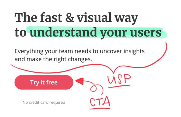
A unique selling proposition (USP) is critical to every successful marketing strategy. It explains to them what it is that you sell. Your unique selling proposition (USP) is where you spell out precisely what they will get from clicking on your ad.
In conclusion, a call to action is a brief, uncomplicated instruction that specifies the next step the user might take to proceed with the engagement. Phrases like “shop,” “purchase,” and “find out how” are all call-to-action verbs that prompt the user to interact with the ad. Users’ pain points your product addresses might also serve as a point of differentiation.
4. Create several versions of your banner Ad
Before making your banner, it’s also essential to decide on the size you’d want it to be since there are various banner types to choose from. Considerations such as where on the site you wish to display might help you select the optimal size. The more the variety of ad formats used, the greater the number of potential ad impressions.
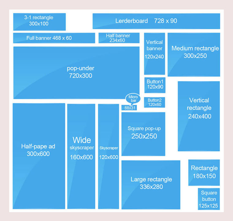
However, because not all websites use the exact sizes for digital ads, it might be time-consuming to create many copies of your banner in all the accessible sizes. However, you may choose from a commonly recognized standard for making banner adverts. Google has identified the following ad sizes as its most effective.
- Leaderboard: 728 × 90
- Large Mobile: 320 × 100
- Half Page: 300 × 600
- Inline rectangle: 300 × 250
- Large Rectangle: 336 × 280
It is also suggested to try out these banner sizes if you have the means to do so:
- Large leaderboard: 970 × 90
- Main Banner: 468 × 60
- Wide skyscraper: 160 × 600
- Mobile: 320 × 50
Find out which websites will be using your banner advertising before you start developing them. Your ad may be modified to match any standard size, allowing you to post it anywhere online.
5. Use contrasting colors to establish your brand
The use of vivid colors is immediately aesthetically pleasing. A well-balanced composition, cohesive concept, or beautiful color palette may accomplish much. For a banner ad to be successful, personal branding is crucial. You shouldn’t simply put everything in there, but with some careful thought and some branding brainstorming, you can come up with a fantastic color scheme for your advertisements.
Users may forget whose ad they saw if you don’t identify yourself. However, if they remember you, they may return and convert. Using a consistent color palette in your marketing is a great way to build recognition among your target audience.
You may include elements of your brand’s established theme and logo in your banner advertising. Use your brand colors in the banner ad if they are consistently used elsewhere on your site or in your marketing materials. Even if no specific color scheme is presently linked with you, color may still be a powerful tool. To make your advertisement more noticeable, you might use contrasting colors, and you could use those colors consistently in your marketing.
6. Incorporate high-quality images
The impact of an advertisement may be affected by the use of visuals and framing. Banner ads effectively capture the viewer’s attention with a striking image. Thus, it is crucial to choose high-quality graphics while doing any design work. They should be adequately proportioned, not stretched or shrunk. Your banner ad should instantly convey to your audience something about your brand, such as what you offer, what you stand for, etc., simply and understandably.
If your ad has a button, choose a color for the button that contrasts with the backdrop.
7. Keep banner ad fonts simple
Brands often use difficult-to-read typefaces leading to a common branding faux pas. Avoid using cursive typefaces, tiny font sizes, or all capital letters. Pick legible, basic typefaces when developing your banner ads. Keep things as simple as possible to get your point through without turning off potential readers.
Headers and descriptions should always be presented in clearly different typefaces or sizes. It’s recommended that you use as little text as possible. In addition, use no more than one or two distinct typefaces for the whole of your advertisement’s content. Ads using a lot of specific typefaces are harder to read and hence more likely to be ignored.
8. Optimize your page to load quickly
To maximize click-through rates, your banner ads must load swiftly. Most consumers will click the “back” button before an ad has finished loading if it takes too long. Videos and other moving images may be effective in specific contexts, but they also have the downside of decreasing page load times to the point that consumers are less likely to stay around to see the ad. Create ads that people won’t mind seeing by making sure they load swiftly and invisibly.
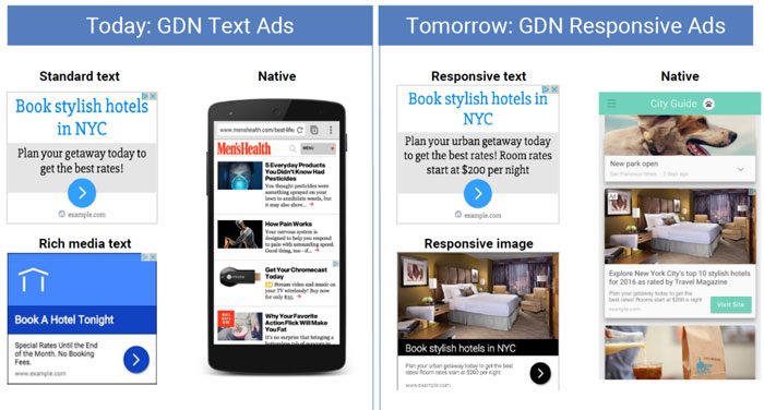
9. Create a responsive banner ad
Every person who views one of your adverts won’t do it on the same website or even on the same gadget. For this reason, your advertisements need a responsive layout. Advertising that is “responsive” adapts its design to the device used to see it.
Ads may adjust their size and position to fit whatever screen they’re being shown on, just as websites can. To maximize the impact of your advertisements across a wide range of devices and users, consider adopting a responsive design strategy.
Wrapping up
The digital advertising landscape has provided business owners and graphic designers with a richer canvas for designing banner ads for conversions. Quality results are achieved through carefully integrating visual concepts and promotional approaches.
If you’re ready to launch a banner ad campaign, you don’t have to do it alone—you can team up with an agency with extensive experience in paid advertising to develop the ideal, clickable ads for you if you are either not a professional designer or too busy operating a company to devote time to design them yourself.
