A logo is a very important part of a company as it has a significant impact on how the company is perceived by the general public. A logo is meant to effectively convey a brand’s image and message. It is basically the face of the company and has the strength to make a lasting first impression on the customers. It is capable of influencing the brand perception of the client as well as their purchase decisions and overall attitude towards the brand.
![]()
A logo design has the potential to make or break a business. A perfectly designed logo communicates the right message to the audience creating an excellent brand reputation. Effective communication with their customers is paramount for businesses to thrive. Marketers strive hard to ensure people’s engagement with the company in many possible ways. A logo, being the face of the company, is the visual tool to attract potential customers’ attention and interact with them. Professionals from graphic design services are in high demand for designing logos needed to create a brand identity.
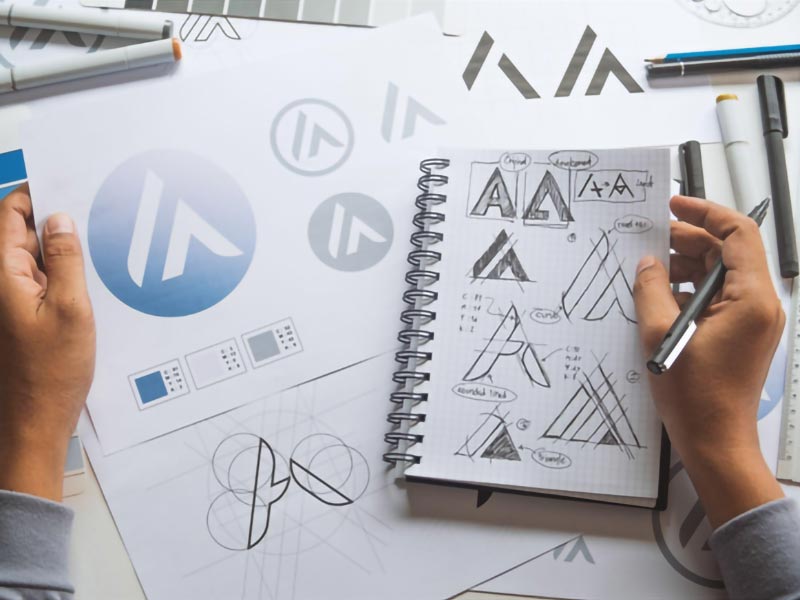
Logo designing is not all that simple as you may tend to think. It can be overwhelming at times. There is much more to creating a perfect logo than just placing your company’s name in a specific shape and size and bringing it to fruition. From selecting the right colour combination to the font size and styles to shapes and images, a lot goes into the process of creating that perfect design.
Effective Tips for Creative Logo Design
Know the Brand and the Target Audience
It is important for logo design services professional to have a thorough understanding of their client’s brand and the target audience. Do research about the business and ask your client all the right questions that can help you create a truly great logo. Knowledge about the nature of the business, its history, products, and services offered, the audience it caters to, and their expectations, all go into creating a perfect logo.
Use of Visual Double Comprendre
This technique has been used in some of the most acknowledged logos of all time. It is called a visual double comprendre because the logos have a hidden meaning in the image. It is an amalgamation of two pictures blended in such a way that a single logo design communicates two concepts at the same time.
Understanding the Colour Psychology
Usage of colours plays an important role in logo designing. Different colours portray different meanings and enable a logo to communicate ideas. Colours breathe life into the visual illustration of the concept. It is crucial that you understand colour psychology and use it judiciously to make a perfect logo.
Keeping it Simple
Irrespective of the style or design pattern you choose for your logo, its essence must remain pure. It is a test for your presentation skills to make creative logos. It’s a good idea to follow the KISS (keep it simple stupid) rule and keep your focus on the essence of the company. KISS is a design principle that says most systems work best when they are kept simple rather than made complicated. Enrich the design with creativity and give it a timeless appeal while keeping the overall design simple. Use creativity to explore simplicity.
Avoid Using Clichés
Every year new design trends come up and are followed by many designers and then they become clichéd. The style is used over and over again by different brands and the originality in logo designs is lost. Very quickly the design trend loses its sheen and becomes passé. There is low recall value and the brands lose their recognition. Being in graphic design services, it’s essential that you understand the importance of creating unique designs rather than follow a trend and make run of the mill designs.
Make It Proportional and Symmetrical
Many designers don’t give much importance to symmetry and proportion while designing a logo. However, every image has its own weight for which balance is important and a symmetrical and well-proportioned design gives the much-needed balance to the image and gives it a pleasing look.
Use of Negative Spaces
Similar to using double comprendre, negative space utilizes the empty spaces between the images to communicate a hidden message to the audience. Negative image logo design is creating an image by utilizing the background of another image. It is an ingenious way used by many designers to convey a multitude of thoughts and vision while creating unique logos for businesses. Take for instance the FedEx logo which has a hidden arrow between the letters E and X.
Adding a sense of motion in the design
An exciting fact about designing a logo is the concept of action in an image. This is not always incorporated in every logo. As a company evolves it makes sense to tweak the logo to convey it’s trajectory, like it has been the case with the Twitter logo. This concept of motion is more suited to designing a mascot logo, like that of games.
Making the logos Versatile
As mentioned earlier, a good logo is timeless and can be used for multiple purposes. Where colours enhance the beauty and appeal of the logos, versatility makes it fit to appear on many different platforms. Apart from social media and electronic channels, it has to look good on the company’s website, business cards, banners, letterheads, etc.
A graphic design services professional has to be well versed with all these concepts of creative logo design to make that perfect logo.