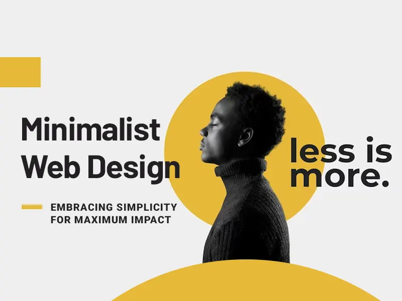
There is one timeless principle that continues to captivate both designers and users alike, and that is minimalism.
The concept of “less is more” has never been more relevant in a world where information overload has become the norm.
Minimalism in web design is a philosophy that seeks to declutter online experiences that allow the website to shine with remarkable clarity.
Minimalist web design offers a breath of fresh air that invites users to engage with content more meaningfully.
And if you want to build your website with a minimalistic design, there are many website design companies nj, Miami, Houston, and other states of the US.
This means you’ll easily be able to create your website with pleasing aesthetics. However, there can be variations in the cost of building a website.
For instance, the charges for website design in New Jersey can be around $4000 – $10,000 for a custom small-business website. And if you’re in Houston then it can be around $2500 – $10,000.
In this article, we’ll walk you through the insights for a minimalistic design and how it can positively impact your business website.
So, without any further ado, let’s get started!
Striking the Perfect Balance
Finding the perfect balance between simplicity and functionality is one of the most critical aspects when it comes to crafting a minimalist web design.
This is because you have to make sure your website remains intuitive and user-friendly for every visitor.
Firstly, implement a well-organized menu on your website with clear labels that describe the content accurately.
Next, utilize drop-down menus sparingly. Additionally, incorporate a search bar as it can be a valuable tool for users who prefer to find specific information quickly.
Moreover, optimize images and graphics to reduce file sizes without compromising quality. Use modern compression techniques to strike a balance between visual appeal and loading speed.
Functionality-First Approach
Functionality should be at the forefront of your design strategy. The functionality-first approach lies in the intention to create intuitive user experiences.
Minimalist web design focuses on simplifying user interaction and guiding visitors through your website with clarity.
The users will more likely be engaged and achieve their goals when they’ll be comfortable navigating your website.
Whether you’re showcasing a product, sharing information, or encouraging sign-ups, a functionality-first approach will support your goals effectively.
Moreover, to ensure your minimalist website adapts flawlessly to different screen sizes, implement responsive design principles.
It will create a consistent and user-friendly experience regardless of the device users are using.
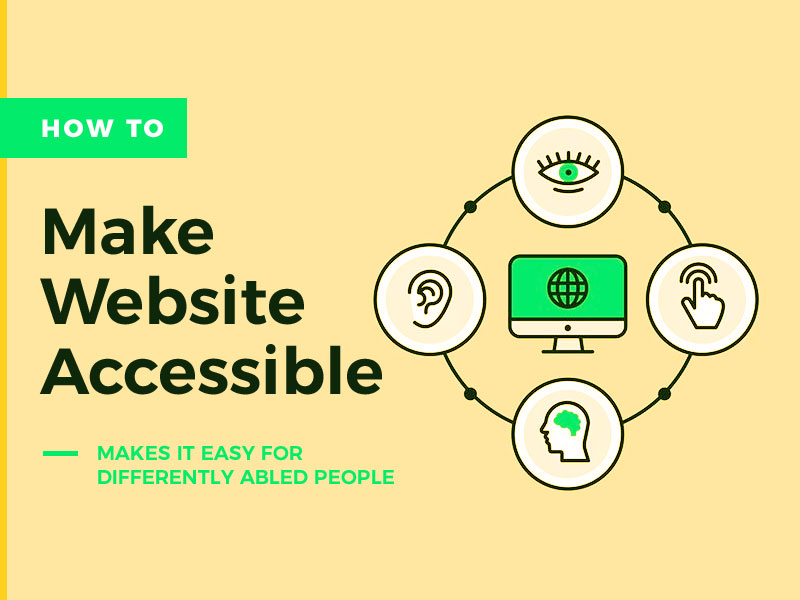
Additionally, a functionality-first approach ensures your website is accessible to all users, including the ones with disabilities.
Minimalist Typography and Effective Communication
When it comes to typography in minimalist web design, the mantra “less is more” couldn’t be more fitting.
Typography plays a pivotal role in communicating your message with clarity and impact.
It can elevate your website’s aesthetics while enhancing the overall user experience for a non-technical audience.
A clean and straightforward typeface can make a powerful statement without overwhelming your audience. A limited number of font families can maintain consistency throughout your cms website design.
Opt for Sans-serif fonts like Arial, Helvetica, or Roboto for a clean and modern appearance.
Moreover, establish a clear and logical hierarchy by varying font sizes for headings, subheadings, and body text. This helps the user in identifying key information easily.
Additionally, you can improve the readability of your content and prevent it from feeling cramped by incorporating ample whitespace around text elements.
Give your text room to breathe by providing generous margins and line spacing.
This is a very good practice that enhances the visual appeal, allowing your non-technical readers to absorb information with ease.
Simplifying the Path to Conversion
A minimalist web design simplifies the path to desired actions such as making a purchase, signing up for a newsletter, or filling out a contact form, which leads to conversion.
A minimalistic design removes all the distractions in which the call-to-action (CTA) takes center stage.
CTAs are strategically placed and designed to stand out. And it doesn’t matter if it’s only a “Buy Now” button or a subscription form.
Users can effortlessly identify the desired actions when unnecessary distractions are not in the visuals. This prompts higher engagement and conversion rates.
Also, avoid using complex jargon and focus on communicating the benefits to your non-technical audience in a straightforward manner.
Moreover, the checkout process is a critical stage in the path to conversion for e-commerce websites.
A minimalistic design can make the checkout process intuitive which can allow users to complete their purchase without unnecessary steps.
It can be done by minimizing the number of form fields required during checkout. Try to only ask for essential information which is required for your business to deliver a service or product.
Additionally, you can also add a progress indicator to keep users informed about the stages of the checkout process.
Showcasing Visual Elements with Impactful Imagery
Impactful imagery becomes a key tool for engaging your non-technical audience. The strategic use of imagery can convey powerful messages and create memorable experiences.
Choose imagery that aligns with your brand’s narrative and resonates with your non-technical audience on an emotional level.
Focus on high-quality photography to elevate brand perception as blurry or pixelated images can be distracting which diminishes the overall impact of your website.
Invest in professional photography that showcases your products or services in the best possible light.
Moreover, adding image galleries or sliders into your minimalist design can be an effective way to showcase multiple images without cluttering the webpage.
Additionally, maintain a consistent style in your images to create a cohesive look and feel.
Wrapping it up!
Minimalist web design is a philosophy that seeks to declutter online experiences.
It has the power to elevate your website’s impact and engage your non-technical audience with remarkable clarity.
In this article, we learned how a minimalistic website design can strike the perfect balance between simplicity and functionality.
Furthermore, we explored how a functionality-first approach reinforces the importance of intuitive user experiences which aligns with the goals of your website.
Typography works as a powerful tool in conveying messages with clarity and impact.
Moreover, a minimalistic design simplifies the path to conversion because of a distraction-free design with streamlined checkout processes.
Finally, impactful imagery and cohesive visual storytelling can leave a lasting impression on your non-technical target audience.
