Whether you’re building a website from the ground up or are giving your existing site a refresh, design matters. In fact, a well-designed website can boost website conversion rates by up to 400%. It’s no wonder that an estimated 80.8% of web redesign projects are launched primarily due to poor conversion rates.
So, what are some of the most important design elements to include in your new website — and how can you pull them off successfully? We’ve got some practical tips that will come in handy for businesses of all sizes.
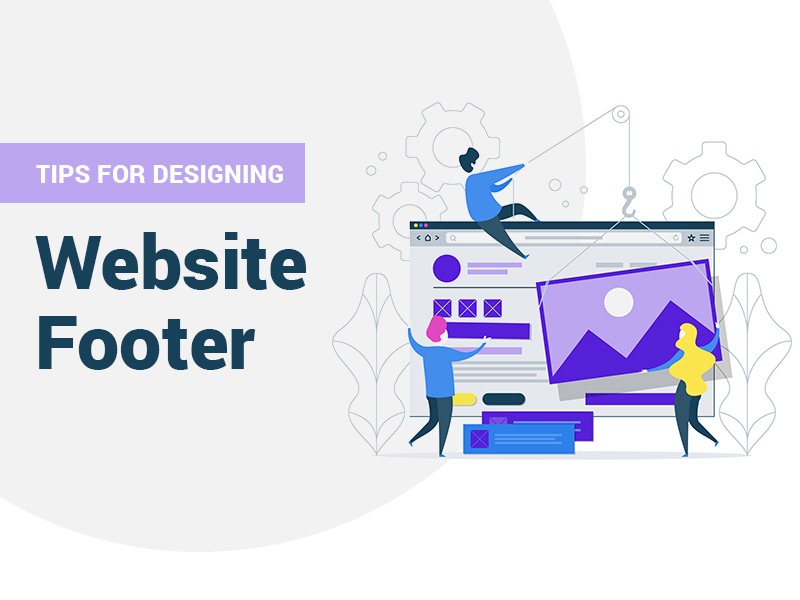
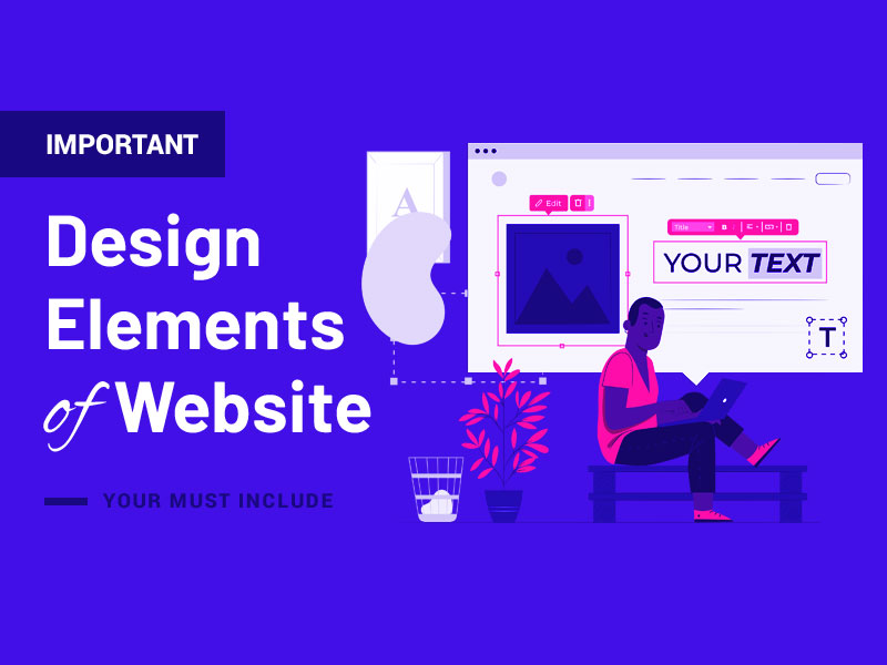
The Most Important Website Design Elements to Include
A Great Logo
There’s no overstating the importance of a logo for your brand. In fact, studies have found that 75% of people recognize a brand primarily by its logo. With this in mind, it’s vital not only that your brand has a well-designed logo but that it’s also highlighted on your website.
Generally, your company logo should be placed in the top left corner of each of your site’s pages. This placement seems to maximize brand recall, which makes sense when considering that most people consume content from left to right.
When saving your logo design for your website, save it as a portable network graphics (PNG) file. This will ensure that the file doesn’t lose any quality when compressed and that all colors will be properly supported.
Eye-Catching Typefaces
The right use of fonts and typography can also go a long way regarding your website’s overall design appeal. There are so many web fonts available that you can get creative and use typography to help your brand stand out from the competition.
Try a free service such as Google Web Fonts to get started experimenting with different typefaces. Here, you’ll be able to browse and implement a wide selection of fonts directly into your web design. These fonts will be compatible across all devices and browsers, too.
Be careful not to overdo it, however. Make sure that the font you use for most of your content is simple and easy-to-read (ideally a serif font). You can always get a little more creative with the occasional script heading, but readability should be the priority.
Quality Images
These days, stock images simply won’t do if you’re really looking to elevate your site’s design and set it apart from that of your competitors. Instead, focus on capturing and uploading your own quality images to portray a more genuine look for your brand.
If you have product offerings, ensure that your product photos are professionally captured. Likewise, photos of your company at work directly on your home page can make all the difference. Professional headshots of your employees can also be added to your “About” page to give readers more insight into your company.
Yes, this may mean shelling out the money for a professional photographer. However, if you have a quality camera on your phone and a tripod, you may even be able to pull this off yourself.
Proper Spacing
Space is one of the most overlooked website design elements on most business websites. Specifically, spacing refers to the balance between content (such as links, photos, and text) with white space on the page. When used properly, spacing can drastically improve the overall look and usability of your website.
White space, for example, can be used to create focal points on the page. You might use increased spacing around a product photo you want to call attention to, or a “contact us” form that encourages people to reach out. Content quickly becomes lost when there’s the insufficient spacing between elements on your site.
When considering spacing on your site, there are many tips to remember. However, the main thing to remember is that you should increase the white space around elements you wish to call attention to. Remember, also, that white space doesn’t have to be white; you can get creative and use other background colors that suit your brand.
Clean Navigation
Few things are more frustrating for web users than not being able to find the information they want on a website. You’ve probably experienced this problem yourself for a time or two. Unfortunately, when users can’t find what they want on a website quickly and easily, they’re likely to leave (and possibly never return). That’s not a good look for your brand.
One of the best things you can do to improve navigation on your site is to use what’s known as “hamburger navigation“. This simply refers to a navigation menu represented by three horizontal lines. Upon clicking on the menu, it expands to show additional options.
When implementing a navigation menu, don’t forget the footer. In addition to having navigation at the top of the page, footer navigation can actually increase conversions as much as 50%.
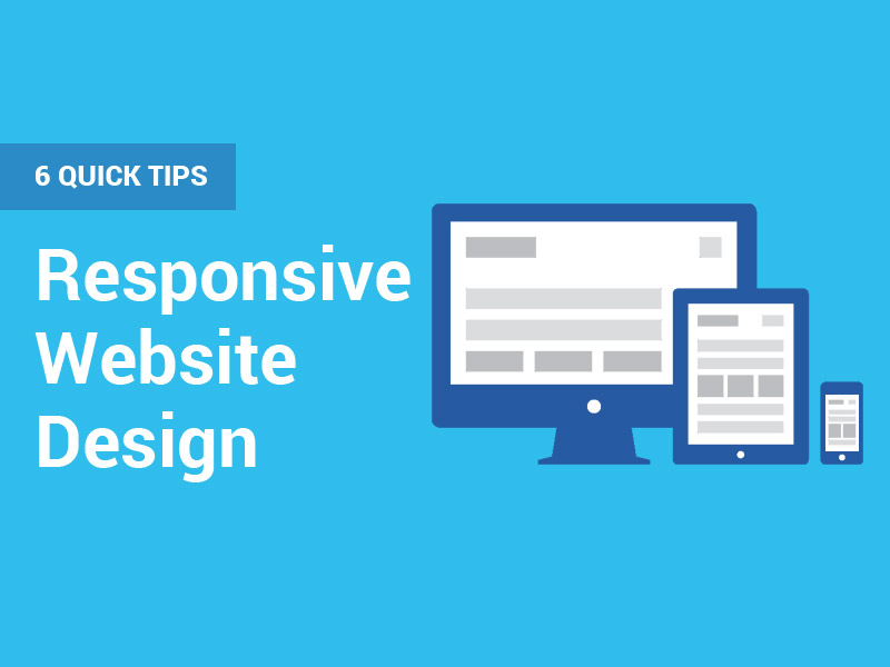
A Responsive Layout
Across the globe, it’s estimated that 68.1% of web users are browsing from mobile devices rather than from laptop/desktop computers. From a website design perspective, a responsive design is more important than ever.
Responsive design simply means that all site components load properly regardless of the device used. Your site should load just as seamlessly from a smartphone as it does from a desktop computer. If your design isn’t responsive, you could miss a lot of business. This is especially true when you consider that Google’s search algorithms favor sites that have a responsive design.
Not sure whether your site is responsive? Check out this free resource that allows you to see what your site looks like from a desktop, laptop, tablet, and mobile device.
Thoughtful Color Scheme
Don’t overlook the importance of color when designing your website. Most importantly, your color scheme should be consistent across your entire site. It should also reflect your brand and its desired image. If you already have colors established in your company logo, this can be a good starting point for your site’s color scheme.
As a general rule, it’s best to stick with no more than three colors in your site’s primary color scheme. This keeps things streamlined and prevents your design from looking too “busy”.
You can also use color psychology to create a strategic color scheme on your page. Different colors can evoke different emotions and associations among your viewers. Consider using red, for example, to build excitement in your branding — or green to communicate value.
Background and Feature Videos
These days, more companies are using video on their websites to capture viewers’ attention. If you don’t have video content on your site already, consider adding background videos that play automatically when somebody visits your page. These are a great way to keep viewers on your site longer while providing valuable content.
Feature videos are another type of media to consider adding. These trendy videos are great for highlighting specific products or services that your company may offer. They tend to be short and to the point, allowing visitors to get a feel for what you offer in a minute or less.
Of course, quality matters when it comes to your website video content. This may mean hiring a professional videographer to record, edit, and create eye-catching video content for your brand.
Elevate Your Website Design Today
As you can see, there’s a lot to keep in mind when it comes to designing a website that caters to your audience. Ultimately, designing a great website will boil down to knowing your audience and what they expect to get out of your website. From there, being sure to include these essential website design elements will help you leave an impression on your site visitors (and lead to more conversions)!