Take an example! When you wear a magnificent dress with the wrong shoes, the entire personality does not look good. Why? Because it is incomplete. That is what the footer part looks like on the website. Even if you make the best website, but make the footer design weak or less catchy. It is incomplete, mate!
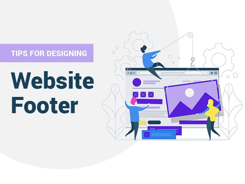
Website footer design is the last component of selling design. If you pay enough attention to this site’s bottom element of the page, your website will get more opportunities than you think!
We are experts and daily deal with clients when developing and designing websites. We always tell them an excellent web page with thoughtful design, competent structure, and critical footer content will always attract customers and make them stay longer. That will also motivate them to take further action, which is why Footer is one of the essential aspects of the website.
Before discussing tips and tricks to design a fantastic footer, we should know what Footer is or why Footer can benefit your website?
What is a Website Footer?
The website footer, opposite the header, is a part of the webpage placed at the bottom. The foot may be the last thing your visitors see while scrolling down, but it is more than you think.
Why is the Footer so Important?
The importance of the Footer cannot be ignored, and it is hard to overestimate. Chartbeat says 25 million users visit various websites and scrolling tracks.
25% of all visitors don’t wait for the page to load completely. They rush down to the website footer to find important information like:
- Contact firm
- Testimonials
- Sitemap
Most visitors spend most of their time on the footer line, then above.
The Benefit of Having a Properly Designed Footer
Having a well-designed footer will always help you. In addition, the visitor surf footer for contact details linked pages with additional services of the company. These elements provide several business benefits to the website.
Adding a source of essential information for your visitors or clients with a well-optimized footer will help you achieve your goal because it will be easy to navigate.
You can tell your visitors or clients crucial information about the company and lead them in its business direction.
It can be anything like subscribing to a newsletter or providing information to help them with various techniques. With this, the Footer simplifies navigation for your visitors if they need to visit anything important on the site.
Footer also conveys a message to you, a visitor, that this is not the end mate and will help push the potential customer to take further action: fill out the feedback form, suggest through mail or contact number, and many more. These things affect the overall persona of the website, especially user engagement. The correct design of the Footer helps to turn visitors into potential customers.
How to Design Website Footer
So, how should your website Footer be designed to attract the visitor’s eye?
We’ve come up with tried-and-true suggestions to assist you with the procedure. Check out these best practices for website footer design and try them out the next time you’re working on one.
Copyright
Let us start by ensuring that the content you wrote or from the content writer on your website should be unique and that no plagiarism or any breach happens upon it. For this, it is essential to have a copyright symbol and the year on the Footer.
It might seem to be a vague idea, but this is one of the best ways to protect your content from plagiarism. So copyright is an essential part of website footer designing.
Get some help from your developer to include the necessary code to ensure that the years can be automatically changed.
Sitemap
You may find some links across the Footer of the websites, which is in the HTML version of your sitemaps. It is crucial to have a clear understanding that these are more or less similar to XML sitemaps. Having sitemaps search engines can easily find your website or web pages related to these. In simple words, sitemaps can help your website to get more recognized on search engine platforms.
Privacy Policy
This is one of the most critical factors of a website footer design, similar to having copyright on your website. The primary purpose of having a privacy policy on the Footer is to explain the information you wrote on the Footer. The data can be anything related to policies, and the primary goal of having it is to track analytics and remarketing, email subscription, and form submissions.
Term of use
After privacy policy comes terms of use, a visitor agrees to when they are visiting a website. These are less similar to the disclaimer, where visitors accept specific terms and conditions. In most scenarios, they place it within the website footer.
The legal text in the footer design ensures that you cover them completely.
Contact Form
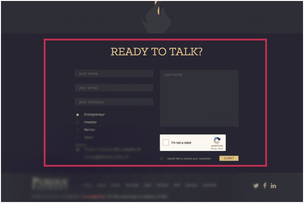
This is another vital part of your website. One of the main reasons this is a request for any website is that visitors or clients sometimes need and have some critical concerns. So, when the user wants to reach you and needs you, providing the contact information is one of the best ideas.
Most of the time, users expect it at the top right of the header. But the standard format is to place contact information at the bottom right or center of the Footer.
Instead of providing an email link, one of the best ideas is to include a contact form in the website footer design. You can also track the form submission within your “Google Analytics” making it a goal accomplishment. Think of a scenario where the visitor uses a system or phone without email or other things, but contact can be used.
With the form, users can get direct thankyou pages-they can also get more information than with messaging and using the CTA (call to action). Forms usually send auto-response emails to users, messages, and calls to action. In a scenario where mail is not delivered, forms can save submissions with the database.
We can also use forms for connecting to marketing automation and other systems. For example, we can make auto forms that ask specific questions, direct submissions to form fillers.
Most often, an email link would be considered spam.
Having all said that, we could say a contact form is one of the best ways to gather information and must be included in website footer design.
Address and Links to Maps and Directions
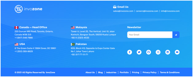
Another most essential part is location, which helps people to find your website. This is part where businesses are targeting local customers, telling google where exactly their shops are!
When you have linked your business with the map, your visitors can easily find you. Moreover, the map link is like a button for users to reach out via smartphones and take them to the map on the mobile phone or tablet device they access. So, make sure that you have included your location on the footer design.
Phone and Fax numbers
When you provide an address, it is ideal to have a phone number with a local area code. Providing these is giving evidence about your location to google. Like the map button, when viewed over mobile or tablet devices, the phone number will transform into a clickable link. You can use that number for any inquiry. It also tells the credibility of a company.
Navigation
This is an area where you can make good use of your Footer. You can also do some creativity, like implement those things that are impossible to find easily but are essential.
These footers are often called “fat footers“, including more than just the standard item. You can also use them as sending your links or add secondary menus drop-down.
Social Media Links
Therefore, some footers implement social media widgets instead of icons. The most recent post on any social media site is available at the bottom of the page when devices for social media are employed rather than icons.
Remember, when you add an element in your Footer, they will display the social media content on every page on your website.
Email Sign-up
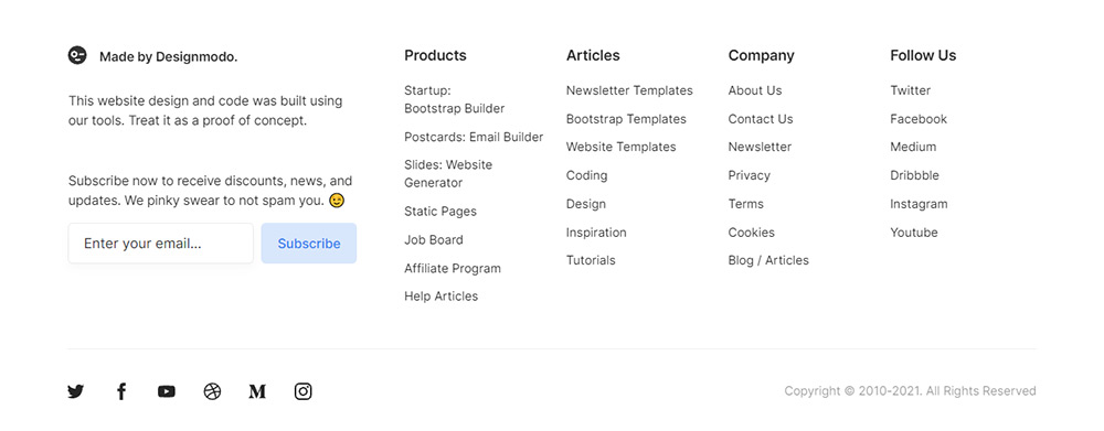
One area where users sign up is on the site’s footer. A minimum of 20% of well-known marketing websites have a sign-up box on their Footer. If a person has discovered something of value in their lives, there’s more chance of sign-ups in such situations.
Including email signup forms in the Footer is one of the best options to consider when looking for ways to provide social proof.
Press
Other than the types of visitors mentioned earlier, the second kind of visitor includes the press. About one percent of these visitors may be journalists and editors. There is no need to provide an official press link within the main navigation. However, you could include this in your Footer, which people can scroll through and locate.
Site Search Tool
We need a search engine for your site for items that visitors might not locate in the content area headers, footers, or headers. For example, you can place it on the website’s footer, but if you place it inside the Footer, the tool will be confused. Therefore, you need to make sure to label it clearly.
Voice search is fast becoming one of the top trending technological trends in digital marketing. It is also possible to implement voice search on the site search tool.
Images
You could always give your Footer a splash of color by including a picture that will add character.
Login
Let’s look at it this way: Not all visitors that visit your website are customers. That could include readers, partners, employees, and affiliates. So, if you wish to offer an account for them, let us select the footer section.
These are visitors who frequent your website and know precisely where to look for the information they’re seeking.
Conclusion
These are among the most effective footer techniques which you can implement immediately. Simple, aren’t they?
Most often, people are under the misconception that footers aren’t so important as a web page’s header or body. That contrasts with our conventional belief that content above the fold is crucial, and nobody is likely to scroll to the bottom because users are always looking towards the Footer.
A footer is an essential part of your website. It tells the visitors and users who you are and what type of business you are doing. It also talks about what kind of business you are running here.
So, you see, Footer is an essential part of the web page. So please pay attention to it. The best way to create the webpage footer is to use all the factors discussed in this article. Also, try to do creativity, think, and analyze your clients’ types and the demands they require visiting a good website.
Once you understand your customers and the factor of the Footer, you can create a fantastic footer.
Footer is the last thing a user sees on your website, so make sure to add the right amount of information, design, and usability to create a user-friendly plus informative footer. It is the last impression of your website, and we should make it worth it.
If you use all these factors on your website, you will undoubtedly have a good result in loyal customers and good sales. So, what are you waiting for, mate! Hire an excellent company that gives good website development services.
