The influence of color on a person’s decision-making process, emotional state, and many other reactions are immense, as far as modern science is concerned. Therefore, the choice of colors has more than an aesthetic role to play in the website design process. This need to adapt lead to the creation of different design styles, among which, Black Websites Design. This is a development style that uses black color as a background, mainly combined with light typesetting and imagery.
The main advantage of this design style is its wide range of applications. You could run a music blog, essay writing service reviews website, a finance company, or publish a Linux Firewall benchmark results study and black would dominate perfectly in each occurrence.

The strong disadvantage, however, is the difficulty to achieve the perfect balance of all design elements, so that the website would provide an optimal user experience. It’s like in writing, there’s only one way to create the best essays, you must fit all the pieces of the story together and present them in the perfect order.
How to Create a Black Websites
To help you master some of the design techniques, we have created this article that will introduce you to 3 design tips, their purpose, and basic features. We’ll also cover our story with some web design templates and custom solutions.
Use Contrast to Adjust Readability
Light letters appear better on a dark surface when they are a bit larger. However, what can we do if we run a blog and need to allow mobile users to read our content? Try adjusting the contrast settings and try different ranges until you figure out the best contrast level.
Large letters take too much screen space and force readers to scroll much frequently, which is daunting and could lead to loss of traffic. The negative influence on user experience is reflected in diminished navigation because the user doesn’t have the view of the whole screen.
Readability is vital for the consistency of the entire content, therefore, it’s imperative to preserve its high quality. Another good way to facilitate contrast adjustment is to use as much whitespace on pages with more textual content, like blogs or product review page.
Thomas Rhythm developed a solution that is an amazing example of high-quality readability and a well-designed black website. The letters are perfectly visible on all devices and the size is optimal.
Include only high-quality imagery
As black dominates the view, every image attracts attention, and we see details much clearer if the image is presented properly. However, high-resolution graphics require more power and that prolongs page load time. Slow websites simply don’t have a place in today’s market. It takes less and less time for users to give up on waiting on a blog page to load or a command to execute and leave the website altogether.
Therefore, we need to create the most efficient image quality, which is never a routine assignment. The image should be sharp to present every detail to perfection. It should be focused so that we can clearly see the depth of the content depicted in the image.
Another good way to improve the visual appeal of your content is to use simple effects. You could increase transparency in some parts of the image to emphasize the main element. Reflections can create a 3D effect if the reflection angle is in the right position.
Unless it’s your design concept, you are not bound to black and white, you can use color photos and different color fonts if you like.
Director and Cinematographer, Blake Allen, has an amazing website that best shows how imagery plays a tremendous role in black websites design. He used various videos to showcase his vision of the world through his portfolio.
Use a black background as a tool to drive sales
In the eCommerce industry, the main point of the design is to focus the attention of the customer on the product. The less distraction, the faster the visitor can make a purchase or inquire about a product or service. This is where the black background comes to play.
The product imagery is mainly colorful which would make it difficult to be seen in a multicolored environment. Black color allows the products to be seamlessly visible and capture the attention of the user most effectively. With fewer distractions, the user can focus on the product and conduct purchase easier.
The famous Tennessee Whiskey producer created a website that encapsulates the aesthetics and effectiveness of black website design for eCommerce purposes. It not only puts the product in focus but adds to the overall appeal of elegance and class. A little bling never hurts until it’s too much.
Black Website Design Live Examples
FernandoPuente.es
FernandoPuente.es

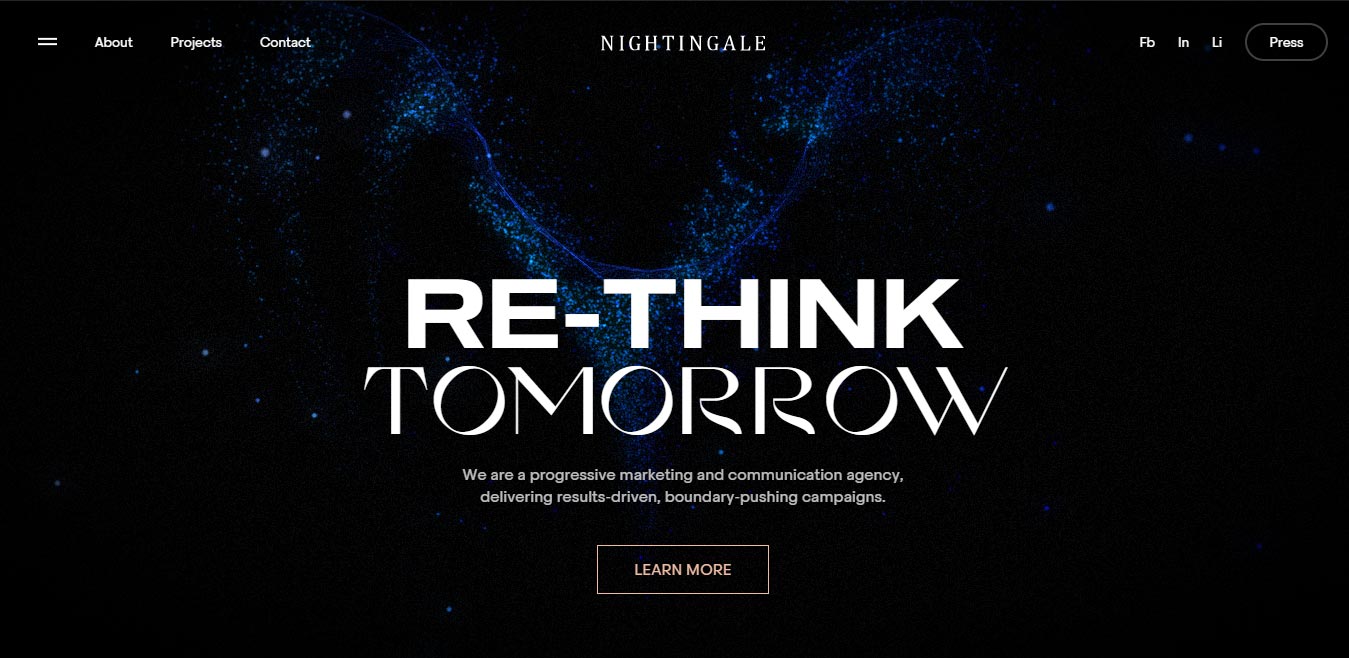
Nightingale.world
HelloToday.jp

UV-way.com

Conclusion
Those were the three pieces of advice that should come handy when a similar project comes your way. Their use is versatile and could help you figure out your tricks or adopt new skills. Keep in mind the beauty of this solution that applies to anything from essay writing help agencies to liquor factories. This gives you a wide range of different industries as potential markets. Wider market means scaling your business faster which gives us the chance to grow.
Explore this concept, try and find your style or develop your own black websites. We only hope you’ve found this article helpful and that you would use this information for personal growth and professional accomplishment.
You May Like:
- Top 12 Free Website Design Tools
- 10 Best Free Wedding Website Builders with Designs and Templates
- Discover the Modern Typography Trends in Web Designing
- Stunning Font Combinations To Inspire Your Next Design
- Tips for Choosing a Web Design Company – 9 Guidelines
- 10 Useful Tips for Effective Web Design and Development
- Best Practices to use Typography in UI Designing


