The objective of graphic designing is to turn something ordinary into exciting, eye-catching content. You have to make yourself aware of the ongoing design trends to get the edge in the market by adhering to the latest techniques and styles.
Graphic design ideas and trends for 2021 are plenty in numbers, combined with advanced technology and the world’s metaphorical standards. Every year, we see revamped and fresh looks in graphical content. The aim here is to examine the trends and their complexity while managing simplicity and fun elements together. Have a look at the below 11 graphic design trends that are reshaping the aesthetics.
Top Graphic Design Trends You Have to Look
1. Organic Design
Designers are applying organic design principles in many different areas, including tangible products, the fashion industry, and of course, digital graphics. The visuals and aesthetics incorporate in an organic design are extracted from the nature around us, making the design adaptive and natural-looking.
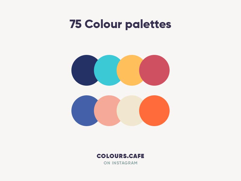
Today, neutral colors are gaining popularity more than ever as they represent our environment. Beige, off-white, light brown, faded green, and sky blue are some of the color palettes use for organic designing. It is up to the designers that either they can go for the one color them or pair it with bright colors to make it attractive.
2. Three-Dimensional Design
by Vivivian
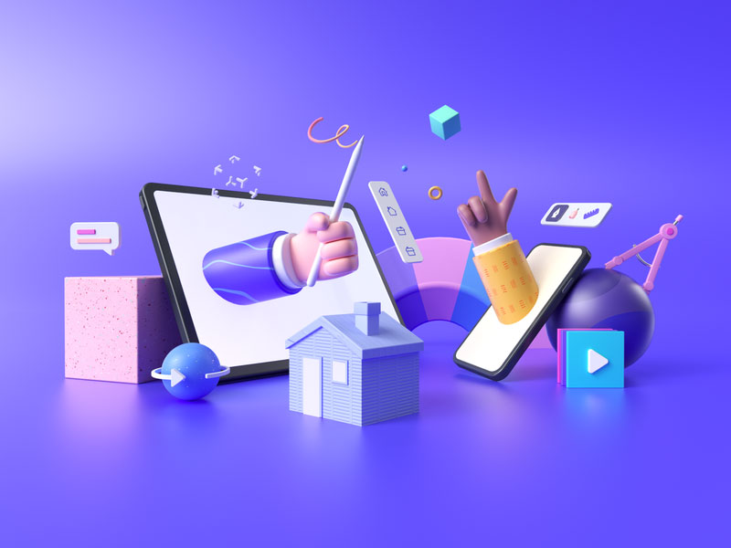
Designing a 3D digital object is not new, but getting more extraordinary and attractive. Not only in the designing area, but 3D designs have also made a revolution in other technical aspects. The demanding use of Virtual Reality (VR) and Augmented Reality (AR) are also the thrust to the 3D graphics. User interfaces of many websites and mobile applications leverage the 3D design to make their screen content pop up, maintaining a powerful impression upon the user.
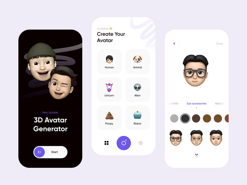
3. Use of Emojis
The usage of emojis is no longer limited to the message exchange; brands are also making use of them to interact with their audience and trigger their emotions. It serves as an effective marketing tool, allowing companies to encourage their consumers for a more positive response.
You can promote the product and services more persuasively if you take social media and other advertising platforms into consideration. Experiment with emojis inclusion in the designs to generate a more meaningful message and communicate with the audience in a more personalized manner. These small elements can make a significant difference.
4. Designing with Gold Colors

by Tenney Tang
The trend of metallic design and effects is booming in 2021. The direction was already in the mainstream in mobile phones body design and made its way to the graphic design industry. It is one of the featured graphic design trends of this era. With minimalistic aesthetics, metallic effects blend perfectly with the design, stimulating the user experience.
Colors like brass, silver, and copper are implementing successfully in their graphic work, but there is no substitute for Gold here. It is the supreme among all metallic graphics and gains the users’ attention.
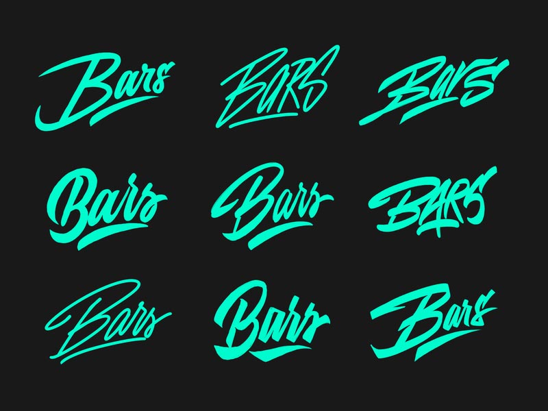
5. Typography
by Yevdokimov
Typography is old but still have its significance and relevance in the graphics industry every year. Designers experiment with a large number of concepts and ideas to which users always respond positively. By analyzing the audience’s response, there is no single reason directing the typography to stop and fade away.
In addition to that, the sub-branch of typography is 3D typography leading towards the next upcoming trend. Side-by-side, there are also textures and animations which designers use with the typography to enhance their visual looks.
No matter which niche you are working for, typography has its relevance in every other design work. It is not less than the symbolic representation of creativity.
6. Using Monochrome
Because of the natural look and appeal to the eyes, the modern design principles are aligned with the minimal palette. It also compensates for the addition of complex graphics and illustrations in a more subtle way.
With monochrome, a designer can focus on more complex graphical elements. On the customer side, it simplifies the overall look, so the customer does not have to overuse their brain to understand the concept behind the design.
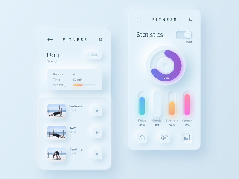
7. Neumorphism
by Mary Tokar
The new trend of neomorphism is getting adopted in many different designs, specifically in the UI design. The underlying concept of neomorphism is to merge different elements from material design, flat design, and skeumorphism. Components designed with neomorphism feel like the 3D design when combined with others expertly.
In tabs and buttons of web and mobile interfaces, the neomorphism principle is observed in high usage.
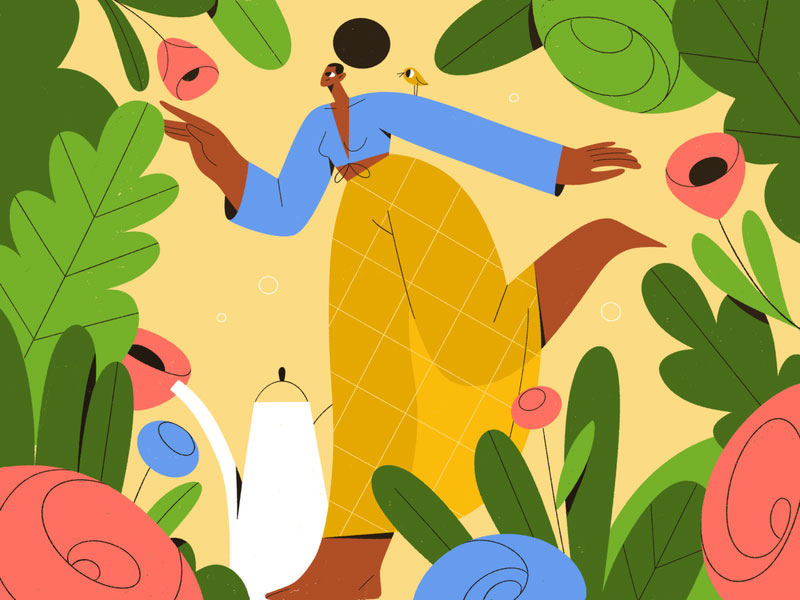
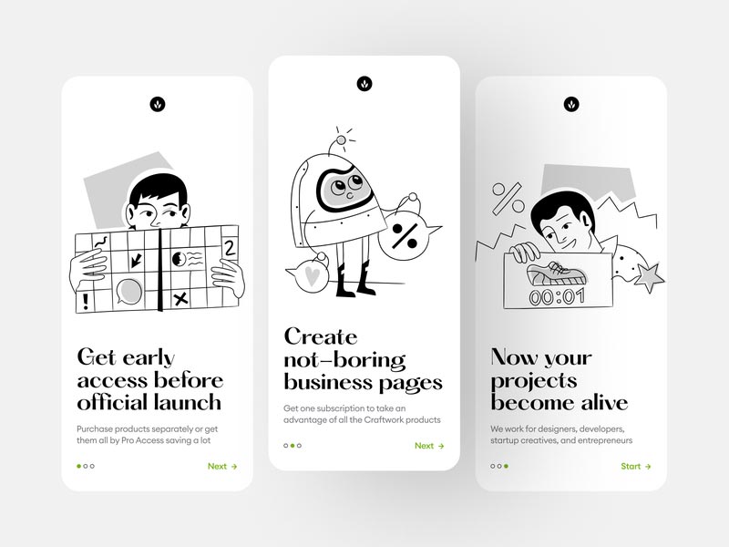
8. Illustrations and Flat Icons

by uigo
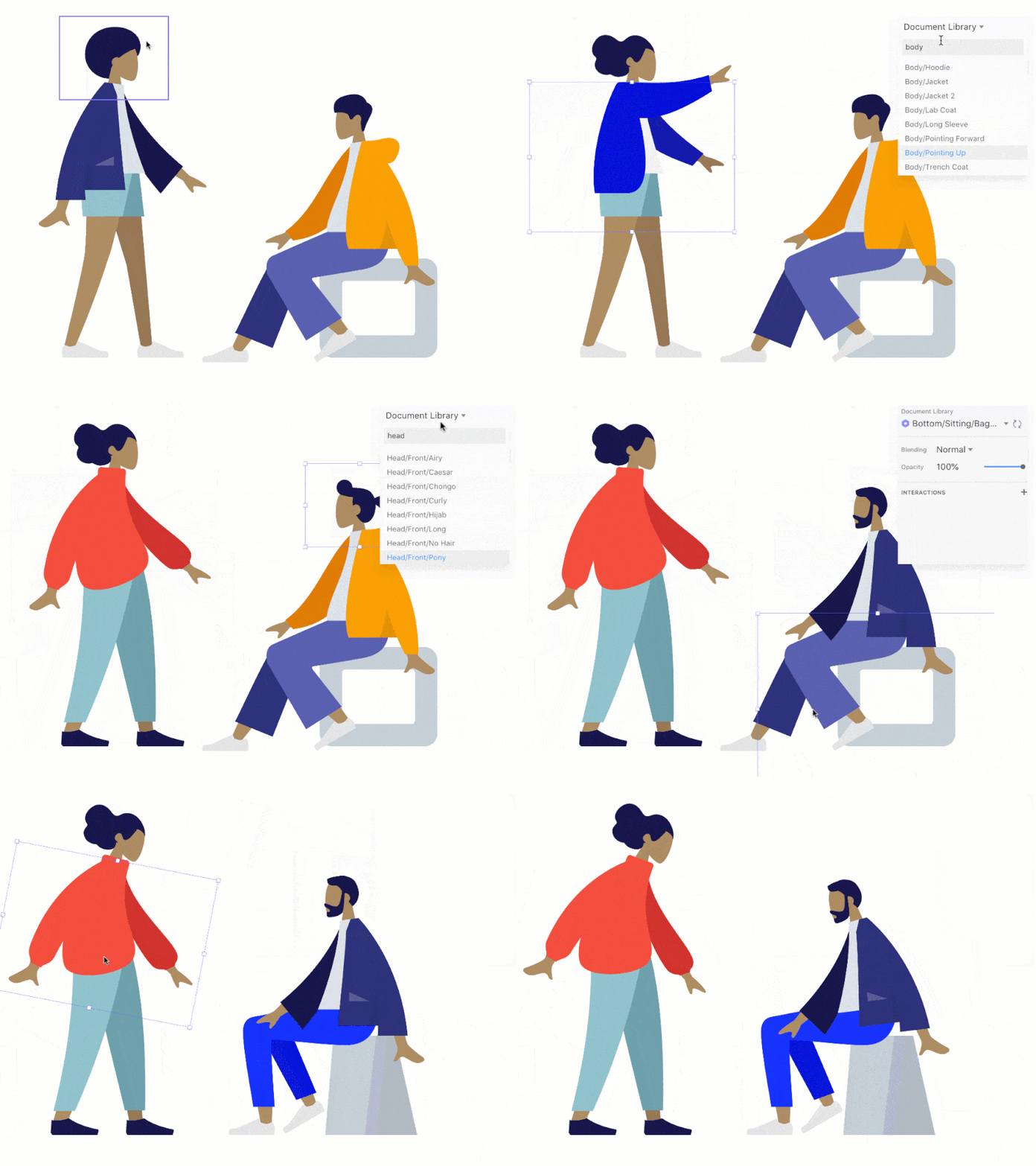
As a trend, illustrations and flat icons are rising. They were there for a long time but now have attained prominence in the design world. The main characteristic of this design principle is simple but powerful to be effective in the market. To forward their messages, narratives, and announcements, brands utilize the flat design approach and make it easily understandable on the user side. Flat designs are also quite popular for developing infographics which come in handy in the official presentations.
9. Muted Palettes of Color
The muted color palette is taking the design world by storm and does not seem to stop in the future. Several designers are using them in their design work frequently and excessively. If you don’t know what muted color is, they’re vibrant colors with an injection of black, white, or a contrasting hue to soften the edges.
People were bored with the bright colors and wanted something new and relaxing for their eyes from many years. Previously, designers were using shocking colors to convey their brand message in a loud digital voice which was tempting to the users initially but started to lose their significance with time.
On the other side, muted colors are a secure and safe choice. LinkedIn is the best example to consider using muted colors for a long time and doing exceptionally with it in terms of the user interface.
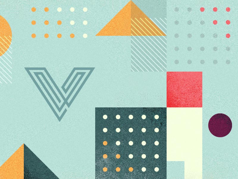
10. Use of Geometrical Shapes
by Veerle Pieters
Surprisingly, several brands are using geometrical shapes in their design nowadays. Some people presume that geometrical shapes are unchallenging to create and use compared to traditional techniques. But the reality is different. It also requires the same amount of energy and creativity to make it work.
If you check out the latest design work today, you will find the shapes like squares, triangles, and circles in most designs. Besides, in many cases, experts use a light background consist of shapes and patterns, making the design more vivid.
Consistency and the structural pattern are what you can expect from the geometrical shapes.
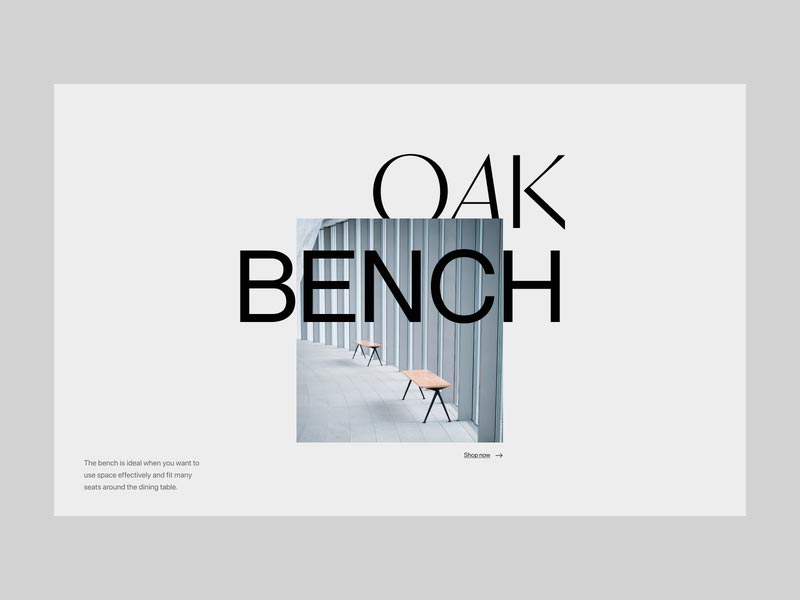
11. Overlapped Text
by Remon
An effective way to grab the visitor’s attention is to use bold text with big font in the website header. Due to its effectiveness, every other website uses it. Designers craft more unique and quirky websites’ titles. The trend of overlapped text came into existence in this way.
The concept is to fuse images with titles or the other way to achieve the attractive websites’ header.
To Sum Up
Every big graphic design trends is the efficient fusion of imagination with innovation. The advancement in technology is aiding the designing world to face the upward inclination, not only for the businesses but also for the individuals to bring their game up. These 11 2021 graphic design trends will allow enterprises to take success leap in the consumer world.
Lastly, if your businessneeds a makeover or requires graphic designing services from experts, in that case, there is also a trend of Unlimited Design Services in Flat Rate Graphic Design Services, which you should definitely check out.
