So, it seems like you repeatedly hit a wall when choosing a font for your website. After all, that’s the only possible explanation for why you are here.
Well, your prayers have been answered. This article will take a detailed look at everything related to choosing a font alongside the subtler aspects attached to the process. Yet, it doesn’t end there. There’ll also be an examination of over twenty-five of the best fonts for website pages available currently.
Itching to get started? Alright then, let’s dive right in!
What exactly is a font?
There’s no standard definition of a font, despite the term being a derivative of the historical ‘typeface‘ — letter styling instruments for devices such as a typewriter. Now, both those terms have become synonymous with each other.
A font is merely the style of the letters used in written content. Subsequently, a page can have uniform characters that stick to one aesthetic and size or wildly differing variants. It is entirely up to the users writing the text.
How do you choose fonts for a website?
Several organizations overcomplicate things when choosing web fonts for their sites. However, it’s a relatively straightforward process if you understand the basics. And to explain this better, let’s go with an analogy:
Your website is your voice. The content contained within the web pages is the subject you’d like to discuss. Now, the font you use is your tone. It’s as simple as that.
Based on this, you have several options when it comes to selecting your tone—font—personality, namely:
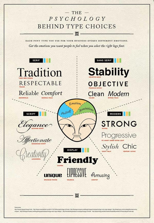
- Serif fonts that exude tradition, comfort, reliability, and a sense of authority
- Sans serif fonts that project objectiveness and stability, leaning toward being minimal
- Script fonts that convey elegance, creativity, and a degree of affection
- Display fonts that relay uniqueness and friendliness, helping with overall brand expression
- Modern fonts which indicate boldness blended with a progressive perspective
There’s no correct answer when determining the best fonts for website pages. Yet, there are a few things you could leverage while deciding which style suits you best.
So, here they are:
Brand and audience identity
Each time you speak, your tone matches what you want to say. It’s the same with your brand identity and the brand font style you choose. This is also the first thing you need to account for. A helpful tip here is to examine two things:
- Your organization’s personality
- The target audience
Once you have an answer for both of those, you bring them together. That will help you shortlist a few web design fonts, even if it doesn’t pinpoint the exact one.
Font readability
Regardless of how visually stunning the font is, there’s no point if no one can read it. Often, web designers get too caught up in making their site look beautiful that they forget what matters: T H E C O N T E N T.
So, stick to the idea of elegance in simplicity. That doesn’t mean you can’t incorporate anything stylish on your web pages. You actually can. But ensure that you are restricting it to headings and titles.
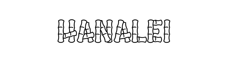
Take Hanalei, for instance. It is the best font for website header titles if you are catering to a teenage audience. Yet, older individuals may have trouble dealing with how busy the letter edges are. In addition, Hanalei may not gel with the other styles you plan on incorporating into your site. So, how do you solve this?
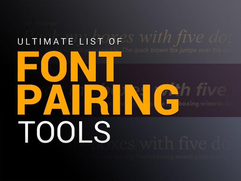
It’s simple: you use font pairing tools. These are oriented explicitly toward ensuring compatibility across all your web pages. In short, you will get a list of suggested font combinations that work well together.
Some of the most popular examples of such tools are:
- Type Connection
- Google Type
- Type Wolf
- Font Pairer
All the listed options are excellent choices in their own right. What matters is how you leverage them.
User experience
The best fonts for website pages are the ones that enable your site pages to load quickly. A little confused? There’s no need to be.
In a few cases, the browser loads the HTML and CSS files before it becomes aware of the need to display the correct font style. This may be due to an algorithm conflict in the prioritization or some other factor.
Here’s the thing: it doesn’t matter what the causal issue is. You should be concerned that your site visitors are staring at a visually jarring page.
Yet, the typeface itself isn’t to blame — The page hosting is at fault. Google fonts is a perfect example here. Most designers face a host of latency issues with it. However, a simple import or self-hosting can fix most of the challenges.
What is the best website font size?
Now that you understand more about the subtleties of choosing the best fonts for website pages, let’s examine some technical aspects behind the same. In short, it’s time to look at font size.
Most pages will have three aspects to them, primarily:
- The heading (H1)
- The sub-heading (H2, H3, H4 …)
- The content (P)
As you may already know, each of the mentioned elements must have different sizes. And while there are no rules to it, most designers follow specific practices for desktop and mobile sites.
Typically, you should follow something along these lines:
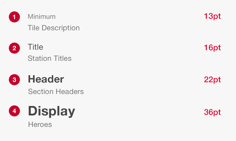
- Content/Body size at 16 to 18 pixels
- Heading size set to 1.96 times larger than the body, which in this case happens to be 35 pixels
- Sub-heading size set to 5 pixels smaller than the heading
Now, these suggestions aren’t set in stone, especially considering displays differ based on the device in usage. There’s also the factor of how ‘content-heavy’ your pages are. In other words, smaller font sizes may make the page seem too busy if there’s a lot to read. Conversely, making everything noticeably larger may make reading challenging for mobile users.
So, despite all the online articles, there’s no concrete answer to this question. The mentioned sizes, however, do serve as an elementary guideline for you to start. Ultimately, it entirely depends on your understanding of what works best.
Understanding the difference between web-safe & web fonts
A persistent confusion amongst novice designers is related to the difference between web-safe fonts and web fonts. It’s vital to note that one is not a substitute for the other, and an attempt to use them interchangeably can lead to disastrous results.
Web-safe fonts are essentially the ones that come preloaded into an Operating System (OS). And the sole reason behind their assigned terminology is that using them will not lead to any display errors.
Web fonts, however, are not installed on every OS. Consequently, using them to write an email, for example, can cause the receiving client browser to display the text incorrectly. In short, both parties must have the same web font installed for any content they wish to send or view.
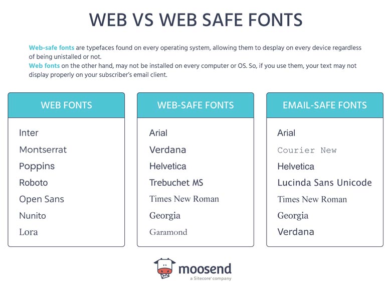
However — and this is crucial — web pages don’t suffer from this issue. The reason? Sites are hosted on a server and don’t rely on peer-to-peer sharing. Essentially, you can get as creative as you’d like when choosing the best fonts for website pages!
The Best Available Web Fonts for Website Design
Now you know how to pick a font, what size to set it at, and, more importantly, the difference between web-safe and web fonts. Now, let’s talk about some of the best available options.
Roboto
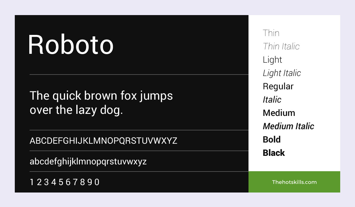
The first google contribution in this list, the Roboto, unironically, is somewhat restrained, almost as if it’s playing to its name. However, considering it’s open-source, it could be in the running for the best free fonts.
Ideally, you’d use this particular style if you want to build an informational page. So, say editorial or blog content — something along those lines. Whatever the format, ensure that you do not use it for anything other than conveying the written subject. Simply put, avoid using the Roboto to cater to aesthetics.
Open Sans
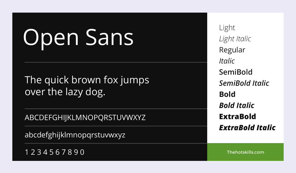
The Open Sans may be a little bare, but that also makes it an excellent choice if you plan on publishing pages with a significant amount of lengthy content.
An ideal example of using it is if you plan on including a Frequently Asked Questions (FAQs) section on your webpage. Besides that, you could also make an argument in favor of product or service descriptions.
Essentially, anything works if it’s not the first thing your site visitor sees.
Merriweather
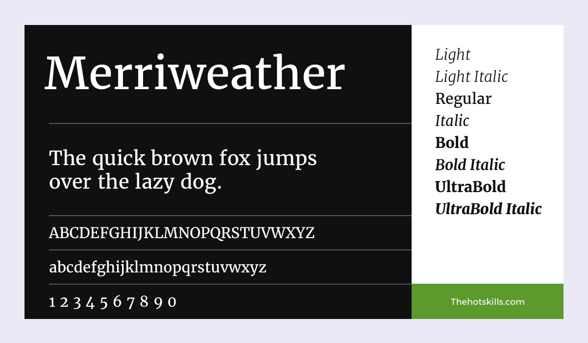
There’s something particularly odd about the Merriweather. Don’t take this the wrong way — it’s just that it doesn’t follow the same pattern as its other google cousins. The letter edges, for example, have a slight ‘rounding’ to them that’s missing in most of the angular typefaces.
In all fairness, the style would lend some charm to your main web pages if you complement it against some lighter tones. For some reason, black or darker backgrounds don’t go well with the typeface.
Overall, Merriweather is one of the best serif fonts for websites. Well, at least if you want substance over somewhat superficial style.
Barlow
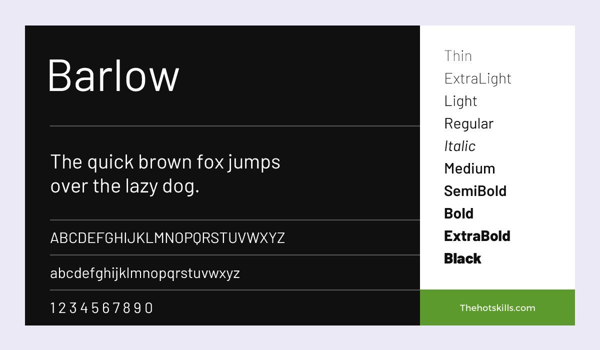
Barlow is somewhat undecided about what it wants to be. Hold on; there’s an explanation coming. But first, let’s examine something very unique to the style. If you look closely, the g’s have a shorter stroke at the end. That’s surprising, considering Google is particular about not deviating from typical typeface conventions.
Regardless, Barlow is somewhat bland if you decide to use an English script. Switch to another language, though, and it becomes an entirely different font.
Barlow Condensed
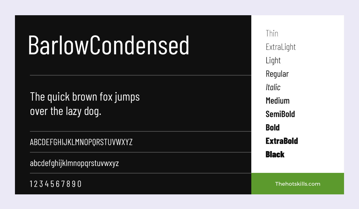
A much better alternative to its slightly unusual older brother, the Barlow Condensed is sleek and sits right between being angular and round. However, that doesn’t mean you use it for your primary pages. Instead, incorporate the font into customer reviews, client testimonials, etc.
These types of content need to have a slightly differentiating factor to highlight them as being something a person said. The Barlow Condensed can do this perfectly.
Rubik
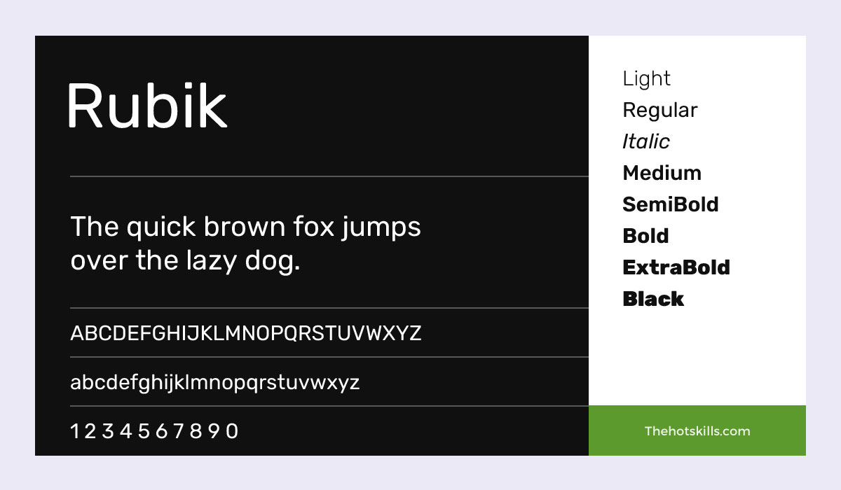
The Rubik is, by far, one of the best fonts for website pages, at least in comparison to other google offerings. The letters have a distinctive circular design, primarily when written in lowercase.
If you are wondering about a suitable use case, you’d need not look any further than site-automated messages, chatbots, or even pop-ups.
Cairo
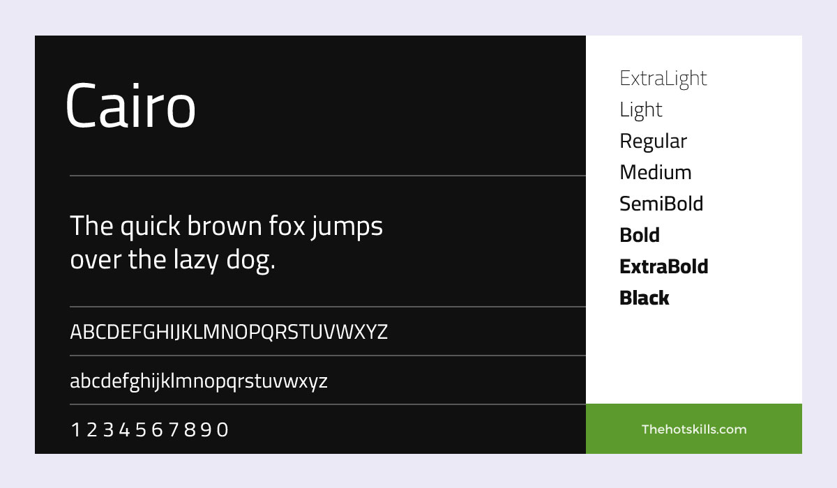
The Cairo, true to its name, works best when you aren’t relying on an English script. There’s nothing wrong with the font, per se. Yet, it loses its charm when forced to stick to conventional letters.
Use it for any other language, and you’ll see it transform right before your eyes. Although not apparent in the picture above, the characters in the English variant are spaced too far apart.
Sora
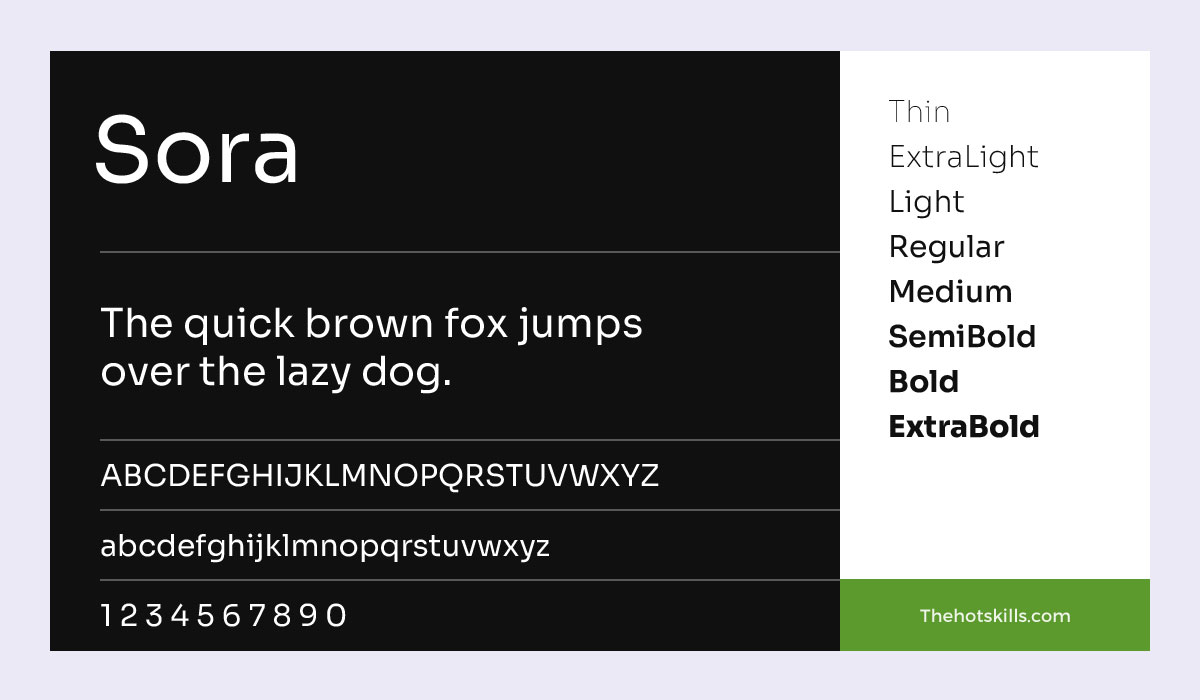
Sora is quirky, somewhat laid back, and perfect if you want darker letters against a colorful background.
Most letter strokes have short flourishes, making the font an excellent choice for introductory pages or guest portals. And you are free to get creative with the background because the outlines will always be crisp regardless of what you use.
Hahmlet
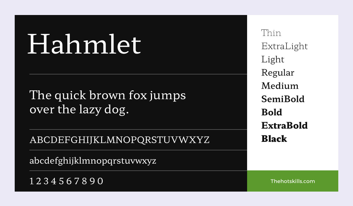
Here’s the thing: the Hahmlet is best-suited for regional or translated web pages. Go for it if you are building something along those lines.
To help explain this better, consider the example of anime or manga sites. In fact, any East Asian script flows immensely well with this font. Another possible use case can be for educational sites that teach such languages.
Andada Pro
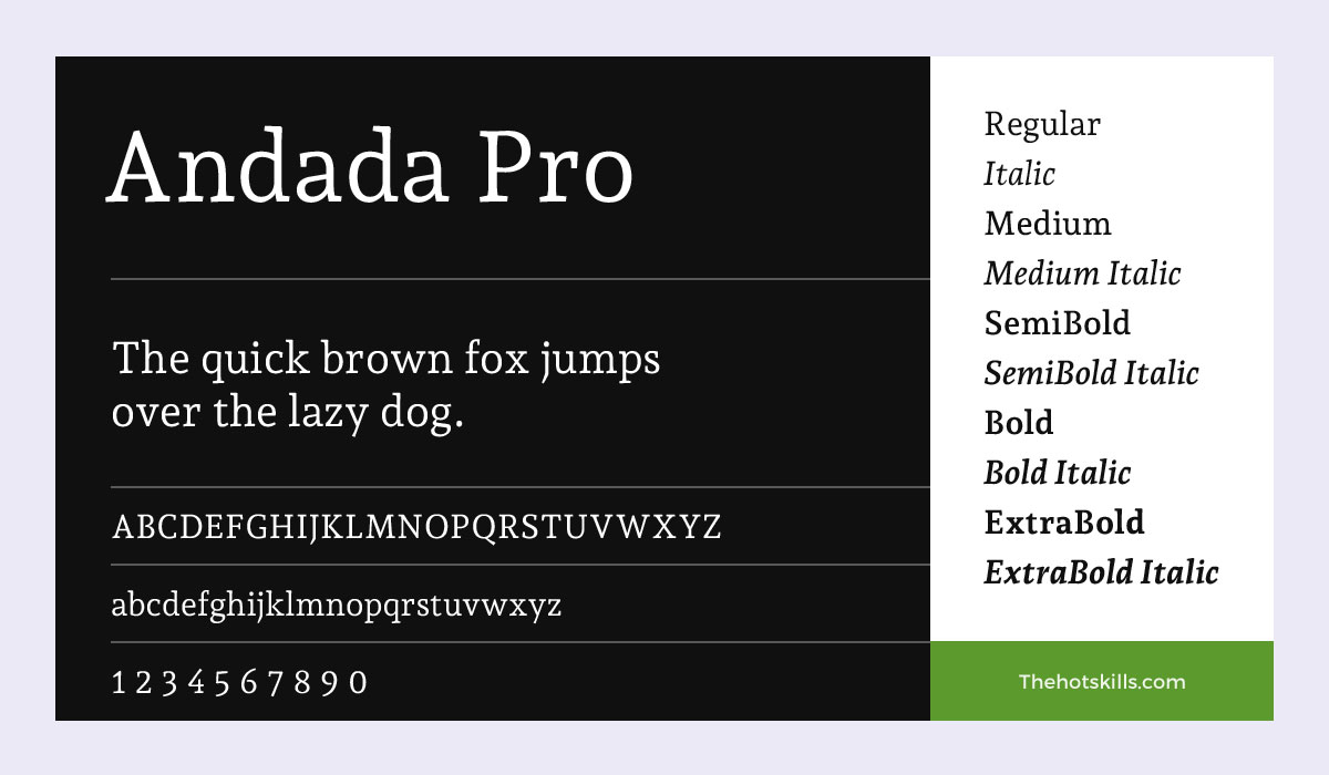
There’s no other way of saying this: the Andada Pro is one of those hipster fonts that go well with artisanal content. Want to publish content on coffee blends? Well, the Andada will be your best bet, then.
A simple tip here is to stick to dark letters. The typeface does most of the work for you. You don’t need to add to it by messing around with colored characters.
Without being too blunt, this is one of the best fonts for website pages if your content needs to retain viewer attention for a long time. After all, coffee beans can only be exciting for so long.
Inter
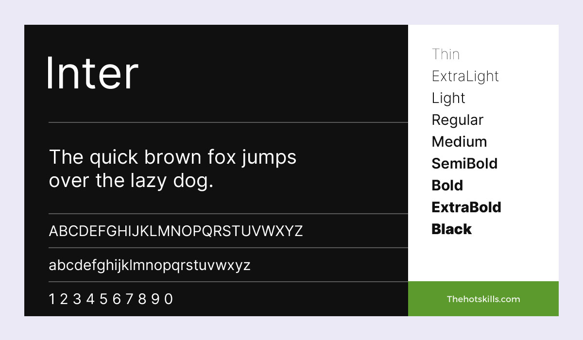
The Inter may have a seemingly incomplete name, but its actual style is anything but. Clean and minimal, this font is a great all-around choice for long-form content.
Anything goes here — blogs, news articles, editorials, etc. However, before you use it liberally, consider that it may not blend well with non-google fonts. So, say you plan on adopting the Pontiac. If that’s the case, Inter may not be the best option.
More Cool Fonts for Websites
The list below fonts are not web fonts. You need to download and convert them into webfonts. You can use the online webfont generator services.
Gobold
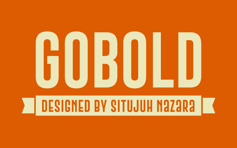
As evident in the name itself, the Gobold is the perfect choice to make a statement. Well, if that’s what you want to do. Designed by Situjuh Nazara and a derivative of the Sans Serif font family, this particular style cuts a clean, minimal look across your page.
The recent update added four new families, including an updated regular and italics feature, and fixed some character bugs.
Bebas Neue Pro
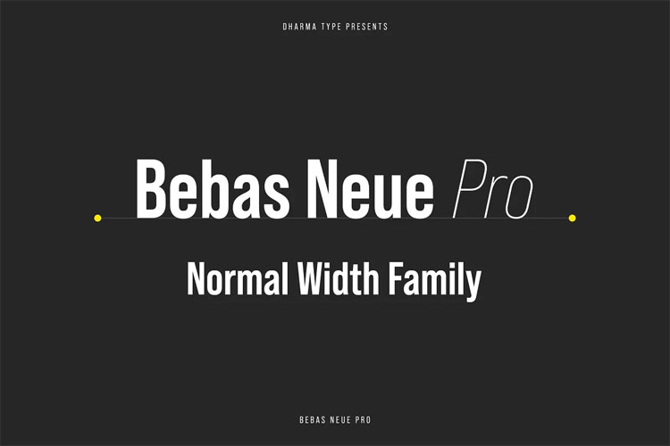
In its initial release in 2010, the Bebas Neue immediately enthralled graphic designers and corporate figures alike. Part of it was due to how it conveyed a sense of professionalism while not sacrificing the broader aesthetic. The other contributing factor was how well the font took to a black background. Simply magical.
Now, with the Pro update, the Bebas Neue comes with a redesigned thinner and regular weight. Lowercase characters have also finally made it into the typeface. Overall, this is probably one of the best fonts for designers. At least for those with a subtle sense of style.
Keep Calm
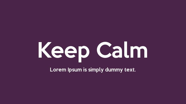
Inspired by an unreleased World War II poster, the Keep Calm font is all about streamlining the content in your pages while lending a sleek appearance. This is an excellent option if you build a page for an audience that looks for style with substance.
Currently, the font is available in three new variants, including the book (regular), light, and heavy. Each of those also comes with a complementary italic.
Zona Pro
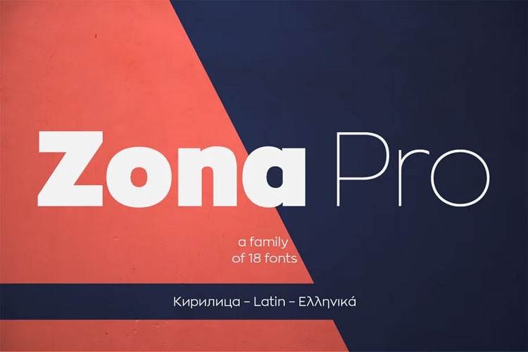
The Zona Pro has something unique: It comes with a package of 18 distinct styles to choose from.
Initially released in 2013, the font draws inspiration from the popular geometric abstract painting styles used in the 1920s. It’s modern, elegant, and, most importantly, suitable for both long and short content.
The 2019 update also featured support for the Cyrillic script and other enhancements, including a redesigned italic. All these additions make it a strong contender for the best fonts for website pages.
Pontiac – Simple Font
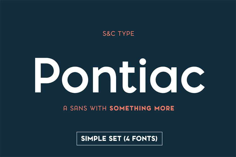
The Pontiac is friendly and has a casualness that’s challenging to put in words. Yet, it’s never a bad idea to try.
Take a look at the rounded letter edges, for example. The font has no sharpness, yet that doesn’t take away from the visual aesthetic. And, if you are a fan of infographics, this should crack a smile on your face.
That’s not to say that you can’t use this particular style for your body content. You can, but it may not be the brightest idea. Instead, it’s best to save the Pontiac for short-form text. Think along the lines of headers, etc.
Super Basic – A Modern San Serif
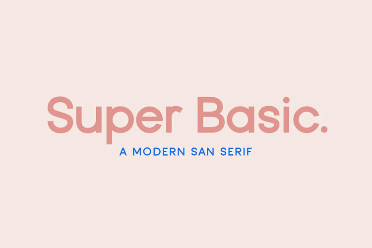
Don’t be fooled by the name here because the Super Basic is one of the most appealing UI fonts. It lends a crisp outline against even the most colorful backgrounds and pairs exceptionally with handwritten or script families.
The usual route would be to use the Super Basic for headings, short content, or, better yet, introductory templates.
Louis George Café
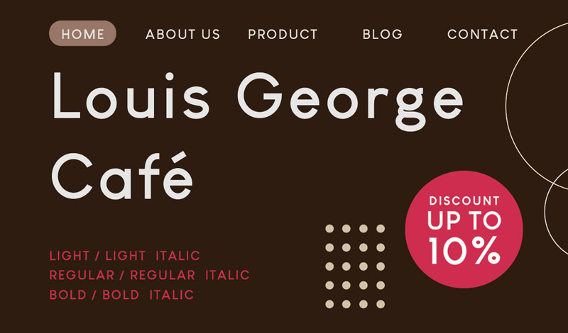
Look, nobody is saying the Louis George Café is an off-beat font. No, not at all. But a significant part of using it correctly depends on color compatibility. In short, if your page has a monochrome palette, this might be the right choice for you.
Honestly, most of the style’s charm comes from its simplistic characters. However, that also makes it somewhat unsuitable against a white background. So, don’t go using it in long-form content.
The Best Web-Safe Fonts
Now, there’s no point in rehashing what web-safe fonts are all about. If you’ve typed something on your keyboard, you’ve already come across them. In addition, due to how common they are, there’s no reason to launch into a description for each typeface. However, it is imperative to explain when you should use them.
Web-safe fonts are best suited for any automated messages that your site sends to visitors. For instance, if your page consistently sends emails to previous visitors, use such fonts to frame the content.
With that out of the way, some of your choices regarding such typefaces are:
- Arial / Helvetica
- Calibri
- Verdana
- Trebuchet MS
- Times New Roman
- Georgia
- Palatino Linotype
- Book Antique
- Comic Sans
- Courier New
While not the most enticing choices, these fonts have their moments in the sun. Yet, it’d be wise to look at them as additional tools and nothing else.
Where can you Download Fonts from?
You can choose several sites when purchasing or downloading any font. However, there’s a little bit of doubt about the authenticity of a few portals. So, it’s best to stick to regulated platforms such as:
- Adobe Fonts
- Google Fonts
- Envato Elements
- Creative Market
- Dafont – Free Fonts
From the listed options, all google fonts are best, open-source and don’t have any associated charges for commercial use. In addition, Dafont is another platform where you can find some of the best fonts for website pages. The best part? The authors make the typefaces accessible for personal use without any additional charges.
Great Design Begins with a Single Letter
This article may have been a little exhaustive at particular points. However, this was necessary to explore what fonts can do for your website. After all, the sum of your website’s overall appeal hinges on its basest parts.
In addition, if you get stuck again on picking the best fonts for website pages, think about the analogy at the outset — the one about your site’s tone. That will be enough to make you critically examine what works and what doesn’t.
Frequently Asked Questions
What is the best font to use for a website?
There’s no concrete answer to this question, with multiple elements factoring into this decision. A simple rule of thumb is to align the brand’s and your intended audience’s identity to help you choose the font you’d like to use. For instance, if your website is informational and primarily caters to news readers, go for Inter.
What are the main styles/types of fonts?
The four main types of font families are:
- Serif
- Sans Serif
- Script
- Display
- Modern
Each typeface has distinctive characteristics and features, making them suitable for eliciting specific emotions from your readers.
What is a good serif font for web pages?
Some of the most popular web-safe serif typefaces include Calibri and Verdana. In the case of web fonts, Pontiac, Inter, Sora, and Gobold are all excellent choices.
How many fonts should a website use?
It’s wise to keep your website’s total number of fonts at four or below. Anything above that number tends to create some visually harsh elements on a page.
Which font is the most attractive?
There’s no such thing as an objectively attractive font. It entirely depends on your preference and how much you want to align it with other elements. Regardless of this being a subjective matter, some of the most popular fonts are Roboto, Open Sans, Pontiac, and Merriweather.
Which font is the most readable?
Page readability depends entirely on how you scale your font size, not the typeface itself. While there are no strict rules, ideally, you’d stick to 16 to 18 pixels for your main body content. The headers should be set to 1.96 times the size of the body content, while the sub-headers should scale downwards by incremental decreases of 5 pixels.
How do you identify a font?
Font Squirrel is an excellent tool for identifying a typeface that you are not familiar with. Merely upload an image on the site, and the platform suggests a list of compatible or similar styles.
Where can you find web fonts?
As mentioned earlier, portals such as Google Fonts and Dafont are excellent sites with an extensive library of typefaces you can choose from.