Typography plays an integral part in web design. Think of typography as the secret ingredient that helps make words on websites look visually pleasing while making sense to everyone. It is like those special ingredients found inside of sandwiches!
Typography goes far beyond selecting fancy fonts; it involves choosing letters carefully to ensure an effortless browsing experience for readers and guide people without leaving confusion behind.
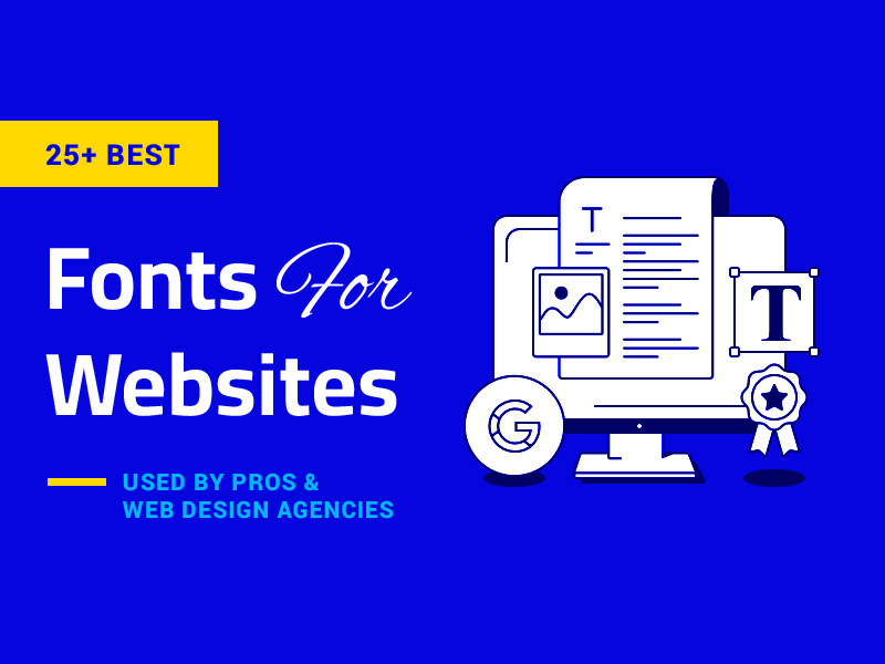
We will share 10 expert tips that can make your website not only look nice but work effectively, too. Let’s begin discussing what typography is and how it can bring life to a website even without extensive design knowledge!
What is Typography?
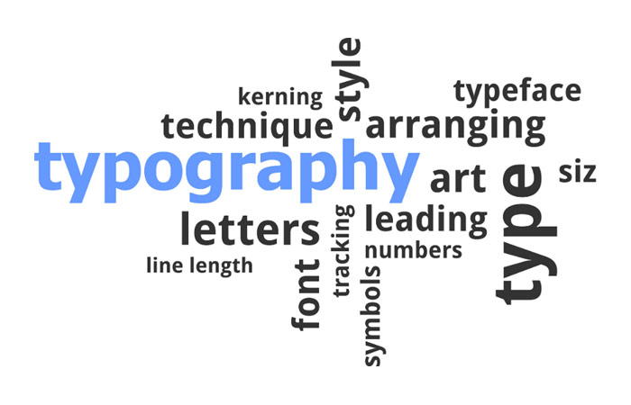
Typography involves making text easy and pleasant to read on websites, like giving the words an attractive facelift that people enjoy reading instead of leaving right away.
Doing this helps people linger longer on your site while making them stay and take action instead of leaving in search of another reading experience elsewhere.
Typography makes text easier for visitors to read on your website, which in turn encourages people to stay and engage with it.
Why is Typography Important?
Typography is more than choosing your favorite font; it plays an integral part in designing how things appear on websites.
As a leading Web Design Company in Mississauga, we understand typography’s crucial role in the design process. We use various fonts and styles on websites to communicate key information to visitors effectively, ensuring a balance between informativeness and aesthetic appeal.
Think of typography like organizing your room: you place the essential items at eye level so they’re easy to locate. Typography has similar functions on websites by making clear what matters while giving an overall professional aesthetic to any site.
Typography can be described as the art of organizing content. Hence, it’s accessible for even non-expert visitors of websites to easily understand what’s being presented there and locate their needs quickly.
1. Keeps Website Consistent
Design by DSKY
Typography — the way text appears on websites is essential in creating an organized and professional image for any website. To achieve this effect, follow some basic rules:
- Make sure your website’s messages are presented in an accessible order so visitors can understand what’s important to them. This ensures they find relevant pages quickly.
- Think carefully about their experience on your site and make sure they find it enjoyable to use it.
- Utilize fonts (the way text appears), which make content more digestible, thus improving comprehension.
- Be consistent in using one font style throughout your website to avoid confusion among visitors. This way, they won’t get disoriented quickly!
In simple words, using appropriate fonts and adhering to these guidelines makes your website attractive and straightforward to comprehend for people without extensive web knowledge.
2. Holds Readers’ Attention
Selecting the right fonts and text styles for your website is of utmost importance in organizing its contents, making clear what should be prioritized, and making the experience enjoyable for visitors, as well as potential visitors.
Imagine this: when viewing a webpage, its typography should make it obvious what’s most beneficial, just like road signs provide guidance.
Even if you don’t consider yourself an expert web designer, always remember this tip: choose fonts and styles carefully so people can understand your website quickly.
3. Increases Readability
Reading large amounts of text can put an immense amount of strain on our eyes, which could potentially result in permanent eye strain.
By using larger fonts with clear and bold typefaces and spaces between paragraphs, you can protect visitors from becoming fatigued while encouraging them to read for longer. Furthermore, this helps distribute content and information more evenly.
4. Elevates Brand Recognition

Employing quality typography on your website will not only set it apart from others but will also help users associate your brand with its font choice.
Typography that stands out will create an exceptional user experience and win the trust of users while helping your brand to flourish.
5. Maintain Hierarchy
Typographic hierarchy is a cornerstone principle. This principle allows visitors to quickly see what information is most vital early in their journey.
Designers should create websites that allow users to absorb essential information quickly.
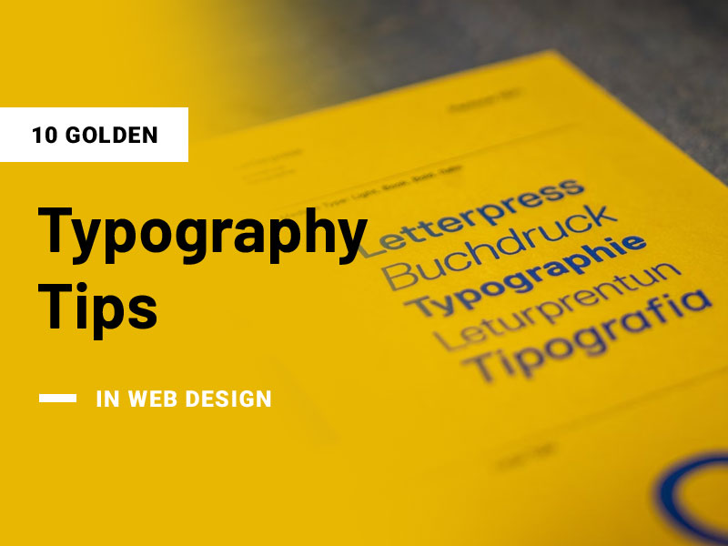
10 Golden Typography Tips One Must Keep in Mind While Designing A Website
1. Choose Minimal Fonts
Each font offers something distinct. Antiqua is widely used by legal, construction, and insurance firms as an indication of trust and reliability – used frequently in their advertising campaigns.
Serif fonts have long been beloved classics favored by luxury brands, while serifs offer something modern; today, they can be found virtually everywhere – script or display fonts are great accents and options that could add flair or variety for creative projects or accents!
Limit yourself to only two or three fonts depending on the task at hand; trying to coordinate too many will prove challenging. Classic combinations are best: antique for the headline (Garamond or Bodoni) and grotesque as the main text font. You may use different Verdana typeface fonts, such as Bold for header text and Normal copy text font.
2. Calculate Type Size
According to the hierarchy principle, larger point sizes reflect more important information, so using it effectively for any headline should attract readers’ attention quickly. In contrast, medium-type sizes should be reserved for body text, and small ones for notes or comments should suffice.
How can you select an appropriate type size for your headline? A special formula allows you to calculate an optimal ratio: body text * 1.6. If your main text was typed out using 18-point font size, 28 should be selected as its headline font size for optimal reading experience and easy perception.
According to many, the so-called golden ratio produces ideal proportions that are both harmonious and easy on the eyes – this number corresponds with this rule and ensures ideal proportions!
3. Select Suitable Line Spacing
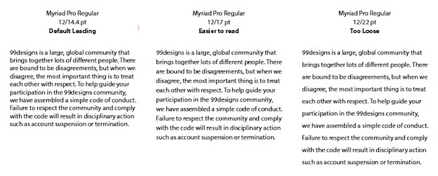
Source: 99designs
When setting line spacing for text documents, line spacing becomes one way of making text more readable. Too close together lines make reading challenging, while too far apart distances make reading cumbersome and troublesome.
There is an industry standard that states the ideal spacing should equal 120% of font size; so, for a font of size 18, 22 would be considered ideal spacing.
When creating your text, this same line spacing should remain throughout so as not to disturb readers while reading; when using headings, however, make sure the top line spacing is larger than the bottom to show which paragraph the heading refers to.
4. Select The Appropriate Line Possible
To make the text easier to read, make every effort possible to choose lines with an optimal reading length; longer lines tend to wear on readers quickly and divert attention elsewhere; too-long lines will cause readers to return backward in an inconvenient way.
Emil Ruder was an influential Swiss graphic designer and typographer of the 20th century who established an ideal line length of 50-60 characters, including spaces.
However, this can vary depending on circumstances. For example, if you have to design a custom website that needs to be mobile-friendly, you may benefit from having shorter line lengths (usually half size or less) for mobile devices; similarly height of lines is determined by length directly.
5. Know The Significance Of Colors & Contrast

When it comes to font selection, readability is key – black font on a white backdrop tends to be easier for readers because contrast increases as contrast increases.
Thus, black on white should be your go-to solution, though you don’t necessarily have to stick with this as there may be other color schemes you find more effective or too many colors will distract attention away from what matters more: your subject.
Be mindful that some individuals can be color blind and cannot distinguish between reds and greens; one in twelve men suffer from this condition, while occurrence tends to be lower among female sufferers.
6. Commit To Left Alignment
Align is designed to equalize spacing among text elements. There are four forms of alignment: left, center, right, and justified text are commonly utilized; justifying text results in spaces being generated between characters with differing lengths that make for disjointed reading experiences that break continuity within your writing project.
Left alignment is your best choice when it comes to organizing text. Just ensure no words or punctuation remain on a line after applying alignment; font size adjustments or tracking techniques (as discussed earlier) can further tidy your text for optimal reading experience.
7. Develop A Visual Hierarchy
A visual hierarchy refers to the subordination and structuring of elements within a design; this determines what elements should take priority, secondary statuses as well and how they combine into systems.
Visual hierarchies play an integral part in helping shape user experiences by drawing their attention toward key points on a journey map or the user journey itself.
Understanding and developing this hierarchy is also crucial for crafting an effective Gen-Z website design, as this generation has distinct visual preferences. Gen-Z users crave efficient, scannable experiences, prioritizing clear communication over cluttered visuals.
Hierarchy can be created with a size of text, colors, or negative spaces. A grid makes the task simpler as it helps organize elements to give a consistent look and group and align elements for an efficient result.
8. Prioritize Readability
No matter your approach, ensure all can easily understand your message. Avoid dark text on black backgrounds; using small font sizes over images with high contrast would only add clutter if the text cannot be read easily by your audience. Without readability at its heart, designing will become futile.
9. Limit Font Choices
Beginning designers often make the mistake of overloading themselves with too many styles and fonts. If using more than two or three, limit each font size/font family accordingly – use one font size/font family for body text while using another for header/subhead copy/or subhead content.
Please don’t shy away from pairing fonts from different families so long as their use makes sense together; using too similar a pair could result in miscommunication between readers or accusations that you used incorrect font choices accidentally.
10. Grammar Rules Are Crucial
Many hidden grammar rules exist that you may be unaware of; learning and understanding design-specific rules of grammar will enable you to create designs with a professional appearance by learning their use correctly.
Ampersands should be avoided along with double spaces following punctuation marks and dashes or hyphens for punctuation marks or dashes as ampersands can create errors when written using correct syntax; there are various guidelines specific for designing sentence structures as well.
While correct grammar might seem trivial at first, many designers would testify to its impact. Using correct grammar can take your design beyond simplistic levels of simplicity into sophisticated levels of sophistication!
Final Thoughts
Typography is essential in creating successful designs, yet even with all these guidelines in place, certain aspects that are easily visible to most visitors could still go overlooked.
Important to keep in mind is the conclusion of any iterative text design process: extensive user testing should serve as the final stage.
Internet users offer invaluable feedback about the readability of your text. Incorporating human input in typography ensures your readers will find comfort with what you write.