An abundance of online content has caused decreasing attention spans. Web visitors click, skim, and often bounce away within seconds. But there’s a tool meant to catch and keep their attention: the landing page. But here’s the catch: a landing page alone doesn’t guarantee success. Without the proper optimization, it will fall flat.
So, how do you ensure your landing page holds interest? This article reveals the best practices of landing page optimization for small business lead generation.

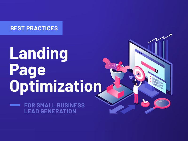
10 Landing Page Optimization Tips for Small Business Lead Generation
Clear and Compelling Headline
The headline is the first thing a visitor reads on your page and it sets the tone for everything that follows. A compelling headline directly addresses the needs of the target audience. It should evoke curiosity, promise a solution, or offer a hard-to-resist unique value.
Crafting compelling headlines isn’t about using fancy words or jargon. It’s about clarity. Simple language, free from complexities, ensures that a broad audience understands the message.
For instance, instead of saying, “Improve your firearm storage solutions for quick access“, a clearer headline might be handgun holsters, “Find the perfect for your handgun“.
Remember that while the headline grabs attention, the following content holds it. So, ensure you fulfill a promise made in the headline — the same way we do in this article. A mismatch can lead to lost trust and a higher bounce rate.
Mobile-Friendly Design
Over 55% of web traffic comes from mobile devices. Mobile-friendly design is not just about making your site look good on a smaller screen; it’s about ensuring a seamless and user-friendly experience. When visitors struggle to navigate or find information on a mobile site, they’re likely to leave, often for good.
But what does “mobile-friendly” truly mean? At its core, it’s about responsiveness. A responsive design automatically adjusts to any screen size, from desktop monitors to smartphones. It ensures that text remains readable, buttons are easily clickable and navigation is smooth. Simple gestures, like pinching to zoom or swiping, should work intuitively.
Beyond the technical aspects, consider the user’s journey. On mobile, attention spans are even shorter. Content should be concise, with clear calls to action (CTAs). Avoid large blocks of text and use visuals wisely. Remember, a mobile-friendly site isn’t just a scaled-down version of a desktop site; it’s a reimagined experience tailored for the on-the-go user.
Fast Loading Speed
A few seconds might seem trivial, but when it comes to web page loading times, they can make or break a user’s experience (UX). Imagine a visitor eager to learn more about your services, deterred by a spinning wheel or a blank screen. Consider the abovementioned short attention span and you’ll know the consequences — your visitor will move on to a competitor’s site.
Speed is important for both user satisfaction and search engine rankings. Google considers page speed as a ranking factor. A faster site can lead to better visibility in search results. But how can one achieve this coveted speed? Start with the basics. Compress images, minimize code and leverage browser caching. Although these might sound technical, many tools and plugins simplify the process, even if you don’t have tech knowledge.
High-Quality Visuals
Visual content, a striking image or a compelling video, can hold a viewer’s attention, conveying messages faster and more effectively than text alone. Instead of just adding any visual, choose the right one that aligns with your message and brand. High quality isn’t only about resolution. It’s also about relevance. An image should enhance the content, provide context or add value.

Source: Freepik
However, you must be cautious. While visuals enrich the UX, they can also slow down your site’s speed if not optimized. Compressing images, using the right file formats and considering techniques like lazy loading can ensure visuals enhance rather than hinder the user experience.
Strong Call-to-Action (CTA)
Every landing page has a purpose, whether it’s to inform, entertain or persuade. But beyond these objectives lies a more tangible goal: to cause action. This is where a strong CTA comes into play. It guides visitors toward a desired outcome, whether purchasing, signing up for a newsletter or downloading digital content.
A CTA should resonate with the value proposition, offering a clear next step. “Buy Now“, “Learn More“, or “Get Started” are not just commands; they’re invitations. They promise value, urging the visitor to take that leap.
Crafting a compelling CTA goes beyond its message. Its design and placement are equally important. A CTA should be noticeable but not overpowering. Contrasting colors, strategic positioning (like at the end of a compelling section or floating as the user scrolls), and an intuitive design can make it more noticeable and clickable.
Minimal Distractions
Pop-ups, sidebars, excessive links – they all vie for a visitor’s attention. But when it comes to a landing page, less is often more. The primary goal is to guide the visitor towards a specific action and every element on the page should serve this purpose. Anything that doesn’t risks diverting attention and diluting the main message.
Consider the navigation bar, for instance. While it’s essential on a central website, it can lead visitors away from the primary action on a landing page. Limiting or removing navigation options creates a more focused environment, nudging visitors toward the desired outcome.
The same goes for content. While showcasing everything you offer is tempting, a landing page should be focused. A concise message, complemented by relevant visuals, can be more impactful than a barrage of information. Go for quality over quantity, ensuring every element on the page adds value and drives action.
Related: How to Use Pop-Up Messages for Maximum Engagement
Trust Signals
Visitors are often wary, bombarded with countless offers, and suspicious of false promises. Businesses need to establish credibility to convert these skeptical visitors into loyal customers or subscribers. Trust signals are little elements that, while often overlooked, build confidence.
Testimonials are a classic example. Real feedback from real customers provides social proof, showcasing the value of your product or service. It’s a peek into the experiences of others, offering reassurance that the claims made are not just marketing fluff. But, you must have authentic feedback. Generic, overly polished testimonials will cause suspicion. Genuine words, accompanied by a photo or a name, resonate more.
Trust badges can range from security seals, indicating a safe browsing environment, to badges from industry associations or awards. They serve as endorsements, signaling that a business is recognized and adheres to certain standards. Moreover, clear policies, like returns or privacy, can also bolster trust. They show transparency, indicating that a business has nothing to hide and values its customers’ rights.

A/B Testing to Identify Best-performing Elements
Assumptions can be costly. What seems like a brilliant idea might not resonate with the audience. This is where A/B testing, also known as split testing, becomes invaluable. It compares two landing page versions to determine which performs better in achieving a set goal.
Imagine you have a headline that you believe is compelling. But could a different phrasing increase conversions? With A/B testing, you can present both versions to different audience segments and see which garners a better response. It’s not limited to just headlines; you can also test CTAs, images, layouts and color schemes.
You can pinpoint what influences user behavior by changing just one element at a time. Over time, these insights can be aggregated to craft a landing page optimized for conversions.
Relevant and Concise Content
When someone lands on your page, they’re seeking answers or solutions. The content should directly address this quest. But relevance alone isn’t enough. Visitors often skim through content, searching for key takeaways. Long explanations or unnecessary jargon can deter them, leading to missed opportunities. Instead, content should be concise, getting to the point without fluff. Every sentence should add value, guiding the visitor closer to the desired action.
The structure is also important. Breaking content into digestible chunks, using subheadings, bullet points or infographics, can enhance readability. It allows visitors to quickly grasp the core message, even if they’re just skimming.
Easy-to-Fill Contact Forms
Contact form is the moment of truth, where visitors decide whether to take the next step in their journey with you. While the preceding content plays a role in nudging them towards this decision, the design and usability of the form itself can be the deciding factor.
Aim for a simple form; the one that’s cluttered with too many fields can be daunting. Visitors might wonder why you need so much information and hesitate or abandon your page. Instead, only ask for the essentials. If you’re capturing leads, a name and email address should suffice. Every additional field can reduce the likelihood of completion.
Beyond the number of fields, consider their design. Are they clearly labeled? Is the font readable? Is there a logical flow? These seem like minor details, but they contribute to the overall UX. An intuitive design and clear instructions can make the process smoother.
Lastly, ensure a clear CTA within the form, highlighting the value of submission. Whether it’s “Get Your Free Quote” or “Join Our Newsletter“, this final nudge reinforces the benefits of taking action.
Also read: Biggest Landing Page Mistakes With Easy Fixes
Landing Page Optimization Wrapp Up
Businesses can capture and retain visitor attention by crafting a clear headline, ensuring mobile compatibility, and prioritizing fast-loading speeds. Incorporating high-quality visuals and a clear CTA engages users while minimizing distractions keeps them focused on the primary goal. Building trust through testimonials and trust signals, continuously refining through A/B testing, delivering concise content, and simplifying contact forms are all essential strategies.
Combined, these practices create a powerful, effective landing page that drives conversions and boosts business growth.