A lot goes into making a timeless and powerful logo for any brand. As a newbie designer or business owner, it is important to understand that a logo is the most prominent brand identity tool. It needs to be carefully crafted if it is to have the desired impacts. To make this possible, here are five logo designing mistakes you should be wary of.
1. Using wrong fonts
Fonts have tremendous impacts on a logo as they dictate whether it will look professional or not. Choosing the wrong fonts will also have a poor impression on customers, affecting your brand’s personality. A rule of thumb to adhere to when choosing fonts is to keep it simple and clean. This is why many top-ranking brands use popular Sans Serif fonts, as they are clear, eligible, and professionally appealing.
2. Being too trendy
While you need to keep up with advancements in the graphics design industry, this does not mean becoming too trendy. Settling for an animated logotype for your website is entirely different from creating a logo that is too trendy. Typically, people quickly lose interest in trendy logos. Since you cannot keep changing logos every time a new trend emerges, attention should be on creating a logo design that speaks about the brand.
3. Poor color schemes
The color schemes you opt for when creating a logo are a make-or-break element as they influence perspectives about the brand. Striking the right balance when choosing colors for your logo is vital, as a slight disharmony will leave you with a design that lacks appeal. Another related mistake is basing your entire logo design on colors. This is a costly mistake because you will have a weak logo that makes it difficult for the brand to have the uniqueness it deserves.
4. Too much detail
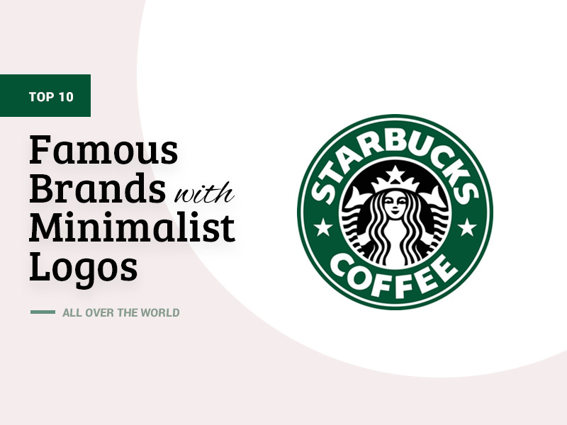
A logo with too many elements always fails to attract the right attention or have the desired impact. The more details a logo has, the more confusing it becomes. Take a lesson from world-renowned brands with distinct logos you can instantly point out even in a crowded billboard by keeping it basic and classic. It is the creativity to make a simple logo design appealing and unique that will make a brand stand out and not incorporate too much detail in it.
5. Confusing typography
Visual branding is an important pillar when building a recognizable brand, and a logo is a basic element in this. The last mistake you want to make when creating a point of identity for a business is having confusing typography that will be difficult to understand. Avoid typography with several hoops and twists or styles that make some letters hard to read. The goal should be to make viewers instantly have accurate information when they see your logo.
Endnote
At the heart of every branding venture and marketing campaign is a good logo. Steer clear of these common logo designing mistakes, and you will have an impactful logo that will enhance the brand’s visibility.