Developing a website with a well-sought and interactive UI and design elements can do most of the job when you wish to attract prospects for your users.
Your website UI and design enable you to standout from the existing competition in the market while helping you to attract a greater number of users. Moreover, since people wish to access services that are easy to use, highly engaging, and incorporate modern ideas, you must look into each adequately while developing a website or an app.
One of the major reasons most companies that provide app and website development services in USA are emphasizing pushing back conventional design ideas and moving towards newer, advanced approaches is because they relate to the fact as mentioned above.
So today, we would talk about some of the trending UI trends that app and web development companies must focus on amp up their development approach and products.
So, without any further ado, let’s look at the top UI trends that developers must watch for in 2021.
1. Unique Animation and Illustration
Animations and illustrations have been making a mark in the industry in previous years. However, they have been in the industry for a longer period of time, including animations and illustrations in the UI as design elements have been new and very impressive.
Among a few of the essential features of animations is that these add a natural touch to the entire look and presentation of an app or website. This is one of the reasons animations are massive attention grabbers.
Since moving images and unusual animation stirs the curiosity among their users, it increases users’ attention span and interest – meaning more user interaction.
2. Minimalistic Designs
Anything you plan to incorporate and experiment with while designing your app, makes sure to keep it minimal and not go over the board. People tend to have a massive interaction and experience with visual aspects on a daily basis, such as advertisements, videos, images, notifications, etc.
This requires you to cut down on features and design aspects that are not directly important. Moreover, optimize the essential aspects of your app and enhance your user’s overall visual experience.
Generally, people prefer designs that do not throw a lot on their faces; rather, they are minimal and suit the nature of the web or app.
3. Colorful – Blurred Backgrounds
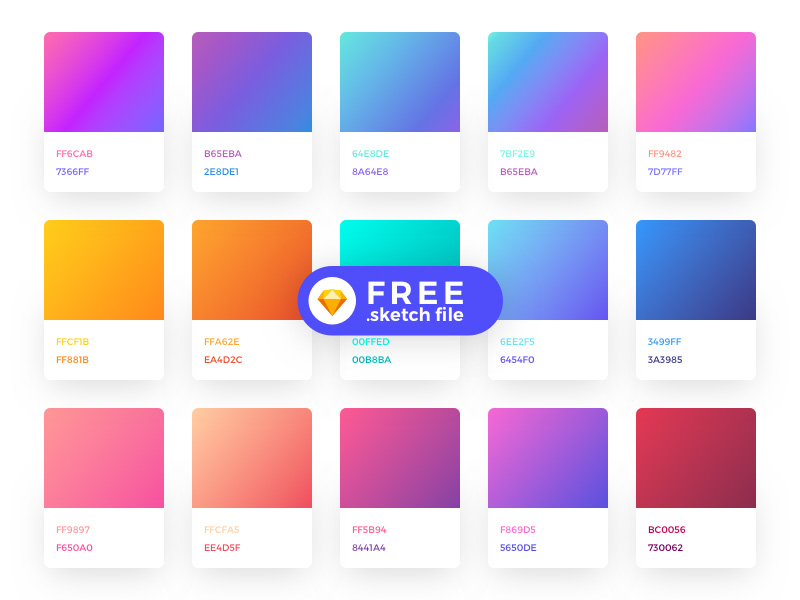
The use of gradients has always been relevant and attractive to users for a very long time. What’s fun is that it is applicable and engaging to this date too.
However, since the gradients, color palette, and patterns have changed massively now, the implementation approach has also altered. Therefore, regardless of the fact that gradients are now lighter and more convenient, they look more complex and intricate.
For instance, previously, gradient implemented 2 – 3 colors at a time; however, now designers can add up to 10 colors in linear gradients. The concept, more commonly among designers, is also known as glassmorphism.
Moreover, they can also use overlay very conveniently. With a colorful yet minimal and highly interactive technique is at work, it can give users a refreshing visual experience enabling greater interactivity with users.
4. Dark Mode Feature
This feature experienced its inception during the previous year, and it continues to grow popular and lovable. The dark mode feature became an instant favorite for users because of its elegant, stylish, and modern look.
With the continuous increase in our time spent using smartphones and laptops, the dark mode has massively enhanced the user experience by giving it a different look without much changes to the overall design.
Other than enhancing the user experience and maximizing the usability and time spent on mobile devices, the dark screen mode comes along with several other benefits;
- It enhances the readability of text on apps/websites.
- It is a good substitute for blue screen light and reduces screen glare.
- IT maximizes the battery life if the device based on an OLED or AMOLED screen.
- It reduces the excess eye strain when using devices at night.
5. Neumorphism
This design trend basically combines skeuomorphism and flat design ideas to create a visual style and designs that combine background elements such as shapes, colors, and gradients, with shadows. The idea is to create UI designs that have optimal graphical intensity and look appealing as well.
This gives the entire layout a fresh, soft, and modern look that resonates with the 3D styling. UI developed using Neumorphism have a very elegant look, and their elements feel very soft and comfortable in use.
However, neumorphism is not highly applicable to basic usability principles. Therefore, it can impact the overall accessibility and look of the apps or websites. But since, the UI elements and design look very interactive, modern, and beautiful, they have been attracting a greater number of users.
This is why the trend is expected to grow further in the time to come.
6. Micro-Interactions
Micro-interactions have been one of the massively growing and attention-seeking UI trends for the last few years. This is one of the reasons every software application has implemented micro-interactions at the core.
In most cases, users don’t realize they interact through micro-interactions that have now become an integral part of most applications. For instance, the like and comment feature on Facebook or Instagram, and the retweet feature on Twitter, are all included.
However, with the trends changing and modifying continuously, the micro-interaction factors move towards touchless and gesture-based interactions to control actions.
With a majority of interactions shifting to voice-based and gesture-based interactions, the users should experience to see more and more in the coming years.
7. Bold Typography
If you haven’t been in a coma for more than a decade, you would have seen that the font and typing sizes are getting bigger and bolder, specifically for websites.
The trend is commonly seen within landing pages and microsites. And, it is expected to grow more in the coming years.
The reason bold typography has been making it big and is trending in the design industry is that it grabs most users’ attention to be seen and read adequately. However, an important point in implementing this is to stick around with the overall design aesthetics.
Most of the websites that tend to attract users for a greater audience towards their services have been implementing this technique majorly because it is a very straightforward and proactive approach.
Examples of websites and tools include Nike, Dropbox, and Drift, etc.
8. 3D Designs
Last but not least, 3D designs and UI layouts have been attracting users for a couple of years now. Although the idea comes with massive memory consumption and requires maximum time to develop it, users have still been trending and loved.
The 3D design has enabled the designers to think beyond the x and y dimensions to implement visually appealing ideas within a three-dimensional space. Ultimately creating images and objects with changing depths and positions.
In the coming years, as the world sees the inception and exponential growth of augmented reality and virtual reality, the world would experience the increased use of 3D ideas and techniques in UI designs.
9. Asymmetrical Layouts
For a few years, another design concept growing glamorous and gaining immense attention by designers is the asymmetrical layouts in the website designs, specifically.
With the conventional symmetric layouts fading out of the picture due to a lack of modernity and attractiveness, users tend to get more interested in asymmetric designs. This is primarily because they tend to add more character, liveliness, and personality to the designs.
Furthermore, the trend is supposed to grow further in usage since it attracts more user attention.
10. Storytelling
Storytelling is leading when it comes to business marketing and attracting users.
It is, basically, the idea of creating a narrative around your data and presenting it in a way that not only attracts users but also compels them to stick around your product.
Talking specifically about UI/UX designs of mobile apps and websites, storytelling adds the x-factor in your layouts and elements that give the right oomph to your design, making it visually appealing and highly engaging.
Brands and businesses majorly use them while introducing their services or products or landing pages to attract target audiences.
Implementing storytelling in your designs and layouts can be achieved by striking an optimal balance between copyright, creativity, and visual hierarchy, including illustrations, colors, interactive elements, high-quality photos, etc.
Final Thoughts
Industries have now collectively become more customer-focused and productive when it comes to generating revenues and building a strong community. With major objectives transforming to be more targeted towards target audiences and prospects, the strategies implemented are transforming.
UI designs are one such example when it comes to customer-centric business approaches. However, as user preferences and requirements modify, it is essential for a business to opt for newer techniques that expand their horizons to cater to a larger user community.
