The right logo for your brand is one of the keys to its success. A recognizable brand logo provides more information than thousands of words ever could. By looking at your logo, your consumers recognize your brand straight away, so it’s in your best interest to make it as memorable as possible.
One can’t go through life without ever noticing a single logo. We’re all able to recognize dozens, if not hundreds of logos at any time, even if we never deliberately tried to actually identify them.
We see logos everywhere every day: on billboards, on a laptop lid, on a box of milk, etc., and we never get to realize how much work was put into designing a particular logo. What we also don’t understand is how the connection between us, the consumers, and the brand is slowly built through their logo. This is what every brand is striving for: to have a logo that anyone in the world can ‘read’.
Minimalist and Complex Logos
As you may have noticed, logos can be different. They can either be minimalist, easy to remember, or a bit more complex. Just look at how different the modern Apple logo and the Starbucks Coffee logo are:
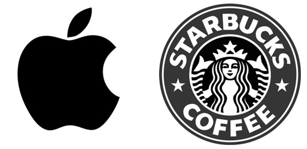
We bet that you’d be able to draw the bitten apple with your eyes closed, whereas the Starbucks logo is pretty hard to copy all the details without looking. However, both are very recognisable, and most of us wouldn’t think they are buying a Nokia when purchasing a phone with a black apple on the back of it. But how do they decide whether to use a simple or a complicated logo for their brand? They just go for it.
Without a doubt, there are certain factors that can have an impact on the logo, such as the industry of where the brand is operating. Still, there are also many examples where two successful companies from the same industry use different types of logos.
What is Minimalist Design?
In interface (UI) design, minimalism is a style that emphasizes minimalist use of flat colours and simple elements, such as geometric shapes and clean lines. Minimalist design should not be confused with an unfinished look. Elements that are designed minimalistic are simple, but they are not simplistic. In other words, the purpose of minimalism is to strip away from unnecessary details and focus only on what needs to be there.
Minimalism isn’t just about UI design. This movement can be seen in other areas as well, such as:
- Music
- Visual Arts
- Architecture and Interior Design
- Cinematography
- Literature
- Cuisine
- Fashion
- Dance
- Science Communication
The art movement began after World War II, primarily in Western cultures. In the beginning, it was only associated with American visual arts, but, eventually, it got largely widespread all over the world.
The minimalist design was largely inspired by Bauhaus culture, which was all about having this more down-to-earth feel instead of worshipping the grandiose designs of the past.
Why Use Minimalist Design in Logos?
Brand owners may prefer using simple logos because they are more efficient. It allows designers to use fewer elements, while still making the logo recognizable. From the point of view of a consumer, the simpler the logo is, the easier it is to remember. That being said, a minimalist logo is advantageous for all parties involved: brand owners, designers, and consumers.
In addition, with the growing number of mobile users these days, a lot of brands want to make their websites compatible with all kinds of portable devices, be it a phone or a tablet. Since phone screens are relatively small, you’d want your logo to still have an impact on your existing or potential consumers. Frankly, a complicated logo may not even be recognizable or show properly on a small screen.
When it’s the holiday season, many brands like to adjust their logo to a particular holiday. For Halloween, some logos may temporarily change their colours to black and orange; for Christmas, some go red and green. Of course, not all brands decide to modify their logos, but some do, and it’s way easier to do if your logo is rather simple and doesn’t require much time to be adjusted.
Over the years, some brands have changed their logos to look simpler and flatter. Take a look at Pepsi’s logo history, for example:
![]()
As you can see, the logo is becoming more and more minimalistic, but at the end of the day, it’s still very recognizable all over the world.
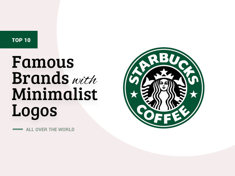
10 Famous Brands with Minimalist Logos
Let’s have a look at some of the most famous brands and their recognizable, yet straightforward, logos:
Apple
If you are familiar with the history of Apple, you know that they were pioneers of the minimalism concept. Starting as an extremely complicated sketch in 1976, the Apple logo got much simplified the following year, where it began looking just like the modern apple, only painted in different colours.
![]()
Uber
Uber has truly changed the game. They basically have no logo at all, only the brand’s name written in a simple font. This is the perfect example of applying minimalism to a logo (even if it doesn’t look like one). Some might say that it’s not creative enough, but just look at how big the company has grown since 2009.
![]()
Airbnb
Airbnb also decided to use minimalist design when making a logo, but they chose a more creative way to design one. You wouldn’t confuse the A on Airbnb’s logo with any other As: it is unique and perfectly symmetrical, something that a perfectionist would enjoy looking at. The unobtrusive pink colour helps consumers remember the logo as well.
![]()
Nike
If you’re older than the Millennials, you remember rocking Nike shoes with the legendary swoosh and the name of the brand above it. However, they got rid of the name above the logo back in 1995 and have only used the swoosh since then. It’s such an effortless, yet extremely recognizable logo.
![]()
Louis Vuitton
Louis Vuitton’s logo often makes appearances in minimalist-logo lists, and rightly so, as their logo only consists of two letters, and it’s not hard to guess which ones. Louis Vuitton is a luxury goods company, so you know they wouldn’t use a simple logo if it wasn’t ‘luxurious-looking’ enough.
![]()
McDonald’s
You may not believe it, but McDonald’s had a complex logo, too. They started using the yellow M only in the 1960s, but it still didn’t look the way it does today. Wherever you are in the world, if you see this McDonald’s sign, your mouth will start watering right away.
![]()
MasterCard
It’s not very clear what precisely the red and yellow circles represent, but you always know what brand this logo belongs to. Maestro, a debit network launched by MasterCard, has pretty much the same logo — only the colours of the circles are red and blue, so by looking at it, you can tell that this brand has something to do with MasterCard.
![]()
Target
A target is a target. You wouldn’t have too many options when making a logo for a brand with a name like that. The main element here is probably the colour and not the circles themselves.
![]()
The F on this logo came a long way from ‘[thefacebook]’ and ‘facebook.’ In 2021, Facebook became Meta, and their logo turned into a different minimalistic logo representing infinity. As you can see, minimalism is as popular as ever, with the largest companies in the world still using simple logos.
![]()
Audi
Frankly speaking, minimalist design is often used among car brands, which is very understandable: they put their logos on each vehicle, and they want it to be recognizable from a long distance. Audi’s four rings are a great example of a memorable, yet simple logo.
![]()
Conclusion
Minimalism is very trendy and popular these days. It can be found in many different areas of our lives, so it isn’t just about interface design. Simple, minimalistic logos are meant to be recognizable by a large group of consumers and provide as much information about the brand as possible.
Minimalist logos can be very different: some brands use certain simple figures and elements, while others just use their name as a logo. Even brands that started with very complex logos at first have simplified them over time in order to adjust to the modern trends and help consumers easily memorise their monograms.
A simple logo doesn’t mean less effort. In fact, a minimalist monogram would probably require even more time and consideration to be put into its design before using it: it should be simple, but unusual, and unique enough so that consumers don’t confuse it with some other brand’s monogram. At the end of the day, whether to use a complicated logo or a simple one is up to the brand itself.