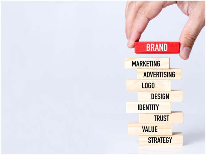
Building a strong brand identity takes time and effort but is a worthwhile investment. Strong branding can help your business to achieve goals & succeed.
Getting a business off the ground is both exciting and scary. But what about making a brand personality as a whole? Branding tells the world who you are, what you do, and what people can expect from your business. It’s important!
Making a brand personality is fun and easy, which is good news. You get to make your business into something people will remember for a long time. Brand identity will help you get customers to stick with you and tell their friends, build trust, and make people think your product or service is worth more and charge more.
Building a solid identity of a brand with design experience seems simple. Still, this guide and worksheet will give you the tools and information you need to develop a memorable brand identity design you’ll enjoy.
What is Brand Identity?
It is the visual and verbal representation of a company or organization. It is the sum of all the elements that make up a brand, including its name, logo, colors, typography, imagery, and tagline. It helps people identify and remember a brand and plays a vital role in building brand awareness and loyalty.
Brand Identity vs. Logo: What’s the Difference?
![]()
Brand identity and logo are two terms often used interchangeably but have different meanings.
Branding leads to a physical and digital thing called a brand identity. It is the collection of digital and physical brand elements that a company makes to show its target audience the right picture of itself. These things make up your brand’s visual identity, so people can see it and know it’s yours.
The logo is a visual representation of a brand. It is a symbol used to identify and represent a company or organization. Logos are often used in marketing and advertising materials, and they can also be found on products, packaging, and company websites.
The main difference between these two is that brand identity is a broader concept encompassing all the elements that make up a brand. In contrast, a logo is a specific visual element representing a brand.
Also read: Logo Rebranding by Popular Brands
The 10 Different Types of Logos & How to Use Them
1. Logos and Marks Together
As I said, a combination mark logo mixes a picture and a word. As you read through this guide, you’ll see that there’s no one type of combination mark. Instead, they’re made up of many different marks. This is why these names are the most common: they can be used in many ways and are very useful.
The image can be on top, to the side, or even below the wordmark in a combination logo. The best combination marks can be used singly and still be easily recognized.
All of the combination marks in your Kittl’s logo maker tool area are logo templates. From that starting point, you can make different versions based on how you want to use your image.
2. Wordmark Logos
Wordmark names come in second regarding how often they are used. They form the second part of virtually all compound names. To qualify as a “wordmark“, a logo must feature stylized letters that spell out the company name.
To make a wordmark, write out your brand’s name and try it out differently. Once you’ve found a type you like, it’s up to you to change each letter. Taking the time to change the notes in your brand name makes the difference between an image and a well-written brand name.
For example, give the letters personality by adding ligatures, making the dots on the i’s into shapes, the y’s curvier, etc. It’s possible that you won’t need a combination mark at all if your brand name is a wordmark, but you might if you want a more compact representation of your logo.
3. Lettermark Logos
A letter mark logo is the best choice if your brand name is long and has more than two words. A letter mark logo shortens the length by making a group out of the first letters of each term. In some cases, the letters sound like a word. NASA is a great example. NASA stands for the National Aeronautics and Space Administration, but no one calls it that.
Other examples, like NPR and TNT, that don’t sound like words are read letter by letter. A letter mark image can be used as a combination mark, like a word mark.
Use design templates and elements to make your brand stand out when making a letter mark logo. To give the logo flavor, use different colors, different sizes of text, shapes, or lines. Always show what your brand stands for and what its story is.
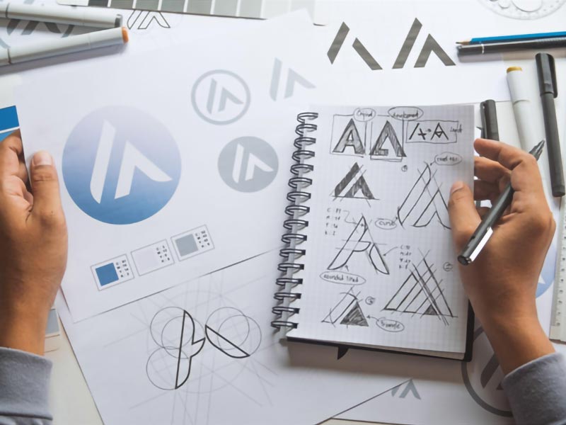
4. Monogram Logos
![]()
Monogram logos are similar to letter mark designs. But there is a clear difference between how they look. Both methods comprise the first letters of the brand name, but monograms weave the letters together instead of putting them next to each other or from top to bottom.
A monogram is like how a family name is embroidered on linens or stamped on silverware. Most people think that this type of logo is high-end or exclusive. There are some exceptions, like some sports teams and brands.
The best brand names for a monogram mark have at most three words. Because the letters are close together, they must be easily read and understood. Choose this type of image if you want to keep your visual branding as simple as possible.
5. Letterform Logos
Another type of logo that uses letters is a letterform image. Only one letter in this case. This type of design is excellent for brands that like to keep things simple. A letterform logo needs a lot of style and shape to stand out. Just a letter will be more challenging to remember.
Brands need different versions of their logos to use on various platforms and in different ways. A wordmark with a variable letterform can be used for everything a brand needs to be. From favicons and app icons to business cards.
On a phone screen, app icons fight for your attention. Users won’t be able to find your app if it has a picture that doesn’t match the brand or isn’t very recognized. Letter shapes work well as app icons.
6. Symbol or Pictorial Logos
Symbol logos, also called pictorial logos, are pictures showing what the brand is or what it does. These can be icons, drawings, or shapes put together in a way that makes them easily recognizable.
Twitter’s logo is a bird, Shell’s is a shell, and Dropbox’s is an open box. Finding an icon visually representing your brand name or story is relatively easy. The trick is to give it that extra bit of character, that unique touch.
So, the Twitter logo looks like a bird, the Playboy logo looks like a rabbit, and the Apple logo looks like an apple. These are the most straightforward logos to get right; all you need to do is make yours unique and vital.
7. Abstract Logos
Abstract logos are like symbol logos gone wild. An abstract logo goes differently than a logo that shows the brand name or the story behind the brand. Sometimes, it starts as a symbol and then changes into an abstract picture. In other cases, the abstraction is born on its own.
To make an abstract mark, you need to know what the brand is all about and how it came to be. You need to know what story you want to tell to be able to come up with an abstract image. Think of it like getting a tattoo: you don’t want a mark that doesn’t mean anything or tell a story.
Even if you have a few shapes next to each other in your abstract mark, what does each shape mean? What does it mean that the two shapes are put together? Yes, you can make up a story since your logo is abstract.
8. Mascot Logos
Mascot designs are fun and friendly, but they could be more versatile. A mascot image might only be suitable for some brands. How do you know if you need a pet logo?
A mascot image could be the right choice if your brand’s story concerns a person or a unique character. Mascots can be drawings or more straightforward versions of what the brand’s ideal customer looks like or what the customer wants to be.
In some cases, the mascot is the company’s founder or someone who impacted how the brand came to be. In other cases, it’s a made-up character meant to get people excited and involved. The Michel man from Michelin was the first mascot image in this style.
Just because a brand has an animal doesn’t mean it’s a mascot logo. The mascot needs to be interesting and tell a story. Use this to your advantage by designing and making plush dolls and figures featuring the mascot.
9. Emblem Logos
An emblem logo is a design that fits all of its parts inside the shape of an emblem. Brands with emblem logos don’t usually have other logos, but they might have simpler forms of the same emblem.
Emblems are great for labels, pins, bottle tops, and other small spaces where a brand needs to fit. They are also exciting and easy to remember. An emblem can be as simple as a few icons and a letter mark in an exciting shape or as involved as a custom illustration with a lot of detail.
Choose an emblem logo if you want your company to become a part of history. A well-made symbol logo will always look good and could be used to make stickers. Use text effects to make the words stand out and ensure the forms and letters stand out against each other.
10. Letters Inside Shape Logos
Logos with words inside forms are similar to emblems but not precisely the same. The difference between them is how hard they are to do. A symbol is like a letter inside a shape regarding a combination mark.
The idea behind this logo style is to make a wordmark (also called a lettermark) stand out from the rest. The form can be anything if it fits the brand’s mission and story.
Consider what shape might represent your brand when thinking about a mark with letters inside a shape. There’s no limit to what you can do because there are many choices. Domino’s Pizza looks like a domino, and Pfizer looks like a pill. Use a shape that goes with your image to give it a story.
What Type of Logo is Right for Your Business?
When choosing a type of logo for your business, it is crucial to consider the following factors:
- Your industry – Some industries are more suited to certain types of logos than others. For example, wordmark logos are often used by businesses in the technology industry, while pictorial mark logos are often used by businesses in the food and beverage industry.
- Your target audience – The type of logo you choose should appeal to your target audience. For example, choose a fun and playful logo if your target audience is young people.
- Your brand identity – The type of logo you choose should reflect your brand. For example, if your brand is all about being modern and innovative, choose a wordmark logo with a clean and simple design.
Once you have considered these factors, you can narrow down your choices and choose the suitable logo for your business.
Also read: 20 Creative Logos with Hidden Meanings
Conclusion
You must choose an excellent image to design a good brand identity. It’s the face of a business, so it should show what the company stands for and wants to do. There are different logos, such as wordmarks, letter marks, graphic marks, and abstract marks, from which to choose. When choosing a logotype, a business needs to think about its own wants and goals and the pros and cons of each type. You can hire a graphics design creator or logo maker to make a logo that fits your needs. A company’s ability to attract new consumers, strengthen existing relationships with existing ones, and establish itself as an industry leader all begin with a logo.