One of the essential considerations when trying to make a business instantly recognizable would be to come up with a great logo. It is easy to underestimate the importance of a logo. If put up alongside the business’s name, an emblem is a hands-down winner when it comes to garnering more attention. Every year a lot of companies go for logo rebranding.
When a website such as Tizona offers promotions, they are typically offered during marketing campaigns with their logos. Why is this? Because visual identity is extremely important if you want a product or service to be memorable and attractive to potential customers.
Unsurprisingly, several factors go into creating a popular logo design, kindly check this blog post from Sonary for some tips. The logo itself has to meet the following expectations.
- Instantly recognizable
- Reflect the message of the brand
- Stay unique
- Get highlighted amongst a sea of competitor
It can often be fine art to master. Irrespective of the company/business size, there have been numerous examples of massive failures even now. Each industry is unique, but they need to connect with customers remains the same across the board. For this purpose, the logo design definition has to be spot on. Some basic logo design guidelines can make a massive difference to the outcome.
- Memorable
- Relevant
- Simple
- Versatile
- Timeless
1. Memorable
One of the vital logo design basics would be to create a sketch that is easy to remember and make a connection instantly. The primary function of this product is to make people associate a particular product with a brand. To achieve this function, the sketch has to be easy to remember. This way, it will stay longer in the memory. Unlike a product from a competitor, the emblem can stand out from the crowd if it is memorable.
2. Relevant
The logo design ideas have to be in line with the company’s products and expectations. They should be able to trigger various emotions in the buyer and show the brand’s personality. For example, a company that deals with the sale of toys should go with bright colours for communicating that energy. The logo design size also has a key role since it would also recommend the font size that would accompany the same.
3. Simple
It should not come as a surprise that simple designs have enjoyed a profound success and impact for the last 150 years. A simple sketch makes it easy to remember and recognize in almost every situation. It also makes it easy for fans and regular consumers to express the brand if required. The personality of the brand should be conveyed, even if it is simple. The focus should not be on the colours or screen real estate. Both have to be kept at a bare minimum. Some of the best ideas for a simple sketch would involve word or letter marks, which are in line with the colours and font of the business.
4. Versatile
The logo design dimensions have to be in such a way that they can be reproduced in several situations, shapes, and ways. A sketch that can be used in one size is not good enough for promotions. The purpose of coming up with an emblem goes out of the window in such a scenario. The availability of the many sharp corners and edges might pixelate the final product if it is resized. The lack of too many interventions can make the outcome quite versatile.
5. Timeless
The intention of a business or company is not too frequently change their brand emblem. For this reason, any design has to stand the test of time. It can be very tempting to use logo design trends or a fashion, but the designer should always keep the future in mind. A great example would be Nike, whose emblem has practically remained unchanged since it was created in the 1970s. The focus would be more on quality rather than quantity. One way to make a product timeless is to remove the unnecessary clutter and avoid any crazy ideas.
It is pretty challenging to achieve a design that manages to hit all the above requirements. This is one of the reasons why only a handful of creations have been able to achieve immense success.
Great Examples of Good Logo Design
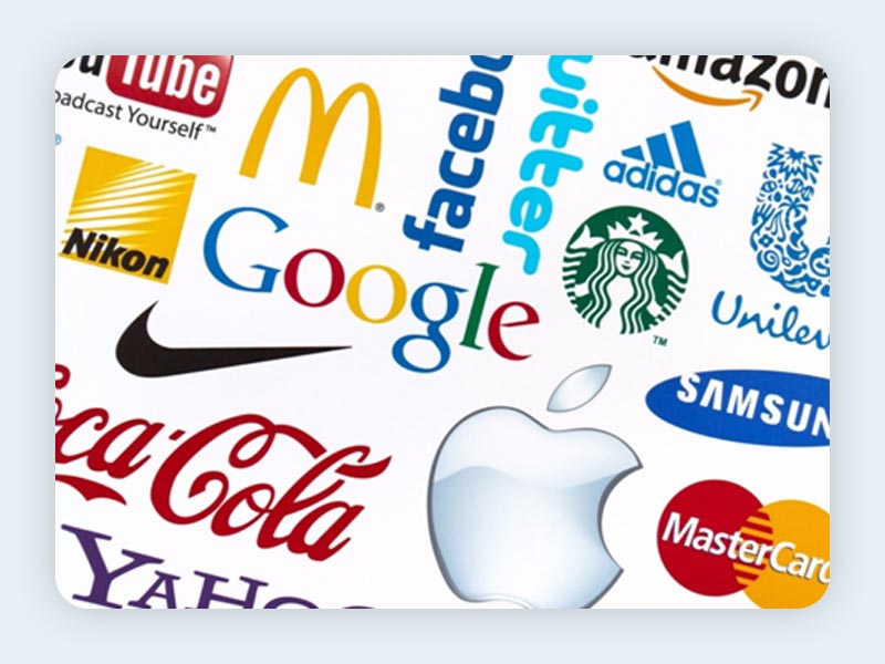
There are many eye catching logos, and we’ll list a few of them below. It’s essential to study every one of them to understand the process better.
1. Nike
The ‘Swoosh’ symbol from Nike easily ranks as one of the most popular. Yet, it is hard to imagine that the logo was created for just $35. Most of the logo design examples tend to focus on this success story, as designer Carolyn Davidson had come up with a brilliant but straightforward design.
This is one of the few designs that can be conveyed in words. The success of this symbol lies in its ability to convey the essence of the company – acceleration, power, and speed – without even trying hard. The lack of colours means that the design has been able to stand the test of time with fantastic ease.
2. Apple

The original Apple logo introduced in 1976 is vastly different from the current sketch. It was way too complex compared to the contemporary design, which was introduced back in 1998. Over the years, Apple has significantly limited the logo design elements and brought in simplicity. Rather than complicate the design, the emblem merely features ‘an Apple.’ After experimenting with colours in the early part of this design philosophy, Apple switched to monochrome sketching in 1995, and it has not looked back since.
3. Coca-Cola
The simplicity, yet powerful nature of the font, is best demonstrated by the Coca-Cola logo since 1958. The logo design elements have undergone very few changes apart from introducing a white wave beneath the letters. Coca-Cola has been able to work its magic with the design by sticking to the guidelines – font, colours, and simplicity. The font used is the classic Americana, while the red colour provides a dash of passion.
4. Mercedes-Benz

It is a trend amongst automakers to change their emblem after a few decades. Yet, Mercedes-Benz is one exception as it has stuck with the same emblem introduced in 1909. The star logo design elements are iconic even now, and it is often accompanied with little to no text. A lot of careful consideration has been given to ensuring that the output stands for all the qualities of Mercedes-Benz – luxury, opulence, and class.
It is easy to note these changes when compared with the symbol of manufacturers of mass-market cars. The Mercedes-Benz symbol features sharp corners, which have a glistening effect, while the font of the brand features rounded and smoothened-out corners.
5. FedEx
For almost two decades after creating the first badge, FedEx kept with a design that only involved a single colour. However, the logo design inspiration for bringing colour palettes into a single sketch resulted on the current logo introduced in 1994. An interesting touch in the symbol would be the presence of a white arrow, which is borne out of fusing the latter E and X.
Final Thoughts
All these five brands have tasted immense success in their history partly because they have always been easy to identify thanks to their logos. You will need to do plenty of research, and you will need to explore the true values of a company to create a powerful logo. Remember that the work is not easy.
All in all, what’s your take on this? Let us know in the comments!
