Being a designer, you need to learn the art of making your artwork decent. Many times, designers do not pay attention to making the logos clean. They use various types of elements to make a glitzy logo, but often forget about the part of making them look neat.
To avoid making your logo look messy, you need to keep in mind some core principles. One of them includes the proper usage of negative spaces in a logo. It looks quite an obvious thing but is overlooked by the designers most of the time.
Using negative spaces, you can not only make your logos creative, but can also illustrate a clear picture of it. As exemplified by the best logos, you’ll know how important negative space is when creating your logo. However, you need to consider some tips to properly utilize negative spaces in the logos. In this article, we will take a look at those points, defining the key areas where a negative space should be used with a proper technique.
Let’s first understand what negative space is and why it is used in the logos.
What is a Negative Space?
Negative space is a special technique that utilizes the background of an image to create a new shape or image. This looks very creative and can be only used perfectly by skilled designers. This can also be said as an art that needs a direct vision before creating an image.
This negative space design provides a unique way to portray a picture within a picture. It showcases a creative message defining the thoughts of a designer in a much ingenious manner.
Sometimes, the negative space images are designed with a clear perspective of bold evidence. This is basically a technique that shows the true nature of a business in a logo.
You might have seen multiple types of these examples in different renowned logos such as WWF, USA Network, and more others. All of them clearly show a separate figure designed using the negative space using précised color combinations.
Why Do Negative Space Logos Look More Creative?
It is a known fact that every brand wants to market its services using a creative logo. They also want to know how to copyright a logo to protect its identity. As a designer, you need to find out those specifics that can bring creativity to your designs. This could be done by using any appropriate feature that fits best with their brand values.
We all know that just using colors and unorthodox shapes could not bring much creativity to the logos. You need to find some other things that can bring the uniqueness factor in logos.
By using negative spaces, you can make your logos a bit elusive in looks among others. Using the combination of two colors or shades, negative space logos can define your brand image uniquely. The good thing about this technique is that it keeps your logos simple, yet creative in overall looks.
It makes sure that you can define a brand message within a picture, giving the whole logo an astounding look. That is why it is also recommended to only prefer skilled designers or agencies to create such logos. These people know how to play with colors and spaces, without affecting the overall quality of the logo.
Tips to Perfectly Utilize Negative Spaces in Logos
Using negative spaces in a logo is an art and needs to be done precisely knowing the exact requirements of the brand. It is something that can’t be done randomly without having any knowledge. Therefore, to do that perfectly, you need to keep in mind a few tips while initializing negative spaces in a logo.
Here are some of the important tips that could help you to design any logo with negative spaces appropriately.
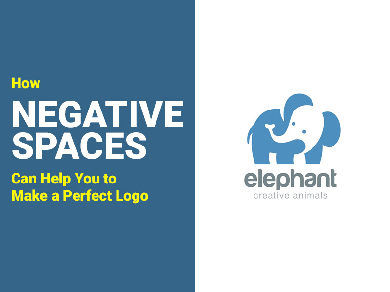
Utilize Minimalist Design with Negative Spaces
It is always said that a logo should be minimalist in design. The reason is that it is the basic identity of a business and must be shown cleanly to the people. Those logos that are a bit messy cannot attract eyeballs quickly. They look uneasy to the eye and fail to portray the brand message of a company correctly.
Using the minimalist design, you can ensure that the logos can be easily understood by people. This type of design is the perfect option to use negative spaces as well. It provides you a better way to draw different types of figures while keeping the whole logo simple. These minimalistic logos with negative spaces are easily understandable, showcasing a clear thought behind the design.
Use Negative Spaces to Fill Critical Information
Negative spaces are always used to showcase critical information about the brand. This is standard practice for using them inside a logo. As a designer, you must need to create such a negative space design that can include enough information about the business or brand.
We have seen multiple logos like FedEx, Oscar, and more others using the same types of logo design. They smartly utilize given spaces inside a logo to showcase the core image. Considering them, you can also learn how to use these spaces to define the main brand message.
You can think of it as the main area where you need to draw the exact brand image. This will help to make that figure look prominent and eye-catching to others. Meanwhile, just make sure to use these spaces neatly, so that the overall picture should not look messy.
Use Negative Spaces to Create Faces
Another way to smartly use negative spaces is to create faces inside the logo. This can be said as a picture within a picture showcasing a bit of uniqueness. As a designer, this technique can add a spin of creativity to your logo designs. It will ensure to make your logos interactive and not become too conventional by just adding one shape.
Nowadays, many brands utilize this kind of logo design to bring a flair of personalization to the logos. Using some smiley or cute faces, you can enhance their interactive look. This will give them a better chance to get more attention, provided they are designed according to the targeted audience.
Use Contrasting Colors
Using negative space just does not mean to blank a particular area. A lot of time people confuse this technique by just blanking a particular area to show the background of the image. This is not a complete definition of using negative spaces, especially when you are designing logos with multiple colors.
Negative space can be also included by using contrasting color combinations. It is simply not necessary to just blank out a specific area to include negative space. You can also creatively design logos with two colors and can use one of them in the area of negative space. This is a contrasting color technique that can also be used instead of just blanking the areas.
Looking from the design perspective, this will make your logo more visually interesting. It will add a combination of two colors smartly with a pattern of negative space designing in the logos.
You can also learn the art of using these contrasting colors by looking at various famous logos such as LG, FedEx, the Museum of London, and more. These logos perfectly show how to use negative space while designing with multiple colors. However, keep in mind that this art requires skilled hands. It requires you to be good at selecting colors and use them appropriately in the logos.
Use the Product Image
Using a product image is also a good option to work with negative spaces in your logo design. We all know that every business wants to promote its products/services eagerly in the market. Using them with plain shapes isn’t a good idea in logos. However, depicting their little image or background using the negative space isn’t that bad at all.
We have seen multiple logos of hospitals and clinics using the same design strategy. They usually include buildings, medics, and other stuff in the negative spaces. Considering the same thought, you can also include your product image in the relevant logos.
For instance, if you are a publisher, you can use books in negative spaces. Similarly, if you are making a logo for an automobile company, use the little demonstration of cars and trucks in the logo. All of this basically depends on your business background and the products you are marketing in the industry.
Use the Negative Space in a Wordmark
We all know that many brands prefer to use wordmarks in their logos. It makes them look professional and simple. From Google to Calvin Klein and more others, you would have seen countless examples of wordmark logos in the world. They look highly sophisticated and offer a clear branding image of the company.
However, being a designer, you could also sense the opportunity of using a simple negative space design in these logos. It can make them look more attractive and eye-catching than just being conventional.
However, make sure to use the negative spaces correctly in these wordmarks. A lot of times, people make design mistakes while using negative spaces in the wordmark. They basically use such spaces that separate the whole word, making them a bit complicated to understand. Therefore, try to be minimal while using negative spaces in the wordmark, so that the actual name of the brand does not get broken.
Use Negative Spaces inside a Letterform
If your logo only consists of a letter, try to smartly include negative spaces inside it. The example of Pinterest and Facebook logos is quite evident in this regard. Both of these logos contain only one letter, yet they are designed with a unique flair of creativity.
Based on your business background, you can include any type of shape inside the letterform. If you don’t have any idea how to design an inner shape, take a look at the different logo examples given on the internet. This will give you a better understanding of how to draw a little negative space inside a letterform.
Famous Examples of Logos Having Negative Space
Looking at the example of famous logos is the best way to learn the art of using negative spaces. Here are some of the popular brand logos having negative spaces.
World Wildlife Fund (WWF)
![]()
The World Wildlife Fund (WWF) is one of those global organizations that doesn’t need any kind of introduction. It has a footprint all over the world, working tirelessly for the betterment of wildlife.
The evergreen logo of WWF is indeed a clear example of using negative space in a logo. It has an adorable panda designed with a combination of black and white colors. For starters, this logo provides a clear explanation of how to design any image using negative spaces.
NBC
![]()
NBC is also a renowned news casting organization having offices in different countries. If you would have analyzed its logo carefully, you might have noticed the head of a peacock. This is very creatively designed, giving a great demonstration of how to use negative space between multiple colors.
LG
![]()
LG is a leader in the industry of electronics in the world and its logo is also very unique. It is the perfect logo that will let you understand how to draw a face using negative space in the logo. It shows a face using the two letters of ‘L’ & ‘G’. If you look closely, you will notice that ‘L’ is creating a nose-like shape, while ‘G’ is completing the whole face.
Meanwhile, some people also associate it with the logo of Pacman. It offers a bit of similarity with the logo of the famous video game, however, its colors are quite different from that.
Final Words
That takes us to the end of this blog in which we have discussed how to use negative spaces in a logo design. It is indeed an art that requires a proper understanding of designing from skilled professionals. Using negative spaces, you can design logos with a creative inner shape, face, or lettering. Just keep in mind to properly use the spaces with the right design that can relate to the logo and its business background.