If you’ve dabbled in the marketing world at all, you probably know that landing pages are key to nailing conversions. Every company aims at making high converting landing pages to raise the amount of traffic to certain pages of their websites.
Just to review: A landing page is a web page, either somewhere within your website or standalone, whose goal is to increase conversion rates and to reduce bounce rate. Experts from RegexSEO say:
“Negative user signals, such as high bounce rate, short time-on-site or pogo-sticking (the worst feedback that your site can receive), will get your website demoted from Google’s search results very fast. So, make sure your site is well structured and fully CRO-optimized.”
However, this only happens when your page is put together strategically; a page that confuses your audience isn’t going to do much for your metrics besides disappoint them.
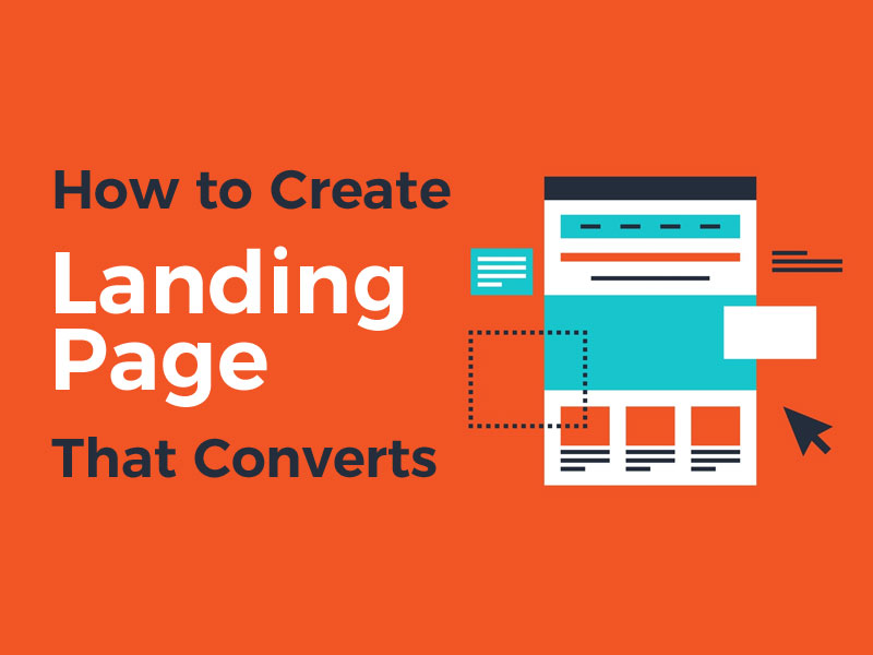
How to Create a Landing Page That Converts
Here are 10 significant factors that will make or break the effectiveness of your landing page.
1. Flawless headline
Your headline is your visitors’ first introduction to your landing page, and it needs to be strong enough to give them a reason to stay.
To do that, start by considering the source through which you’re directing your visitors to your landing page; how did they get there? Make sure the headline they see is consistent with the language of the ad, social post, or email (to name a few) that brought them there, using language that is clear and accessible to the reader.
Aside from that, you’ll want a headline that is short, sweet, and to the point; try not to use more than 10 words, but do use a large font that grabs attention. In design, large elements are perceived as more important than small elements, so your visitors will pay attention if you “ask” them to.
Finally, make sure the headline either says something about your offer, your brand, or the main goal of your company. Remember, the idea is to keep your audience interested, so use words that you think will be appealing to them.
2. Straightforward copy
You got customers to your page – now you have to keep them there.
Directly under your header is your opportunity to persuade your readers. Go into detail about your offer and tell them why they should choose you.
Don’t be afraid to be creative, but keep the creativity within reason. A little humor is almost certain to work in your favor; too much wit will scare visitors away. And, aim for some sort of balance between your headline and body copy; if your headline is clever, make your body copy more serious (and vice versa).
Also, stay on topic. If the goal of your page is to get visitors to sign up for a home inspection, don’t talk about your latest company updates.
Your body copy shouldn’t take up a lot of space (avoid large chunks of text at all costs), so try your best to get to the point in one or two sentences. Keeping it short will lessen the likelihood of your visitors getting bored, leaving your site, and failing to convert.
3. Optimize CTAs
This is the last element of copy to consider on your page, but arguably the most important one.
As stated above, the whole point of a responsive landing pages is to drive conversion rates. You have a goal that you want to be met, so it’s important to pave the way for your visitors to reach that goal – which is done through your CTA, or call-to-action.
A CTA is a small line of text that asks your visitors to do something, usually displayed on a “button”. This could be anything from “Claim Your Coupon” to “Go to Home Page,” “Download my Ebook,” or of course “Buy now.” Having a CTA on your landing page is essential, as it’s what your entire landing page has been leading up to.
Create a CTA that you think will be relevant to your users, and that logically follows the body copy above. Try to only use one CTA; sticking CTAs everywhere will not only lose the visual “power” of the buttons, but also divert visitors’ attention to too many areas on the page.
Also, make sure to place your button “above the fold” – i.e. somewhere on the upper level of your landing page, so your visitors don’t need to scroll down to see it.
4. Use Images
Landing pages need to look good, and the visual content is just as important as written content. People often process images faster than they do words, which lets images engage people in a way that text can’t.
For this reason, adding high-quality, clear images to your landing page is key. When in doubt, use Stock Images app for quality and professional images; research shows that images featuring human faces increase trust on websites. However, avoid images that look posed or like they’ve been through a Photoshop session; more than ever, people tend to be allergic to images that look even remotely advertorial.
5. Don’t clutter
Remember, landing pages aren’t your entire website – they’re simply a stopover on what will hopefully be your visitors’ flight to conversion. For that purpose, a clean layout is key in having a landing page perform well.
The first few seconds a visitor spends on your landing page are the crucial ones, because that’s when they acclimate and figure out what they’re looking at. However, this decision process can take all of four seconds before they decide to go elsewhere.
To help your visitors understand your page, don’t try to pack in the content or the visual elements too much. Allow a good portion of white space to fill your page; use colors that don’t overwhelm the eyes; choose one good image instead of four or five.
When you think you’re finished designing, click out of your landing page and reopen it in an hour to allow yourself to experience it as if you were a first-timer; this will help you determine if your layout is on-point or needs a clean, fresh sweep.
6. Use your logo
Your company logo doesn’t need to be front and center of your landing page, but it does need to make an appearance – preferably at the top-right corner. Logos are important in general, but for landing pages they add an extra layer of trust, and your audience will expect one; if they don’t find it, it might cause them to look for the source of the offer and detract from the offer itself.
Remember, visitors to your page may have gotten there from all different sources, some of which that aren’t directly related to you (like social media or native advertising). Your logo is the way to make it clear to them who the offer is coming from, and it provides assurance that the offer is reliable.
7. Make the offer count
The design and layout of your page are obviously important, but the aesthetic will only take you so far. Your page could rival a Picasso painting in terms of presentation, but if your offer isn’t perceived as worthwhile, your visitors aren’t going to click.
Consider your offer from your visitors’ point of view: Is the discount really worth their while? Does your newsletter provide the insights that will actually help them run their business? Make sure your offer is either too enticing to pass up or taking care of a problem your visitors are desperate to solve.
8. Consider adding reviews to your page
Social proof, or the idea that people look to others’ behavior when making decisions, has stood the test of time – and website reviews along with them. Consumers use reviews to help them make decisions about the movies they should see, restaurants to go to, and even the products they should buy.
And, adding reviews to a landing page has shown to significantly boost conversion!
Figleaves, for example, improved their conversion rate by 35% after adding testimonials to their site. If you don’t have time to scour the web for reviews you like, there are tools to help you find the ones that work.
9. Remove navigation links
You’ve probably heard how important it is to sport a menu and navigation links on your website, so your visitors have a clear way to find what they’re looking for.
However, when it comes to landing pages, the opposite is true. You don’t want to give your visitors any extra reason to leave your page, and navigation links can take them all over your site – and away from your offer.
The only link on your landing page should be within your CTA (and social sharing links). If you find any others, remove them ASAP!
10. Page speed
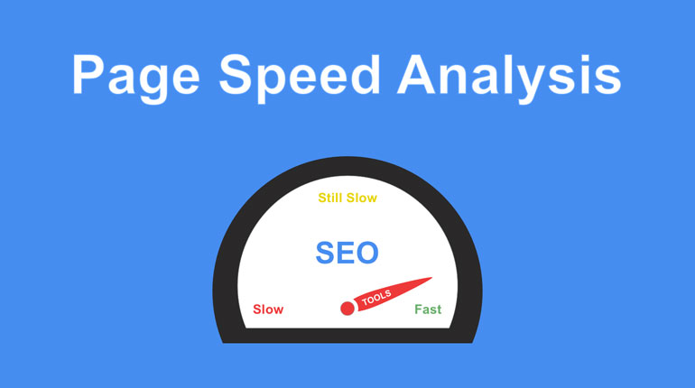
Last but certainly not least, the loading time of your site is another critical element that will make or break the effectiveness of your landing page. To put it simply, 40% of people will abandon a website that takes more than three seconds to load – can you imagine what that does to a conversion rate?
If almost half of your visitors don’t even stick around long enough to read your headline, you know the odds are not in your favor for getting them to purchase.
Like with review-gathering, there are tools to help you check and improve your site loading time. If you find that your bounce rate is high, you may want to do routine checks of your loading time with the goal of getting your page to load in under a second.
How Does Your Landing Page Measure Up
Does your landing page meet all of these criteria? If not, you may have your work cut out for you – but it will be worth it in the long run. Have your audience in mind for every step of the way; remember, the goal of your landing page is to excite leads enough that they want to take action. Create a clear, no-frills landing page that follows the above tips, and watch your leads turn into conversions.